
Recomendados
Recomendados
Más contenido relacionado
Último
Último (20)
Destacado
Destacado (20)
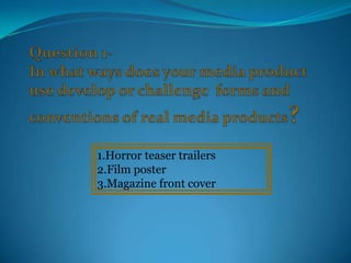
Media a2 evaluation sand
- 1. 1.Horror teaser trailers 2.Film poster 3.Magazine front cover
- 2. Teaser Trailers Previous to making our teaser trailer we had to carry out research so we were aware of the different forms of trailers such as, teaser trailers and a theatrical trailers. We analysed horror theatrical trailers such as, ‘X-men’, ‘Insidious’ and ‘One missed call’ and teaser trailers ‘Saw VI’ such as, ‘Rec’ and ‘Insidious’. This enabled us to establish the difference between the two trailers, as well as gain an understanding into horror conventions. We also researched ‘X-men’ the theatrical trailer, as this was a different genre it gave extra knowledge into other conventions. When analysing the ‘X-Men’ trailer we compared it with the horror trailer and its conventions, when doing so we realised that they we very opposite as they use the following conventions:- •Action and fighting •Characters with special powers •Special effects •Bright setting •When analysing theses trailers we came across the following conventions:- •Dark lighting and setting When filming our teaser trailer we took the •Pace Unknown/ mysterious characters majority of these conventions into consideration •Todorov’s theory -Narrative theory of equilibrium and used it when filming, but we did not necessarily in the beginning happy and disequilibrium as there make the Todorov theory obvious in the trailer, as is a tragic ending we believe it was not really significant in making an •Increase of pace when tension occurs effective horror teaser trailer. •Propp’s character theory •Props and costume •Film title at the end
- 3. Conventions I have used in my trailer: Dark lighting and setting:- When filming the trailer we wanted to create a particular atmosphere that was creepy and tense. Therefore, when filming the bedroom scene me made sure that the lights were off, and used the ‘night mode’ on the camera when filming; this was effective in creating the dark atmosphere as well as enable the audience to clearly see the actions taking place. We also choose to film our exterior scene during the evening as it would be dark, reinforcing the horror conventions in the teaser trailer. Whilst filming using the ‘night-mode’ we came across some issues, for example we had to make sure that the camera was facing at the right angle when filming as the footage was not always visible. Props and costumes:- One of the main props that we used was a knife, which we covered in ketchup as we wanted it to seem like blood stains, the knife and the blood is part of the horror convention as the knife and blood highlights danger, death and distress. For the costume, the character is wearing a ripped white shirt with red marks that is suppose to represent blood stains. By her wearing this particular piece of clothing this highlight the juxtaposition as the connation of ‘white’ is peace whilst ‘red’ is rage ; also through the use of the colour red we were ensuring that we were keeping with the colour scheme. By using the laptop this highlight to the audience that this is a modern teaser trailer, as well as making the, aware that the actions taking place is due to the mysterious e-mail received on the laptop. Increase of pace when tension occur:- To create tension and suspense we increased the pace of this following scene in our trailer, this is to indicate to the audience that something tragic is about to occur immediately grabbing there attention. Teaser trailer usually tend to be between 30 sec- 1:30 min, and our trailer is just at the minimum as it is 39 seconds. Characters -(Propp’s character theory)- Victims and villain:- The villain is played by Sandra, who can been seen in the following scene holding a set of keys which is to access the place where she captures the Victim. Also the character sends a the mysterious e-mail to the victim Sharmain which makes her panic and fearful for her life . The conventions that we used in my teaser trailer such as, props and costumes, shots, props and characters was influenced by the film ‘One missed call’, also due to the fact that the plot is cantered around a piece of technology which is mobile phone.
- 4. Film Poster Before creating our film poster we carried our research by analysing existing film posters, this enabled us to have the understanding on how to create a effective film poster that will appeal to our target audience. The film poster which we analysed were; ‘Fast Five’, ‘Insidious’ and ‘Orphan’. From analysing these poster and researching and looking at other forms of film promotions, we noticed the following conventions:- Analysing these three film posters allowed us to understand the actors of the film are usually the main Film title usually positioned at the bottom focus of the film poster, and the name of the film needs Film title is usually bold and the biggest to be displayed in a unique ways to grab the audience's Close up of main characters attention. When creating our film poster we challenged Dark background – unknown setting one of the conventions, as we did not put the name of the Credits and extra information at the bottom-vertically film at the bottom but at the top of the image. Also, we Website and credits placed at the bottom of the film went against the conventions also believed that it will be poster necessarily to include the rating of the film on the film Close up or extreme close up or an object or main poster, as it enables the audience to be aware of what Tagline to make the audience interested in watching the content to expect in the film. film
- 5. The conventions I have used in my poster We have also kept with the We have positioned the film title at the colour scheme (Red. Black and top of the poster, this is the convention white)which can be identified that we challenged ,when carrying out in the magazine front cover and our planning an research on film teaser trailer, as the colours posters. By placing the film title at the reinforces the horror genre. The top this immediately draws the dark background is effective in audience’s attention to the image making the gruesome image below which is the main focus, as it stand out as black represents:- allows the audience to have an death, evil and mystery. White understanding of the themes and the represents purity and plot of the film and what to expect. innocence which is a sharp contrast, as well as the red representing rage and anger. This informs the reader that the actually movie is due to be released, but they will be able to watch the By going against the teaser trailer to be able to have a slight conventions we included understanding of the film before they the rating of the film, as it can watch it in the cinemas. immediately identifies the target audience, and informs people of what We have included the tagline which is content to expect from the the second biggest font after the film film. title, as it grab the audience’s attention The credits which gives extra information as well as giving them an insight of what by informing the audience who is the to expect in the film. This also makes it a producer of the film, the actors names and memorable way for identifying the film. directors have been place in the convention place which is in the middle of the film poster; by placing it in the By placing the name of the website on the film conventional place this allows the audience poster this allows the audience to have a chance to to be familiar with what they are seeing so gain more information about the characters and they are able to identify that it is a film the plot, by going on the website and watching the poster. trailer.
- 6. Film Magazine Front Cover Before creating our magazine front cover we analysed existing magazine covers so we were aware of the conventions of a film magazine cover, by analysing a popular and professional film magazine: Empire When researching existing magazine front covers we came across a problem, as we were unable to find magazine front cover that covered horror films. Therefore, we decided to pick magazine front covers that was broad and have similar conventions to what a horror film magazine will have. We analysed ‘X-Men First Class and ‘I am Legend’ as each film magazine front cover uses the colour scheme that is used in horror film., as the red and black have a connation of mystery and death. Conventions we came across when analysing theses magazine front covers:- Film’s name over lapping the image of the When creating our magazine front cover main character we used most of the conventions but we Price and the date on top of the magazine challenged one in particular:- ‘Film Exclusive information is provide inside:- name overlapping the image of the main PLUS! character . As we thought that our Same colour scheme with actually film and magazine front cover will not look trailer presentable if we use this convention, Mid shot or close up of main character in as it will distract the reader from the the film main focus which is the image of the Magazine name is in large font main character. Other headlines contains information about what is inside the magazine
- 7. Conventions I have used in my magazine front cover EMPIRE- Is the biggest and boldest which we achieve by increasing the font size. We also used the same font which The date of the magazine is used in the actually magazine, release and price is placed at so it appear professional and the top. recognisable to the reader. Provides the reader with background information We have challenged the conventions regarding the main character, this of a film magazine front cover by not will make them more interested in included the name of our trailer: ‘The watching the actually film. Unknown’, instead we incorporated the name into catchy phrase . Colour scheme: Black, red and white. This ties in with the The ‘Pulse’ immediately grabs horror convention, this colour the reader’s attention, as it informs scheme can also be identified them of the extra information in the trailer. given inside the magazine; regarding other horror films during the current year. We have used a close-up of the we wanted to keep to the colour main character is the teaser scheme so we kept the writing trailer, as it is eye catching and ‘white’, which lists the extra gives the reader and insight information. into the plot. This is We also placed this information commonly used with We have placed a barcode at at the side of the magazine, so it magazine front cover to inform the right hand corner of the does not over shadowing the main them of the characters. magazine, which is a typical image which is USP. magazine convention.