
Recomendados
Recomendados
Más contenido relacionado
Último
Último (20)
Destacado
Destacado (20)
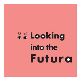
Looking into the Futura - a type specimen book
- 2. Light Condensed Medium Condensed Bold Condensed Light Condensed Medium Condensed Bold Condensed Light Book Medium Light Book Medium Heavy Bold Extra Bold Heavy Bold Extra Bold Futura Futura Futura Futura Futura Futura Futura Futura Futura Futura Futura Futura Futura Futura Futura Futura Futura Futura 12 pt. Regular 12 pt. Condensed
- 3. efficiency and forwardness efficiency and forwardness efficiency and forwardness efficiency and forwardness efficiency and forwardness efficiency and forwardness efficiency and forwardness efficiency and forwardness efficiency and forwardness 12 pt. Medium 11 pt. 10 pt. 09 pt. 08 pt. 07 pt. 06 pt. 05 pt. 04 pt. Futura took from the Bauhaus movement its clean and crisp aesthetic.The simplicity reflects a sense of efficiency and forward-ness that people today still appreciate. 07 pt. Book 50 pt. Bold Futura u u
- 4. 33 pt. Bold 12 pt. Medium Oblique u u Paul Rennerutopia of design He believed that Futura is the utopia of design. Paul Renner, the main designer for Futura, is from Germany. In 1927, he created Futura, which he believed was the result of the elimination of all ornamentation and individual characteristic.
- 5. 95 pt. Bold 51 pt. Bold 30 pt. Bold 30 pt. Bold u t o p i a u t o p i a u t o p i a
- 6. Characteristicssense of style Futura is the sign of efficency– it is clean, standarized and stylized without an “overt” sense of style. A typeface’s basic function is its readability. In order to enhance that, Renner derived Futura entirely from geometric forms. He uses near-perfect circles, triangles and squares and strokes of similar weights.
- 7. futura into the … Looking 1 2 3 4 5 ascender height cap height x–height base line descender height 1 2 3 4 5Capital letter rounded oo like eyes tittle same shape as the letter o over hang over hang over hang over hang: a part of the letter hangs below the baseline lowercase letter: ascender is higher than the cap-height
- 8. 30 pt. Bold 12 pt. Bold 50 pt. Medium O o o o o o ooo V v v v v v vvv O is almost a perfect circle. However, on close observation it is slightly oval on the sides. Futura is one of the only typeface with a circular o. Geometrical The negative space of the v forms an obvious triangle. However, v isnot the only letter who does that. The negative space of A, Y and X also does the same.
- 9. ij170 pt. Medium Similarity dpdp qbqb b, d, q, p are all very similar. They are all either mere reflections of each other or rotations of each other. When put together, the fit perfectly. The i and the j are also very similar. The j is basically the i with an extend. The lack of a upwards curve on the j is subtle but demands attnetion when seen. 38 pt. Medium
- 10. A B C D E F G H I J K L M N O P Q R S T U V W X Y Z a b c d e f g h i j k l m n o p q r s t u v w x y z 1 2 3 4 5 6 7 8 9 0 !@#$%^&*() :;?/”’<>{}., 12 pt. Medium A B C D E F G H I J K L M N O P Q R S T U V W X Y Z a b c d e f g h i j k l m n o p q r s t u v w x y z 1 2 3 4 5 6 7 8 9 0 !@#$%^&*() :;?/”’<>{}., 12 pt. Medium Oblique Full Alphabet
- 11. Look out for the futura ... Look out for the futura ... Look out for the futura ... Look out for the futura ... 18pt. Condensed Light Medium Bold Extra Bold
- 12. Candy Wang