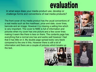
1. evaluation The front cover of my media product has the usual conventions of a real media such as the masthead, price and date, cover lines, barcode and an image. However it is missing a selling line which is very important. The cover to NME is full of information and pictures when my cover has one picture and a few cover lines making it seem like there is less on there. The contents page has everything that a normal one has and works well however I feel that it has little on it. My double page spread looks very blank compared to the one in this. However there is still a lot of information and there are a couple of pictures which breaks up the text. In what ways does your media product use, develop or challenge forms and conventions of real media products?
2. My media product represents the indie and rock genre of music. The images show people the same age as the reader and wearing cloths that the reader would wear. The title of the double page spread is in a horror font because the band are called Killed by Ninjas and the pictures have a horror style to them . The title of the magazine is Underground Music which means it’s music that is in the magazine is unknown and new, the colour of the title is a contrast to the title because it is bright. How does your media product represent particular social groups?
3. The magazine is a mainstream magazine which rivals NME. It’s “publishers” are Bauer a rival one to the publisher of NME. the distributors would be all small shops and other mainstream shops such as WHSmith and Tesco. Bauer are a big magazine publisher and have published massive mags such as FHM and MOJO, this means that the magazine has a good publisher behind it and would know what sells a magazine. What kind of media institution might distribute your media product and why?
4. The audience for my music magazine are aged between 15 and 25, this group are young adults and therefore will listen to new music from young bands. The magazine is aimed at both sex’s. The genre of music the magazine focuses on is indie and rock, this means the magazine is aimed at the indie scene. The people who read the magazine will be in school, college or uni, they will wear cloths from Topshop/Topman, NEXT and H&M which is what they will see in the mag. The boys might like gadgets and there is a couple of pages in the magazine which is dedicated to them. Who would be the audience for your media product?
5. The pictures used of the whole band have them looking into the camera which makes it seem like the are looking at the reader. The word “you” is used to create a connection between writer and reader. The colour is bright and catches the readers eye when skimming through. certain parts of text are bold or in a different font to stand out. Page 2 - 3: New bands - all the new bands we love and you will too. Page 5 - 6: Live bands - all the latest reviews on gigs and a guide to all the up and coming ones. Page 8 - 9: KILLED BY NINJAS - special 2 page spread on their KILLER comeback. Page 15 - 17: Summer festivals - the go to guide for festivals. Page 18 - 20: Must have - all the music you SHOULD own. Page 21 - 25: Posters - exclusive pictures of the bands you love. Page 27: Gadget loving - all the new gadgets that will rock your socks. Page 28 - 30: The Sunshine Underground - talk about their new album and touring. Page 32 - 34: Top rated - the best bands of all time. How did you attract/address your audience?
6. When making the product I used a digital camera to take the images, on the camera is a setting to change the colour of it. Then once on the computer I used Photoshop to and noise onto the image. On Publisher I put the actual piece together and the back up work was done on PowerPoint. Using the internet I found a website called DaFont where you can download free fonts from their archive. What have you learnt about technologies from the process of constructing this product?
7. When making the cover to the school magazine I didn’t have Publisher and I didn’t know about the website called DaFont so it looks pretty basic. There are no selling lines on the school mag because it’s free, on the music magazine I left it out because I thought all the information on it would sell it, however I would put one on now seeing it. The title is at the bottom of the school mag because I thought it might look good but the title placing on the music magazine looks much better. There is also no barcode or price on the school mag because it is free, this makes it look empty and the music mag look fuller. Looking back at your preliminary task, what do you feel you have learnt in the progression from it to the full product?