
Recommended
More Related Content
Viewers also liked
Viewers also liked (11)
Similar to Adam Gray Work Examples
Similar to Adam Gray Work Examples (20)
Recently uploaded
Recently uploaded (20)
Adam Gray Work Examples
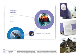
- 1. Print Client: Skills for Logistics Skills for Logistics asked us to produce an annual report to show what they as well as the ‘circles’ theme which they were keen to continue. They needed an annual report that would fit into their existing literature and also have some Project Title: Annual Report had achieved so far towards their ultimate goal of fully integrating all logistics Contribution: Design & artwork sectors. An established logo and corporate guidelines were already in existence stand-out.
- 2. Print Client: Pall-Ex Pall-Ex are a logistics company with heavy investment in technology to give other important issues such as environment concern. Each topic was given it’s own card, then stacked on top of a box printed to look like a pallet. This would Project Title: Sales DM them some unique USP’s. To promote these they wanted a piece of direct mail then be shrink wrapped like an actual pallet of goods. Contribution: Creative & Design that made it clear that they not only had these USP’s but were also ahead on
- 3. Print Client: University project The challenge for this university project was to produce a serious mailer about use a home A4 printer to reproduce it. With a free sample inside this mailer aimed to be serious, educational but also fun and encouraging towards Project Title: Durex Mailer the dangers of STD’s, and to promote safe sex in a fun way . It should also be Contribution: Concept, design & artwork available to be printed out from an on-line source, so it should be possible to safe sex.
- 4. Print Client: University project Asked to experiment with guerilla advertising, and to engage the viewers, they wanted. Running at the same time would be a series of stencil art placed at street-level advertising positions e.g. bus stop advertising boards, road side Project Title: Guerilla Advertising I created a hip-hop radio station. To advertise it I proposed adverts would be board / 48 sheet etc. Contribution: Concept, design & artwork printed in magazines along with a stencil for viewers to tear out and use how
- 5. Print Client: Interski Interski are an established skiing holiday and events organiser, especially for their series of literature to be brought up to date and be more engaging. They felt they offered more that their clients realised and wanted a style that would Project Title: Company Literature organising school skiing holidays. They also own sub-brands like Snowco which shout this out right from the front covers. Contribution: Concept, design & artwork focus on more specific demographics and also sell equipment. They wanted
- 6. Web Client: Bulwell Academy Bulwell Academy were in need of a holding-site to promote their completely process. With one key colour for guidance the site was designed to be clean and adaptable. To inject some colour each section of the site was assigned a colour Project Title: Holding website new collage. With a new building in progress, a new logo still not chosen and that could potentially be carried on through the future guidelines. Contribution: Design no corporate guidelines to guide the design of the site, it was a challenging
- 7. Web Client: Hepworth Hep2o Having already put out the ‘flexible plumber’ adverts, the campaign needed a were real or fakes. The site offered a free trial pack whilst capturing detailed information about the user. Project Title: Hep2o Website website to get potential customers involved with the viral marketing aspect. Contribution: Design Readers were challenged to vote on whether the photos of the flexible plumber
- 8. Branding Client: CPK Auto CPK Auto are an established wholesaler of tires that were looking to update Project Title: CPK Logo their look. They were very impressed by the recent SKY logo and wanted a very Contribution: Design & artwork similar feel to their new logo.
- 9. Branding Client: Nottingham University The Environmental Technology Department at Nottingham University were temptation to represent the old-hat ‘four elements’ was avoided, and instead a simple representation through colour and flowing shape, overlapping and Project Title: ETC Logo looking for a logo that would hold appeal to a broad age range. It also had interacting with each other was used. Contribution: Design & artwork to represent interaction with general nature and also look modern. The
- 10. Branding Client: Geoquip Geoquip provide large scale properties with high-tech security on the scale from their logo up to celebrate 25 years in the business and to mark their push to gain more of a market share on the industry. Technical brochures, catalogues, Project Title: Geoquip Re-brand of stately homes and oil lines in the middle-east. They operate worldwide and a website and other literature were provided in this new style. Contribution: Concept, design & artwork are heavily invested in technology and development. They wanted to re-brand
- 11. Exhibition Stand Client: Deans Foods Deans are a large provider of farm produce to supermarkets and always have a with the stand builder and working from Deans requirements, I came up with a design that introduced moving graphics across the panels delivering many Project Title: Deans exhibition stand presence at all relevant exhibitions. I was asked to design a stand based on a floor messages without being cluttered. A relaxing stand were people would linger. Contribution: Design area already purchased and a budget already outlined by a stand builder. Liaising
- 12. Illustration Client: Personal work Various illustrations done on both computers and by hand. Project Title: Various Contribution: Illustration, digital and hand