
Recomendados
Más contenido relacionado
La actualidad más candente
Destacado
Destacado (16)
Similar a Q Magazine Cover Analysis Targets Mature Readers
Similar a Q Magazine Cover Analysis Targets Mature Readers (20)
Más de adamcunliffe
Más de adamcunliffe (19)
Último
Último (9)
Q Magazine Cover Analysis Targets Mature Readers
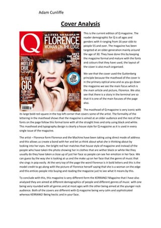
- 1. Adam Cunliffe Cover Analysis This is the current edition of Q magazine. The reader demographic for Q is all ages and genders with it ranging from 16 year olds to people 55 and over. The magazine has been targeted at an older generation mainly around the age of 30. They have done this by keeping the magazine formal and mature with the fonts and colours that they have used, the layout of the cover is also much organised. We see that the cover used the Guttenberg principle because the masthead of the cover is in the primary optical area and as you go down the magazine we see the main focus which is the main article and picture, Florence. We also see that there is a story in the terminal are so that it is one of the main focuses of the page also. The masthead of Q magazine is very iconic with its large bold red square in the top left corner that covers some of the artist. The formality of the lettering in the masthead shows that the magazine is aimed at an older audience and the rest of the fonts on the page follow this formal tone with all the straight lines and only using black and white. This masthead and typography design is clearly a house style for Q magazine as it is used in every single issue of the magazine. The artist – Florence form Florence and the Machine have been taking using direct mode of address and this allows us create a bond with her and let us think about what she is thinking about by looking into her eyes. Her bright red hair matches that house style of magazine and instead of the people who have taken the photo showing her in clothes that are wither black or white like they usually do they have taken a close up of just her face so people can see her emotion in her face. We can guess by the way she is looking at us and the make up on her face that the genre of music that she sings in pop easily. At the very top of the page the word Florence is in bold letters and this is the model credit to go along with the picture of Florence herself saying that she is a woman on the edge and this entices people into buying and reading the magazine just to see what it means by this. To conclude with this, this magazine is very different form the KERRANG! Magazine that I have also analysed they are aimed at different demographics of people and different genres of music with one being very rounded with all genres and at most ages with the other being aimed at the younger rock audience. Both of the covers are different with Q magazine being very calm and sophisticated whereas KERRANG! Being hectic and in your face.