
Recomendados
Más contenido relacionado
La actualidad más candente
La actualidad más candente (20)
Destacado
Destacado (10)
Similar a Analysis of magazine front cover
Similar a Analysis of magazine front cover (20)
Más de adinabredenthorpe
Más de adinabredenthorpe (20)
Analysis of magazine front cover
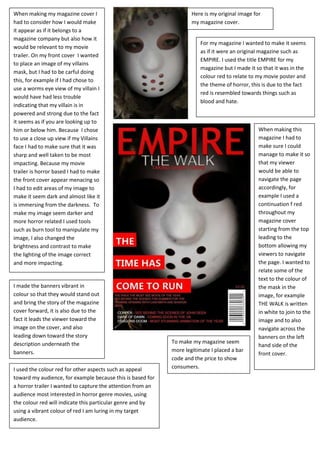
- 1. When making my magazine cover I had to consider how I would make it appear as if it belongs to a magazine company but also how it would be relevant to my movie trailer. On my front cover I wanted to place an image of my villains mask, but I had to be carful doing this, for example if I had chose to use a worms eye view of my villain I would have had less trouble indicating that my villain is in powered and strong due to the fact it seems as if you are looking up to him or below him. Because I chose to use a close up view if my Villains face I had to make sure that it was sharp and well taken to be most impacting. Because my movie trailer is horror based I had to make the front cover appear menacing so I had to edit areas of my image to make it seem dark and almost like it is immersing from the darkness. To make my image seem darker and more horror related I used tools such as burn tool to manipulate my image, I also changed the brightness and contrast to make the lighting of the image correct and more impacting. Here is my original image for my magazine cover. For my magazine I wanted to make it seems as if it were an original magazine such as EMPIRE. I used the title EMPIRE for my magazine but I made it so that it was in the colour red to relate to my movie poster and the theme of horror, this is due to the fact red is resembled towards things such as blood and hate. When making this magazine I had to make sure I could manage to make it so that my viewer would be able to navigate the page accordingly, for example I used a continuation f red throughout my magazine cover starting from the top leading to the bottom allowing my viewers to navigate the page. I wanted to relate some of the text to the colour of the mask in the image, for example THE WALK is written in white to join to the image and to also navigate across the banners on the left hand side of the front cover. I made the banners vibrant in colour so that they would stand out and bring the story of the magazine cover forward, it is also due to the fact it leads the viewer toward the image on the cover, and also leading down toward the story description underneath the banners. To make my magazine seem more legitimate I placed a bar code and the price to show consumers.I used the colour red for other aspects such as appeal toward my audience, for example because this is based for a horror trailer I wanted to capture the attention from an audience most interested in horror genre movies, using the colour red will indicate this particular genre and by using a vibrant colour of red I am luring in my target audience.