SlideShare a Scribd company logo
1 of 7
In what ways does your media product use, develop or challenge forms and conventions of real media products? My media magazine suits conventions of real media products by, having a strong masthead across the top of the magazine front cover. It also has a strong image that is the central focus of the front cover. It also has a price with issue number and a barcode, which is common amongst all magazines. It has a strong quote, that makes a reader want to read more about a well known artist. The font for the artist is also eye catching and interesting,  which is seen common in magazines about popular artists having eye catching fonts.
How does your media product represent particular social groups? My magazine links with my target group in a number of ways. The main artist is a young person wearing stylish clothing which looks like the type of hip hop artist the target audience would relate too. The fonts are very lively and bold which                         similarly attracts the target audience, eye catching headings and colour                  schemes enable the target audience to pick the magazine out as interesting.                    Interesting headings for articles for well known artists also interest the reader and        make them want to read the articles. They want to know about their favourite artists and what’s new in the musical world. Hip hop music is all about what new stars and music are being produced, so the use of introducing new stars and new singles, new things make the reader want to read the magazine.  The heading is an example of a modern font and interesting title that is eye catching.    Audiences of this genre like to feel the artists are addressing them as the artists are their idols. “I thought my fans had forgotten me” is the article used when the famous artist is addressing the audience which represents his fans. I wanted to represent my audience in a positive way, through positive images and positive competitions and quotes. It is noted that this genre of music is associated with crime at times, which is why I made sure that my magazine was positive to the target audience.
What kind of media institution might distribute your media product and why? A good magazine publisher that I would choose for my magazine is IPC Media. They publish similar magazines as to my product, magazines that are modern and display similar genres of music such as NME magazine. IPC Media have a tradition in distributing successful and popular magazines. By having my product distributed by the same company is showing how my product is popular and successful. I feel my magazine could be published by IPC Media because it follows a similar professional look to the magazines that are distributed. The styling and format of the magazines are very similar between my product and NME, they cover similar genre’s of artists as well. I therefore feel that IPC Media is the perfect distributer for my magazine product. I at first see my magazine fit in with the new style of distributing. Online distributing is becoming the more popular choice. I will therefore attract my younger teenage audience who have an in-depth knowledge of the internet. I will start my product as a free one too see how popular it could become. If it becomes popular, see it as a magazine that could be purchased like magazines of today and make money.
The audience for my media product is the age range of 13 – 25 year olds. I have aimed my product at a younger target group, as I belong to this age category and my research showed from my questionnaire, that a large majority of this age range chose hip hop. Both genders would be targeted in this magazine because of the features inside of it. The artists that are portrayed in the magazine are liked by both genders and by people of many ages. The extra content is also something that everyone would be attracted to. Winning prizes and holidays which are advertised for my magazine is an exciting prospect for this age in the target market. The images have a shared split between the number of male and female artists shown. Therefore making the artists and the magazine in all appealing to both genders in the age range that I have targeted. My magazine follows conventions of teen magazines through colour and layout which is why they are the ideal target audience for my magazine.  Who would be the audience for your media product? The pose and the artist has a young style and theme to it which is aimed at the younger target audience.
What have you learnt about technologies from the process of constructing this product? I have used many different programmes to make my magazine a success. I have learnt how to take the backgrounds off of pictures with ease using Macromedia Fireworks MX 2004. Using tools such as firework, and Lasso Tool. I never had heard of Fireworks before and I would have probably tried to use the Paint programme, this would have therefore made my product look less professional. Which is why this technology is a good one to use, enabling me to get rid of the background to pictures quickly. I have used new internet sites that are able to add interesting and modern fonts. On www.cooltext.com I used the classic font “BuschGardenz” with a Neon effect to achieve my title. It is eye catching and effective, it is a technology I wouldn’t have thought of using, until I found it on a search engine.
Looking back at your preliminary task, what do you feel you have learnt in the progression from it to the full product? I have learnt to use more professional fonts for my front cover. The Ely college magazine has been made using WordArt which looks unconventional. My music magazine has used an interesting font that is recognisable. From my research of existing magazine I found that all magazines had a distinctive font that was recognisable which I needed to use. The fonts for headings and text of article titles is common throughout the magazine, it is also very clear to read which is a convention of a magazine. The colour scheme of the college magazine is not conventional at all. No magazine uses gradient colours, so I have gone for plain colours that are consistent all of the way through. My questionnaire gave me an idea of the colour schemes my target audience wanted to use, and research showed that magazine front covers follow the rule of 3. I have learnt much better ways of editing my images for the magazine. The school magazine was limited to pictures in a school environment and were not imaginative. Whereas we had more freedom in choosing images and had to edit them so they looked better. I have learnt better ways of editing them too, being introduced to Macromedia Fireworks has helped me to advance my editing. I have learnt that picture borders do not need to be over complicated. In the school magazine I used fancy colourful borders which look unprofessional. A simple border is much more effective. I also found that an article often uses more quotes than I had used in the school magazine, which is why in my double page article there is many more quotes from the main musician.
Looking back at your preliminary task, what do you feel you have learnt in progression from it to the full product? Continued. The final music magazine is much more improved from the college magazine. The changes I have made make the music magazine look much more professional, and look similar to some of the music magazines that I had researched previously.

More Related Content

What's hot (19)

Sam titmarsh
Sam titmarshSam titmarsh
Sam titmarsh
 
Jennie Baxandall Foundation Portfolio Evaluation
Jennie Baxandall Foundation Portfolio EvaluationJennie Baxandall Foundation Portfolio Evaluation
Jennie Baxandall Foundation Portfolio Evaluation
 
Gareth tomlins 2
Gareth tomlins 2Gareth tomlins 2
Gareth tomlins 2
 
As g321
As g321As g321
As g321
 
Evaluation
EvaluationEvaluation
Evaluation
 
Media Evaluation
Media EvaluationMedia Evaluation
Media Evaluation
 
Media evaluation
Media evaluationMedia evaluation
Media evaluation
 
Sam titmarsh
Sam titmarshSam titmarsh
Sam titmarsh
 
Media Studies Product Evaluation
Media Studies Product EvaluationMedia Studies Product Evaluation
Media Studies Product Evaluation
 
Chays parker
Chays parkerChays parker
Chays parker
 
Question 2
Question 2Question 2
Question 2
 
WDF Crowd Control Media evaluation
WDF Crowd Control Media evaluationWDF Crowd Control Media evaluation
WDF Crowd Control Media evaluation
 
As g321
As g321As g321
As g321
 
Response Questions
Response QuestionsResponse Questions
Response Questions
 
Question (4)
Question (4)Question (4)
Question (4)
 
As media evaluation
As media evaluationAs media evaluation
As media evaluation
 
Question (3)
Question (3)Question (3)
Question (3)
 
Evaluation
EvaluationEvaluation
Evaluation
 
Evaluation
EvaluationEvaluation
Evaluation
 

Viewers also liked (17)

Media Coursework Evaluation
Media Coursework EvaluationMedia Coursework Evaluation
Media Coursework Evaluation
 
Gareth tomlins
Gareth tomlinsGareth tomlins
Gareth tomlins
 
bitişiklik kuramı
bitişiklik kuramıbitişiklik kuramı
bitişiklik kuramı
 
facebook
facebookfacebook
facebook
 
A2 media evaluation kieran mackender
A2 media evaluation kieran mackenderA2 media evaluation kieran mackender
A2 media evaluation kieran mackender
 
Magazine evaluation
Magazine evaluationMagazine evaluation
Magazine evaluation
 
facebook nedir ?
facebook nedir ?facebook nedir ?
facebook nedir ?
 
Harry seager
Harry seagerHarry seager
Harry seager
 
A2 level media evaluation
A2 level media evaluationA2 level media evaluation
A2 level media evaluation
 
Jamie cranwell
Jamie cranwellJamie cranwell
Jamie cranwell
 
Evaluation
EvaluationEvaluation
Evaluation
 
Final evaluation by Matt Jewitt
Final evaluation by Matt JewittFinal evaluation by Matt Jewitt
Final evaluation by Matt Jewitt
 
Ryan lock
Ryan lockRyan lock
Ryan lock
 
A2 media coursework evaluation
A2 media coursework evaluationA2 media coursework evaluation
A2 media coursework evaluation
 
Media evaluation powerpoint
Media evaluation powerpointMedia evaluation powerpoint
Media evaluation powerpoint
 
Slideshare
SlideshareSlideshare
Slideshare
 
Ben mantell
Ben mantellBen mantell
Ben mantell
 

Similar to Lewis szulc

Similar to Lewis szulc (20)

Evaluation[1]
Evaluation[1]Evaluation[1]
Evaluation[1]
 
Music magazine evaluation
Music magazine evaluationMusic magazine evaluation
Music magazine evaluation
 
Natalie Nolan's Evaluation of her media product
Natalie Nolan's Evaluation of her media productNatalie Nolan's Evaluation of her media product
Natalie Nolan's Evaluation of her media product
 
AS Media Studies- Music Magazine Evaluation
AS Media Studies- Music Magazine EvaluationAS Media Studies- Music Magazine Evaluation
AS Media Studies- Music Magazine Evaluation
 
Evaluation
EvaluationEvaluation
Evaluation
 
Understanding of issues evaluation redo.1
Understanding of issues  evaluation redo.1Understanding of issues  evaluation redo.1
Understanding of issues evaluation redo.1
 
Understanding of issues evaluation redo.1
Understanding of issues  evaluation redo.1Understanding of issues  evaluation redo.1
Understanding of issues evaluation redo.1
 
Music Magazine Evaluation
Music Magazine EvaluationMusic Magazine Evaluation
Music Magazine Evaluation
 
Evaluation of my music magazine
Evaluation of my music magazineEvaluation of my music magazine
Evaluation of my music magazine
 
Evaluation of my music magazine
Evaluation of my music magazineEvaluation of my music magazine
Evaluation of my music magazine
 
Rebecca Warren AS Media evaluation
Rebecca Warren AS Media evaluationRebecca Warren AS Media evaluation
Rebecca Warren AS Media evaluation
 
Evaluation
EvaluationEvaluation
Evaluation
 
Media evaluation
Media evaluationMedia evaluation
Media evaluation
 
Evaluation
EvaluationEvaluation
Evaluation
 
Evaluation of the music magazine
Evaluation of the music magazineEvaluation of the music magazine
Evaluation of the music magazine
 
Jamie cranwell
Jamie cranwellJamie cranwell
Jamie cranwell
 
Music Magazine Evaluation
Music Magazine EvaluationMusic Magazine Evaluation
Music Magazine Evaluation
 
Evaluation
EvaluationEvaluation
Evaluation
 
Evaluation
EvaluationEvaluation
Evaluation
 
Evaluation
EvaluationEvaluation
Evaluation
 

More from afrench14

Evaluation of music magazine
Evaluation of music magazineEvaluation of music magazine
Evaluation of music magazine
afrench14
 
Sam titmarsh
Sam titmarshSam titmarsh
Sam titmarsh
afrench14
 
Stephen woodley
Stephen woodleyStephen woodley
Stephen woodley
afrench14
 
Hannah matthews
Hannah matthewsHannah matthews
Hannah matthews
afrench14
 
Keiron bradbury
Keiron bradburyKeiron bradbury
Keiron bradbury
afrench14
 
Harry seager
Harry seagerHarry seager
Harry seager
afrench14
 
Emma whitehand 2
Emma whitehand 2Emma whitehand 2
Emma whitehand 2
afrench14
 
Hannah Matthews
Hannah MatthewsHannah Matthews
Hannah Matthews
afrench14
 
Beth presentation
Beth presentationBeth presentation
Beth presentation
afrench14
 
Music magazine evaluation
Music magazine evaluationMusic magazine evaluation
Music magazine evaluation
afrench14
 
Codie's Evaluation
Codie's EvaluationCodie's Evaluation
Codie's Evaluation
afrench14
 
My evaluation a2
My evaluation a2My evaluation a2
My evaluation a2
afrench14
 

More from afrench14 (20)

Daniel jay
Daniel jayDaniel jay
Daniel jay
 
Evaluation
EvaluationEvaluation
Evaluation
 
Evaluation of music magazine
Evaluation of music magazineEvaluation of music magazine
Evaluation of music magazine
 
Wham!
Wham!Wham!
Wham!
 
Sam titmarsh
Sam titmarshSam titmarsh
Sam titmarsh
 
Ryan lock
Ryan lockRyan lock
Ryan lock
 
Stephen woodley
Stephen woodleyStephen woodley
Stephen woodley
 
Hannah matthews
Hannah matthewsHannah matthews
Hannah matthews
 
Keiron bradbury
Keiron bradburyKeiron bradbury
Keiron bradbury
 
Harry seager
Harry seagerHarry seager
Harry seager
 
Emma whitehand 2
Emma whitehand 2Emma whitehand 2
Emma whitehand 2
 
Hannah Matthews
Hannah MatthewsHannah Matthews
Hannah Matthews
 
Evaluation
EvaluationEvaluation
Evaluation
 
Beth presentation
Beth presentationBeth presentation
Beth presentation
 
Music magazine evaluation
Music magazine evaluationMusic magazine evaluation
Music magazine evaluation
 
Codie's Evaluation
Codie's EvaluationCodie's Evaluation
Codie's Evaluation
 
Evaluation
EvaluationEvaluation
Evaluation
 
My evaluation a2
My evaluation a2My evaluation a2
My evaluation a2
 
Evaluation
EvaluationEvaluation
Evaluation
 
Jump
JumpJump
Jump
 

Lewis szulc

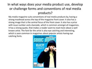
  • 1. In what ways does your media product use, develop or challenge forms and conventions of real media products? My media magazine suits conventions of real media products by, having a strong masthead across the top of the magazine front cover. It also has a strong image that is the central focus of the front cover. It also has a price with issue number and a barcode, which is common amongst all magazines. It has a strong quote, that makes a reader want to read more about a well known artist. The font for the artist is also eye catching and interesting, which is seen common in magazines about popular artists having eye catching fonts.
  • 2. How does your media product represent particular social groups? My magazine links with my target group in a number of ways. The main artist is a young person wearing stylish clothing which looks like the type of hip hop artist the target audience would relate too. The fonts are very lively and bold which similarly attracts the target audience, eye catching headings and colour schemes enable the target audience to pick the magazine out as interesting. Interesting headings for articles for well known artists also interest the reader and make them want to read the articles. They want to know about their favourite artists and what’s new in the musical world. Hip hop music is all about what new stars and music are being produced, so the use of introducing new stars and new singles, new things make the reader want to read the magazine. The heading is an example of a modern font and interesting title that is eye catching. Audiences of this genre like to feel the artists are addressing them as the artists are their idols. “I thought my fans had forgotten me” is the article used when the famous artist is addressing the audience which represents his fans. I wanted to represent my audience in a positive way, through positive images and positive competitions and quotes. It is noted that this genre of music is associated with crime at times, which is why I made sure that my magazine was positive to the target audience.
  • 3. What kind of media institution might distribute your media product and why? A good magazine publisher that I would choose for my magazine is IPC Media. They publish similar magazines as to my product, magazines that are modern and display similar genres of music such as NME magazine. IPC Media have a tradition in distributing successful and popular magazines. By having my product distributed by the same company is showing how my product is popular and successful. I feel my magazine could be published by IPC Media because it follows a similar professional look to the magazines that are distributed. The styling and format of the magazines are very similar between my product and NME, they cover similar genre’s of artists as well. I therefore feel that IPC Media is the perfect distributer for my magazine product. I at first see my magazine fit in with the new style of distributing. Online distributing is becoming the more popular choice. I will therefore attract my younger teenage audience who have an in-depth knowledge of the internet. I will start my product as a free one too see how popular it could become. If it becomes popular, see it as a magazine that could be purchased like magazines of today and make money.
  • 4. The audience for my media product is the age range of 13 – 25 year olds. I have aimed my product at a younger target group, as I belong to this age category and my research showed from my questionnaire, that a large majority of this age range chose hip hop. Both genders would be targeted in this magazine because of the features inside of it. The artists that are portrayed in the magazine are liked by both genders and by people of many ages. The extra content is also something that everyone would be attracted to. Winning prizes and holidays which are advertised for my magazine is an exciting prospect for this age in the target market. The images have a shared split between the number of male and female artists shown. Therefore making the artists and the magazine in all appealing to both genders in the age range that I have targeted. My magazine follows conventions of teen magazines through colour and layout which is why they are the ideal target audience for my magazine. Who would be the audience for your media product? The pose and the artist has a young style and theme to it which is aimed at the younger target audience.
  • 5. What have you learnt about technologies from the process of constructing this product? I have used many different programmes to make my magazine a success. I have learnt how to take the backgrounds off of pictures with ease using Macromedia Fireworks MX 2004. Using tools such as firework, and Lasso Tool. I never had heard of Fireworks before and I would have probably tried to use the Paint programme, this would have therefore made my product look less professional. Which is why this technology is a good one to use, enabling me to get rid of the background to pictures quickly. I have used new internet sites that are able to add interesting and modern fonts. On www.cooltext.com I used the classic font “BuschGardenz” with a Neon effect to achieve my title. It is eye catching and effective, it is a technology I wouldn’t have thought of using, until I found it on a search engine.
  • 6. Looking back at your preliminary task, what do you feel you have learnt in the progression from it to the full product? I have learnt to use more professional fonts for my front cover. The Ely college magazine has been made using WordArt which looks unconventional. My music magazine has used an interesting font that is recognisable. From my research of existing magazine I found that all magazines had a distinctive font that was recognisable which I needed to use. The fonts for headings and text of article titles is common throughout the magazine, it is also very clear to read which is a convention of a magazine. The colour scheme of the college magazine is not conventional at all. No magazine uses gradient colours, so I have gone for plain colours that are consistent all of the way through. My questionnaire gave me an idea of the colour schemes my target audience wanted to use, and research showed that magazine front covers follow the rule of 3. I have learnt much better ways of editing my images for the magazine. The school magazine was limited to pictures in a school environment and were not imaginative. Whereas we had more freedom in choosing images and had to edit them so they looked better. I have learnt better ways of editing them too, being introduced to Macromedia Fireworks has helped me to advance my editing. I have learnt that picture borders do not need to be over complicated. In the school magazine I used fancy colourful borders which look unprofessional. A simple border is much more effective. I also found that an article often uses more quotes than I had used in the school magazine, which is why in my double page article there is many more quotes from the main musician.
  • 7. Looking back at your preliminary task, what do you feel you have learnt in progression from it to the full product? Continued. The final music magazine is much more improved from the college magazine. The changes I have made make the music magazine look much more professional, and look similar to some of the music magazines that I had researched previously.