
Recomendados
Más contenido relacionado
Destacado
Destacado (20)
Magazine front cover deconstructions pp
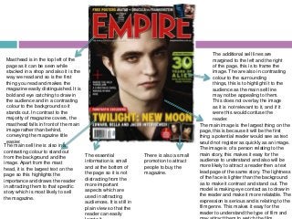
- 1. The additional sell lines are Masthead is in the top left of the margined to the left and the right page as it can be seen while of the page, this is to frame the stacked in a shop and also it is the image. The are also in contrasting way we read and so is the first colour to the surrounding thing you read and makes the things, this is to highlight it to the magazine easily distinguished. It is audience as the main sell line bold and eye catching to draw in may not be appealing to them. the audience and in a contrasting This does not overlay the image colour to the background so it as it is not relevant to it, and if it stands out. In contrast to the were this would confuse the majority of magazine covers, the reader. masthead falls in front of the main The main image is the largest thing on the image rather than behind, page, this is because it will be the first conveying the magazine title thing a potential reader would see as text easier. would not register as quickly as an image. The main sell line is also in a The image is of a person relating to the contrasting colour to stand out The essential There is also a small main story, this makes it easy for the from the background and the information is small promotion to attract audience to understand and also will be image. Apart from the mast and at the bottom of people to buy the more likely to attract a reader then a text head, it is the largest text on the the page so it is not magazine. lead page of the same story. The lightness page so this highlights the distracting from the of the face is lighter than the background importance and draws the reader more important as to make it contrast and stand out. The in attracting them to that specific aspects which are model is making eye contact as to draw in story which is most likely to sell used in attracting the reader and make it more relatable. The the magazine. audiences. It is still in expression is serious and is relating to the plain view so that the film genre. This makes it easy for the reader can easily reader to understand the type of film and
- 2. The additional sell lines are Masthead is located in the top left margined the right of the page, of the cover so it can be seen this is to frame the image which while stacked in a shop and as we highlights its importance. They read left to right, top to bottom, it is are also in contrasting colour to first thing you read and makes the the surrounding things, this is to magazine easily distinguished. It is highlight it to the audience as the a bold clear font, which is in a main sell line may not be complementary colour to the appealing to them. This does not background. This is so it does not overlay the image as it is not distract the audience, but relevant to it, and if it were this also looks appealing. The would confuse the reader. masthead goes behind the main The main image dominates the picture which page, this is because it relates to the is a convention the majority of main article which is being used to magazines follow. draw in the readers. The colours are This small sticker is in a complementing that of the back contrasting colour to highlight ground which highlights the The essential it and the text on it entices the The main sell line is also in a importance of the image in relation information is in plain reader and also alerts them to complementary colour to the to the magazine. He has a dominant background, but is white so that it view so that the the fact that it is the ‘first’ stance which shows the personality stands out from the image. reader can easily meaning there will be more. and determinacy of the character Disregarding the mast head, it is locate it. It is small and at the bottom of which brings across the genre of the the largest text on the cover film. The model is at eye level so which highlights the importance of the page so it does not distract the that it seems as though he is making it and draws in the readers eye contact with the reader which attention to that story which is audience from the more important would draw them in more. most likely the biggest article in the magazine. aspects of the cover.
- 3. The additional sell lines are Masthead is in a bold clear font, margined to either side of the page which is in a contrasting colour to this helps to frame the image which the red background, it is positioned highlights its importance. They are in the top left of the cover so it can also in contrasting colour to the be seen while stacked and it is first background but in the same colour thing you read; making the palette as the rest of the text as to magazine easily distinguished. The keep their relevance on the page. masthead goes behind the main This does not overlay the image as picture which is a convention the it is not relevant to it, and if it were majority of magazines follow. this would confuse the reader. The main sell line is also in a contrasting colour to the background, but is white so that it stands out from the image which is dark and mysterious. It is the largest text The use of the work on the cover (apart from the The main image dominates the page, this is done by the fact ‘you’ personalises mast head) which highlights the he is standing over the main sell line. This highlights his the text and will importance of it and draws in importance, and also his dominance over the text. This is draw in the reader. the reader making them more because he is a very famous actor and is instantly The fact it is in likely to read it. recognisable to be linked with the film which the article is The essential information is in plain italics highlights the about, and a reader is more likely to relate to an image then view so that the reader can easily to the reader text when browsing. He is dark in contrast to the background locate it. It is small and at the bottom of drawing their which makes him stand out but also shows the genre of the the page so it does not distract the attention to it. Also film it is advertising. He is also making eye contact with the audience from the more important the ‘plus’ is bold and audience drawing them in, his face is not in shadow whereas aspects of the cover. red, drawing the the rest of him is, which shows his face is more important
- 4. Masthead is in a bold clear font, There is also a small promotion to which is in a complementing colour attract people to buy the magazine. to the blue in the background, it is positioned in the top left of the The additional sell lines are cover so it can be seen while margined to either side of the page stacked and it is first thing you this helps to frame the image which read; this makes the magazine highlights its importance. They are easily recognisable and in the same colour range as the distinguishable from others. The rest of the text which keeps it in masthead goes behind the main tune with the rest of the magazine picture which is a convention the cover, but separate as not to majority of magazines follow. confuse the audience. The use of the controversial ‘swear’ The main image is dominating the word will shock and intrigue the page to draw in the reader as most audience. people are likely to register an image more than text when The main sell line is in a skimming through a shelf of complementary colour of the magazines. The costume is in same palette to the background Enigma code is here to intrigue the keeping with the colour scheme of which is cold which would reader as to what the article is The essential the magazine to show that this is suggest the film is cold and about by making a small comment information is in plain the most important article in the intriguing. It is all in capitals to with little detail. It is below the main view so that the magazine. The model is looking highlight it and it is in a clear reader can easily sell line as to make it obvious of the towards the camera as to make eye bold text. The second name is relevance but is smaller as it is not locate it. It is small contact and draw in the audience. in a different colour and is essential. The text is clear so it and at the bottom of slightly bolder, this is because it easy to read and the white keeps the page so it does is the name the audience is with the colour scheme of the page. not distract the most likely to recognise. audience from the more important