SlideShare una empresa de Scribd logo
1 de 1
In what ways does your media product use, develop or challenge forms
and conventions of real media products?
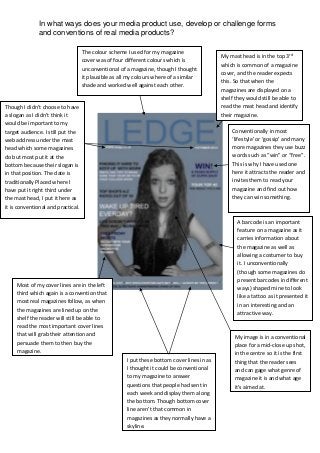
The colour scheme I used for my magazine
cover was of four different colours which is
unconventional of a magazine, though I thought
it plausible as all my colours where of a similar
shade and worked well against each other.

Though I didn’t choose to have
a slogan as I didn’t think it
would be important to my
target audience. I still put the
web address under the mast
head which some magazines
do but most put it at the
bottom because their slogan is
in that position. The date is
traditionally Placed where I
have put it right third under
the mast head, I put it here as
it is conventional and practical.

My mast head is in the top 3rd
which is common of a magazine
cover, and the reader expects
this. So that when the
magazines are displayed on a
shelf they would still be able to
read the mast head and identify
their magazine.
Conventionally in most
‘lifestyle’ or ‘gossip’ and many
more magazines they use buzz
words such as “win” or “free”.
This is why I have used one
here it attracts the reader and
invites them to read your
magazine and find out how
they can win something.

A barcode is an important
feature on a magazine as it
carries information about
the magazine as well as
allowing a costumer to buy
it. I unconventionally
(though some magazines do
present barcodes in different
ways) shaped mine to look
like a tattoo as it presented it
in an interesting and an
attractive way.

Most of my cover lines are in the left
third which again is a convention that
most real magazines follow, as when
the magazines are lined up on the
shelf the reader will still be able to
read the most important cover lines
that will grab their attention and
persuade them to then buy the
magazine.
I put these bottom cover lines in as
I thought it could be conventional
to my magazine to answer
questions that people had sent in
each week and display them along
the bottom. Though bottom cover
line aren’t that common in
magazines as they normally have a
skyline.

My image is in a conventional
place for a mid-close up shot,
in the centre so it is the first
thing that the reader sees
and can gage what genre of
magazine it is and what age
it’s aimed at.

Más contenido relacionado

Más de Amelia Hart

Skills devolpment - music video
Skills devolpment - music videoSkills devolpment - music video
Skills devolpment - music videoAmelia Hart
 
Mumford and sons
Mumford and sonsMumford and sons
Mumford and sonsAmelia Hart
 
Mumford and sons
Mumford and sonsMumford and sons
Mumford and sonsAmelia Hart
 
Mumford and sons
Mumford and sonsMumford and sons
Mumford and sonsAmelia Hart
 
Production schedule
Production scheduleProduction schedule
Production scheduleAmelia Hart
 
Risk assessment form
Risk assessment formRisk assessment form
Risk assessment formAmelia Hart
 
Audience profile music magazine
Audience profile music magazineAudience profile music magazine
Audience profile music magazineAmelia Hart
 
Questionnaire anaylasis
Questionnaire anaylasisQuestionnaire anaylasis
Questionnaire anaylasisAmelia Hart
 

Más de Amelia Hart (10)

Skills devolpment - music video
Skills devolpment - music videoSkills devolpment - music video
Skills devolpment - music video
 
Mumford and sons
Mumford and sonsMumford and sons
Mumford and sons
 
Mumford and sons
Mumford and sonsMumford and sons
Mumford and sons
 
Mumford and sons
Mumford and sonsMumford and sons
Mumford and sons
 
Production schedule
Production scheduleProduction schedule
Production schedule
 
Risk assessment form
Risk assessment formRisk assessment form
Risk assessment form
 
Audience profile music magazine
Audience profile music magazineAudience profile music magazine
Audience profile music magazine
 
Skills indesign
Skills indesignSkills indesign
Skills indesign
 
Skills indesign
Skills indesignSkills indesign
Skills indesign
 
Questionnaire anaylasis
Questionnaire anaylasisQuestionnaire anaylasis
Questionnaire anaylasis
 

Evaluation q.1

  • 1. In what ways does your media product use, develop or challenge forms and conventions of real media products? The colour scheme I used for my magazine cover was of four different colours which is unconventional of a magazine, though I thought it plausible as all my colours where of a similar shade and worked well against each other. Though I didn’t choose to have a slogan as I didn’t think it would be important to my target audience. I still put the web address under the mast head which some magazines do but most put it at the bottom because their slogan is in that position. The date is traditionally Placed where I have put it right third under the mast head, I put it here as it is conventional and practical. My mast head is in the top 3rd which is common of a magazine cover, and the reader expects this. So that when the magazines are displayed on a shelf they would still be able to read the mast head and identify their magazine. Conventionally in most ‘lifestyle’ or ‘gossip’ and many more magazines they use buzz words such as “win” or “free”. This is why I have used one here it attracts the reader and invites them to read your magazine and find out how they can win something. A barcode is an important feature on a magazine as it carries information about the magazine as well as allowing a costumer to buy it. I unconventionally (though some magazines do present barcodes in different ways) shaped mine to look like a tattoo as it presented it in an interesting and an attractive way. Most of my cover lines are in the left third which again is a convention that most real magazines follow, as when the magazines are lined up on the shelf the reader will still be able to read the most important cover lines that will grab their attention and persuade them to then buy the magazine. I put these bottom cover lines in as I thought it could be conventional to my magazine to answer questions that people had sent in each week and display them along the bottom. Though bottom cover line aren’t that common in magazines as they normally have a skyline. My image is in a conventional place for a mid-close up shot, in the centre so it is the first thing that the reader sees and can gage what genre of magazine it is and what age it’s aimed at.