
Recomendados
Más contenido relacionado
La actualidad más candente
La actualidad más candente (19)
Destacado
Destacado (9)
Similar a Music magazine research
Similar a Music magazine research (20)
Último
Último (20)
Music magazine research
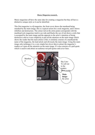
- 1. Music Magazine research. Music magazines all have the same idea for creating a magazine but they all have a distinctive unique style so it can be identified. This first magazine is a Q magazine, the front cover shows the masthead being smashed by the main image, this is a typical action for a rock magazine, and it shows rebellion and destruction. The colour red on the artist jacket corresponds with the masthead rock magazines tend to use reds and blacks the use of red shows a style that is accepted by the main image and the opposite to the artist’s intention of being destructive and as it uses simplicity to put all the attention on the main image which shows the reader that the main article is this; it similarly consists of a masthead the name of the magazine, the lead article and obviously the main image. Using this main image only technique it is a very simple but clever idea to attract the magazine’s readers as it puts all the attention on the main image. It’s also consists of a pull quote which is used to and attract an audience not pull quotes and cover lines. Masthea d Main image- the artist Sky Line- To call out to the readers about events
- 2. The contents page has more images then words, the main image relates to the front cover which is important for audience benefit. The actual contents is simplistic it uses bold sub headings to attract audience and a little description on what it is about. The theme is still carried out using reds as the underline and has the skyline which has the name of the magazine with the issue number on they added this to boast about how many of their magazines have been published before hand and that they are successful that’s why they sold so many. The contents numbers are clearly laid out which is sufficient in creating a clear a satisfying magazine. The double page spread consists of the band and writing about them. Uses columns for a neat lay out and drop caps for the first letter of the first word for it to stand out and encapsulate the audience. The double page consists of a different picture from the front cover which is normal for a magazine. Drop Cap- The first letter is big and in bold Main Image Columns-. Lay out to look neater The unique & Personal qualities The issue Number Bold sub heading s
- 3. This Third magazine is again a Q magazine. This front cover shows a different idea of lay out, This magazine is completely the opposite of the previous magazine it is crowded with pull quotes and cover lines another way to attract their readers the interesting point is that this is the same magazine but uses a different way to attract their readers. The Masthea d The Skyline- To call out to the readers about events. Cover lines- What to expect. Flash
- 4. The double page spread foreshadows the contents page it shows a lead image again it’s in columns for a typical magazine style and a stand first; the main image takes over the majority of the double page. Standfirst- the font is a little bit larger to introduce the article. Standfirs tLead image Colum ns
- 5. A different rock magazine such as ‘Karrang’ uses a different idea to attract their audience they over crowd their front cover full of information about different bands and provide their audience with free gifts, as with ‘Q’ magazine which uses simplicity and focuses on one artist in particular. The audience is of a younger audience as those of ‘Q’ magazine this is shown for the types of modern bands and the ability for free posters and gifts. Similarities of this magazine to the others is that the main image over takes the masthead which shows a sign of rebellion and destruction as the masthead is smashed this is typical for a rock magazine, and the colours they use reds and blacks which stick out. The Masthead- the name of the magazine. The Skyline- To call out to the readers about events. Lead article- What audienc e expects to read about. Free Poster s- to bribe the reader. Cover lines- What to expect. The Masthead- the name of the magazine. Lead article- What audienc e expects to read about.
- 6. This contents page compared to the previous three is similar as they both use the same font in bold for the page numbers and the title, they again do this for the same reason as the other magazines for the audience benefit so they can go straight to that page without hesitation. They repeat some images from the contents page underneath the page number and title again for the readers benefit so they are ensured that that band is on that page. Says ‘content’ to navigate the reader. Image of a band that the skyline announced. Using the same font from the front cover. Says what to expect in the magazine. The same band which was on the front cover so the audience can recognise and turn straight to that page. Annou ncing what pages the free posters Using the same font in bold with a little description about that page.
- 7. Stand First- Introduces the article. Lead Image Drop Cap- The first letter is big and bold. Columns- A neat and tidy way to layout. Pull Quote- using very informal language so the tone and register is for a younger audience.