
Recomendados
Más contenido relacionado
Similar a Mastheads i have chosen
Similar a Mastheads i have chosen (20)
Más de amybrain
Último
Último (20)
Mastheads i have chosen
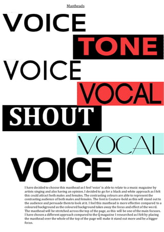
- 1. I have decided to choose this masthead as I feel ‘voice’ is able to relate to a music magazine by artists singing and also having an opinion. I decided to go for a black and white approach as I felt this could attract both males and females. The contrasting colours are able to represent the contrasting audience of both males and females. The font is Couture-bold as this will stand out to the audience and persuade them to look at it. I feel this masthead is more effective compared to a coloured background as the coloured background takes away the focus and effect of the wo rd. The masthead will be stretched across the top of the page, as this will be one of the main focuses. I have chosen a different approach compared to the Q magazine I researched as I felt by placing the masthead over the whole of the top of the page will make it stand out more and be a bigger focus. Mastheads