Design Logic for BlueAnt Digital Talks
•Descargar como PPTX, PDF•
0 recomendaciones•515 vistas


Recomendados
Más contenido relacionado
Similar a Design Logic for BlueAnt Digital Talks
Similar a Design Logic for BlueAnt Digital Talks (20)
Último
Último (20)
Design Logic for BlueAnt Digital Talks
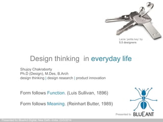
- 1. Design thinking in everyday life Presented for BlueAnt Digital, New Delhi -India: 23/5/2014 Form follows Function. (Luis Sullivan, 1896) Form follows Meaning. (Reinhart Butter, 1989) Lacie ‘petite key’ by 5.5 designers Shujoy Chakraborty Ph.D (Design), M.Des, B.Arch design thinking | design research | product innovation Presented to
- 2. Living in a designed society Wake up to design everday Experience design everywhere Walk through designed streets Study in designed universities Above: EPFL Zurich, Switzerland Presented for BlueAnt Digital, New Delhi -India: 23/5/2014
- 3. Living in a designed society Use designed spaces Use designed services Above: BikeMi, bike sharing Milano Experience designed systems Above: Milan (Italy) Metro: yellow line Experience designed systems Presented for BlueAnt Digital, New Delhi -India: 23/5/2014
- 4. Living in an un-designed society Walk through un-designed streets Study in un-designed universities Eat un-designed food Eat in un-designed restaurants Presented for BlueAnt Digital, New Delhi -India: 23/5/2014
- 5. Living in an un-designed society Experience un-designed services Experience un-designed shopping Accept un-designed products Above: Wheelchair in an airport Presented for BlueAnt Digital, New Delhi -India: 23/5/2014
- 6. Standardisation in a designed society For each service a standardised icon Consistent usage of colors and fonts Consistent usage across locations Presented for BlueAnt Digital, New Delhi -India: 23/5/2014
- 7. User experience becomes intuitiveConsistent indication for every street All important city layers are indicated Presented for BlueAnt Digital, New Delhi -India: 23/5/2014
- 8. Non-standardisation in an un-designed society Critical services are non-uniformly indicated Improvisation ‘jugaad’ is accepted No clarity of communication Concept of iconography is weak Presented for BlueAnt Digital, New Delhi -India: 23/5/2014
- 9. Non-standardisation in an un-designed society Improvisation ‘jugaad’ is accepted Above: Ahmedabad airport Emergency indications are poorly designed Above: 2° AC compartment- Indian Railways Life threatening warnings illegible Presented for BlueAnt Digital, New Delhi -India: 23/5/2014
- 10. Too much detailing Over detailing leads to confusion Cartoonish proportions Presented for BlueAnt Digital, New Delhi -India: 23/5/2014
- 11. ‘Hard vs Soft’ spaces Un-designed is ‘Hard’ 2° A.C. Indian Railways designed is ‘Soft’ Treno di notte- Trenitalia (Italy) Presented for BlueAnt Digital, New Delhi -India: 23/5/2014
- 12. Sensitivity to details Thought out details lead to consistency reducing stress on the user Inconsistent details lead to stress on the user Presented for BlueAnt Digital, New Delhi -India: 23/5/2014
- 13. Sensitivity to consistency Systemic level design leads to consistency
- 14. Sensitivity to consistency Logo Digital identity Smart cardPhysical identity
- 15. Sensitivity to simplicity Presented for BlueAnt Digital, New Delhi -India: 23/5/2014 Do not use conflicting fonts and colors Use large fonts and coordinated colors
- 16. Sensitivity to information Presented for BlueAnt Digital, New Delhi -India: 23/5/2014 Metro map of ATM service Milan: all facilties are indicated Metro map of DMRC service Delhi: no facilties are indicated
- 17. Sensitivity to usability Presented for BlueAnt Digital, New Delhi -India: 23/5/2014 lack of usability Thought given to usability
- 18. Sensitivity to Design Presented for BlueAnt Digital, New Delhi -India: 23/5/2014 Rubbish bin Plastic chair Ice-cream brick
- 19. Sensitivity to packaging Presented for BlueAnt Digital, New Delhi -India: 23/5/2014 Quality packaging communicates trust (olive oil €4) Usability increases pleasure (spices€2 each) All critical information present (chicken €3)
- 20. Sensitivity to packaging Presented for BlueAnt Digital, New Delhi -India: 23/5/2014 Material selection is important (bottle €2) Graphics are important (spaghetti €1) Protection is important (6 eggs €2)
- 21. Sensitivity to clearity Presented for BlueAnt Digital, New Delhi -India: 23/5/2014 Too much information No heirarchy Structure and layer the information Clear heirarchy
- 22. Make functions visible Presented for BlueAnt Digital, New Delhi -India: 23/5/2014 Do not hide the obvious and basics Above: 3 step operation to remove a contact
- 23. Consider symmetry and simplicity Presented for BlueAnt Digital, New Delhi -India: 23/5/2014 Proper use of geometry is important
- 24. Don’t introduce unknown symbols Presented for BlueAnt Digital, New Delhi -India: 23/5/2014 Do not hide critical functionality behind arbitary icons Critical functionality should be clearly mapped and visible
- 25. Reduce is not always simple Presented for BlueAnt Digital, New Delhi -India: 23/5/2014 Less is not always better Google page 2014 Google page 2004
- 26. Reduce is not always clear Presented for BlueAnt Digital, New Delhi -India: 23/5/2014 Iconography should be recognisable Too much reduction can take away clarity
- 27. Reduce can be archetypical Presented for BlueAnt Digital, New Delhi -India: 23/5/2014 Icons should communicate clarity of thought and purpose
- 28. Affordance Presented for BlueAnt Digital, New Delhi -India: 23/5/2014 Flat design shouldn’t take away from affordance
- 29. Consistency Presented for BlueAnt Digital, New Delhi -India: 23/5/2014 Consistency is critical for everyday use Above: Android 3.3 Consistency is critical for everyday use Above: Android 4.2
- 30. Further Reading Presented for BlueAnt Digital, New Delhi -India: 23/5/2014 Laws of Simplicity- John Maeda Emotional Design- Donald Norman
- 31. design thinking | design research | product innovation Delhi | Milan Sound logic behind great design. Disclaimer: All content in this document is copyrighted intellectual property of DesignLogic India.