

Recomendados
Más contenido relacionado
La actualidad más candente
La actualidad más candente (15)
Destacado
Similar a IVC - Lesson 07
Similar a IVC - Lesson 07 (20)
Más de Arzoo Sahni
Más de Arzoo Sahni (20)
Último
Último (20)
IVC - Lesson 07
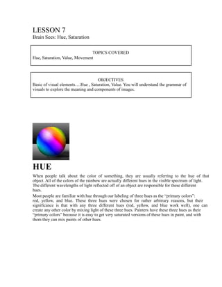
- 1. LESSON 7 Brain Sees: Hue, Saturation TOPICS COVERED Hue, Saturation, Value, Movement OBJECTIVES Basic of visual elements….Hue , Saturation, Value. You will understand the grammar of visuals to explore the meaning and components of images. HUE When people talk about the color of something, they are usually referring to the hue of that object. All of the colors of the rainbow are actually different hues in the visible spectrum of light. The different wavelengths of light reflected off of an object are responsible for these different hues. Most people are familiar with hue through our labeling of three hues as the “primary colors”: red, yellow, and blue. These three hues were chosen for rather arbitrary reasons, but their significance is that with any three different hues (red, yellow, and blue work well), one can create any other color by mixing light of these three hues. Painters have these three hues as their “primary colors” because it is easy to get very saturated versions of these hues in paint, and with them they can mix paints of other hues.
- 2. Likewise, with three different hues of lights one can create thousands of hues by mixing them in different proportions. In terms of visual literacy, however, it is more relevant to group the different hues into two categories: warm and cool. Basically, red, orange, yellow, and other similar hues are warm. Blue and its close cousins are seen as cool hues. By examining the balance of warm and cool, and the presence of primary colors, we can get a good sense of what is going on in an image visually. Visually, hue does three things. It adds another dimension to images that once were black and white. It acts as a formal element in a composition that directs the viewer‟s attention. It also creates moods and feelings in an image that complement the message that the image gives formally. It was not long ago that our photographic images were in black and white. Black and white images translate reality in a different way than color images. In black and white, all color is translated into different values of gray. There is a greater sense of the abstract forms in a black and white image than there is in a color image, which classifies things in terms of color, not shape and value. The presence and absence of color in an image can change the formal aspect of the image. When black and white images are juxtaposed with colored images, this seems to create two different realities. For example, it can shift time and location.
- 3. The colors in an image play an active roll in determining how the other visual elements will interact in that image. For example, in an image predominated by cool hues, a warm hue will draw the attention of the viewer. Colors tend to recede and contract. Placing certain colors next to each other can enhance dimension. Color adds another factor in how the image works formally. From The Year of Living Dangerously (Australia, 1983), directed by Peter Weir Likewise, mood can be expressed through hue. Each hue is associated with different emotions. Red evokes feelings of strong emotion or anger. Most likely, this association is derived from the feelings we get when we see blood. Blood red is the ultimate red. Blood red represents passion,
- 4. anger, and pain; all very strong emotions. Therefore, in films, red is frequently used for prostitutes, and fast cars. Red suggests extravagance. Blue, on the other hand is cool and passive. these feelings are probably related to the blue ocean or sky. Therefore, blue is frequently used to stand for truth in blue uniforms and the American flag, for example. Yellow is cheerful, and warm, perhaps like the warm yellow sun. White‟s association with innocence may have originated with the pureness of snow, for instance. The epitome of innocence in the media would be a girl in a white dress with light blond hair and a white lily. Black represents evil because it is associated with the darkness of the night. Therefore, black is worn by vampires, and burglars. These are a few examples, among many, that illustrate the way in which the feelings associated with certain colors can affect the way these hues are used in media; non-verbal cues that send a message or enhance the mood of the picture or scene.
- 5. Saturation Tree Frog - Michael David Ward Saturation, which is the amount of gray in a particular color. A color with more gray is considered less saturated, while a bright color, one with very little gray in it, is considered highly saturated. The amount of saturation does not affect the basic hue of a color and it also is unrelated to the value (amount of light or darkness in a color.) For example, if we take away the colors in an image, the tonal values will remain. However, taking away the colors themselves will make the image completely unsaturated. A more saturated color is also called a more „pure‟ color because it is undisturbed by gray. The four images at the top of this page are the same watercolor of a frog reproduced at different saturations. The image on the top left is fully saturated, and the one on the bottom right is completely unsaturated. JFK - from White House video, Clinton, Steve Liss, 1992 Oval Office -Susan Biddle, 1992
- 6. More saturated colors are also considered more bold and tied to emotions, while unsaturated ones are softer and less striking. The producers of an image often have a choice of how saturated they want to make the colors in that image, and their decisions reflect their intentions. A black and white image (in reality, made up almost entirely of shades of gray) is an example of total unsaturation to the point where color is actually absent. Unsaturated black and white is often used to represent the past while highly saturated colors are frequently used in depictions of the future. When Time magazine selected Bill Clinton as their 1992 Man of the Year they featured photographs which juxtaposed images of the past in black and white, (A teenaged Clinton shaking John Kennedy‟s hand, the Bush Oval Office) with images representing the future (A triumphant post-election Clinton shaking his fist; Clinton, the then president-to-be, walking into the Oval Office) which were highly saturated, right down to the color of their skin. Advertisers often use saturated colors in order to catch the passing attention of readers and viewers. Unsaturated colors and non colors (black, white and gray) are restful and sometimes depressing, and we usually avoid those kinds of feelings. We focus more on saturated colors because the more boldly-colored objects seem closer to us. In some advertisements, neutral and lively colored images are put together, creating a remarkable contrast. For example, the following color picture illustrates a magazine article presenting eight models. They “come from incredibly diverse backgrounds.” The saturated colors in this picture exaggerate this diversity of cultures. If we lower the saturation of the image, we don‟t notice the contrast and the effect changes dramatically. Mademoiselle advertisement, Troy Word 1994. The colors are not as affecting, and the contrast between the color of the models‟ skins is not as striking. The saturation of a color can also affect our emotional reaction to an image. Colors that have low saturations are often seen as dull and boring, but can also be thought of as restful and peaceful. Highly saturated colors, on the other hand, are more vibrant and emotionally aggressive. When we look at an image in which the colors are highly saturated, our attention is grabbed. Movie makers use this aspect of saturation all the time in order to convey particular feelings. For example, notice the difference in saturations between the still from Howard‟s End and the still from Do the Right Thing.
- 7. Howard’s End directed by James Ivory, 1992 The colors in Howard‟s End are much less saturated because the movie is much more tranquil and serene. Do the Right Thing , however, is an intense movie which expresses highly charged, extreme feelings. Therefore, the colors the director and cinematographer use are very saturated and emotionally loaded. Saturation is an important component of color that affects us every day, often without our realizing it. VALUE The visual element of value or tone is, in its simplest form, the juxtaposition of light and dark. It is defined as the intensity of lightness or darkness in anything that is visible. Value, along with hue and saturation, make up the three components of color. In nature there are hundreds of different steps in value that are sometimes not easily distinguished by the human eye. In the graphic arts and photography, however, there are far fewer steps because they are simply to subtle to perceive visually. Images derive a simulated natural tone from pigment, paint, or nitrate of silver. Thirteen steps in value have been identified, which range from white to black. These steps are based on a tonal scale, which defines the variations of shading.
- 8. A work composed mainly of the lighter end of the scale is a “high key” work, for example, the landscape works of Claude Monet. While “low key” works, such as those of Rembrandt, are made up of the darker end of the value scale. “The Petit Bras of the Seine” Claude Monet. 1872. “The Woman Taken in Adultery” Rembrandt. 1644. The element of value is used to express emotions, form, space, and movement as well as to give off the illusion of light. Since the scale for value is so limited in two-dimensional images, it is implied through several techniques. The juxtaposition of elements within a work determines value. This is achieved by placing the lightest element next to the darkest. One way to comprehend the importance of value is to count the shades in an image from lightest to darkest. Each color has its own tonal value; as pink is lighter than brown. An image is often described in terms of its value and chroma. Chroma is defined by the other two elements of color: hue and saturation. Value is independent of, and exists without, chroma. Both the element of value and the elements of hue and saturation (chroma) create their own patterns. Often these value patterns cross and camouflage chroma. A monochrome image depicts the importance of value in a work. This type of image is composed of different degrees of value for one color or a few complementary colors.
- 9. A full color image of “Reclining and Standing Nudes” by Picasso. 1942. The same image lacking chroma illustrates more precisely the different degrees of value. In real life, value is upset by texture because surfaces react to illumination. Since in nature things are obscured by shadows, artists developed techniques to show this notion. Sfumato is the technique of using graduated values to blur images and to make them ambiguous, as well as to suggest movement. Leonardo Da Vinci’s “Mona Lisa” demonstrates sfumato in the eyes and mouth. Specifically, the eye featured here depicts this notion by suggesting movement. Another technique that allows artists to manipulate the element of value is chiaroscuro. This contrast technique exploits the difference between light and dark.
- 10. Value is not, however, perceived in absolute terms. Instead, it is perceived in relative terms, in which degrees of value are influenced by their surrounding environments. Specifically, contrast effects change the perceived values of an image or object by the juxtaposition of adjacent darker or lighter tones. Value is one of the most fundamental visual elements, as without variations in light intensity images and objects could not be perceived by the human eye. The Basics of Scale Since the Renaissance, scale has become an integral part of visual literacy as a whole. Scale in an image, like a scale in a produce market, acts to show relations between objects. Rather than measuring weight, however, visual scale deals with apparent relative size of objects. By manipulating the apparent size of objects, scale can be used to produce a number of effects. Manipulation of scale can give greater meaning to a basic image, lending it new life. Scale is most commonly used in order to create the illusion of depth on a two-dimensional plane. The pioneer of this technique was Raphael, a Renaissance artist whose works introduced the concept of using scale as creation of depth to the Western art world. The basic principle behind this technique is that objects diminish in apparent size as they approach the horizon. Artists over the centuries have adopted this technique as a standard for representing depth in painting, photography, and film. Since the dawn of film, the use of scale has been further developed. No longer is scale restricted to the creation of an illusion of depth, but may be used to give information in the form of visual communication, concerning the characters and relations between them. The positioning of characters and the scalar relationship between the two reveals, without dialogue, the relationship between characters, as well as defining traits of a character or characters. Finally, scale may be used to create an emotional response in the viewer. By clever use of scale, the director may manipulate the feelings of the audience in order to invoke a stronger relationship between the characters in the film and the viewer.
- 11. Dimension The notion that objects occupy three-dimensional space in our physical world is not a cultural construct but a vivid reality. We know this because we can grasp a solid object, feel its contours, and move it from one place to another. Because of this spatial and tactile awareness we make assumptions about our physical environment based on visual stimuli perceived by our stereoscopic vision. In the visual arts, this means that a two-dimensional representation (drawing, painting, photograph, etc.) can imply three-dimensional reality by mimicking its effects on our ocular system. According to Professor Donis A. Dondis, this is done primarily through the use of linear perspective, which is often supplemented by tonal manipulation in the form of chiaroscuro, the dramatic emphasis of light and shadow. Since perspective and chiaroscuro are extremely representational methods of expressing dimension, photography in particular excels at them. The precision with which the photographic lens can record minute details is unmatched by the eye. However, man-made optics cannot duplicate the human eye‟s wide peripheral vision without the tremendous distortion of perspective that results when using a wideangle or fisheye lenses. Gerald Mast argued that the moving image can illicit a sense of dimensionality within the viewer that is simply unattainable by the static image. “The enlarging or shrinking of an object over a period of time or the length of time it takes to travel between two points are two familiar ways of defining terms like „close‟ and „far.‟” These changes in scale appear so natural that we forget we are looking at a flat screen. So aside from perspective and tone motion over time is another useful method of representing dimension. Chance MeetingDuane Michals., 1969. Though dimension is an integral part of our world and something we can both feel in the space around us in two-dimensional formats such as painting and photography it can only be represented by such illusion. In fact, when more visually striking representations of three- dimensionality have been attempted in film, it hasn‟t caught on. Films in 3-D have never been more than an oddity. It‟s as if people are so accustomed to inferring dimension on a flat surface
- 12. through more conventional means that the 3-D image becomes too hot, bombarding the viewer with more information than they care to deal with. Another reason that might explain the unpopularity of the 3-D medium is that viewers want to see a realistic image, to be a voyeur in someone else‟s life, but they do not want to actually become part of what‟s happening. Three-dimensional format brings the image to close to real life and involves the viewer too much, almost in an accusing way. The safer, more removed aspect of standard film, in which dimension is implied, is more pleasant for the viewer because it removes them from what is going on while at the same point showing them everything. We can make judgments and give opinions without suffering the consequences. Linear Perspective Reproduced from Sensation and Perception1993. Walter Ioos Jr., 1994. The technical convention of linear perspective is a Renaissance invention. It is a systematic, formalized method of representation that allows the artist or designer to simulate depth with a few scant lines. It operates on the premise that objects appear progressively smaller the farther away they are. Lines that extend out into space converge at one or more vanishing points on the horizon line, which coincides with eye level. Light and Shadow Besides the tool of linear perspective, artists and designers also have a broad range of values at their disposal which can be used to imply dimension by means of chiaroscuro lights and darks. Since light travels in straight lines it cannot curve around an object and equally illuminate all its contours. This means that some surfaces of the object will receive more light than others. These variations in the amount of light being reflected from the object‟s surfaces are observed as different values.
- 13. Value enables the artist or designer to fill in the gaps left by linear perspective. For instance, the basic linear information is insufficient in conveying the dimensionality of a sphere. Without tonal information it is merely a flat circle. The fact that light travels in straight lines also results in the phenomenon of the cast shadow. It is through the dramatic emphasis of highlights, reflected light, and cast shadows that chiaroscuro achieves its revelatory function. Since lighting is so instrumental in this technique, changing the placement of the light sources or the number of these light sources can have drastic effects on the representation, as evidenced in the center and rightmost frames of the above triptych. The leftmost frame is the same scene rendered as a simple wireframe with no tonal information. Eye level Walter Ioos, Jr. 1994. Poster from Film und Foto International Exhibition, Stuttgart, Germany, 1929. Objects located dramatically above eye level are said to be seen from worm‟s eye view, while those positioned extremely below eye level are seen from bird‟s eye view. The decision of which point of view to take within the frame involves more than just aesthetic considerations; it has psychological implications as well. A slender upright object seen from worm‟s eye view tends to look more massive and stable because it is appears wider at the base and grows narrower from the bottom like a mountain. The same object seen from bird‟s eye view often looks more minuscule and unstable because it appears narrower at the base and grows wider from the bottom like a top.
- 14. Motion In Donis A. Dondis‟ view, motion, the final visual element, is perhaps “one of the most dominant visual forces in human experience.” As she explains in A Primer of Visual Literacy, true motion exists only in the physical world. Motion in visual images is always an illusion. It can either be implied or suggested, as in still pictures, or overtly simulated, as in motion pictures. By combining time and space, the use of motion helps ground visual images in our experience of the real world. Suggestion of motion in static images often appears somewhat “unrealistic” or unnatural. By blurring a subject (as in the icon above), using sfumato or contrapposto, selectively using hue, texture, line, shape, direction, scale, or dimension, a still image can be infused with implied movement. Because these techniques require the viewer to invoke his or her experience of motion in real life, suggested motion is involving and compelling. Unlike in motion pictures, recognizing motion in still images is a more conscious, interpretive process. Detail from Mona Lisa, Da Vinci, 1503-06. The Mona Lisa‟s smile serves as a useful example of “sfumato,” Italian for “smoke.” Sfumato is a shading technique painters can use to suggest motion. By blurring the corners of her mouth, Da Vinci creates the illusion that the Mona Lisa is in the act of smiling or frowning. The ambiguity of her expression forces the viewer to interpret it as he or she chooses. Dancers, Sarah Nathanson, 1994. “Contrapposto” refers to the technique of twisting or shifting the weight of a figure to imply motion. The contorted bodies of the dancers in this still picture are off balance, thereby giving the impression that the figures are in the process of moving.
- 15. Motion, Sarah Nathanson, 1994. A line can also imply movement. In this image, the line gives the viewer the feeling that it is moving. It does so by leading the viewer‟s eyes along its path. Porsche advertisment, Car and Driver, Jan.1994. Blur, direction, and dimension are all represented in this still image. Even though its subject, the car, is in focus, the blurred background tells the viewer it is in motion by giving the impression that he or she is moving along with the car. The lines of the picture cut across the frame from the upper right corner to the lower left corner, giving it direction. These diagonal lines upset the balance of the image and instill a feeling of motion in its composition. The lines of the road converge at a focal point on the horizon, giving the image a three-dimensional quality, or perspective. Dimension incorporates perspective, and is demonstrated by positioning the car on the Z-axis.