
Recomendados
Más contenido relacionado
La actualidad más candente
La actualidad más candente (19)
Destacado
Similar a Evaluation for Preliminary Task
Similar a Evaluation for Preliminary Task (20)
Más de asmediac12
Más de asmediac12 (20)
Evaluation for Preliminary Task
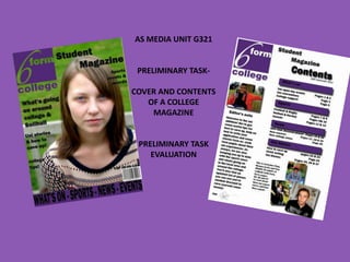
- 1. AS MEDIA UNIT G321 PRELIMINARY TASK- COVER AND CONTENTS OF A COLLEGE MAGAZINE PRELIMINARY TASK EVALUATION
- 2. In what ways does your media product use, develop or challenge forms and conventions of real media products? THE FRONT COVER-SIMILARITIES Clear masthead Image complying to the rule of thirds Appropriate cover lines around the main image Barcode, date and price at the bottom
- 3. THE FRONT COVER-DIFFERENCES My cover lines are appropriate to a college magazine and would draw the students in whereas NME would have cover lines that would attract the target audience of a music magazine Footer at the bottom indicating to reader what to expect from the college magazine On NME, MIA is in big letters, dominating the cover as she is famous and would appeal to the target audience. But in my magazine it is a average college student, not famous who doesn’t need to be named, you’d just expect her to be from the sixth form, which she is.
- 4. In what ways does your media product use, develop or challenge forms and conventions of real media products? CONTENTS PAGE-SIMILARITIES Keeping the logo on the contents page, as well as the front cover A few words from the creators of the magazine (in mine, a editor’s note) Typical contents page style (telling you what's in the magazine and what pages) Pictures of things related to the magazine (college students on mine, bands on NME) Date at the top of the magazine Use of house theme (Purple Use of subheading to help and same font for my direct reader magazine)
- 5. CONTENTS PAGE-DIFFERENCES Advertisements to subscribe on the NME magazine On my student magazine I have a proper editors note with a picture of ‘the editor’, a student. On NME there is just a few words from the makers about the picture of Arctic Monkeys I’ve used more than 1 picture, unlike NME
- 6. What have you learnt about the technologies from the process of constructing this product • Learnt how to use Photoshop and InDesign • How to use a digital camera and to use the rule of thirds, also what shot types to take (MCU for front cover) • Using Photoshop to develop my photos and make them look more professional and appealing (Changing levels, blurring background etc.) • Using Moodle to gain resources to help me with my magazine • Using InDesign to create a double page spread and how to export it
- 7. Creating the front cover I used a digital camera and got a MCU of a student around college, I then uploaded it onto Photoshop and edited it to make her stand out more and so it looked more professional. I also enlarged it, when I did this I made sure I kept to the rule of thirds like a lot of magazine covers. How did I edit the picture? Using Adobe Photoshop I… • enlarged the picture and zoomed in a bit, although I took the original picture with the girl on the right hand side (rule of thirds) I made it even more obvious when I zoomed in. • Changed the levels, making her stand out more and the colours more vibrant. • Used the lasso tool and selected around her to then blur the background, again, making the main image stand out even more to the reader. I then added all the other details (masthead, logo, cover lines etc.) see my stage development for more detail.
- 8. Creating the contents Before I started working in InDesign, I started by manipulating my images of students in Photoshop. On a couple I just changed the levels and cropped them, but on two I changed the levels and blurred the background to make them stand out and look more professional I then went into InDesign to start putting together the contents page • I copied the logo and masthead from my front cover and then added in ‘contents’ and the date • I came up with things to put in my magazine and then put them under subheading like a regular magazine, but also to help the reader • I put my photos in appropriate places, using one of them as a ‘editor’ and adding a note. Again, like regular magazines • I then filled the dead space with a signature of the editor and a caption by the photos • I tried to keep a house theme, mostly purple which fits in with the logo, but also the font.