
Recommended
More Related Content
What's hot
What's hot (20)
Similar to Research q magazines
Similar to Research q magazines (20)
More from asmediac14
More from asmediac14 (20)
Recently uploaded
Recently uploaded (20)
Research q magazines
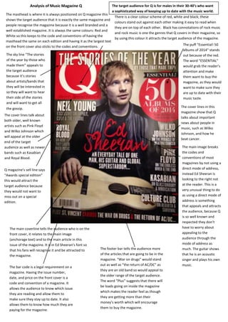
- 1. The masthead is where it is always positioned on Q magazine this shows the target audience that it is exactly the same magazine and people recognise the magazine because it is a well branded and a well established magazine. It is always the same colours: Red and White so this keeps to the code and conventions of having the masthead the same on each edition and having it as the largest text on the front cover also sticks to the codes and conventions. There is a clear colour scheme of red, white and black; these colours stand out against each other making it easy to read when they are on top of each other. Black has connotations of rock music and rock music is one the genres that Q covers in their magazine, so by using this colour it attracts the target audience of the magazine. The sky line “The stories of the year by those who made them” appeals to the target audience because it’s stories about artists/bands that they will be interested in so they will want to hear their side of the stories and will want to get all the gossip. The cover lines talk about both older, well known artists such as Pink Floyd and Wilko Johnson which will appeal at the older end of the target audience as well as newer bands such as Kasabian and Royal Blood. The main image breaks the codes and conventions of most magazines by not using a direct mode of address, instead Ed Sheeran is looking to the right not at the reader. This is a very unusual thing to do as using a direct mode of address is something that appeals and attracts the audience, because Q is so well known and respected they don’t have to worry about appealing to the audience through the mode of address as much. The guitar shows that he is an acoustic singer and plays his own music. The cover lines in this magazine show that Q talks about important news about people in music, such as Wilko Johnson, and how he beat cancer. The puff “Essential! 50 albums of 2014” stands out because of the red. The word “ESSENTIAL” would grab the reader’s attention and make them want to buy the magazine, as they would want to make sure they are up to date with their music taste. Analysis of Music Magazine Q The main coverline tells the audience who is on the front cover, it relates to the main image (anchorage text) and to the main article in this issue of the magazine. It is in Ed Sheeran’s font so that his fans will recognise it and be attracted to the magazine. Q magazine’s sell line says “Awards special edition” this would attract the target audience because they would not want to miss out on a special edition. The bar code is a legal requirement on a magazine. Having the issue number, date, and price on the front cover is a code and convention of a magazine. It allows the audience to know which issue they are reading and allow them to make sure they stay up to date. It also allows them to know how much they are paying for the magazine. The footer bar tells the audience more of the articles that are going to be in the magazine. “War on drugs” would stand out as well as “the return of AC/DC” as they are an old band so would appeal to the older range of the target audience. The word “Plus” suggests that there will be loads going on inside the magazine which makes the reader feel as though they are getting more than their money’s worth which will encourage them to buy the magazine. The target audience for Q is for males in their 30-40’s who want a sophisticated way of keeping up to date with the music world. They are from a high social class.
- 2. The mast head is on the contents page exactly the same as it is on the front cover but this time is on a black background instead of red. This reminds the target audience of the name of the magazine and therefore develops the branding of the magazine. The title of the page (code and convention) tells the audience what the page is set to do – tell the reader what is in this issue of Q. Q sets out its features very differently to any other magazine I have looked at. It tells you about each article with an image related to almost each article and then also tells you the page number. The page number is in a colourful bubble enabling it to stand out, making it clear the reader what page each article is on. The articles mentioned relate to the cover lines on the front cover. The “Plus” implies that the magazine is adding even more in just for the reader. It makes the reader feel as though they are getting their money’s worth. It also shows that there is more than what a first glances showed, to the magazine. A code and convention of a magazine is to have columns on the contents page. The content page of Q magazine has been split into 3 columns. This makes it look structured, sophisticated and is easy to read. The contents page of Q doesn’t include any links to social media preventing it from accessing its online target audience. It also has no adverts in the magazine, however this could be considered a good thing as many people say that magazines have too many adverts in them. The Q magazine also has no editor’s message this could mean the magazine lacks the personal that other magazines, such as Kerrang, have. This contents page has lots of images on (more than on any of the other magazines I’ve looked at). The images would appeal to the target audience as they are related to articles in the magazine. A lot of the images use a direct mode of address which would appeal to the target audience as it makes them feel involved in the magazine. The images add a visual appeal to the contents page.
- 3. A code and convention of magazine is to give credit to the person who wrote the article and to the person who has taken the photos for the article. However Q has not done this in this particular article. The headline takes up about a third of the left hand page; it is bold and stands out on the white background. It makes it clear who the article is about so if someone was skimming through the magazine it would stand out and catch their eye. Q has not used a stand first to add an introduction to the article however they have used another code and convention- A large quote! This makes the article interesting and allows the audience to acknowledge that this is a reliable article as they have a direct quote from Ed Sheeran. The text has been split into two columns; this makes it easier to read and makes it look more appealing to read, than a big block of text. Putting text into columns on the double page spread is also a code and convention of magazines. The main image takes up the whole of the right side (it is usually the left side) and is a very long shot of Ed Sheeran, it shows him holding his guitar which is part of who he is both as a person and as a musician. The way he is holding it is as though he will use his guitar to fend off an “mobs” which links to the header of the article. The page number at the bottom of the page connects the article to the contents page and allows the magazine to flow. The reader can find the article again easily if they put down the magazine as they can quickly turn to the page number the article is on. Having page numbers is a code and convention of any magazine. Q have used a drop capital, however instead of using it at the beginning of the article, as a visual indicator the audience that the article has started, it has been used in the last part of the article. By doing this it breaks up the article and makes it more interesting to look at and consequently more interesting to read.