
Recomendados
Más contenido relacionado
La actualidad más candente
La actualidad más candente (19)
Similar a Step by step guide for my contents page
Similar a Step by step guide for my contents page (20)
Más de asmediaf12
Más de asmediaf12 (20)
Step by step guide for my contents page
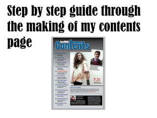
- 1. Step by step guide through the making of my contents page
- 2. 1 Gradient tool I used. I chose to make my contents page in InDesign rather than Photoshop so I opened up the programme and started on my background. To make sure that the contents matched the front cover and had a clear link, I put a gradient on the background, this time using black and grey. To achieve this look I had to use the gradient tool and change the swatches around to get the desired look.
- 3. 2 Once I was satisfied with the background I moved on to making the title ‘Contents’. Using the text tool I made sure I used the same font as the masthead on the front cover, I filled it with a blue and added a drop shadow behind it.
- 4. 3 For the next step I moved on to making my index. Using the text tool and keeping the rule of thirds in mind I situated the text to the left and only used up one column. I made the articles name blue to match the ‘contents’ and the front cover, with the description of the article in black. For the article that was going to be my double page spread I changed the colour to red, this was for a couple of reasons; one was so that matched the coverline on the front cover and the second was because red connotes importance, singling out this one article.
- 5. 4 Moving on from the index I chose to place my main image onto the page. To do this I had to go to ‘File, place’ and choose the photograph that I wanted. This image is of the same person that is featured on my front cover and double page spread, to make sure all of the pages link and are relevant. I took up two columns with this image but made sure to leave enough space near the bottom for text. To place the text I had to once again use the text tool and then make sure they were all aligned and neat.
- 6. 5 Once my main image was set in place I decided to add another photograph to demonstrate my use of different artists and different types of photographs. I place my second photograph over the top of the first one and separated it by putting it in its own box, adding a drop shadow and rotating the image. This created the effect of the image being on of a polaroid, a personal snap shot, making it feel more personal to the audience.
- 7. 6 Once my photographs were set into place I had to add mini descriptions just as the professional magazines do. I also added the page number in which you can find the article that links with the images. I made sure that that too was red and larger than the other text.
- 8. 7 To start filling in the white space I had under the photographs I added a section called ‘AND IN THE NEWS’ I wanted this section to take up two columns so I only wrote it in one.
- 9. 8 I made a divide in the page underneath the ‘and in the news’ section using the box tool. Underneath the divide I added another box and filled it in black, this was so I could place my editors note inside.
- 10. 9 Just like professional magazines, I wanted my editors note to have a picture of the editor alongside it. I used this medium close up because it is a very common shot to be used for this type of photograph.
- 11. 10 After the image I inserted the text to go with it. I wanted this text in two columns so I had to chose the paragraph option and type in the amount of columns needed. Once I had done this my contents page was complete, this being the final product.