SlideShare una empresa de Scribd logo
1 de 12
Descargar para leer sin conexión
Charte Graphique


   Musée des Confluences
Cette charte graphique comprent les recommandations d’utilisation
et les caractéristiques des différents éléments graphiques (logos,
couleurs, polices...) qui peuvent être utilisés sur les différents sup-
ports de communication du Musée des Confluences.
La charte graphique permet de garantir l’homogénéité et la cohérence
de la communication visuelle du musée. Elle définit ce qu’il faut faire
et ce qui est interdit de faire.

Le logo du Musée des Confluences est un logo d’esprit moderne, avec
une police linéale simple avec des caractères qui diffèrent des autres
polices ( le «n» et le «u» ). Le tout est écrit en noir pour plus de sobriété.
Une lettre de chaque mot est reliée aux autres par un symbole qui
forme un éléphant. Les lettres sont reliées entre elles dans un esprit
de «lien», comme les fleuves du quartier de Confluences. C’est aussi
en rapel aux fleuves que ce symbole est d’une couleur bleu-vert.
La figure de l’éléphant est traitée avec un style manuel, comme
une peinture rupestre, puisque le musée va, entre autre, traiter des
sciences humaines.
Sommaire

1- 		   Les différentes parties du logo

2-		    La gamme chromatique

3- 		   Variations chromatiques

4- 		   Typographie

5- 		   Déclinaisons web

6- 		   Déclinaisons papier

7- 		   Règles de composition

8- 		   Contre-indications
les diffentes parties du logo

             Aller-Light. Retouchée pour le «n» (qui est un «u»
             inversé)
             «musée des» : 59 pt
             «confluences» : 73 pt

             typographie moderne à l’image du bâtiment du mu-
             sée

             Le glyphe est représenté de façon manuelle,
             comme s’il avait été fait à la main, comme une
             peinture rupestre. En rapport avec les sciences
             humaines, et pour rompre avec le caractère
             trop moderne de la typographie.


             Petit logo carré, qui se compose seulement d’un
             bout du glyphe. Ce format carré avec une forme
             simple (pas de texte) permet d’être vu clairement,
             en tout petit ou même de loin. Le format carré est
             nécessaire pour les adaptations (facebook, i-phone.
             ou tout autre avatar).
             Il garde avant tout la forme du «M» pour qu’on est à
             l’esprit qu’il s’agit d’un musée.
La gamme chromatique

                C 74%
                        R 81%
                M 36%
                        V 126%   # 4c7d77    Les couleurs du logo sont en rapport avec les
                J 52%                        fleuves du quartier Confluences, dans les tons
                        B 120%
                N 11%
                                             bleu-vert. Les deux couleurs sont très contras-
                C 7%
                M 0%
                        R 235%               tées pour bien faire ressortir les éléments.
                        V 249%   # ebf9f9
                J 2%
                        B 249%
                N 0%


                C 60%
                M 51% R 102%
                J 51% V 102%      # 666666
usée            N 20% B 102%
                                             En niveau de gris les deux couleurs sont toujours
es                                           aussi contrastées et donc lisibles.
                C 5%    R 239%
                                             Les couleurs sont alternées en fonction de la
                M 3%    V 239%    # efefef
                                             couleur du fond ( foncée ou claire).
                J 3%    B 239%
                N 0%


                C 75%
                      R 0%
                M 68%             # 000000
                      V 0%
                J 67%
                      B 0%
usée            N 90%                        En noir et blanc il faudra simplement rajouter un
es              C 0%
                        R 255%
                                             contour noir autour de la forme blanche, pour
                M 0%                         avoir une délimitation.
                        V 255%    # ffffff
                J 0%
                        B 255%
                N 0%
Variations chromatiques


               usée
               es                                                              usée
                                                                               es


Sur fond clair, on choisira le logo foncé, noir et vert.   Sur fond foncé, on choisira le logo clair, blanc et
   Et le petit logo est le bleu clair sur fond vert.       bleu clair. Le petit logo doit être vert sur fond bleu
                                                           clair.
Typographie

Le logo
Le logo s’adapte aux marges du
document.


                                                      Les titres
                                                      Les titres des documents sont en

                                                      «Aller Display»,   26 pt.
                                                      Ils sont centrées dans la page.
Les sous-titres
Les sous-titres des documents sont en

«Aller Bold», 15 pt.

Ils sont alignés à gauche, à la marge
«basique» du document.                                Les textes
                                                      Les textes des document sont en

                                                      «Aller-Light», 12 pt.

                                                      Ils sont justifiés à gauche, avec des
                                                      marges de 31mm de chaque côté.


      Marge de tête : 21mm
      Marge de pied : 28 mm
      Petit fond : 31 mm
      Grand fonf : 31 mm
Déclinaisons
Le favicon reprend le visuel «petit logo»


                                                                             Application Smartphone


Ensemble graphique Facebook


Taille minimum et maximum des logos pour le Web.                  Taille minimum et maximum des logos pour le Web.


                                                                                8 x 5 mm                   4 x 4 mm
                          40 x 24 mm                 40 x 24 mm
                                                                                15 x 9 mm                  7 x 7 mm
                          100 x 60 mm                15 x 15 mm
Déclinaisons papier
Carte de visite                                                         Entête de lettre


                  Nom : Aller, 18 pt
                  Service : Aller Light 12 pt
                  Mail et téléphone : Aller Light 8pt
                  Information musée : Aller Light 7 pt


                                      Logo : 40 x 66 mm
                                      Destinateur et destinataire :
                                      Aller, 12 pt , aligné à gauche.
                                      Texte : Aller Light, 13 pt,
                                      justifié à gauche


                                        Marge de tête : 21mm
                                        Marge de pied : 28 mm
                                        Petit fond : 31 mm
                                        Grand fonf : 31 mm
Règles de composition
Les interdits


Ne pas écraser   Ne pas incliner   Ne pas inclure de fond blanc au logo   Ne pas changer les couleurs
Cadeau Visiteurs

Más contenido relacionado

Destacado

2024 State of Marketing Report – by Hubspot
2024 State of Marketing Report – by Hubspot2024 State of Marketing Report – by Hubspot
2024 State of Marketing Report – by HubspotMarius Sescu
 
Everything You Need To Know About ChatGPT
Everything You Need To Know About ChatGPTEverything You Need To Know About ChatGPT
Everything You Need To Know About ChatGPTExpeed Software
 
Product Design Trends in 2024 | Teenage Engineerings
Product Design Trends in 2024 | Teenage EngineeringsProduct Design Trends in 2024 | Teenage Engineerings
Product Design Trends in 2024 | Teenage EngineeringsPixeldarts
 
How Race, Age and Gender Shape Attitudes Towards Mental Health
How Race, Age and Gender Shape Attitudes Towards Mental HealthHow Race, Age and Gender Shape Attitudes Towards Mental Health
How Race, Age and Gender Shape Attitudes Towards Mental HealthThinkNow
 
AI Trends in Creative Operations 2024 by Artwork Flow.pdf
AI Trends in Creative Operations 2024 by Artwork Flow.pdfAI Trends in Creative Operations 2024 by Artwork Flow.pdf
AI Trends in Creative Operations 2024 by Artwork Flow.pdfmarketingartwork
 
PEPSICO Presentation to CAGNY Conference Feb 2024
PEPSICO Presentation to CAGNY Conference Feb 2024PEPSICO Presentation to CAGNY Conference Feb 2024
PEPSICO Presentation to CAGNY Conference Feb 2024Neil Kimberley
 
Content Methodology: A Best Practices Report (Webinar)
Content Methodology: A Best Practices Report (Webinar)Content Methodology: A Best Practices Report (Webinar)
Content Methodology: A Best Practices Report (Webinar)contently
 
How to Prepare For a Successful Job Search for 2024
How to Prepare For a Successful Job Search for 2024How to Prepare For a Successful Job Search for 2024
How to Prepare For a Successful Job Search for 2024Albert Qian
 
Social Media Marketing Trends 2024 // The Global Indie Insights
Social Media Marketing Trends 2024 // The Global Indie InsightsSocial Media Marketing Trends 2024 // The Global Indie Insights
Social Media Marketing Trends 2024 // The Global Indie InsightsKurio // The Social Media Age(ncy)
 
Trends In Paid Search: Navigating The Digital Landscape In 2024
Trends In Paid Search: Navigating The Digital Landscape In 2024Trends In Paid Search: Navigating The Digital Landscape In 2024
Trends In Paid Search: Navigating The Digital Landscape In 2024Search Engine Journal
 
5 Public speaking tips from TED - Visualized summary
5 Public speaking tips from TED - Visualized summary5 Public speaking tips from TED - Visualized summary
5 Public speaking tips from TED - Visualized summarySpeakerHub
 
ChatGPT and the Future of Work - Clark Boyd
ChatGPT and the Future of Work - Clark Boyd ChatGPT and the Future of Work - Clark Boyd
ChatGPT and the Future of Work - Clark Boyd Clark Boyd
 
Getting into the tech field. what next
Getting into the tech field. what next Getting into the tech field. what next
Getting into the tech field. what next Tessa Mero
 
Google's Just Not That Into You: Understanding Core Updates & Search Intent
Google's Just Not That Into You: Understanding Core Updates & Search IntentGoogle's Just Not That Into You: Understanding Core Updates & Search Intent
Google's Just Not That Into You: Understanding Core Updates & Search IntentLily Ray
 
Time Management & Productivity - Best Practices
Time Management & Productivity -  Best PracticesTime Management & Productivity -  Best Practices
Time Management & Productivity - Best PracticesVit Horky
 
The six step guide to practical project management
The six step guide to practical project managementThe six step guide to practical project management
The six step guide to practical project managementMindGenius
 
Beginners Guide to TikTok for Search - Rachel Pearson - We are Tilt __ Bright...
Beginners Guide to TikTok for Search - Rachel Pearson - We are Tilt __ Bright...Beginners Guide to TikTok for Search - Rachel Pearson - We are Tilt __ Bright...
Beginners Guide to TikTok for Search - Rachel Pearson - We are Tilt __ Bright...RachelPearson36
 

Destacado (20)

2024 State of Marketing Report – by Hubspot
2024 State of Marketing Report – by Hubspot2024 State of Marketing Report – by Hubspot
2024 State of Marketing Report – by Hubspot
 
Everything You Need To Know About ChatGPT
Everything You Need To Know About ChatGPTEverything You Need To Know About ChatGPT
Everything You Need To Know About ChatGPT
 
Product Design Trends in 2024 | Teenage Engineerings
Product Design Trends in 2024 | Teenage EngineeringsProduct Design Trends in 2024 | Teenage Engineerings
Product Design Trends in 2024 | Teenage Engineerings
 
How Race, Age and Gender Shape Attitudes Towards Mental Health
How Race, Age and Gender Shape Attitudes Towards Mental HealthHow Race, Age and Gender Shape Attitudes Towards Mental Health
How Race, Age and Gender Shape Attitudes Towards Mental Health
 
AI Trends in Creative Operations 2024 by Artwork Flow.pdf
AI Trends in Creative Operations 2024 by Artwork Flow.pdfAI Trends in Creative Operations 2024 by Artwork Flow.pdf
AI Trends in Creative Operations 2024 by Artwork Flow.pdf
 
Skeleton Culture Code
Skeleton Culture CodeSkeleton Culture Code
Skeleton Culture Code
 
PEPSICO Presentation to CAGNY Conference Feb 2024
PEPSICO Presentation to CAGNY Conference Feb 2024PEPSICO Presentation to CAGNY Conference Feb 2024
PEPSICO Presentation to CAGNY Conference Feb 2024
 
Content Methodology: A Best Practices Report (Webinar)
Content Methodology: A Best Practices Report (Webinar)Content Methodology: A Best Practices Report (Webinar)
Content Methodology: A Best Practices Report (Webinar)
 
How to Prepare For a Successful Job Search for 2024
How to Prepare For a Successful Job Search for 2024How to Prepare For a Successful Job Search for 2024
How to Prepare For a Successful Job Search for 2024
 
Social Media Marketing Trends 2024 // The Global Indie Insights
Social Media Marketing Trends 2024 // The Global Indie InsightsSocial Media Marketing Trends 2024 // The Global Indie Insights
Social Media Marketing Trends 2024 // The Global Indie Insights
 
Trends In Paid Search: Navigating The Digital Landscape In 2024
Trends In Paid Search: Navigating The Digital Landscape In 2024Trends In Paid Search: Navigating The Digital Landscape In 2024
Trends In Paid Search: Navigating The Digital Landscape In 2024
 
5 Public speaking tips from TED - Visualized summary
5 Public speaking tips from TED - Visualized summary5 Public speaking tips from TED - Visualized summary
5 Public speaking tips from TED - Visualized summary
 
ChatGPT and the Future of Work - Clark Boyd
ChatGPT and the Future of Work - Clark Boyd ChatGPT and the Future of Work - Clark Boyd
ChatGPT and the Future of Work - Clark Boyd
 
Getting into the tech field. what next
Getting into the tech field. what next Getting into the tech field. what next
Getting into the tech field. what next
 
Google's Just Not That Into You: Understanding Core Updates & Search Intent
Google's Just Not That Into You: Understanding Core Updates & Search IntentGoogle's Just Not That Into You: Understanding Core Updates & Search Intent
Google's Just Not That Into You: Understanding Core Updates & Search Intent
 
How to have difficult conversations
How to have difficult conversations How to have difficult conversations
How to have difficult conversations
 
Introduction to Data Science
Introduction to Data ScienceIntroduction to Data Science
Introduction to Data Science
 
Time Management & Productivity - Best Practices
Time Management & Productivity -  Best PracticesTime Management & Productivity -  Best Practices
Time Management & Productivity - Best Practices
 
The six step guide to practical project management
The six step guide to practical project managementThe six step guide to practical project management
The six step guide to practical project management
 
Beginners Guide to TikTok for Search - Rachel Pearson - We are Tilt __ Bright...
Beginners Guide to TikTok for Search - Rachel Pearson - We are Tilt __ Bright...Beginners Guide to TikTok for Search - Rachel Pearson - We are Tilt __ Bright...
Beginners Guide to TikTok for Search - Rachel Pearson - We are Tilt __ Bright...
 

Charte Graphique Camille Bonnevial

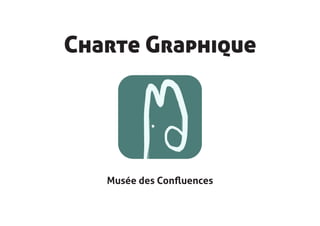
  • 1. Charte Graphique Musée des Confluences
  • 2. Cette charte graphique comprent les recommandations d’utilisation et les caractéristiques des différents éléments graphiques (logos, couleurs, polices...) qui peuvent être utilisés sur les différents sup- ports de communication du Musée des Confluences. La charte graphique permet de garantir l’homogénéité et la cohérence de la communication visuelle du musée. Elle définit ce qu’il faut faire et ce qui est interdit de faire. Le logo du Musée des Confluences est un logo d’esprit moderne, avec une police linéale simple avec des caractères qui diffèrent des autres polices ( le «n» et le «u» ). Le tout est écrit en noir pour plus de sobriété. Une lettre de chaque mot est reliée aux autres par un symbole qui forme un éléphant. Les lettres sont reliées entre elles dans un esprit de «lien», comme les fleuves du quartier de Confluences. C’est aussi en rapel aux fleuves que ce symbole est d’une couleur bleu-vert. La figure de l’éléphant est traitée avec un style manuel, comme une peinture rupestre, puisque le musée va, entre autre, traiter des sciences humaines.
  • 3. Sommaire 1- Les différentes parties du logo 2- La gamme chromatique 3- Variations chromatiques 4- Typographie 5- Déclinaisons web 6- Déclinaisons papier 7- Règles de composition 8- Contre-indications
  • 4. les diffentes parties du logo Aller-Light. Retouchée pour le «n» (qui est un «u» inversé) «musée des» : 59 pt «confluences» : 73 pt typographie moderne à l’image du bâtiment du mu- sée Le glyphe est représenté de façon manuelle, comme s’il avait été fait à la main, comme une peinture rupestre. En rapport avec les sciences humaines, et pour rompre avec le caractère trop moderne de la typographie. Petit logo carré, qui se compose seulement d’un bout du glyphe. Ce format carré avec une forme simple (pas de texte) permet d’être vu clairement, en tout petit ou même de loin. Le format carré est nécessaire pour les adaptations (facebook, i-phone. ou tout autre avatar). Il garde avant tout la forme du «M» pour qu’on est à l’esprit qu’il s’agit d’un musée.
  • 5. La gamme chromatique C 74% R 81% M 36% V 126% # 4c7d77 Les couleurs du logo sont en rapport avec les J 52% fleuves du quartier Confluences, dans les tons B 120% N 11% bleu-vert. Les deux couleurs sont très contras- C 7% M 0% R 235% tées pour bien faire ressortir les éléments. V 249% # ebf9f9 J 2% B 249% N 0% C 60% M 51% R 102% J 51% V 102% # 666666 usée N 20% B 102% En niveau de gris les deux couleurs sont toujours es aussi contrastées et donc lisibles. C 5% R 239% Les couleurs sont alternées en fonction de la M 3% V 239% # efefef couleur du fond ( foncée ou claire). J 3% B 239% N 0% C 75% R 0% M 68% # 000000 V 0% J 67% B 0% usée N 90% En noir et blanc il faudra simplement rajouter un es C 0% R 255% contour noir autour de la forme blanche, pour M 0% avoir une délimitation. V 255% # ffffff J 0% B 255% N 0%
  • 6. Variations chromatiques usée es usée es Sur fond clair, on choisira le logo foncé, noir et vert. Sur fond foncé, on choisira le logo clair, blanc et Et le petit logo est le bleu clair sur fond vert. bleu clair. Le petit logo doit être vert sur fond bleu clair.
  • 7. Typographie Le logo Le logo s’adapte aux marges du document. Les titres Les titres des documents sont en «Aller Display», 26 pt. Ils sont centrées dans la page. Les sous-titres Les sous-titres des documents sont en «Aller Bold», 15 pt. Ils sont alignés à gauche, à la marge «basique» du document. Les textes Les textes des document sont en «Aller-Light», 12 pt. Ils sont justifiés à gauche, avec des marges de 31mm de chaque côté. Marge de tête : 21mm Marge de pied : 28 mm Petit fond : 31 mm Grand fonf : 31 mm
  • 8. Déclinaisons Le favicon reprend le visuel «petit logo» Application Smartphone Ensemble graphique Facebook Taille minimum et maximum des logos pour le Web. Taille minimum et maximum des logos pour le Web. 8 x 5 mm 4 x 4 mm 40 x 24 mm 40 x 24 mm 15 x 9 mm 7 x 7 mm 100 x 60 mm 15 x 15 mm
  • 9. Déclinaisons papier Carte de visite Entête de lettre Nom : Aller, 18 pt Service : Aller Light 12 pt Mail et téléphone : Aller Light 8pt Information musée : Aller Light 7 pt Logo : 40 x 66 mm Destinateur et destinataire : Aller, 12 pt , aligné à gauche. Texte : Aller Light, 13 pt, justifié à gauche Marge de tête : 21mm Marge de pied : 28 mm Petit fond : 31 mm Grand fonf : 31 mm
  • 11. Les interdits Ne pas écraser Ne pas incliner Ne pas inclure de fond blanc au logo Ne pas changer les couleurs