call girls in Vasundhra (Ghaziabad) 🔝 >༒8448380779 🔝 genuine Escort Service 🔝...
Font Plan
1. Font Plan
Masthead/Title font
The font that is particularly used to convey the rap genre in various media texts are fonts
that classify under ‘graffiti’ or ‘old school graffiti’ (which has an ‘ancient font’ look), such as:
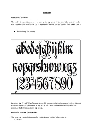
Rothenburg Decorative
I got this text from 100freefonts.com and this shares similar traits to previous font like this.
Graffiti is a popular convention in rap music and so this would immediately show the
audience that my magazine is rap based.
Headlines and Text (Front Cover)
The font that I would like to use for headings and various other texts is:
Bebas
2. SAMPLE
The font may not connote the genre in specific but it does have one attribute that can be
linked to the rap genre; it connotes a hidden meaning, which is the fact that since the font is
bold and all in capital letters, it could represent the power and the egos that rappers tend to
have. This is why it would be useful for the heading.
An example that links to the ‘Bebas’ font is the masthead of ‘Vibe’ magazine portrays that
message. ‘Vibe’ is a rap magazine and it does not use the graffiti art or any other font linked
specifically to rap. This font is like the ‘Bebas’ font, it is bold and in capital letters (excluding
the ‘e’).
Main Text Body (Double-Page Spread and Contents Page)
My idea for the main body of text is to use ‘Gill Sans MT’.
Sample.
I have no main reason as to why I am using this text in relation to genre, but I am using it
more for visibility. The text is visible and easy to read, as graffiti text will be quite difficult to
read and understand. The ‘Bebas’ font only has capitals and that is why I do not want to use
it as my main body of text.