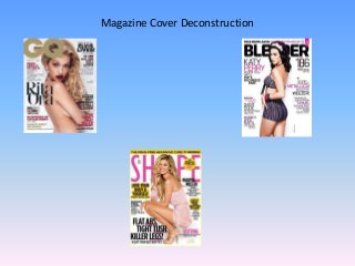
2. The masthead on this
magazine is placed behind
the main image, this helps
the image stand out more.
The black font also stands
out against the white
background so you can
clearly see the name of the
magazine.
The main image is Katy
Perry, she is doing a sexy
pose wearing skimpy
clothing. This is to more
attract people to buy the
magazine, especially males.
The main coverline
links with the main
image because it tells
you who they are.
The sub-heading is
gives the readers more
information about Katy
Perry by referencing
one of her songs, it
also shows what the
story is going to be
about without going
into too much detail.
The coverlines on this
magazine are quite small as
they aren’t as important as
the main story. They are
used to show the readers
there are more stories in
the magazine than just the
main one. They are written
in pink and black to stand
out from the white
background.
The colour scheme is very plain
but the pink and black go well
together and stand out against
the white background.
3. The masthead is
placed behind the
main image, this is so
the image can stand
out more. It is also
quite large so the
readers can easily see
what the magazine is
called.
The main image is of
Marisa Miller, she is doing
a sexy pose by showing
off her legs this is to
attract more people to
buy the magazine. She is
wearing pink which links
with the colour scheme of
the magazine.
The coverlines on
this magazine vary in
size to attract the
readers to certain
stories. This shows
there is a variety of
stories within the
magazine other than
the main one.
The main coverline links
with the main image as it
tells us who it is to attract
her fans to buy the
magazine.
The sub-heading tells the
readers more about the
main story without going
into too much detail.
The colour scheme of the magazine is plain but
bright. It has a plain white background but has
bright colours used in the cover lines to help
them stand out and attract readers.
4. The masthead is placed in
front of the main image so
that it will be more
noticeable. The colour gold
against white makes it
stand out more.
The main coverline links
with the main image
because it tells you who it is.
The cover lines on this
magazine stand out as they
are in a variety of colours,
red, gold, white and black.
They are used to tell the
reader about the other
stories in the magazine.
The main image for this
magazine is Rita Ora. She
isn’t wearing any clothes
and is doing a sexy pose.
This is to attract more
readers to the magazine,
specifically males.
The colour scheme for
this magazine is using
red, black and gold to
stand out on the white
background.
5. Overall Thoughts
• Overall I thought the layout was best on the GQ magazine as it was less crowded
with information and didn’t go into much detail about the stories in the magazine
but showed you there was a variety of different stories, which I think attracts the
readers more. However I liked the colour scheme on the SHAPE magazine as it
included bright colours like yellow to make it stand out more against the white
background. I also liked how on the GQ magazine the masthead was placed in
front of the main image so you could see it more clearly which will attract more
people to buy it, especially if the main image is a seductive image.
• For my magazine I will complete the design and layout like the SHAPE magazine as
I think the colours scheme stands out more and attracts more readers.