
Recommended
More Related Content
What's hot
Viewers also liked
Similar to Contry magazines
Similar to Contry magazines (20)
Recently uploaded
Recently uploaded (20)
Contry magazines
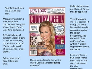
- 1. Colloquial language Serif font used for a used for an informal more traditional friendly approach look. Main cover Line is in a ‘Free Downloads dark pink which inside’ is positioned compliments the lighter on top of a white shade of pinky/peach box which is used to used for a background contrasted against the colour A colour scheme of background, also different shades of pink the words ‘Free’ is used to accompany and ‘Inside’ are the feminine photo of written in a bold, ‘Carrie Underwood’ larger font to entice also dressed in a shade the reader. of pink. Some words are in Colour scheme of blue which makes Pink, Yellow and Shape used relates to the writing them contrast and Blue. inside ‘Country’s most shocking stand out against moments’ the pink
- 2. The magazine front cover is very minimalistic with a cream background and This country music not very much writing, magazine front this draws attention to cover is very simple the figure on the front of in comparison to a very well known ‘Country Weekly’ country singer, Taylor with barely any Swift. writing, the magazine is relying on the image of A minimal amount of Taylor Swift to sell colour is used, such as their magazines cream and a deep shade rather than of red, this also draws informing the attention to the figure on reader about the the front. content of the magazine. Taylor swift wears a black dress and a pair of black cowboy boots fitting in with the genre of the magazine.
- 3. This front cover does not follow A Sans Serif font is used the conventions of for the masthead, cover the typical line and other writing on magazine cover as the cover which has a you can only see more modern approach three quarters of on the traditional sense the ‘models’ face, of country music which although the eye ‘country weekly’ conveys. line is in the top third of the page. The front cover is Although this magazine also quite front cover seems to be minimalistic in more modern than comparison to others I have looked at, it ‘Country Weekly’, still sticks to the with a minimal traditions of country colour scheme of music by ‘Toby Keith’ dark Red and dark being dressed in his shade of ‘cowboy’ hat. blue/green.