1. This double page spread follows general and layout
conventions of a standard double page spread through
it‟s use of a pain image, pull quotes and smaller related
images. The layout appears similar to many of Mixmag‟s
interviews/articles with specific artists and so the double
page spread maintains and reinforces brand identity in
this way.
The title used on the page is a cross between a standfirst
and a main sell line as it gives subtle hints about the article
and outlines who is featured on and what the interview
will entail, however, it is bold and placed directly above
the article. It suggests that the article is wacky and
interesting as it lists bizarre topics (i.e. “Lothario and,
2. erm...fisherman”) and so the reader will want to know the
back story behind these. Dizzee Rascal, the featured
artist, is also presented as “grounded” – the audience will
assume and trust that he is down to earth and possibly just
like them thus making the double page spread more
relatable for the reader who will feel a connection with
the artist, therefore, drawing the audience in. The mode-
of-address is colloquial and friendly; demonstrated in the
sell line when it says “erm...fisherman”. The use of “erm” is
commonly used when speaking to, say, a friend or
relative, and isn‟t usually used in magazines or books
however, conventions are broken here; the audience will
feel like Mixmag is their friend through this use of colloquial
language and will therefore deem Mixmag more
trustworthy and trust/take in the information that is in front
of them.
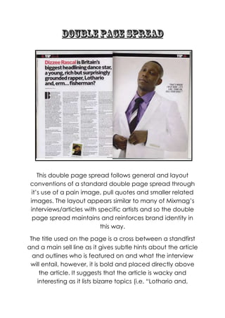
There is only two images which feature on the double
page spread and these are the main image and a
smaller related image giving the double page spread a
more basic, yet sophisticated look. The smaller related
image is of Armand Van Helden who collaborated with
Dizzee on his track entitled „Bonkers‟ (one of the dancier
tracks Dizzee, who is a predominantly grime artist that
releases dance music aswell, has released) and so
doesn‟t really give a representation of Dizzee as such.
However, the same can‟t be said for the main image
which shows Dizzee Rascal in a purple shirt, black tie and
a white blazer, stood against a white background. He is
tying up the buttons of his blazer which gives the
audience the impression that although he is down to
3. earth, he is also professional, slick and cool. His white
blazer and the background also make the purple shirt
stand out, which could represent that, Dizzee Rascal isn‟t
afraid to break boundaries and doesn‟t mind standing
out/being different (reflecting his change in genre from
grime to upbeat dance music). He is also making direct
address with the audience and so the connection they
will feel with the magazine and the artist is reinforced. The
fact he is dressed in a suit also makes him look very
professional and could reflect the fact that he has come
a long way from his early grime days and is more mature.
There is no genre specific iconography on this double
page spread however, which is common in Mixmag but
breaks general music magazine conventions. The image
will be used to draw in the audience as it shows Dizzee
looking serious and professional; like the audience take
dance music seriously, he takes his job as an artist seriously
– the image is again more relatable to the reader. The
image is placed on the right hand side and this is
common in Mixmag‟s double page spread interviews with
artists. It allows the reader to have access to almost a
profile on the artist; they can read information on them on
the left and refer back to what they look like as an
individual and possibly envision the artist saying the
answers they have given in the interview.
The body copy, which is placed in columns on the left
page, and it‟s an interview. A keen reader of Mixmag
would also be able to tell it‟s an interview from the
predominantly white colour scheme and basic layout. The
text is presented in columns, which is common in Mixmag
4. and goes with the theme/design of the whole magazine
as in most articles/features the text is in columns, rows and
lists. Pull quotes are used which may draw the audience
to the main body of text if the sell line already hasn‟t; the
reader is more likely to scan the image rather than to
immediately start reading the article and so this is a last
chance attempt to attract the reader to the double
page spread before they turn the page over. The mode-
of-address within the pull quote (“that‟s where I‟m at now
– it‟s like „come on, sell your soul!”) is used effectively here
as the informal language makes the reader feel like they
are on the same wavelength as Dizzee; “that‟s where I‟m
at now” and “it‟s like” reinforces the friendly feel to the
magazine and makes the reader feel as if they are being
pulled into a conversation with the artist. They would also
want to know the back story behind the pull quote –
where/why did the artist say that?
There is no other text features that stand out as such; the
double page spread consists of a pull quote which is
written in italics, body copy in column format and a sell
line which is bold and underlined so it stands out. This
helps to emphasis the simplistic layout that Mixmag is
known for. The body copy is set in columns, going alomg
with the design of Mixmag throughout the inside of the
magazine (thus maintaining brand identity and creating a
symbiotic link between all articles/features in the
magazine).
The interview section (which appears in every issue of
Mixmag) always maintains the same basic layout with a
white background and so this maintains brand identity –
5. the reader will feel comfortable that they are able to
recognise the interview section and so, the bond
between the audience and the magazine will be strong
through repetitive use of this layout. The simple colour
scheme also helps to maintain brand identity for Mixmag;
although they are known for using vibrant, fresh colours,
they have used white, black and purple as a main colour
scheme and this works as the brightness of the white
makes the double page spread stand out from the rest of
the magazine, reflecting the vibrant/fun aspect of the
reader, but with the added use of black it also reflects the
passionate yet serious side of them, therefore showing
that they take dance music seriously but can have fun.
The fonts which feature on the textual elements of the
double page spread are all in a basic sans serif font. Even
the sell line is using a basic san serif font, reflecting the
simplicity of the layout; they haven‟t focused on fancy
display fonts or gimmicks. The basic layout reflects the
way that the information more accessible, trustworthy
and direct to the audience – it is straight to the point and
this will please the audience who are passionate listeners
of dance music and take it seriously. The font is also used
to maintain brand identity; Mixmag is known for its funky
fonts however throughout the magazine this only tends to
be on titles/headlines, whereas the rest of the text is
usually an average, basic, every day font.