SlideShare una empresa de Scribd logo
1 de 19
Evaluation
    1) In what ways does your media products use, develop or
       challenge forms and conventions of real media products?


Front Cover

By thoroughly researching existing music magazines, I had learnt the general conventions of front
covers which I was determined to follow when creating my own music magazine. One of the various
conventions I had noticed, mainly in R&B and Hip Hop genre magazines, was that it is conventional
for front covers to feature a solo artist rather than a band. This was common in magazines such as
Vibe. As you can see from many front covers below, solo artists are most common.


In order to create importance to my main artist on the front cover, I decided that using this
convention of a solo artist would be a good idea. It allows my target audience to realise that the
monthly issue revolves mainly around one particular artist, for example, the music magazine I
created revolved around Alisha Rai. This encourages the target audience to appreciate her as an
individual and learn more about her.

Puffs are also conventional in music magazines. Using a puff in my own front cover had made it
stand out from the other texts; it also made up for not making use of conventions such as featured
article photos and banners. Furthermore, I have not just followed general conventions, but also
layout conventions, as it is normal to find the puff in the top right hand corner. The softer,
sophisticated look also is more suitable for female audiences, which was my aim; hence the fact you
don’t see it on the front cover of ‘Vibe’ as it is more likely to be a harder, solid and attention
grabbing tone and colour. If a puff was not used the front cover would not be as attention grabbing
which leads to less people picking it up and reading it. I placed it on the right hand side below the
masthead so it can be noticed straight away, below ismy own production of a front cover and two
other magazine covers from Billboard which show this convention effectively.

Medium long shots are common in the covers below and above, mainly for female audience. This
could possibly be due to showing more of their hour glass figure and beauty; therefore I did not
hesitate to use this convention in my own piece.


From the front covers above and the earlier ones from vibe, we can also see that it is conventional in
R&B/Hip Hop magazines to have a plain background. This is to add to the importance of the main,
solo, artist at the front and also keep it simple. I used it in my own media text for similar reasons.
Challenging the R&B convention, I went for a more sophisticated look for my media products,
making my front cover look simpler, and attract my target audience of women in their 20’s and 30’s,
rather than keeping it feisty and attracting the younger audience.

Another way my media product uses conventions of real media products, are through the layout of
the mast-head. As you can see from two of the Vibe covers and two of the Billboard covers above, it
is conventional to place the main image in front of the mast-head. I decided to use this in my own
media product for two main reasons. Firstly, to show that my magazine is well established and the
target audience are able to almost instantly recognise the magazine through its brand identity, and
can tell it’s a Rhythm issue without needing to see all the letters of the word. Secondly, I decided to
use it to continue the important image of the model in front of the mast-head, as it is an issue
revolving around her. This is also the prime reason I did not have a featured article photo. Also
because through thorough research I noticed that featured article photos were mainly common in
indie rock music magazines, such as NME.
The barcode is a vital convention in all magazine front covers which I was certain to follow in my
own piece, as were the sell-lines on the side which are the main features that encourage audiences
to buy the magazine. It is also positioned in a conventional place, which is in the bottom right corner.
This is placed in the bottom right because attention is not needed on it therefore it is moved to the
side, if it was at the top then it would grab unnecessary attention. However, the price is placed on
top of the barcode, as the human eye reads from top left to bottom right and therefore the price
lingers in the reader’s minds and they are likely to buy it no matter how much it is after reading the
sell-lines of the magazine.


Contents page

The contents page I produced also follows several forms and conventions of real media products;
however, it also challenges the common conventions. When creating my contents page, I was hugely
inspired by one of Blender’s contents page which I had analysed in depth.


The Blender issue has a long shot of Katy Perry, allowing audiences to see her whole body. It also has
a plain background so that the audience focus on the first object they see; in this case it is the artist
or the giant mushroom. Similarly, I decided to take a long shot of my model and also keep a plain
white background. However, I have challenged conventions of media texts by also including two
small pictures in the bottom right corner. I did this to emphasise the importance of the model for
this month’s issue and also, it is the last thing the readership would see (the human eye reads from
top left to bottom right) and therefore they are most likely to turn to the page featuring the artist,
intrigued to read more about her. This challenges conventions because if you have a main image of
an artist, you don’t see smaller ones of the same artist. As well as challenging general conventions, I
have challenged the conventions of R&B magazines, as pop and indie rock magazines do have
multiple images on their contents page. By challenging this I have added originality and a unique
edge to my contents, setting it apart from its competition.

The name of the magazine features on the front cover along with the date of issue. This reminds the
audience, especially the new readership; of the magazine they are reading which helps to establish
the brand further.


Another contents convention I used in my own production is the use of section headings. This
convention is used in many magazines such as ‘Vibe’ and ‘Billboard’. The importance of this is that
the content is divided in to categories that interest the readership the most, rather than flicking
through it trying to find it. For example, if the readership was interested in reading about fashion,
they can see content with in the fashion section without hassle.


In addition to this, I had come across was that most contents pages did not feature every article
within the magazine. They were categorised and the most interesting articles were displayed, this
had a good effect on audiences because when the audience flick through the pages to get to the
particular article they want to read, they would come across more articles that do not feature on the
contents. I developed used this convention in my own media production.

Double Page Spread

On my double page spread, I decided to display an interview between one of our journalists at
Rhythm and the artist. This was because the front cover and contents page both highlight her
importance, which makes the audience wonder what really is important about her. Therefore, by
having an interview, all the questions from the readership about the artist can be answered. It also
maintains the sophistication of the magazine and is a convention for magazines aimed at
professional women in their 20s and 30s like to read and enjoy in depth articles that reflect their
intelligence levels and that allow them to connect with the celebrity being interviewed or presented.
Interviews are common in music magazines generally which is a convention that I felt was important
to follow.
Like the contents page, I also placed the name of the magazine in the corner, which establishes the
magazine to new readerships. The most common convention of a double page spread is a large,
interesting pull quote, especially if it is an interview. I used this convention to grabs the audience’s
attentions. It presents an enticing extract of the article in order to really intrigue the target audience
and make them feel impelled to read on, it is a terrific technique. I decided to use the quote ‘I sing
about life not men…” as it supports the target audience profile of the magazine. This is because the
magazine is for independent women who strive to reach their ambitions and put their career before
their love life. The pull quote is also placed in a conventional place which is at the top so audiences
see it first; it is also in a bold font which makes it look more appealing.


Another convention I have used is making the image of my model cover the majority of the page,
alongside with two other images relating to the article. This is common double page spreads as it
enables audiences to create a visual image of what they are reading and be able to understand the
artist more in a realistic way. For example, Alisha states she can play the piano, and there if a small
image alongside of her lying on a piano which makes her words look more effective and keeps the
audiences intrigued. Also, the main heading is ‘Alisha Rai’ which is in a large script font, next to it is
‘Exclusive’ which instantly tells the target audience that they are about to read an interview as it is
common for the word ‘Exclusive’ to feature on a double page spread. Below is a summary of what
the article is about and what it will feature which is another convention that is always present before
an interview.
The name of the magazine is also common on double page spreads to remind the audiences that
they are reading an article from a particular magazine and this increases brand loyalty if the
audiences enjoy what they are reading. Apart from general conventions, I have also followed layout
conventions including the positioning of the main image in the bottom right and the title on the top
left. I believe my double page spread has used many codes and conventions of magazines in general
and R&B magazines.

In all three productions I have maintained brand identity and achieved a symbiotic link, it is
conventional for magazines to do this. I have done this by maintaining a sophisticated colour scheme
of colours such as pink, white and grey. I have also included the name of the magazine on each
media text and maintained a sophisticated and appealing mode of address throughout.

    2) How does your media product represent particular social
       groups?
My three productions represent many different social groups including gender, age, class and race.

When viewing my three productions, it is clear that a representation of women is shown. I
represented women as confident, this is a typical because it is a convention to have women on the
front cover that has a confident look and pose. It also represents women as independently
successful. They have complete control over their life and have passion to be rewarded for their
hard work. Below is an example of Beyoncé giving a confident pose and the cover highlights her
success.
Both of the quotes of Beyoncé reflect on her achievements, referring to all the roles she plays. Her
holding the award highlights her success in a visual way.

I decided to use this typical representation of women being confident to add importance to my artist
and also make the audience appreciate them as an individual, after all they act as a role model to
them. This confidence is represented through her pose, facial expressions and direct address with
the audience, as shown below.


Independence is also highlighted in the embedded quote on my double page spread. It shows that
her life does not revolve around men, showing that most women are now becoming independent
and don’t need to rely on their partner.


Femininity is also another representation of women which I followed by using the colour pink
throughout all three pieces. However, apart from the ‘girly’ stereotype there are other
representations of women being sex objects. The following images are examples of women who are
represented in that way.
I decided to invert this representation and give my artist a sophisticated and decent look to which
audiences can admire.

My media products are aimed at audiences in the ABC1 professional bracket, which is why simplicity
and certain mode address is used that maintains this simplicity rather than having much explicit
language. As the audience is in their 20s and 30s, they are more likely to be in a stable career and at
the top ends of Maslow’s hierarchy of needs, reaching towards the self actualisation section,
fulfilling all their needs as well as being in a higher class of the professional bracket.


Artists such as Beyoncé, Mariah Carey and Alicia are all at a high class. We know this by their choice
of elegant costumes, silver jewellery, and the mise-en-scene elements in their music videos.
http://www.youtube.com/watch?v=9b8erWuBA44 this video is by Mariah Carey who clearly shows
class with her huge house and ornaments inside the house that feature, rather than shooting in the
local park. My artist was given this class and position to add to her personality and become someone
the target audience of my products can relate to. This representation is shown through the mise-en-
scene shown. Below are examples of how my magazine highlights the representation of class. The
earrings and necklace are elegant and add to a rich representation, and her lying on a piano also
shows her class. This is because pianos are very expensive and the fact she’s lying on one shows she
has total control and in the top ends of the ABC1 professional bracket.


Ethnicity is one particular social group that I decided to represent very differently. Asian artists are
very rare in the music industry and during my research I had not come across any Asian artists on
any music productions and therefore I thought I would challenge this convention bring this in to the
music industry to add uniqueness and encourage a wider audience to buy the magazine. The most
common race is black artists, especially in R&B music magazines. Most black artists are represented
as sex objects or aggressive I have challenged this stereotype of females in R&B magazines by using a
sophisticated and elegant women as the model who cannot be seen as a sex object, which reinforces
the Asian stereotype. I have done this by use of costume, not revealing too much of the models skin.
However, I also go against the female stereotype, because Asian females are seen as subordinate to
men, and dependent on them in every way. My model goes against this and shows independent and
her own success.


    3) What kind of media institution might distribute your media
       product and why?


The media institution that will publish my media products will be Hearst Magazine UK. The company
is one of the largest and diversified communications institutions and have published 20 magazines
around the world including Cosmopolitan, Esquire and Elle. This means that they have a huge
experience of publishing magazines over the years, making them a success. Also, the fact they are
well known will invite more audiences in to taking an interest to my music magazine. Hearst
Magazine publishes lifestyle magazine, whereas my magazine is a music magazine. However, being
owned by them is advantageous to my magazine because Hearst Magazine has a developed and
great understanding of female audiences and how to deliver them to advertisers effectively. We
know this because their website states that they reach out to one in four women in the UK, which is
a tremendous amount. This would be very useful to my own productions because they also are
aimed at female audiences, and therefore, similar audiences will be shared.

The only way for a magazine to survive these days is to embrace modern technology. Hearst have
their own website with an image of a women in the background, this reflects on the fact they cater
for female audiences mainly, and understand the needs and interests of them. They will be a good
ownership for my magazine as they have a lot of experience in the magazine business and know how
to keep it running. They also have a huge budget, and therefore my magazine will be promoted and
advertised in an efficient way so that it delivers to the right audiences, furthermore, my music
magazine will be launched effectively because it could be advertised in other, successful magazines
such as Cosmopolitan and Elle who will have similar personality traits to the readership of my
magazine, gaining loyal audiences and increasing the circulation figure. In addition to this, knowing
that my magazine is owned by Hearst, advertises are likely to be attracted to place ads within the
magazine, this will boost revenue of Rhythm as well as the content within it.

There are many music magazines on sale in shops and being owned by such a successful company,
my music magazine will be able to stand out from the competition.


    4) Who would be the audience for your media product?
           Sophistication and confidence are the main personality traits of the
            target audience of my media product. The products are aimed at a
              female audience aged between 25 and 35. Independence is
encouraged by her successful career, which prevents her from relying on other people in life. She
has a good sense of humour, encouraging her to socialise with friends and acquaintances. Facebook
is a site she uses mainly when using the internet, posting pictures of her nights out and socialising
with friends. She also surfs the web, building her general knowledge and also to do online shopping.


                She belongs to the ABC1 professional bracket, with a well paid
                 job that she enjoys and allows her to use her imagination and
                  talent After a long day at work, she looks forward to coming
                   home and putting on her favourite romantic comedy’s
                   including Love Actually and Confessions of a Shopoholic with her
                    ultimate indulgence; a box of Thorntons chocolates. She also watches
                    many soaps including corrie and Eastenders. She is in a long term relationship,
          hoping to get married soon. The relationship brings out her romantic side and femininity,
going on dates with her other half and having a feminine spirit such as Malibu. However, this does
not affect her independence and work life.


                  She is an individual who has a great passion for music and likes to keep up-to-date
                  with the latest gadgets. Her IPhone 4 is filled with a variety of songs which she
                  listens to depending on her mood at the time. Artists such as Beyonce and Mariah
                  Carey act as inspiring role models for her, she tries to relate to them with the
similar personality-traits they have in common such as confidence and
independence.


The readership also takes pride in her appearance by visiting the gym twice
          a week and keeping a healthy diet in order to maintain her
           perfect hour glass figure. She is also very competitive when it
            comes to fashion, going shopping every often trying to keep up with the latest trend.
             However, following the crowd is not her aim. She likes to create a look of her
              own, having been inspired by her favourite artists. Reading about these
               artists keeps the target audience interested,the main lifestyle magazines
                they read from are Cosmo and Glamour.

            She believes it is important to live life to the fullest and strive for the
success youdream off. My media products will celebrate this quality of hers and
also encourage it wholeheartedly and she would enjoy Rhythm as it fulfils all these
criteria’s and encourages women to be the best they can be.


    5) How did you attract/address your audience?
Through my three productions, I attracted my target audience in many different ways.
Front cover

I had given out a post-production questionnaire in order to find out which features of my work
appealed to the target audience the most. Here is a link to my questionnaire and analysis.

http://bhaviniasmedia.blogspot.co.uk/2012/12/post-production-questionnaire-and.html

According to the post-production questionnaire that I had given out to my target audience, the
image on the front cover was the first thing the audiences saw. The main image portrays a
sophisticated and confident pose of the artist which addresses the audience because it reflects on
their personality. With this similarity, audiences are able to relate with the artist through the
sophistication and confidence they portray. The model also has a gentle smirk, showing she is happy
with her life, just like the target audience. Another factor that also maintains sophistication is the
colour scheme of the front cover. The main colours are grey, white and pink. Pink connotes
femininity; this encourages female audiences to pick up as it is a female aimed magazine. The
audience is sophisticated and therefore would like to see a sophisticated design of the magazine.

The sell-lines also attract and appeal to the target audience of my magazine. Below are most of the
sell-lines which are directly aimed at the target audience.

                   The puff attracts the audience because it gives them a chance to keep up-to-date
                   with the latest gadgets and also encourage their passion for music. The fact that
                   it is a “brand new IPod” they will buy the magazine hoping that their intelligence
                   will lead them to winning something desirable.


                      The audiences of my magazine enjoy watching soaps, therefore this
sell line is a bonus for them because they find out the star of their soap is a new
member of the music industry and therefore they would want to pick it up and read it.


                     Appearance is important to the target audience of my magazine. They enjoy
                     keeping up with the latest fashion on beauty. Seeing a sell-line with the “secret
                     to hair perfection” of the famous singer Mariah Carey would be very appealing
                     to the target audience, because they would want to feel and look like a
                     celebrity. It also enhances the appeal to read on as it does not give a lot away,
                     and audience are curious to know the ‘secret’ to Mariah’s hair perfection.


The magazine attracts the audience by displaying the top 20 R&B tracks
of 2012. This would be effective as the audience enjoy R&B music and
will be kept up to date with it every month.The top 20 tracks sell-line
doesn’t give too much away and so it would intrigue the TA, making her
want to read it.
The three artists act as typical role models to the target audience,
                         therefore seeing their name on the front cover would encourage them to
                         read about it.


Another feature that attracts the audience is the mast-head. One of the people I gave my
questionnaire out to have stated that the mast-head was the first thing she saw on the cover. The
name of the magazine reflects on the genre because Rhythm comes from the Rhythm and Blues
(R&B) and therefore, audiences are then further encouraged to buy the magazine.

Contents page

The colour scheme on the contents page maintains the sophisticated look of the magazine, relating
to the target audience. As highlighted in my post production questionnaire, the audiences I
questioned had said that the colour scheme remained the same through all three productions and
made sense that it was from the same magazine issue.This therefore created a symbiotic link
between the three media texts which maintains brand identity. The colours grey, pink and black
were used in all three productions, keeping the audiences attracted.

The articles listed in the contents page were placed according to the interests of my target audience.
Shopping for clothes and keeping up with the latest trends is something that is enjoyable for my
audience and that is why there is a fashion section. The articles placed in the fashion section will
directly address the audience as it is a women’s magazine and also reflect on the importance of their
fashion. Vibe’s contents page featuring Ciara influenced me on having a fashion section.


                         Horoscopes are admired by women. I realised this from my own interest
                          and also through the questionnaire I carried out during my research and
                           planning. And therefore I thought it would be a good idea to include one
                            in my magazine. My target audience would enjoy reading their
                             horoscope, seeing how true they are and how much they relate to their
                              life.

                             Double page spread

        The embedded quote was the most attractive feature on my
double page spread, according to my post production questionnaire. This
was because the font was large, placed at the top above the image and had text effects added to it.
The embedded quote reflects on the personality of my target audience and therefore they are able
to relate to the article more and feel it is especially for them. It addresses the audience as
independent and more concerned about life rather than men.


The fact that the double page spread is an interview of the artist automatically attracts the target
audience because they see the are intrigued to read about the artist on the front cover and see what
is so important and special about her. They are able to relate to her whilst reading the whole article
and look up to her, seeing her as a role model that they can strive to be like. The conent of the
double page spread also appeals to my target audience because it shows the passion and drive the
singer has for music, something they feel to relate to due to their passion for music. It also highlights
the artists independence in life and also the fact that she does want to settle down with someone
special.

Overall, all these features attract my audience in to reading the magazine and also make them feel it
is directed at them the whole time. The use of images makes my magazine one that appeals to my
audience because the choice of model shares similar characteristics and personality traits to them,
such as confidence and passion for music. It shows someone that is happy with their life, and the
target audience want to be like her and find out why she is so happy so that they can be happy
aswell. The mode of address used also appeals to my target audience because it is language that
suits them, such as ‘Secret to hair perfection’. The audiences are sophisticated and the language
used is also sophisticated for the audience to relate to, in addition to mode of address, the layout
and design of my three productions also maintain sophistication. It is in a structured layout rather
than all over the place like Metal and Pop magazines. The colours used are soft and feminine, and
the continuity of three main colours give the magazine a symbiotic link. Through this, audiences are
able to recognise common conventions of the magazine itself, and be able to notice it in a shop in a
herd of other magazines. All these features appeal to the target audience in many ways.


    6) What have you learnt about technologies from the process
       of constructing this product?
This project has helped me improve on my existing technological skills and also
develop new skills. After doing GCSE Media I had learnt how to use Adobe
Photoshop, however, briefly. This A-Level course has shown me the importance
of professionalism when it comes to editing original pieces. It also encouraged
me to look deeper in to the software and make use of the many functions I did
not previously know about. For example; the fxbutton was used throughout my
whole editing process.

This function was used to add effects to my images and texts to make them look more realistic and
attractive.
I also learnt how to use blogs as I had never used them before. It shows
                          how advanced technologies have become as anything can be posted and
                          written on it. There were certain files that could not be copied on to the
                          blog such as PowerPoint’s which was when I found SlideShare. It is a
                          straight forward site which allows you to share files.


                           I also improved my skills of using a DSLR camera. After
                           many failed attempts I managed to take the pictures I
                           had aimed to take. It helped me to experiment with
different ISO’s, aperture and shutter speeds to help me obtain a high quality
picture. Taking pictures in different settings and angles also helped me
improve my photography skills compared to my preliminary task where I used
a different, low quality camera. Using a DSLR helped me during the editing
process as the pictures were high in brightness and contrast as it was so I
didn’t need to edit the actual image, but only the text and images which
were placed on to the images.


    7) Looking back at your preliminary task, what do you feel
       you have learnt in the progression from it to the full time
       product?
After completing my preliminary task, I had realised many areas in which I had to practice on or
change when it comes to the real product. As part of the preliminary we had to do a target audience
profile and mission statement. After completing this I had learnt how to write in depth and describe
my product in detail, discussing every aspect. This would help me create a visual image of my final
product and act as a useful planning tool.

After doing my school magazine I picked up on eight main aspects which I needed to improve in
order to make my music magazine to look more realistic and sophisticated:


    1. Use of image – There is a very big difference between the image of my preliminary front
       cover and my music magazine front cover; this is because I took longer to plan what my
       image will look like. With my preliminary task I was unsure of what I was capable of
       producing therefore I did not think of every single aspect of the image and just chose one of
       three pictures taken, however, when it came to my main task, I took many images in a
       variety of different shots and angles. I chose the ones that were the most suitable and
       professional looking.


    2. Mise-en-Scene – I planned weeks in advance of which settings will be most effective when
       taking my photos. In order to make my images look sophisticated I thought I would stick to
       the white background just like I did for the preliminary but I realised it was slightly boring,
       and music is something that should be expressed with the settings. Although, whilst carrying
       out research in to locations, I noticed that women were presented against a plain
       background in order to direct complete attention to her. This was common in front covers
       and therefore I used it in my own media text, however, I also included a heater where my
       artist confidently leaned against in order to add to her sophistication. Another mise-en-
       scene element I improved on was costume. When carrying out a research in to costume on
       existing artists I realised that a dress would add to my artist’s femininity and sophistication,
       the colour of the dress (pink) maintains the colour scheme of the magazine which makes it
       look more appealing. She wears jewellery to reflect on her wealth and fame. As you can see
       on my preliminary task, I did not analyse and plan in to as much depth as I did for the main
       task.


    3. Font – After carrying out the preliminary task I realised that he font would look more
       effective it had been more unique, attractive and also suit the target audience – in this case
       the 6th formers. The font of the mast-head should be bolder and more eye-catching with a
       distinctive font to showbrand identity, making it stand out from the rest. When it came to
       the main task, I made sure that my font was in big and bold font and a sans serif typeface
       because sans serif makes it look smoother n feminine. Also, the ‘R’ of Rhythm has a slit,
       making it look more unique so that it stands out from other magazines. When completing
the preliminary task I also noticed that the masthead over the models head does not look
    appealing or realistic. When it came to the main task I took this thought on board and made
    sure that the masthead was behind the model so that it looks more realistic, sophisticated
    and appealing. I also learnt how to add effects to fonts on Adobe which made my text stand
    out more and look more appealing. Furthermore, I used between two and four different
    fonts and sizes rather than using the same one for every text like I did for my preliminary.


                     Before                                       After


4. Colour Scheme – This was also an aspect that I needed to improve on when making my final
   products. Rather than using different colours, I thought it would look more appealing if
   similar colours were used which suit the audience of the product. This is why I went for pink
   and grey colours, knowing that my target audience are women. I also avoided using solid
   colours so that it does not look plain, but attractive. An example is shown below of using the
   gradient effect on my puff in the final music magazine production. According to my post-
   production questionnaire, the colour scheme was the main aspect that maintained a
   symbiotic link between the three productions.


5. Camera and Photoshop – in my preliminary task I used my phone camera, however I realised
   that the quality wasn’t as good as I expected. Using a professional DSLR camera would make
   the whole production look appealing. I had to learn how to use the camera because I found
   it very hard to use when I had my first attempt, but I knew that I had to take a professional
   looking image in order to make my three productions successful. I took many practice shots
   and chose the best ones out of all of them, this is something I did not do for the preliminary,
   I had taken three images and chose from those. I also noticed that if the medium shot filled
   the frame more, it would look more professional. My Photoshop skills had also improved
   after the preliminary task because I made use of gradient tools and the ‘fx’ button which
   helped the content on my work blend in well. In my preliminary, not all the texts and puffs
had blended in and it looked like it was just copied and pasted on to the image without
    adjustments which was not very appealing.


6. Knowledge – After the preliminary research I carried out thorough research so that I have a
   reason for every item I place on my magazine. I learnt that music magazines have content
   there for a reason, for example mise-en-scene elements to make a male stronger or costume
   that make a female look slimmer. Colours are also chosen wisely. This research widened by
   previous knowledge in to music magazines and helped me develop a magazine that is similar
   to the ones out there. It strengthened my knowledge of general conventions and layout
   conventions of music magazines so that my own piece actually fits the expectations the
   target audiences hope to see in a magazine.

7. Appealing – In order for the front cover to appeal to the target audience, mode of address is
   important. When creating my preliminary front cover, I used sell-lines that reflect on 6th
   formers and used words such as ‘Gossip’ and ‘Crushes’ and the content was things that
   relate to them such as ‘High fashion at low costs’ as 6th formers have a small budget but high
   clothing desires. By using languages that the audience can understand and feel that they are
   spoken to personally, and that the magazine is made just for them. I think this was an
   effective technique which I was determined to use in my main task. I used sell-lines that
   would address women only, between the ages of 20 and 30. I also chose a model that the
   target audience can relate to as she looks successful and confident; she acts as a role model.
   Whereas, for the preliminary there was no reason for the model choice and therefore did
   not look appealing.


8. Layout –I followed typical layout conventions from my preliminary as well as general
   conventions. For example, the masthead is supposed to remain at the top and it is
   conventional for the puff to be placed in the top right. However, after research I had realised
   that the main sell-line had to be larger than all the other sell-lines and therefore I took this in
   to consideration when creating my main sell-line as you can see below. It is conventional for
   the barcode to be placed in the bottom right corner and so I followed this convention too.
9. Contents page – as you can see below, I changed the layout of the contents page
   completely. This is because the preliminary contents draft is aimed at a younger audience
   still in full-time education as you can see by the layout, colours and positioning of sub-
   headings. From research, this type of contents page was not common in music magazines.
   For example, it is rare to have puffs in R&B music magazine. Also, it is conventional to have
   one main image covering up half the page rather than two small images, and therefore I
   decided not to follow the ideas from my preliminary task and start the contents page from
   scratch. Furthermore, the front cover and contents page of the preliminary task do not have
   a direct or obvious symbiotic link and therefore we are unable to tell they are from the same
   magazine. It is conventional to have a symbiotic link in order to maintain a brand identity
   and so I continued a simple colour scheme rather than using any colour I can get hold of.


    In conclusion, I believe that I have created three effective media productions due to the
    thorough research, decision making and hard work. It is evidently appealing to whom it was
    created for and distributed by a well-known company and therefore it will prove to be a
    success.Whilst carrying out this task, I learnt many skills and created a deeper understanding
    of magazines in general as well as music magazines. I can tell that I have made a huge
    difference from the preliminary and can now use Photoshop confidently. Furthermore, I
    have learnt that some music magazines follow certain codes and conventions whereas
    others challenge these conventions on order to create uniqueness.

Más contenido relacionado

La actualidad más candente

Music Magazine Evaluation (Finished)
Music Magazine Evaluation (Finished)Music Magazine Evaluation (Finished)
Music Magazine Evaluation (Finished)ChrisDarby2010
 
Evaluation Questions
Evaluation Questions Evaluation Questions
Evaluation Questions RosieDaly
 
Media As Corsework Pp
Media As Corsework PpMedia As Corsework Pp
Media As Corsework PpAlex Reid
 
Evaluation 2
Evaluation 2Evaluation 2
Evaluation 2Dragonium
 
Hatties evaluation
Hatties evaluationHatties evaluation
Hatties evaluationhattie_clyde
 
As media presentation
As media presentationAs media presentation
As media presentationKorrinaalbert
 
AS Media Studies: Evaluation Question 1
AS Media Studies: Evaluation Question 1AS Media Studies: Evaluation Question 1
AS Media Studies: Evaluation Question 1_arlindm1
 
New media evaluation
New media evaluationNew media evaluation
New media evaluationasmaa786
 
AS Media Studies: Evaluation Question 5
AS Media Studies: Evaluation Question 5AS Media Studies: Evaluation Question 5
AS Media Studies: Evaluation Question 5_arlindm1
 
New media evaluation
New media evaluationNew media evaluation
New media evaluationJAAN12345
 
Logbook and evalution22
Logbook and evalution22Logbook and evalution22
Logbook and evalution22Harry_Frampton
 

La actualidad más candente (17)

Music Magazine Evaluation (Finished)
Music Magazine Evaluation (Finished)Music Magazine Evaluation (Finished)
Music Magazine Evaluation (Finished)
 
Final evaluation
Final evaluationFinal evaluation
Final evaluation
 
Evaluation Questions
Evaluation Questions Evaluation Questions
Evaluation Questions
 
Media As Corsework Pp
Media As Corsework PpMedia As Corsework Pp
Media As Corsework Pp
 
Evaluation 2
Evaluation 2Evaluation 2
Evaluation 2
 
Hatties evaluation
Hatties evaluationHatties evaluation
Hatties evaluation
 
Media evaluation
Media evaluationMedia evaluation
Media evaluation
 
As media presentation
As media presentationAs media presentation
As media presentation
 
AS Media Studies: Evaluation Question 1
AS Media Studies: Evaluation Question 1AS Media Studies: Evaluation Question 1
AS Media Studies: Evaluation Question 1
 
New media evaluation
New media evaluationNew media evaluation
New media evaluation
 
AS Media Studies: Evaluation Question 5
AS Media Studies: Evaluation Question 5AS Media Studies: Evaluation Question 5
AS Media Studies: Evaluation Question 5
 
New media evaluation
New media evaluationNew media evaluation
New media evaluation
 
Evaluation of Lyrics
Evaluation of LyricsEvaluation of Lyrics
Evaluation of Lyrics
 
Evaluation of Lyrics
Evaluation of LyricsEvaluation of Lyrics
Evaluation of Lyrics
 
Logbook and evalution
Logbook and evalutionLogbook and evalution
Logbook and evalution
 
Logbook and evalution22
Logbook and evalution22Logbook and evalution22
Logbook and evalution22
 
Evaluation
EvaluationEvaluation
Evaluation
 

Destacado

A case study
A case studyA case study
A case studybhavzz03
 
Questionnaire analysis
Questionnaire analysisQuestionnaire analysis
Questionnaire analysisbhavzz03
 
Questionnaire analysis
Questionnaire analysisQuestionnaire analysis
Questionnaire analysisbhavzz03
 
A case study
A case studyA case study
A case studybhavzz03
 
Questionnaire analysis
Questionnaire analysisQuestionnaire analysis
Questionnaire analysisbhavzz03
 
A case study
A case studyA case study
A case studybhavzz03
 
Double page spread 2
Double page spread 2Double page spread 2
Double page spread 2bhavzz03
 
Contents page overview
Contents page overviewContents page overview
Contents page overviewbhavzz03
 
Questionaire
QuestionaireQuestionaire
Questionairebhavzz03
 
Double page spread 2
Double page spread 2Double page spread 2
Double page spread 2bhavzz03
 
A case study
A case studyA case study
A case studybhavzz03
 
Questionnaire analysis
Questionnaire analysisQuestionnaire analysis
Questionnaire analysisbhavzz03
 

Destacado (18)

A case study
A case studyA case study
A case study
 
Bluetooth
BluetoothBluetooth
Bluetooth
 
WEP
WEPWEP
WEP
 
Overview
OverviewOverview
Overview
 
Tugasan
TugasanTugasan
Tugasan
 
Questionnaire analysis
Questionnaire analysisQuestionnaire analysis
Questionnaire analysis
 
Questionnaire analysis
Questionnaire analysisQuestionnaire analysis
Questionnaire analysis
 
A case study
A case studyA case study
A case study
 
Questionnaire analysis
Questionnaire analysisQuestionnaire analysis
Questionnaire analysis
 
User account
User accountUser account
User account
 
A case study
A case studyA case study
A case study
 
Double page spread 2
Double page spread 2Double page spread 2
Double page spread 2
 
Contents page overview
Contents page overviewContents page overview
Contents page overview
 
Questionaire
QuestionaireQuestionaire
Questionaire
 
Double page spread 2
Double page spread 2Double page spread 2
Double page spread 2
 
A case study
A case studyA case study
A case study
 
Questionnaire analysis
Questionnaire analysisQuestionnaire analysis
Questionnaire analysis
 
Pump jeans
Pump jeansPump jeans
Pump jeans
 

Similar a Evaluation new

AS level Media Studies Evaluation
AS level Media Studies EvaluationAS level Media Studies Evaluation
AS level Media Studies EvaluationAngelGordon
 
Kieron's Media Magazine Evaluation
Kieron's Media Magazine EvaluationKieron's Media Magazine Evaluation
Kieron's Media Magazine EvaluationKieronSava
 
Kieron's Media evaluation
Kieron's Media evaluationKieron's Media evaluation
Kieron's Media evaluationKieronSava
 
AS Media Final Evaluation
AS Media  Final EvaluationAS Media  Final Evaluation
AS Media Final EvaluationNav Man
 
(Final evalution2)
(Final evalution2)(Final evalution2)
(Final evalution2)Benita29
 
(Final evalution)
(Final evalution)(Final evalution)
(Final evalution)Benita29
 
Final Evaluation
Final EvaluationFinal Evaluation
Final EvaluationBenita29
 
Final Evalution
Final EvalutionFinal Evalution
Final EvalutionBenita29
 
Music Magazine evaluation
Music Magazine  evaluationMusic Magazine  evaluation
Music Magazine evaluationBenita29
 
Question 1
Question 1Question 1
Question 1bet kei
 
New media evaluation
New media evaluationNew media evaluation
New media evaluationJas1231
 
New media evaluation
New media evaluationNew media evaluation
New media evaluationasmaa786
 
New media evaluation
New media evaluationNew media evaluation
New media evaluationasmaa786
 
Question 1
Question 1Question 1
Question 1bet kei
 
Media evaluation
Media evaluationMedia evaluation
Media evaluationOllySnowxx
 
Evaluation 1.2
Evaluation 1.2Evaluation 1.2
Evaluation 1.2BaneTMB
 
As Media Evaluation 1.25
 As Media Evaluation 1.25 As Media Evaluation 1.25
As Media Evaluation 1.25BaneTMB
 

Similar a Evaluation new (20)

AS level Media Studies Evaluation
AS level Media Studies EvaluationAS level Media Studies Evaluation
AS level Media Studies Evaluation
 
Kieron's Media Magazine Evaluation
Kieron's Media Magazine EvaluationKieron's Media Magazine Evaluation
Kieron's Media Magazine Evaluation
 
Kieron's Media evaluation
Kieron's Media evaluationKieron's Media evaluation
Kieron's Media evaluation
 
AS Media Final Evaluation
AS Media  Final EvaluationAS Media  Final Evaluation
AS Media Final Evaluation
 
(Final evalution2)
(Final evalution2)(Final evalution2)
(Final evalution2)
 
(Final evalution)
(Final evalution)(Final evalution)
(Final evalution)
 
Final Evaluation
Final EvaluationFinal Evaluation
Final Evaluation
 
Final Evalution
Final EvalutionFinal Evalution
Final Evalution
 
Music Magazine evaluation
Music Magazine  evaluationMusic Magazine  evaluation
Music Magazine evaluation
 
Question 1
Question 1Question 1
Question 1
 
New media evaluation
New media evaluationNew media evaluation
New media evaluation
 
New media evaluation
New media evaluationNew media evaluation
New media evaluation
 
New media evaluation
New media evaluationNew media evaluation
New media evaluation
 
Question 1
Question 1Question 1
Question 1
 
Media evaluation
Media evaluationMedia evaluation
Media evaluation
 
Evaluation 1.2
Evaluation 1.2Evaluation 1.2
Evaluation 1.2
 
As Media Evaluation 1.25
 As Media Evaluation 1.25 As Media Evaluation 1.25
As Media Evaluation 1.25
 
Magazine evaluation
Magazine evaluationMagazine evaluation
Magazine evaluation
 
Question 1
Question 1Question 1
Question 1
 
Evaluation q1-4
Evaluation   q1-4Evaluation   q1-4
Evaluation q1-4
 

Más de bhavzz03

Beyonce billboard
Beyonce   billboardBeyonce   billboard
Beyonce billboardbhavzz03
 
Beyonce billboard
Beyonce   billboardBeyonce   billboard
Beyonce billboardbhavzz03
 
Beyonce billboard
Beyonce   billboardBeyonce   billboard
Beyonce billboardbhavzz03
 
Contents page overview
Contents page overviewContents page overview
Contents page overviewbhavzz03
 
Beyonce billboard
Beyonce   billboardBeyonce   billboard
Beyonce billboardbhavzz03
 
Alicia essence
Alicia   essenceAlicia   essence
Alicia essencebhavzz03
 
Questionnaire
QuestionnaireQuestionnaire
Questionnairebhavzz03
 
Questionnaire
QuestionnaireQuestionnaire
Questionnairebhavzz03
 
Questionnaire
QuestionnaireQuestionnaire
Questionnairebhavzz03
 

Más de bhavzz03 (13)

Overview
OverviewOverview
Overview
 
Overview
OverviewOverview
Overview
 
Beyonce billboard
Beyonce   billboardBeyonce   billboard
Beyonce billboard
 
Beyonce billboard
Beyonce   billboardBeyonce   billboard
Beyonce billboard
 
Beyonce billboard
Beyonce   billboardBeyonce   billboard
Beyonce billboard
 
Contents page overview
Contents page overviewContents page overview
Contents page overview
 
Blender
BlenderBlender
Blender
 
Overview
OverviewOverview
Overview
 
Beyonce billboard
Beyonce   billboardBeyonce   billboard
Beyonce billboard
 
Alicia essence
Alicia   essenceAlicia   essence
Alicia essence
 
Questionnaire
QuestionnaireQuestionnaire
Questionnaire
 
Questionnaire
QuestionnaireQuestionnaire
Questionnaire
 
Questionnaire
QuestionnaireQuestionnaire
Questionnaire
 

Evaluation new

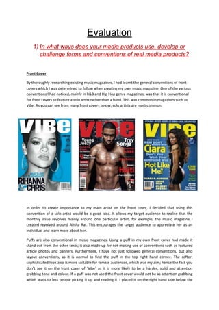
  • 1. Evaluation 1) In what ways does your media products use, develop or challenge forms and conventions of real media products? Front Cover By thoroughly researching existing music magazines, I had learnt the general conventions of front covers which I was determined to follow when creating my own music magazine. One of the various conventions I had noticed, mainly in R&B and Hip Hop genre magazines, was that it is conventional for front covers to feature a solo artist rather than a band. This was common in magazines such as Vibe. As you can see from many front covers below, solo artists are most common. In order to create importance to my main artist on the front cover, I decided that using this convention of a solo artist would be a good idea. It allows my target audience to realise that the monthly issue revolves mainly around one particular artist, for example, the music magazine I created revolved around Alisha Rai. This encourages the target audience to appreciate her as an individual and learn more about her. Puffs are also conventional in music magazines. Using a puff in my own front cover had made it stand out from the other texts; it also made up for not making use of conventions such as featured article photos and banners. Furthermore, I have not just followed general conventions, but also layout conventions, as it is normal to find the puff in the top right hand corner. The softer, sophisticated look also is more suitable for female audiences, which was my aim; hence the fact you don’t see it on the front cover of ‘Vibe’ as it is more likely to be a harder, solid and attention grabbing tone and colour. If a puff was not used the front cover would not be as attention grabbing which leads to less people picking it up and reading it. I placed it on the right hand side below the
  • 2. masthead so it can be noticed straight away, below ismy own production of a front cover and two other magazine covers from Billboard which show this convention effectively. Medium long shots are common in the covers below and above, mainly for female audience. This could possibly be due to showing more of their hour glass figure and beauty; therefore I did not hesitate to use this convention in my own piece. From the front covers above and the earlier ones from vibe, we can also see that it is conventional in R&B/Hip Hop magazines to have a plain background. This is to add to the importance of the main, solo, artist at the front and also keep it simple. I used it in my own media text for similar reasons. Challenging the R&B convention, I went for a more sophisticated look for my media products, making my front cover look simpler, and attract my target audience of women in their 20’s and 30’s, rather than keeping it feisty and attracting the younger audience. Another way my media product uses conventions of real media products, are through the layout of the mast-head. As you can see from two of the Vibe covers and two of the Billboard covers above, it is conventional to place the main image in front of the mast-head. I decided to use this in my own media product for two main reasons. Firstly, to show that my magazine is well established and the target audience are able to almost instantly recognise the magazine through its brand identity, and can tell it’s a Rhythm issue without needing to see all the letters of the word. Secondly, I decided to use it to continue the important image of the model in front of the mast-head, as it is an issue revolving around her. This is also the prime reason I did not have a featured article photo. Also because through thorough research I noticed that featured article photos were mainly common in indie rock music magazines, such as NME.
  • 3. The barcode is a vital convention in all magazine front covers which I was certain to follow in my own piece, as were the sell-lines on the side which are the main features that encourage audiences to buy the magazine. It is also positioned in a conventional place, which is in the bottom right corner. This is placed in the bottom right because attention is not needed on it therefore it is moved to the side, if it was at the top then it would grab unnecessary attention. However, the price is placed on top of the barcode, as the human eye reads from top left to bottom right and therefore the price lingers in the reader’s minds and they are likely to buy it no matter how much it is after reading the sell-lines of the magazine. Contents page The contents page I produced also follows several forms and conventions of real media products; however, it also challenges the common conventions. When creating my contents page, I was hugely inspired by one of Blender’s contents page which I had analysed in depth. The Blender issue has a long shot of Katy Perry, allowing audiences to see her whole body. It also has a plain background so that the audience focus on the first object they see; in this case it is the artist or the giant mushroom. Similarly, I decided to take a long shot of my model and also keep a plain white background. However, I have challenged conventions of media texts by also including two small pictures in the bottom right corner. I did this to emphasise the importance of the model for this month’s issue and also, it is the last thing the readership would see (the human eye reads from top left to bottom right) and therefore they are most likely to turn to the page featuring the artist, intrigued to read more about her. This challenges conventions because if you have a main image of
  • 4. an artist, you don’t see smaller ones of the same artist. As well as challenging general conventions, I have challenged the conventions of R&B magazines, as pop and indie rock magazines do have multiple images on their contents page. By challenging this I have added originality and a unique edge to my contents, setting it apart from its competition. The name of the magazine features on the front cover along with the date of issue. This reminds the audience, especially the new readership; of the magazine they are reading which helps to establish the brand further. Another contents convention I used in my own production is the use of section headings. This convention is used in many magazines such as ‘Vibe’ and ‘Billboard’. The importance of this is that the content is divided in to categories that interest the readership the most, rather than flicking through it trying to find it. For example, if the readership was interested in reading about fashion, they can see content with in the fashion section without hassle. In addition to this, I had come across was that most contents pages did not feature every article within the magazine. They were categorised and the most interesting articles were displayed, this had a good effect on audiences because when the audience flick through the pages to get to the particular article they want to read, they would come across more articles that do not feature on the contents. I developed used this convention in my own media production. Double Page Spread On my double page spread, I decided to display an interview between one of our journalists at Rhythm and the artist. This was because the front cover and contents page both highlight her importance, which makes the audience wonder what really is important about her. Therefore, by having an interview, all the questions from the readership about the artist can be answered. It also maintains the sophistication of the magazine and is a convention for magazines aimed at professional women in their 20s and 30s like to read and enjoy in depth articles that reflect their intelligence levels and that allow them to connect with the celebrity being interviewed or presented. Interviews are common in music magazines generally which is a convention that I felt was important to follow.
  • 5. Like the contents page, I also placed the name of the magazine in the corner, which establishes the magazine to new readerships. The most common convention of a double page spread is a large, interesting pull quote, especially if it is an interview. I used this convention to grabs the audience’s attentions. It presents an enticing extract of the article in order to really intrigue the target audience and make them feel impelled to read on, it is a terrific technique. I decided to use the quote ‘I sing about life not men…” as it supports the target audience profile of the magazine. This is because the magazine is for independent women who strive to reach their ambitions and put their career before their love life. The pull quote is also placed in a conventional place which is at the top so audiences see it first; it is also in a bold font which makes it look more appealing. Another convention I have used is making the image of my model cover the majority of the page, alongside with two other images relating to the article. This is common double page spreads as it enables audiences to create a visual image of what they are reading and be able to understand the artist more in a realistic way. For example, Alisha states she can play the piano, and there if a small image alongside of her lying on a piano which makes her words look more effective and keeps the audiences intrigued. Also, the main heading is ‘Alisha Rai’ which is in a large script font, next to it is ‘Exclusive’ which instantly tells the target audience that they are about to read an interview as it is common for the word ‘Exclusive’ to feature on a double page spread. Below is a summary of what the article is about and what it will feature which is another convention that is always present before an interview.
  • 6. The name of the magazine is also common on double page spreads to remind the audiences that they are reading an article from a particular magazine and this increases brand loyalty if the audiences enjoy what they are reading. Apart from general conventions, I have also followed layout conventions including the positioning of the main image in the bottom right and the title on the top left. I believe my double page spread has used many codes and conventions of magazines in general and R&B magazines. In all three productions I have maintained brand identity and achieved a symbiotic link, it is conventional for magazines to do this. I have done this by maintaining a sophisticated colour scheme of colours such as pink, white and grey. I have also included the name of the magazine on each media text and maintained a sophisticated and appealing mode of address throughout. 2) How does your media product represent particular social groups? My three productions represent many different social groups including gender, age, class and race. When viewing my three productions, it is clear that a representation of women is shown. I represented women as confident, this is a typical because it is a convention to have women on the front cover that has a confident look and pose. It also represents women as independently successful. They have complete control over their life and have passion to be rewarded for their hard work. Below is an example of Beyoncé giving a confident pose and the cover highlights her success.
  • 7. Both of the quotes of Beyoncé reflect on her achievements, referring to all the roles she plays. Her holding the award highlights her success in a visual way. I decided to use this typical representation of women being confident to add importance to my artist and also make the audience appreciate them as an individual, after all they act as a role model to them. This confidence is represented through her pose, facial expressions and direct address with the audience, as shown below. Independence is also highlighted in the embedded quote on my double page spread. It shows that her life does not revolve around men, showing that most women are now becoming independent and don’t need to rely on their partner. Femininity is also another representation of women which I followed by using the colour pink throughout all three pieces. However, apart from the ‘girly’ stereotype there are other representations of women being sex objects. The following images are examples of women who are represented in that way.
  • 8. I decided to invert this representation and give my artist a sophisticated and decent look to which audiences can admire. My media products are aimed at audiences in the ABC1 professional bracket, which is why simplicity and certain mode address is used that maintains this simplicity rather than having much explicit language. As the audience is in their 20s and 30s, they are more likely to be in a stable career and at the top ends of Maslow’s hierarchy of needs, reaching towards the self actualisation section, fulfilling all their needs as well as being in a higher class of the professional bracket. Artists such as Beyoncé, Mariah Carey and Alicia are all at a high class. We know this by their choice of elegant costumes, silver jewellery, and the mise-en-scene elements in their music videos. http://www.youtube.com/watch?v=9b8erWuBA44 this video is by Mariah Carey who clearly shows
  • 9. class with her huge house and ornaments inside the house that feature, rather than shooting in the local park. My artist was given this class and position to add to her personality and become someone the target audience of my products can relate to. This representation is shown through the mise-en- scene shown. Below are examples of how my magazine highlights the representation of class. The earrings and necklace are elegant and add to a rich representation, and her lying on a piano also shows her class. This is because pianos are very expensive and the fact she’s lying on one shows she has total control and in the top ends of the ABC1 professional bracket. Ethnicity is one particular social group that I decided to represent very differently. Asian artists are very rare in the music industry and during my research I had not come across any Asian artists on any music productions and therefore I thought I would challenge this convention bring this in to the music industry to add uniqueness and encourage a wider audience to buy the magazine. The most common race is black artists, especially in R&B music magazines. Most black artists are represented as sex objects or aggressive I have challenged this stereotype of females in R&B magazines by using a sophisticated and elegant women as the model who cannot be seen as a sex object, which reinforces the Asian stereotype. I have done this by use of costume, not revealing too much of the models skin. However, I also go against the female stereotype, because Asian females are seen as subordinate to men, and dependent on them in every way. My model goes against this and shows independent and her own success. 3) What kind of media institution might distribute your media product and why? The media institution that will publish my media products will be Hearst Magazine UK. The company is one of the largest and diversified communications institutions and have published 20 magazines around the world including Cosmopolitan, Esquire and Elle. This means that they have a huge
  • 10. experience of publishing magazines over the years, making them a success. Also, the fact they are well known will invite more audiences in to taking an interest to my music magazine. Hearst Magazine publishes lifestyle magazine, whereas my magazine is a music magazine. However, being owned by them is advantageous to my magazine because Hearst Magazine has a developed and great understanding of female audiences and how to deliver them to advertisers effectively. We know this because their website states that they reach out to one in four women in the UK, which is a tremendous amount. This would be very useful to my own productions because they also are aimed at female audiences, and therefore, similar audiences will be shared. The only way for a magazine to survive these days is to embrace modern technology. Hearst have their own website with an image of a women in the background, this reflects on the fact they cater for female audiences mainly, and understand the needs and interests of them. They will be a good ownership for my magazine as they have a lot of experience in the magazine business and know how to keep it running. They also have a huge budget, and therefore my magazine will be promoted and advertised in an efficient way so that it delivers to the right audiences, furthermore, my music magazine will be launched effectively because it could be advertised in other, successful magazines such as Cosmopolitan and Elle who will have similar personality traits to the readership of my magazine, gaining loyal audiences and increasing the circulation figure. In addition to this, knowing that my magazine is owned by Hearst, advertises are likely to be attracted to place ads within the magazine, this will boost revenue of Rhythm as well as the content within it. There are many music magazines on sale in shops and being owned by such a successful company, my music magazine will be able to stand out from the competition. 4) Who would be the audience for your media product? Sophistication and confidence are the main personality traits of the target audience of my media product. The products are aimed at a female audience aged between 25 and 35. Independence is
  • 11. encouraged by her successful career, which prevents her from relying on other people in life. She has a good sense of humour, encouraging her to socialise with friends and acquaintances. Facebook is a site she uses mainly when using the internet, posting pictures of her nights out and socialising with friends. She also surfs the web, building her general knowledge and also to do online shopping. She belongs to the ABC1 professional bracket, with a well paid job that she enjoys and allows her to use her imagination and talent After a long day at work, she looks forward to coming home and putting on her favourite romantic comedy’s including Love Actually and Confessions of a Shopoholic with her ultimate indulgence; a box of Thorntons chocolates. She also watches many soaps including corrie and Eastenders. She is in a long term relationship, hoping to get married soon. The relationship brings out her romantic side and femininity, going on dates with her other half and having a feminine spirit such as Malibu. However, this does not affect her independence and work life. She is an individual who has a great passion for music and likes to keep up-to-date with the latest gadgets. Her IPhone 4 is filled with a variety of songs which she listens to depending on her mood at the time. Artists such as Beyonce and Mariah Carey act as inspiring role models for her, she tries to relate to them with the similar personality-traits they have in common such as confidence and independence. The readership also takes pride in her appearance by visiting the gym twice a week and keeping a healthy diet in order to maintain her perfect hour glass figure. She is also very competitive when it comes to fashion, going shopping every often trying to keep up with the latest trend. However, following the crowd is not her aim. She likes to create a look of her own, having been inspired by her favourite artists. Reading about these artists keeps the target audience interested,the main lifestyle magazines they read from are Cosmo and Glamour. She believes it is important to live life to the fullest and strive for the success youdream off. My media products will celebrate this quality of hers and also encourage it wholeheartedly and she would enjoy Rhythm as it fulfils all these criteria’s and encourages women to be the best they can be. 5) How did you attract/address your audience? Through my three productions, I attracted my target audience in many different ways.
  • 12. Front cover I had given out a post-production questionnaire in order to find out which features of my work appealed to the target audience the most. Here is a link to my questionnaire and analysis. http://bhaviniasmedia.blogspot.co.uk/2012/12/post-production-questionnaire-and.html According to the post-production questionnaire that I had given out to my target audience, the image on the front cover was the first thing the audiences saw. The main image portrays a sophisticated and confident pose of the artist which addresses the audience because it reflects on their personality. With this similarity, audiences are able to relate with the artist through the sophistication and confidence they portray. The model also has a gentle smirk, showing she is happy with her life, just like the target audience. Another factor that also maintains sophistication is the colour scheme of the front cover. The main colours are grey, white and pink. Pink connotes femininity; this encourages female audiences to pick up as it is a female aimed magazine. The audience is sophisticated and therefore would like to see a sophisticated design of the magazine. The sell-lines also attract and appeal to the target audience of my magazine. Below are most of the sell-lines which are directly aimed at the target audience. The puff attracts the audience because it gives them a chance to keep up-to-date with the latest gadgets and also encourage their passion for music. The fact that it is a “brand new IPod” they will buy the magazine hoping that their intelligence will lead them to winning something desirable. The audiences of my magazine enjoy watching soaps, therefore this sell line is a bonus for them because they find out the star of their soap is a new member of the music industry and therefore they would want to pick it up and read it. Appearance is important to the target audience of my magazine. They enjoy keeping up with the latest fashion on beauty. Seeing a sell-line with the “secret to hair perfection” of the famous singer Mariah Carey would be very appealing to the target audience, because they would want to feel and look like a celebrity. It also enhances the appeal to read on as it does not give a lot away, and audience are curious to know the ‘secret’ to Mariah’s hair perfection. The magazine attracts the audience by displaying the top 20 R&B tracks of 2012. This would be effective as the audience enjoy R&B music and will be kept up to date with it every month.The top 20 tracks sell-line doesn’t give too much away and so it would intrigue the TA, making her want to read it.
  • 13. The three artists act as typical role models to the target audience, therefore seeing their name on the front cover would encourage them to read about it. Another feature that attracts the audience is the mast-head. One of the people I gave my questionnaire out to have stated that the mast-head was the first thing she saw on the cover. The name of the magazine reflects on the genre because Rhythm comes from the Rhythm and Blues (R&B) and therefore, audiences are then further encouraged to buy the magazine. Contents page The colour scheme on the contents page maintains the sophisticated look of the magazine, relating to the target audience. As highlighted in my post production questionnaire, the audiences I questioned had said that the colour scheme remained the same through all three productions and made sense that it was from the same magazine issue.This therefore created a symbiotic link between the three media texts which maintains brand identity. The colours grey, pink and black were used in all three productions, keeping the audiences attracted. The articles listed in the contents page were placed according to the interests of my target audience. Shopping for clothes and keeping up with the latest trends is something that is enjoyable for my audience and that is why there is a fashion section. The articles placed in the fashion section will directly address the audience as it is a women’s magazine and also reflect on the importance of their fashion. Vibe’s contents page featuring Ciara influenced me on having a fashion section. Horoscopes are admired by women. I realised this from my own interest and also through the questionnaire I carried out during my research and planning. And therefore I thought it would be a good idea to include one in my magazine. My target audience would enjoy reading their horoscope, seeing how true they are and how much they relate to their life. Double page spread The embedded quote was the most attractive feature on my double page spread, according to my post production questionnaire. This
  • 14. was because the font was large, placed at the top above the image and had text effects added to it. The embedded quote reflects on the personality of my target audience and therefore they are able to relate to the article more and feel it is especially for them. It addresses the audience as independent and more concerned about life rather than men. The fact that the double page spread is an interview of the artist automatically attracts the target audience because they see the are intrigued to read about the artist on the front cover and see what is so important and special about her. They are able to relate to her whilst reading the whole article and look up to her, seeing her as a role model that they can strive to be like. The conent of the double page spread also appeals to my target audience because it shows the passion and drive the singer has for music, something they feel to relate to due to their passion for music. It also highlights the artists independence in life and also the fact that she does want to settle down with someone special. Overall, all these features attract my audience in to reading the magazine and also make them feel it is directed at them the whole time. The use of images makes my magazine one that appeals to my audience because the choice of model shares similar characteristics and personality traits to them, such as confidence and passion for music. It shows someone that is happy with their life, and the target audience want to be like her and find out why she is so happy so that they can be happy aswell. The mode of address used also appeals to my target audience because it is language that suits them, such as ‘Secret to hair perfection’. The audiences are sophisticated and the language used is also sophisticated for the audience to relate to, in addition to mode of address, the layout and design of my three productions also maintain sophistication. It is in a structured layout rather than all over the place like Metal and Pop magazines. The colours used are soft and feminine, and the continuity of three main colours give the magazine a symbiotic link. Through this, audiences are able to recognise common conventions of the magazine itself, and be able to notice it in a shop in a herd of other magazines. All these features appeal to the target audience in many ways. 6) What have you learnt about technologies from the process of constructing this product? This project has helped me improve on my existing technological skills and also develop new skills. After doing GCSE Media I had learnt how to use Adobe Photoshop, however, briefly. This A-Level course has shown me the importance of professionalism when it comes to editing original pieces. It also encouraged me to look deeper in to the software and make use of the many functions I did not previously know about. For example; the fxbutton was used throughout my whole editing process. This function was used to add effects to my images and texts to make them look more realistic and attractive.
  • 15. I also learnt how to use blogs as I had never used them before. It shows how advanced technologies have become as anything can be posted and written on it. There were certain files that could not be copied on to the blog such as PowerPoint’s which was when I found SlideShare. It is a straight forward site which allows you to share files. I also improved my skills of using a DSLR camera. After many failed attempts I managed to take the pictures I had aimed to take. It helped me to experiment with different ISO’s, aperture and shutter speeds to help me obtain a high quality picture. Taking pictures in different settings and angles also helped me improve my photography skills compared to my preliminary task where I used a different, low quality camera. Using a DSLR helped me during the editing process as the pictures were high in brightness and contrast as it was so I didn’t need to edit the actual image, but only the text and images which were placed on to the images. 7) Looking back at your preliminary task, what do you feel you have learnt in the progression from it to the full time product?
  • 16. After completing my preliminary task, I had realised many areas in which I had to practice on or change when it comes to the real product. As part of the preliminary we had to do a target audience profile and mission statement. After completing this I had learnt how to write in depth and describe my product in detail, discussing every aspect. This would help me create a visual image of my final product and act as a useful planning tool. After doing my school magazine I picked up on eight main aspects which I needed to improve in order to make my music magazine to look more realistic and sophisticated: 1. Use of image – There is a very big difference between the image of my preliminary front cover and my music magazine front cover; this is because I took longer to plan what my image will look like. With my preliminary task I was unsure of what I was capable of producing therefore I did not think of every single aspect of the image and just chose one of three pictures taken, however, when it came to my main task, I took many images in a variety of different shots and angles. I chose the ones that were the most suitable and professional looking. 2. Mise-en-Scene – I planned weeks in advance of which settings will be most effective when taking my photos. In order to make my images look sophisticated I thought I would stick to the white background just like I did for the preliminary but I realised it was slightly boring, and music is something that should be expressed with the settings. Although, whilst carrying out research in to locations, I noticed that women were presented against a plain background in order to direct complete attention to her. This was common in front covers and therefore I used it in my own media text, however, I also included a heater where my artist confidently leaned against in order to add to her sophistication. Another mise-en- scene element I improved on was costume. When carrying out a research in to costume on existing artists I realised that a dress would add to my artist’s femininity and sophistication, the colour of the dress (pink) maintains the colour scheme of the magazine which makes it look more appealing. She wears jewellery to reflect on her wealth and fame. As you can see on my preliminary task, I did not analyse and plan in to as much depth as I did for the main task. 3. Font – After carrying out the preliminary task I realised that he font would look more effective it had been more unique, attractive and also suit the target audience – in this case the 6th formers. The font of the mast-head should be bolder and more eye-catching with a distinctive font to showbrand identity, making it stand out from the rest. When it came to the main task, I made sure that my font was in big and bold font and a sans serif typeface because sans serif makes it look smoother n feminine. Also, the ‘R’ of Rhythm has a slit, making it look more unique so that it stands out from other magazines. When completing
  • 17. the preliminary task I also noticed that the masthead over the models head does not look appealing or realistic. When it came to the main task I took this thought on board and made sure that the masthead was behind the model so that it looks more realistic, sophisticated and appealing. I also learnt how to add effects to fonts on Adobe which made my text stand out more and look more appealing. Furthermore, I used between two and four different fonts and sizes rather than using the same one for every text like I did for my preliminary. Before After 4. Colour Scheme – This was also an aspect that I needed to improve on when making my final products. Rather than using different colours, I thought it would look more appealing if similar colours were used which suit the audience of the product. This is why I went for pink and grey colours, knowing that my target audience are women. I also avoided using solid colours so that it does not look plain, but attractive. An example is shown below of using the gradient effect on my puff in the final music magazine production. According to my post- production questionnaire, the colour scheme was the main aspect that maintained a symbiotic link between the three productions. 5. Camera and Photoshop – in my preliminary task I used my phone camera, however I realised that the quality wasn’t as good as I expected. Using a professional DSLR camera would make the whole production look appealing. I had to learn how to use the camera because I found it very hard to use when I had my first attempt, but I knew that I had to take a professional looking image in order to make my three productions successful. I took many practice shots and chose the best ones out of all of them, this is something I did not do for the preliminary, I had taken three images and chose from those. I also noticed that if the medium shot filled the frame more, it would look more professional. My Photoshop skills had also improved after the preliminary task because I made use of gradient tools and the ‘fx’ button which helped the content on my work blend in well. In my preliminary, not all the texts and puffs
  • 18. had blended in and it looked like it was just copied and pasted on to the image without adjustments which was not very appealing. 6. Knowledge – After the preliminary research I carried out thorough research so that I have a reason for every item I place on my magazine. I learnt that music magazines have content there for a reason, for example mise-en-scene elements to make a male stronger or costume that make a female look slimmer. Colours are also chosen wisely. This research widened by previous knowledge in to music magazines and helped me develop a magazine that is similar to the ones out there. It strengthened my knowledge of general conventions and layout conventions of music magazines so that my own piece actually fits the expectations the target audiences hope to see in a magazine. 7. Appealing – In order for the front cover to appeal to the target audience, mode of address is important. When creating my preliminary front cover, I used sell-lines that reflect on 6th formers and used words such as ‘Gossip’ and ‘Crushes’ and the content was things that relate to them such as ‘High fashion at low costs’ as 6th formers have a small budget but high clothing desires. By using languages that the audience can understand and feel that they are spoken to personally, and that the magazine is made just for them. I think this was an effective technique which I was determined to use in my main task. I used sell-lines that would address women only, between the ages of 20 and 30. I also chose a model that the target audience can relate to as she looks successful and confident; she acts as a role model. Whereas, for the preliminary there was no reason for the model choice and therefore did not look appealing. 8. Layout –I followed typical layout conventions from my preliminary as well as general conventions. For example, the masthead is supposed to remain at the top and it is conventional for the puff to be placed in the top right. However, after research I had realised that the main sell-line had to be larger than all the other sell-lines and therefore I took this in to consideration when creating my main sell-line as you can see below. It is conventional for the barcode to be placed in the bottom right corner and so I followed this convention too.
  • 19. 9. Contents page – as you can see below, I changed the layout of the contents page completely. This is because the preliminary contents draft is aimed at a younger audience still in full-time education as you can see by the layout, colours and positioning of sub- headings. From research, this type of contents page was not common in music magazines. For example, it is rare to have puffs in R&B music magazine. Also, it is conventional to have one main image covering up half the page rather than two small images, and therefore I decided not to follow the ideas from my preliminary task and start the contents page from scratch. Furthermore, the front cover and contents page of the preliminary task do not have a direct or obvious symbiotic link and therefore we are unable to tell they are from the same magazine. It is conventional to have a symbiotic link in order to maintain a brand identity and so I continued a simple colour scheme rather than using any colour I can get hold of. In conclusion, I believe that I have created three effective media productions due to the thorough research, decision making and hard work. It is evidently appealing to whom it was created for and distributed by a well-known company and therefore it will prove to be a success.Whilst carrying out this task, I learnt many skills and created a deeper understanding of magazines in general as well as music magazines. I can tell that I have made a huge difference from the preliminary and can now use Photoshop confidently. Furthermore, I have learnt that some music magazines follow certain codes and conventions whereas others challenge these conventions on order to create uniqueness.