Medical and wellness devices blurring lines

This document discusses the convergence of medical and wellness devices, which means health care providers and mHealth companies now face issues that medical device companies have long dealt with, such as navigating regulatory approval and data sharing concerns. As devices collect more body metrics with greater accuracy, they blur the lines between medical and wellness uses. The document outlines seven pitfalls to avoid in mHealth app and web design: 1) expecting eager adoption from reluctant users; 2) letting feature creep overwhelm usability; 3) relying too heavily on expert opinions without considering typical users; 4) assuming you know how users will behave without testing; 5) presenting data in confusing or alarming ways; 6) unintentionally triggering regulatory approval needs; and

Recomendados
Más contenido relacionado
La actualidad más candente
La actualidad más candente (19)
Destacado
Destacado (20)
Similar a Medical and wellness devices blurring lines
Similar a Medical and wellness devices blurring lines (20)
Medical and wellness devices blurring lines
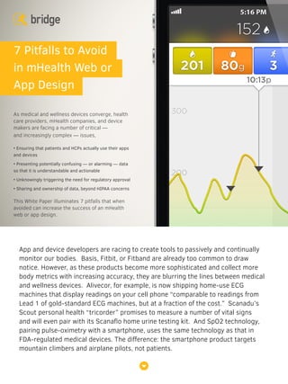
- 1. App and device developers are racing to create tools to passively and continually monitor our bodies. Basis, Fitbit, or Fitband are already too common to draw notice. However, as these products become more sophisticated and collect more body metrics with increasing accuracy, they are blurring the lines between medical and wellness devices. Alivecor, for example, is now shipping home-use ECG machines that display readings on your cell phone “comparable to readings from Lead 1 of gold-standard ECG machines, but at a fraction of the cost.” Scanadu’s Scout personal health “tricorder” promises to measure a number of vital signs and will even pair with its Scanaflo home urine testing kit. And SpO2 technology, pairing pulse-oximetry with a smartphone, uses the same technology as that in FDA-regulated medical devices. The difference: the smartphone product targets mountain climbers and airplane pilots, not patients. 7 Pitfalls to Avoid in mHealth Web or App Design As medical and wellness devices converge, health care providers, mHealth companies, and device makers are facing a number of critical — and increasingly complex — issues, • Ensuring that patients and HCPs actually use their apps and devices • Presenting potentially confusing — or alarming — data so that it is understandable and actionable • Unknowingly triggering the need for regulatory approval • Sharing and ownership of data, beyond HIPAA concerns This White Paper illuminates 7 pitfalls that when avoided can increase the success of an mHealth web or app design.
- 2. This convergence of medical and wellness devices means health care providers and mHealth companies now face issues that those in the medical device arena have been grappling with for some time. Strategizing how or if the product will be regulated by the FDA is one such issue. Data sharing is another, leading to complications around ownership and confidentiality of electronic record systems, not to mention access and workflow for an ever increasing variety of health professionals and institutions. And if one of the big promises of health-related devices and apps is that they’ll provide hugely valuable “big data,” then it’s all the more critical that people actually use those devices. Devices that throw too much data at users, presenting it in ways that are far from easy to understand, can ultimately dissuade or downright scare a user. If you are developing or customizing an mHealth application, or exploring your company’s digital strategy, savvy navigation of the 7 pitfalls outlined below can increase your odds of designing a more engaging, medically useful, and commercially successful mobile product. Perhaps this happened to you: ablaze with good intentions on New Year’s Day, you pulled out your shiny new sensor and hit the road for the first jog of a 5-days-a-week personal fitness program. Tracking your route and mileage was very satisfying — at least for a few weeks. But as time went on, an inner voice kept saying: “I know I should do this run, but I don’t want to…” Before long, a guilt-ridden mantra replaced it: “I don’t want to look at my records on the website because I know I’ve been bad!” Pitfall #1 Expecting Eager Adoption
- 3. Minus the initial enthusiasm, resistance to using a mobile monitoring device is very similar for those with chronic disease. Patients who must incorporate medical technology into their lives represent the most extreme example of a reluctant customer — someone who would rather never have to use your product in the first place. For example, someone with diabetes may know that a device to help dose mealtime insulin is critical for his or her health, but unlike a slick new cell phone, they’re not so eager to pull it out and show it off every time they sit down to a restaurant dinner. Routine and social implications can soon overshadow novelty — whether users have a chronic disease or not. And resistance can be compounded by the emotional wallop of getting bad news. “I’ve been doing everything right, but my weight, heart rate, and blood pressure are still just as bad as before!” When people don’t feel able to control important health measures, they often just don’t want to know. Increasing the odds of your product being used requires recognizing that human nature comes with innate obstacles to new habits and behaviors, especially health habits. Using the app becomes the first habit to encourage and support. To do that, it’s key to remove obstacles wherever possible. Aim for the most “passive” data upload approach, and certainly avoid docks and wires, software installation, and assembly. Think about “pushing” data intelligently, so that users receive it when and where it’s most likely to get attention and be useful. For example, instead of relying on users making time to sit down at a PC to review their data in a web app, what about sending pithy, actionable text messages when a user gets to the gym, the supermarket, or the doctor’s office? And since humans are notorious for not sticking to a program when results are incremental or far in the future, find ways to reward use in the short-term — without patronizing users. Be cautious about assuming “gamification” is the answer to turning anything from a chore to fun. Instead, determine whether and just what challenges and rewards truly keep your users engaged beyond any initial novelty. And always strive for the highest level of beauty and usability to make every interaction with the product pleasing and frustration-free. Patients who must incorporate medical technology into their lives represent the most extreme example of a reluctant customer — someone who would rather never have to use your product in the first place.
- 4. Healthcare professionals — still new to incorporating patient-provided data and other new data streams into their practices — may also represent “reluctant users,” as may family partners and other caregivers. If you want your data to be used by HCPs, be sure to think through who exactly will interact with the data — and how. Before even thinking about data content and presentation, you need to understand workflow and how that data will be delivered. Will receptionists or technicians pull data off devices or websites to bring to an HCP’s attention? Will the practice need to import your data into their medical record system? Are you asking HCPs to log onto the web to see data, or to install an application on their computer or smartphone or tablet, or to look directly at a patient’s device? Are you expecting a family caregiver and patient to share passwords? Do you need permissions and privacy settings? Start by understanding it inside and out, and be sure your design choices respect — and ideally improve — user workflow. Greater possibilities lie at the evolving frontier of integrating big data into healthcare systems. How will you help clinicians not only manage, but welcome, the potential flood of information coming their way? This may mean developing new workflows that fit comfortably into medical practices and clinician mindset. For example, data might potentially be sent or shared by patients during a visit or call. Or it might simply be available around-the-clock on demand to a physician via a website. Most radically, it might be flagged with decision-making software and pushed via email or text to a doctor’s attention when triggered (see pitfalls #6 and #7 below for related cautions). What works best may depend on the specifics of your product’s function and on rapidly changing protocols of the medical practices that you hope will use it. Decisions and implementation around these questions will have a significant impact on the design — and successful uptake — of your product. Before even thinking about data content and presentation, you need to understand workflow and how that data will be delivered.
- 5. Product designers and marketing teams get excited about features and options, but when it comes down to usability, more doesn’t always mean better. This holds true particularly in medical design, where usability can literally be a matter of life and death. For example, a pump programmed to deliver medication might kill a patient from a use error. Device makers must focus on designing to reduce confusion for safety. This may mean conscious, diligent editing: to limit and channel operator safety-related choices as much as possible; to provide extremely simple, single- decision screens at key points in the interface when choice is necessary; and to shift more complex tasks to areas where they can be accessed by advanced users as needed without impacting critical workflow. Achieving error-free simplicity means evaluating every single demand on a user’s attention. While the consequences may be milder, consumer software and devices must walk the same tightrope in selecting and culling their features if they want to succeed with users. More features means more to learn, more momentary choices, more settings, more places to get lost when users try to do the basics. In fact, any outgrowths of complex functionality are potential places to lose users who might otherwise have loved your core functionality. While it can be painful to edit out ideas that took a lot of effort to generate, examine every proposed feature to be sure it’s worth the complexity it adds — nothing comes completely free. Pitfall #2 Letting Feature Creep Engulf Usability Any outgrowths of complex functionality are potential places to lose users who might otherwise have loved your core functionality.
- 6. And even products that seem stupidly simple can be fantastically effective and successful. Think of the supremely minimal functionality of the Flip video camera; of the brevity and simplicity of Twitter; most recently, of the apparently absurd reductionism of the successful “Yo” app, which does nothing more than allow a user to send text that says “Yo” to a lucky recipient. Adding to the challenge of balancing usability and features, any consumer device aspiring to find a place in the professional healthcare environment will need to be designed with multiple user types in mind. This might mean the interface has to work for patients, nurses, or specialist doctors, all of whom may have widely different priorities. And the software must allow for identifying user types and accommodating each type’s workflow, without one user’s needs compromising another’s. Tailored user-type interactions might be accomplished via carefully structured interface organization, login types and permissions, selectable use modes, or customized individual setups. This preference handling also applies on a larger system setup level. Different physicians within one practice may need to individually customize how they analyze or view patient data whereas another practice may want to streamline clinicians’ software interactions by creating a fixed practice-wide setup. Don’t underestimate the importance of making this type of practice-level setup easy for the administrators — it is one of the first experiences a clinical user will have with your product. Of course, navigating the line between too much and too little functionality in your product is a balancing act. Your most enthusiastic, loyal users may well be the ones clamoring for the deepest functionality. Which leads us to the importance of avoiding Pitfall #3 …
- 7. Device designers often consult with their “stable” of KOLs, key opinion leaders who are viewed as expert clinicians in their field. While KOLs are great at advancing best practices, their background and the usually resource-rich environment in which they work may give them a perspective that does not represent your target market. The majority of clinicians often have less experience with various devices or tools; limited time to spend learning a product or teaching its use; less access to computers or tablets and lack of permission to install apps; or fewer patients who are comfortable with electronic tools. Similarly, “patient experts” who may be designers or engineers working on a product development team for a chronic disease from which they suffer pose the same risk: while they can prove fantastic contributors for an insider perspective on what it is like to live with a condition, they represent a rarefied type of user. Over-reliance on their input can lead to products with too many features and a complexity level that often does not work well for most users. Likewise, it’s not advisable to assume that a designer, engineer, project manager, entrepreneur, or expert consultant from the field represents the skills, mindset, or desires of your target market. For teams developing health and wellness tools — often in the startup environment — members may have a passion for staying fit and healthy. However, the market for those products could be people for whom fitness is less of a passion, and more a begrudged chore. Such target users may also be unfamiliar with concepts that are at the core of what the new app or device Those intimately familiar with the evolving design can’t be relied on to judge its usability. Pitfall #3 Relying on Too Many “Expert” Opinions Including Your Own
- 8. offers. They might need to be trained not just in how the product works, but in the very principles of health or exercise that it is trying to support. And finally, the immersion experience involved in designing a product can turn any team member into something of an expert — in both the field it is designed for, and in the specifics of operating that product. Those intimately familiar with the evolving design can’t be relied on to judge its usability. When you want users to evaluate your developing product, whether formally or informally, think through the range of demographics within your market and actively seek subjects who span those categories. This might mean selecting for varied education levels, age, years in practice for clinicians or years since diagnosis for a patient, experience with similar products, inner city vs. rural habitation. Key to remember: define target users up front, and then include them in the most comprehensive way possible in all testing to avoid building a product that simply doesn’t work for your real target market. For more than a decade, a large medical device company’s flagship infusion pump had been in widespread use. It was high time for a hardware and software redesign. The pumps were programmed individually by nurses for safe drug delivery to each patient, and the company envisioned a full redesign of the user interactions required to do this most common task. However, in fear of alienating an existing “expert” trained customer base, the device maker was reluctant to touch the numerous, less frequently used settings. Instead, they planned to leave that part of the UI in the old format, and let users switch back and forth between two significantly different modes. Pitfall #4 Assuming You Know Users And How They Will Behave
- 9. The UI designers approached the challenge by sharing simple prototypes with groups of hospital nurses very early in the redesign. The feedback including both the “split personality” concept and a full redesign. To the team’s surprise, users were ready to break completely from the old interface in favor of the new — despite the burden of having to relearn the pump. Once the company decided it no longer had to accommodate the legacy interface, a dramatically simpler and consistent UI could be created, allowing the new product to increase its market share. It’s risky for project teams to overestimate their ability to anticipate user interpretations or behaviors. Research efforts with real potential users reliably yield surprises, often ones that prove critical to the success of the project. Certainly, non-regulated devices, including apps, can allow for changes more easily late in the design process, or even once products are on the market. However, even for these kinds of products, getting it right out of the gate can smooth a product’s sometimes make-or-break market introduction — and save cost over the long term. It’s important not to confuse user testing and market research. Companies sometimes ask users to evaluate idealized descriptions and images of the products. That may be useful as a starting point to determine what’s worth further development, and how to position the product, but it doesn’t give you the “where the rubber meets the road” feedback that you really need to drive the right and usable features into your product. Instead, aim to take meaningfully differentiated alternatives out to users at key decision points during development, particularly early on during product definition and feature selection. First design concepts might take a very broad range of approaches and configurations, even including features you’re not sure you can build or that you think most users would dismiss. The goal: inspire conversations with users that bring out their needs and priorities. Once you are in the field, the cost of showing additional broad ideas at this stage is low, and the payoff in “eurekas” that guide your project can be high. It’s risky for project teams to overestimate their ability to anticipate user interpretations or behaviors. Research efforts with real potential users reliably yield surprises, often ones that prove critical to the success of the project.
- 10. Later in user testing, as you move forward with features, continue to test multiple, slowly narrowing ranges of concepts, and build in the real tradeoffs that design decisions entail. The idea is to give users something concrete to help them figure out what they really want and hence what you should deliver. For example, if a fashion-oriented interchangeable decorative cover makes a smartwatch thicker and heavier, make models people can put on and compare with and without it. If the screen can be customized with a photo, don’t just show the user how pretty it can look. Instead, give them an idea of the steps it will take to do it, even if it’s just with simple storyboards. The dialogue you are looking for is open and exploratory, yielding comparisons like: “Yes, that looks great, but it’s most important that it’s thin.” Or, “That’s so easy! I’d do it every day.” Probe for the “whys,” for the specifics that might help you get new ideas: “Which would you want to have at home? Carry daily? Take on your trips? Use in a restaurant? Why did you make a face when you saw this? Did it remind you of something? Show me again how you’d hold that if you had to put it on yourself.” And always look for what people do — not just what they say — as they actually interact with your prototype. Finally, be wary of relying too heavily on user “personas” to drive design decisions. Product design teams sometimes develop a set of fictional people representing expected user types, with their individual priorities, mindsets, abilities, and environments. Then they vet the design against those personas: “Shirley would find this feature much too complicated! She needs to just get the basics done and go!” Experienced medical product designers know all too well that these constructs are no substitute for testing with real users. As part of obtaining FDA clearance, they must prove usability and design out use errors. This means always going back out to users, not personas, to evaluate what is being created. Personas simply can’t replace committed, ongoing user-testing of features and their execution during a project; they are prone to reinforcing predetermined stereotypes held by the team generating them. Personas may serve as good reminders of who you want to please, but they can only, by definition, tell you what you already know.
- 11. Imagine a day in the likely near future when sensors in your clothing can keep tabs not just on your workout effort, but on the health of your various organs. This sensor gives you a 24/7 numerical data stream. On the web, you can view a bunch of detailed body- system reports. One day, you get a text alert about an impending heart attack. Your experience of the product might move through: “What am I supposed to do with so much information? Am I supposed to make sense of this chart? And if all this data is basically telling me I’ve got a good chance of dying soon, I don’t even want to see it!” Poor design around how data is delivered and presented to lay users could well drive them away. Typical data collected by a “smart device,” and portrayed in an app, might be a set of data points collecting body process measurements over time. Meticulous and thoughtful graphic design can make the difference between instant, intuitive comprehension and utter befuddlement when users confront data. Don’t underestimate the design and user testing effort it will take to create data reporting that users can make sense of, interact with, and draw conclusions from without a frustrating learning curve. Beyond the basics of data presentation, tools to help users make sense of their data might include flagging a trend or meaningful event, illustrating target ranges, showing progress indicators, using color-coded alerts, or even building in the ability to compare a user’s numbers to those of populations of users. These features can greatly increase the informative and communicative power of your product, but bear in mind that they might have significant regulatory consequences (as discussed below in pitfall #7). In the case of self-monitoring products that have the potential to deliver potentially jarring news, thoughtful presentation of data acknowledging emotions and behavior can be key to getting and keeping those users. This is another frontier in Pitfall #5 Stymying — Or Even Scaring — Users With Data
- 12. medical and biotech product design with as yet no clear solution. As a start, some companies such as genetic testing startup 23andMe, have turned to collaborating with genetic counselors to guide customers through their testing results. A further consideration in the design of data reporting is to what degree that data will be brought to users pro-actively, versus requiring them to seek it out. For example, should a monitoring app alert a user when a metric starts to be of concern? Should HCPs be alerted when a patient’s metrics veer out of target zones? These questions bring up contiguous concerns around privacy and ownership, which are explored further in Pitfall #6. Perhaps the biggest challenge in making a health and wellness tool truly welcomed by users is whether that product brings a user closer to actually changing behavior, or to receiving a medical intervention. Designers need to ask themselves questions like: “How can this app or device help a user take the information they receive from a graph, and then turn that graph around, towards better health?” This is where systems and tools beyond just the design of the device and data presentation may become the crucial components of a product’s — and its user’s — success. For example, a sensor might analyze data to make a home diagnosis, and the maker of that sensor might partner with clinics who can opt-in to receive texts or emails when patients are diagnosed by the device. A new health monitor might integrate with a targeted social network, bringing users who opt in together around various shared goals or conditions and allowing them to share problems, approaches, progress, and experiences. A device may need to talk to a user’s cloud-based aggregated healthcare data to start providing truly meaningful feedback, integrated with information from other sources. And perhaps the product itself is envisioned as a tool for habit change, using its sensor-gathered data about a user’s lifestyle to build targeted coaching right into the way it presents data. Meticulous and thoughtful graphic design can make the difference between instant, intuitive comprehension and utter befuddlement when users confront data.
- 13. Scanadu’ Scout promises to be “your doctor’s new best friend,” and suggests: “Dislike the long wait and out-of-date magazines at the doctor’s office? Now you can share data with your doctor from the comfort of your own home.” “Wellness” data, like the vital signs captured by the Scanadu product, is by nature personal, and essentially medical. As consumer devices offer an increasingly accurate and predictive window into your health, the data they collect is becoming more sensitive and more valuable to a number of potential parties, including health care institutions, insurers, and employers, among others. And as that information moves to networked computers, cell phones, and the cloud, app creators will need to up their efforts in exploring not only how to reap the benefits of all this data, but also how to manage design that takes into account the accompanying risks and concerns around sharing. Patient-generated health data is a potentially powerful tool for medicine. But how should this data be made available to a medical practice? Imagine an anomalous, worrying heart event captured by a patient-worn health monitor. Is this flagged for the patient? Is the information available to a doctor in the cloud? Is it sent to the If use of data by HCPs is part of a product’s value proposition, the app maker must explore its relationship with medical practices, and how HCPs really feel about getting this information and the responsibility that might come with it. Pitfall #6 Ignoring Complexities of Sharing, Privacy & Ownership
- 14. doctor, passively by the app, or actively by the patient? What are the implications if a doctor doesn’t look at it, and how is it handled if they do? How does potentially critical information from non-FDA approved device get treated by an HCP? If use of data by HCPs is part of a product’s value proposition, the app maker must explore its relationship with medical practices, and how HCPs really feel about getting this information and the responsibility that might come with it. Complicating matters further — and mirroring ownership of personal photos in the social media landscape — medical companies and eventually health and wellness companies will increasingly face issues about data ownership. They will also have to grapple with whether the data can be taken away from one party — device company, partnered web-app development company, or patient — by the other. Can it be shared indiscriminately with competitors or peers? What are the attendant medical, legal, and investment risks to the patient, the data service provider, the device company, and the medical practitioner? Many don’t think of a smartphone app intended for consumer use as a “medical device” — but the FDA might beg to differ. Their definition of a medical device is based simply on intended function, and risk. A flat wooden stick sold as a popsicle stick is not a medical device. The very same item sold to physicians as a tongue depressor is viewed as just such a device by the FDA, albeit a low-risk Class 1 device. One of the earliest tasks for any designer of a new health and wellness tool is determining whether a product will require FDA approval before going to market. The FDA offers guidelines that continue to evolve. At the same time, they stipulate that many products fall into a category labeled “enforcement discretion,” in which Pitfall #7 Drifting into Uncharted Regulatory Seas
- 15. the FDA will decide on a case-by-case basis whether and how the product needs to be regulated. Below are examples of products that might meet the “enforcement discretion” category: Products marketed to healthcare professionals to support clinical decision making or diagnosis: A heart rate monitor worn during exercise and marketed as helping users increase their fitness may not require regulation, while the same device marketed to physicians for use during stress testing in the clinic might be considered regulated. Products interpreting data or doing “more complex” calculation decisions around that data — as opposed to merely displaying raw data: An asthma app graphing daily peak flows over time is likely unregulated. A version that features data graphs indicating bronchial restriction with a color coded “call your doctor” panic button may require FDA clearance. Products “commercializing” existing treatment protocols: Diabetes educators have taught patients how to use standard formulas to calculate their insulin dose for decades. But an electronic insulin calculator using those same algorithms to determine doses is seen as commercializing the algorithm, and hence takes on risk requiring regulation. Products employing ever-more-sophisticated technology pushing closer to putting treatment and diagnosis directly in patients hands: A smartphone medication reminder app, or a post-heart-surgery biofeedback recovery tool might fall into enforcement discretion. As “medical grade” components become commodities, classification comes down to “what are you going to do with that sensor?” Products that leverage “big data”: How the FDA will evaluate products that leverage “big data” is a big unknown. Companies working on products in this area will have to navigate uncharted waters, collaborating with regulatory expertise and making regular FDA check-ins. Products that incorporate hardware and software: Systems incorporating hardware and software represent a knotty frontier in regulation. For example, a company that creates a regulated iPhone EKG app is considered the final “device manufacturer,” by the FDA. As such, it is held
- 16. responsible for verifying the safety of all of the device’s components. However, if the phone itself is a component, what responsibilities does the manufacturer have to ensure only proven configurations of smartphone hardware and software revision levels are used? Those developing an unregulated product should be proactive and determine whether certain features will trigger regulation. Plan your approach with the help of an mHealth-savvy regulatory expert, and contact the FDA early to verify. In the process of talking with the FDA, developers can shape how their product is positioned and classified. For example, if a product won’t be marketed to HCPs, make that clear. Specify that the product is not trying to replace an interaction with clinicians or affect treatment decisions. The FDA’s recent Medical Apps Roadshow offered the analogy of “tax planning vs. tax evasion”: conscientious alignment of your intended use and marketing message may remove the need for regulation. Strategizing of FDA approval for a regulated product is beyond the scope of this article, but once again, calling on savvy regulatory experts and contacting the FDA early is advised. As a starting outline for planning, make sure sure to get input from regulatory experts at key milestones throughout the project. Those should include: Determination of submission type Development of risk analysis — and hence your mitigation strategy Rounds of formative and later final summative testing (per requirements of HE75) Maintenance of ongoing documentation of the design process, which will be part of any FDA submission Development of a quality system for production For companies used to making purely non-medical consumer products, it’s easy to underestimate the design and strategic challenges involved in creating new mobile health apps or systems. Given goals of reducing healthcare costs, improving ongoing user wellness, and fitting into a complex continuum of care, even a well- defined product will likely kick up plentiful, meaty design problems for which there aren’t yet guiding precedents. Build time and flexibility into the project plan, allowing an interdisciplinary team to iterate, test, and evolve the design as understanding grows. We have yet to see any project turn out to be easier than expected.
- 17. Contact Us 375 Alabama St, Suite 410 San Francisco, CA 94110 bridgedesign.com 415-487-7100 mhealthinfo@bridgedesign.com Medical & Life Sciences Design Bridge Design is a full-service product development firm focused exclusively on medical and life science products — physical and digital. Our clients include some of the world’s leading companies, from Fortune 500 to startups. Having taken numerous products to market over the past two decades, we’ve learned through experience what pitfalls to avoid, so we’ll raise our hand if we see a better way of doing things. We’ve built our reputation mostly on repeat business, and our clients rely on us to help them navigate difficult challenges and often conflicting needs.