SlideShare una empresa de Scribd logo
1 de 113
Descargar para leer sin conexión
WORKS FROM THE STUDIO
1959 - 2006
ROBERTBALLAGHWorksfromtheStudio1959-2006
GORRY GALLERY
20 Molesworth Street, Dublin 2
Tel/Fax 01 6795319
www.gorrygallery.ie
GORRY GALLERY
ROBERT BALLAGH
ROBERT BALLAGH
WORKS FROM THE STUDIO
1959-2006
THE GORRY GALLERY
in Association with
DAMIEN MATTHEWS FINE ART
Presents
ROBERT BALLAGH
Works from the Studio
1959 - 2006
at
The Gorry Gallery
20 Molesworth Street Dublin 2
Tel/Fax: 01 6795319
www.gorrygallery.ie
20 September - 5 October 2006
DAMIEN MATTHEWS FINE ART
14 Brechin Place, London, SW7 4QA
UK 00 44 207 373 9337
IRL 00 353 86 841 4421
matthewsfineart@aol.com
4
DAMIEN MATTHEWS FINE ART
14 Brechin Place
London
SW7 4QA
Telephone 00 44 207 373 9337
00 353 86 841 4421
Email matthewsfineart@aol.com
THE GORRY GALLERY
20 Molesworth Street
Dublin 2
Tel/Fax 00 353 1 6795319
Web www.gorrygallery.ie
All rights reserved. No part of this publication may be used or reproduced
in any form whatsoever without prior written permission from the publisher.
Copyright © 2006 Damien Matthews Fine Art Publications.
All artwork by Robert Ballagh. Copyright © Robert Ballagh 2006.
Designed and produced by Damien Matthews Fine Art Publications.
5
Contents
Foreword
James & Thérèse Gorry and Damien Matthews page 6
Overview
Philip Vann page 9
Catalogue
Part I page 25
Conversation
Karim White page 62
Catalogue
Part II page 76
Chronology of Paintings page 107
6
Foreword
It may be argued that artists have an obligation to observe and chronicle the world
they live in, which, in Robert Ballagh’s case, is predominantly that of urban Ireland –
although there are, increasingly, radical rural allusions in his work.
Throughout his career, his work has movingly and ingeniously reflected many facets of
modern Ireland, its politics, culture, history and potential future developments. His art is
marked throughout by an unerringly fresh and often innovative exploration of ideas and
concepts, however controversial they may be. Ballagh is a pioneer in this regard.
This exhibition of work from his studio - ranging from 1959 to 2006, and encompassing
photographs, preliminary studies and finished pieces in an ambitious range of media –
bears witness to his spirit of free and fearless philosophical enquiry, and gives an intimate
insight into his distinctive political psyche and unique artistic development.
We are delighted to have this opportunity to stage this exhibition and trust it will
complement his Retrospective at the Royal Hibernian Academy.
James and Thérèse Gorry & Damien Matthews.
‘You hope your paintings will transcend their
time but they must be of their time as well.’
These words of Robert Ballagh indicate the particular and
elemental nature of his gift. His largely self-taught art, made
over the last forty years, comes out of an essentially urbane
sensibility, rooted in his own immediate perceptions of the
world, mediated always by a keen sceptical intelligence.
Thus his artistic meditations on diverse subjects are
characterised by an eternally open mind, radically playful
wit and manifold allusions subtly made by a highly cultured
man, well-versed in the history of art and especially in Irish
history, politics, art and literature. His work is free from
mystifying dogma, trend-setting ego or fear of ruffling
critical feathers.
Ballagh has never felt hemmed in by pursuing a singular
artistic line; he feels free to experiment widely, so that his
work has encompassed apparent extremes of Pop Art,
stamp and banknote design, theatrical stage-sets and incisive
portraiture. He says, ‘You look at the master of the 20th
century, Picasso. He did so many different things, had so
many styles and approaches. That seems to me the way, the
model.’ Yet a coherent approach to composition-making
unites Ballagh’s approach to different genres. Increasingly,
over the years he has found that he belongs unashamedly to
a rich, longstanding western figurative tradition -
encompassing Van Eyck and Edward Hopper, Carlo Crivelli
and Stanley Spencer - that even post-Modernism cannot
dispel. Above all, there appears to be a lucid self-assurance
and palpable humaneness at the root of his work - the non-
melodramatic yet sure mark of a man and artist who has
always trusted to his own intuitions ultimately to find his
own way, personally, politically and artistically.
His route to becoming an artist seems, in retrospect, quite
circuitous yet it also contains a distinctive, ineluctable logic
of its own. Born in Dublin in 1943, his parents - his mother
from a southern Catholic family, with an affluent farming
background, his father a Presbyterian who converted to his
wife’s religion - were warmly supportive of their only child
yet, as Ballagh says, ‘my mother was a very respectable
woman who thought art was not a serious profession. But
there was also a personal tragedy in the family, in that I had
a cousin who was a very good artist, who committed suicide.
So it absolutely confirmed that this was not the profession
for her son.’ As a teenager at school, he painted oils of such
archetypal subjects as Maternity and The Blessing (both
1959) both of which, heavily impastoed (unlike his later
work), show the
influence of Giacometti
and Louis le Brocquy,
whose works he had seen
in reproduction. Earlier
in that same year he
painted a shadowed, wry
Self-Portrait, precocious
in its suave use of line,
light and shade and its
ambiguous attitude,
partly sullen, partly
challenging.
He went on to study architecture for three years at the
College of Technology in Dublin. But this wasn’t a second-
best compromise. ‘I was very fortunate that my tutor was
Robin Walker, who had worked with Le Corbusier in Paris
and Mies van der Rohe in Chicago. He’d come back recently
from Chicago full of belief in modern architecture, and to
be taught by someone with that kind of passion was
fantastic.’ Ballagh imbibed there what has been called a
‘Miesian precision’, which he has carried through his
cultural life. And today, he makes an architectural analogy
when talking about creating pictures: ‘I generally make very
few changes once I’ve worked out the picture. Sometimes
you have to but generally the house is built according to the
blueprints. More spontaneous artists do that while they’re
working on a picture. But for me, that’s all done before I
start working. It’s all planned and worked out and developed
from there.’ In fact, in his close friendship with the Irish
artist Micheal Farrell, it became an in-joke between them
that ‘he used consistently to criticise me as “too fussy, too
detailed, taking too long, not spontaneous, etc.”’
Robert Ballagh: An Overview
Self-Portrait (1959)
9
At College, his inventiveness - ‘designing buildings that were
outlandish’ - got him into repeated rows with some of his
tutors, and he realised that it would be many ‘years before I
got to create beautiful buildings - if ever!’ So what he calls
‘an easy choice’ was made - he jettisoned architecture to play
bass guitar in a professional showband, which toured the
avid market of rural Irish village dance halls. Lucrative and
exciting at first, after three years or so this became tedious.
So he gave it up, spent time in London, and then worked in
Dublin for a time as an engineering draughtsman and a
postman. He acquired a useful ‘art education on the hoof’
by doing what he calls some ‘crass commercial work, like
labels for supermarkets, where you inevitably pick up skills,
learning about typography and layout, for example.’
Two meetings
occurred which
changed his life
essentially. He had
met sixteen-year-old
Betty Carabini at a
beat club, and in
1967 they were
married, with Micheal
Farrell as best man. It
was shortly before this
that Farrell had
returned from a stay
in New York. Ballagh
had been introduced
to Farrell in a Dublin pub; the latter was looking for an
assistant to help him complete two large-scale paintings
commissioned for the Bank of Ireland on College Green.
A conversation along these lines ensued:
Farrell: ‘I hear you’re interested in art. Can you draw a
straight line?’
Ballagh: ‘I think I could manage that.’
Farrell: ‘Well, you’ve got a job for £5 a week and all the
drink you can take.’
Ballagh gained a good deal from the experience, working for
two or three months with Farrell on monumental, hard-
edged abstract canvases in the relatively new acrylic medium.
There followed a grounding period when Ballagh sought to
develop and hone his incipient artistic skills. The Package
Series (1967) explores what the American critic Clement
Greenberg (whom Ballagh was reading at the time) had
called the ‘literal flatness’ asserting ‘itself as the main event
of the picture’.
Using some of
the techniques
learned from
Farrell, such as
the use of
masking tape to
delineate areas
of flat colour,
Ballagh painted
the abstracted forms of a flattened out matchbox, and to his
surprise found that the starkly elegant results ‘looked not
unlike those of Gerald Murphy, an American proto-Pop
artist from the 1920s and 30s.’
The following year, Ballagh embarked on his Map Series, in
which map shapes - actually based on freeform ink blots but
elusively evocative of individual yet nameless international
territories - were set on grids against oceanic blue
backgrounds. He now sees these works as ‘an excuse formally
to experiment with acrylic paints, and using some day-glow
paints which were very mad altogether.’ The works made a
subtle political point too - that ‘sometimes divisions on
maps are absolutely arbitrary, man-made by the forces of
Empire’ and other reactionary forces.
However, politics
come vividly into the
foreground in his next
series portraying
marchers, refugees,
burning Vietnamese
monks and Latin
American firing
squads - yet these
works retain a
universal meaning
with their subtlety of approach far transcending any didactic
or propagandist agenda. The contemporary, rapidly
developing Troubles in Northern Ireland, the Civil Rights
Movements there and in the United States, as well as the
incessantly televised, agonised unfolding of the Vietnam War
10
Robert Ballagh with Micheal
Farrell, wedding morning (1967)
Match Box (1967)
Series 4 No. 3 Marchers (1969)
all were part of the impetus behind these imposing works
whose forms movingly yet coolly abstract the newsprint-
photo forms of protesters and victims of war and civil strife.
‘A terrible beauty is born’ indeed out of these abstracted
snapshots of life in the media-snatched front line.
The garish, rather sickly sweetness of the modernising Irish
economy, with its burgeoning consumer culture, that had
emerged in the 1960s is the subject of a series of paintings
made in 1971. The trite empty-headedness of a society
aiming for purely materialistic ends is hinted at in portrayals
of iced cakes and dolly mixtures set with deliberate,
discomforting vapidness against collaged, kitsch materials
redolent, for example, of fake leopard skin.
‘It is impossible, thirty years later, to appreciate the impact
of this first major onslaught of international art on an
unsuspecting Irish public’, the critic Dorothy Walker wrote
in 1997. She was referring to the first two ground-breaking
ROSC exhibitions that took place in Dublin in 1967 and
1971. These showed the most famous living artists from
around the world - including Picasso, Bacon, Barnett
Newman, Rothko, Tapies and some of the younger
American Pop artists like Rauschenberg, Lichtenstein and
Jim Dine - though modern Irish art was excluded. Seeing
work by the American Pop artists in particular confirmed to
Ballagh that he was on the right track, having quite
independently come to many similar artistic conclusions.
In an article (published in The Dubliner, November 2004),
Ballagh recalls the 1967 ROSC exhibition, ‘washed up on
Irish shores… the fields of bright acrylic primary colours,
the razor sharp outlines and the hopelessly ironic comic
book content all overwhelmed me.’ He found ‘gaining access
to the modern art scene [in Ireland] was not difficult’, and
‘within a relatively short period I became Ireland’s best-
known Pop artist. To be frank, I was probably Ireland’s only
Pop artist.’ Yet even at such an early stage in his career,
Ballagh could not help contemplating the potential impasse
of much contemporary avant-garde art. ‘When I looked at
the work of, say, Roy Lichtenstein, an incredibly intelligent
artist, I couldn’t help speculating that his chosen technique
would inevitably restrict his full development, and sadly,
such has been the case. Lichtenstein remained trapped in a
prison of Ben Day dots for the rest of his life, and let’s face
it, he is not unique. Many other modern artists have
suffered the same stylistic incarceration.’
In the late 1960s, Ballagh’s attention was drawn in two
apparently disparate directions - researching and
contemplating great classical artists, and watching the state
of national emergency unfolding in Northern Ireland as
Civil Rights marchers were attacked by the B-Special police.
Actually, there was no divergence at all in these two aspects,
as Ballagh went on make a series of innovative paintings
based on Goya’s The Third of May, David’s The Rape of the
Sabines and Delacroix’s Liberty at the Barricades. Just as
these late 18th and 19th masterpieces convey thoughtful yet
viscerally charged responses to contemporaneous political
repression, so Ballagh’s Pop Art adaptations - with a stinging
succinctness of their own, as in his juxtaposition of a
simplified version of Delacroix’s painting with a glimpse of
a current Irish newspaper headline reporting events
‘(RIOTS) IN DERRY’ - reflect his own response to events
of his own time.
In his 1986 book, Robert Ballagh, Ciaran Carty has written:
‘Seamus Heaney made a similar connection in terms of
poetry. In August 1969 he saw the Goya painting The Third
of May at the Prado in Madrid. That night he turned on the
TV in his hotel room to see the B-Specials rampaging up the
Catholic Falls Road. For a while he toyed with
counterpointing the two images of violence in a poem.
Some months later he came across Ballagh’s painting… He
thought it intriguing that two Irish artists in two different
disciplines had thought of using the same Spanish image of
oppression in exactly the same association.’ Carty quotes
Ballagh’s comment: ‘Seamus understood very early on what
my painting was about - that it wasn’t just a classical
pastiche.’
The question of how artists could respond to the
increasingly violent situation became an urgent one. Louis
le Brocquy painted semi-occluded images where anguished
faces are helplessly shielded behind outstretched hands with
plaintive palms. Oisín Kelly made a cast aluminium
sculpture in 1969 of poignantly vulnerable rows of nearly
faceless Marchers. The artist Brian O’Doherty made a public
performance in which he changed his name by deed poll to
Patrick Ireland (all his subsequent artwork, though not his
11
art criticism, being made under that name) ‘until such time
as the British military presence is removed from Northern
Ireland and all citizens are granted their civil rights’. Micheal
Farrell has spoken of the changed direction of his work as a
consequence of events in Northern Ireland: ‘In 1969, the
Bogside in Derry was ablaze. I made a speech at the opening
of the Living Art exhibition in Cork when I was accepting
my prize-money, but those assembled did not think much of
it. I believed that we could not stand by and let the series of
events unfold. The only ones who supported me were Leo
Smith, my art dealer, and Robert Ballagh. I donated the
prize-money as part of the artists’ fund for refugees who
were streaming across the border.’
The traumatic events of January 30 1972, known as Bloody
Sunday, when British soldiers opened fire indiscriminately
on peaceful demonstrators in the Bogside, Derry, killing
thirteen and wounding others, were the spur for Ballagh’s
installation at the Irish Exhibition of Living Art in Dublin
later that year. He chalked out the rough outline of thirteen
figures on the gallery floor, pouring animal blood onto
them. This commemoration of victims of the Bloody
Sunday atrocities was made as a response to the ‘self-
protective apathy’ that, ‘after the initial shock and
indignation, many citizens of the Republic of Ireland [felt].’
Now preserved only in the form of a photomontage of nine
panels, this ephemeral artwork still has a raw power to
disquiet and move.
Ballagh’s 1973 painting of the so-called Winchester Eight -
IRA members on trial in England - is seen by the artist ‘on
one level as simply an early attempt to use oil paint’,
reproducing the sepia tones of police file photos of the
group. But on another level, the effect is sinister and
surreally mundane in the way its attenuated palette, pitifully
economical portrayals and mournful mugshot solemnity
help implicitly conjure up something of the sufferings and
violence of the period.
In 1972 Ballagh began an extensive series of pictures
depicting people observed looking at paintings by artists
such as Mondrian, Warhol, Stella, Jasper Johns, Barnett
Newman, Pollock, Motherwell, Soulages and, from Ireland,
Farrell and Cecil King. A vast polyptych canvas (1972) of
back views of simplified gallery-going figures - often based
on his own photos of standing and crouching spectators -
peering at modern masterpieces on the museum wall was
purchased for the Bank of Ireland Collection. His exhibition
of these paintings at the prestigious David Hendriks Gallery
in Dublin in 1972 was a sell-out. A series of successful
selling exhibitions followed abroad, based on similar themes.
(He showed with Hendriks for fifteen years, and later
recalled that ‘in the often fractious world of Irish art’
Hendriks offered him ‘generosity, support and
encouragement during the difficult beginnings of a career in
the arts.’) A 1977 painting, The Conversation, interposes the
sunglasses-wearing Ballagh into a Vermeer-like domestic
interior, where he appears to ruminate on advice from an
admonitory Old Master. This speculatively humourous
example of cultural time travel shows how increasingly
Ballagh was going beyond Modernist and contemporary
influences to contemplate examples of earlier, classical
western art - the antithesis perhaps of the instantaneous
modern approach. He says, ‘As my career developed, I found
myself wandering into the National Gallery rather than the
Tate Gallery.’
In 1973, he painted a picture Inside No. 3, set in his inner-
city Dublin family home. ‘The nude is such a predominant
theme for western painting, I just said I had to have a crack
at this. The only model I had was my wife.’ His wife is
seen nude, descending a spiral staircase - a reference to
Duchamps’ seminal image, and there is a Pop Art reprise of
Delacroix’s Liberty over the fireplace. Ballagh had in mind
12
Derry January 30, 1972 (Part View)
Two People and a Michael Farrell, 1972
here questioning what John Berger in his influential 1972
book Ways of Seeing had characterised as, traditionally in
western art, the proprietorial glance of the male spectator
towards the female nude. In Ballagh’s picture, all we see of
the artist himself are his trouser bottoms and white shoes as
he lounges on a chair or sofa. His wife’s face is averted from
him towards either the implicitly feminist image of a
resurgent Liberty or to Ballagh’s own face in black-and-white
grinning on the far corner TV screen.
Having painted his wife, Ballagh realised that ‘so as not to
be a male chauvinist pig, I had to do a male nude. If I did
my wife as the female nude, I didn’t have much choice.’ So
in the companion Upstairs Inside No. 3, the artist (wearing
only a white tee-shirt and white socks) gazes directly at the
spectator, and somewhat obliquely at his wife. Though he
initially found portraying himself so ‘a bit tricky and
embarrassing’, it is in fact a dignified self-image, wittily
subverting any notion of the ‘superior’ male gaze. Two
further artistic images within the painting - one of Gustave
Caillebotte’s famous 1877 painting of a Parisian street scene
in the rain, another of a Japanese erotic print which his wife
is perusing - are characteristically allusive. From the early
1970s onwards, Ballagh found himself increasingly admiring
and being inspired by the realist tradition in western art -
ranging from the gorgeous scrutiny of humanity and the
natural world in early Renaissance altar pieces by Carlo
Crivelli through the acute seeing of Vermeer and what he
has called ‘the meticulous precision of Jan van Eyck’ and
other 15th century Flemish painters to the photographically-
inspired realism of Caillebotte and the unnervingly honest
acerbity of German Neue Sachlikeit art - and, in this context,
the Caillebotte representation here is telling.
In mid-70s Catholic Ireland, this painting of himself semi-
clothed caused mild controversies. What Ballagh himself
found ‘hugely ironic’ was the way that, by way of contrast,
not one single person remarked on ‘the fiercely rude
Japanese print’ - with its dramatically heightened sexual
encounter explicit on the pages which his wife is
contemplating.
Through the open window in this painting, with its view of
the King’s Inns, the splendid 18th century headquarters of
Dublin’s barristers, we see a helicopter hovering. For Ballagh
at the time, this vehicle was emblematic of a more and more
militarised world, one intruding inescapably into the state of
domestic happiness. This proved to be a somewhat ominous
portrayal too, since, as Ballagh notes, a few years later the
skies around his home - located near the Special Criminal
Courts, which were used for non-jury trials of political
prisoners - were buzzing with helicopters whenever there was
a trial.
Another painting entitled Inside No. 3 after Modernisation
intermingles a plethora of artistic styles - Realism, Pop, even
Abstract Expressionism - to make a cuttingly amusing
comment on a contemporary post-Modernist tendency that
encourages artists to be uninihibitedly stylistically liberal
and, perhaps, as a result, unfocussed.
Dublin, where Ballagh was born and has always lived, is the
setting of much of his art and a perennial pleasure and
preoccupation. James Joyce’s own words preface Ballagh’s
1981 book, Dublin, which chronicles the artist’s
photographic views, taken over a year with a rather
cumbersome Roliflex camera. Joyce wrote, ‘For myself, I
always write about Dublin, because if I can get to the heart
of Dublin I can get to the
heart of all the cities of the
world. In the particular is
contained the universal.’
Ballagh says, ‘In a city like
Dublin, you have steps that
are just worn from the
passage of people over the
centuries. I like the patina of
human existence.’ He
deliberately didn’t photograph
places like Trinity College,
‘because they’re in all the
books. I photographed places
that many Dubliners don’t
know but that I love. So it’s a
highly personalised view.
‘Joyce said that if Dublin was knocked down, they could
rebuild it from his books, since he mentions so many places
and streets. But he would not recognise it now. I grew up in
Joyce’s city but my children grew up in a completely
13
Solitary Figure, Dublin
Tenement (1980)
different one. The Georgian squares are still there but the
little, daily things that Joyce wrote about, the pork shop
where Leopold Bloom in Ulysses got his kidneys - gone!’
Ballagh’s photographed Dublin, largely unpeopled (except
for a few rowers on the Liffey), is counterpointed in his
1981 book with brief quotations from Joyce, juxtaposing,
for instance, a view of a terraced house façade, with its net
curtains and potted plant in the window, with a kind of
Hibernian haiku from Ulysses: ‘an old woman peeping. Nose
whiteflattened against the pane.’ Similarly a view of
weathered gravestones in Mount Jerome cemetery under
hauntingly bare trees is paired with these lyrically
apocalyptic lines from Ulysses: ‘How many. All these here
once walked around Dublin. Faithful departed. As you are
now so once were we.’
Dublin now appears, in retrospect, a poignant, elegaic record
of a poorer, more distressed yet surely more characterful city
than the one it has developed into during the economic
boom that has accelerated in recent years, fruits of the so-
called ‘Celtic Tiger’ economy. We see here remnants of the
superbly crafted 18th and 19th century granite paving
which has largely now been torn up in favour of the
‘mundane concrete slab’. We see a doorway covered in
corrugated iron, part of a house façade otherwise open to
the elements. Ballagh’s text reads: ‘Behind this door and to
the back was once the bedroom of Molly Bloom. This
house, celebrated in literature, has fallen the victim… of
planner’s blight and civic indifference.’ Six similar
photographs, in antique-looking photogravure form, have
been used most effectively to illustrate a 1986 limited
edition publication of Joyce’s Dubliners.
Ballagh’s perspective on Dublin reverberates with myriad
historical nuances and personal allusions. A stark
photograph of boarded-up shops, curiously white-washed all
over, is accompanied with the comment: ‘These two facades
were painted for the papal visit of 1979. All the vacant…
shops looked so shabby that it was decided to brighten them
up. Ironically it was to no purpose as the Pope’s tour failed
to keep to schedule and passed by in the dark!’
In a 1988 painting, In the Heart of the Hibernian Metropolis,
an ingenious yet philosophically credible sepia illusion is
created: the figure of Ballagh, in checked shirt, jeans and
glasses, is seen accompanying Joyce himself on a stroll down
O’Connell Street some day early last century. In fact, the
original source photograph of what was then (before Irish
Independence) known as Sackville Street was taken in 1904,
the year in which Ulysses is set. A print, James Joyce on
O’Connell Street, has been made by adapting the 1988
painting, and using some oil paint, to evoke the apparition
of the writer apparently stepping out of the street itself, out
of history, beyond the picture frame, to confront us now.
A self-portrait of Ballagh with his wife Betty and their two
young children outside their home at Temple Cottages in
Dublin, is scrupulously observant in quotidian details of
contemporary clothing and yellow, parked family car. It is an
acute period piece, with a subversively sardonic comic note
introduced by the publication that the artist is so immersed
in that it covers his face. This aspect was based on a
reference photograph of the artist in the same posture
outside his house, his nose buried in the same American
book, with (what is for the serious artist) its comically
pathetic title How to Make Your Art Commercial.
Ballagh’s reading of recent Irish history informs much of his
work. The History Lesson, a 1989 triangular-shaped painting,
with a brownish palette redolent of a newspaper archival
print, shows the artist in informal checked shirt and glasses,
portrayed with two heads, each moving with swift alertness
towards the nobly static figures of James Connolly and
Patrick Pearse, who are seated either side of a table under an
interrogative overhanging light. Ballagh says that he is
fascinated by the fact that the political rebellion of 1916 was
‘led by poets, actors, writers, musicians, social reformers,
Irish language activists - a truly remarkable gathering of
people who wanted to break with England and create an
independent Ireland.’ The painting was partly created in
response to an extreme climate of censorship and historical
re-writing that had grown up in Ireland in the 1970s and
80s when, under the shadow of paramilitary violence in
Northern Ireland, rebels such as Connolly and Pearse were
often dismissed as dangerous subversives, possibly terrorists -
an attitude that is no longer widespread since the end of
the Troubles.
14
Frequently Ballagh is described as a photo-realist painter.
The limitations of such a label are shown by pictures like
The History Lesson, which keenly demonstrates the
thoughtful playfulness with which the artist selects and
transfigures his original source material. In some respects,
Ballagh would be better described as at times a photo-
surrealist. His deep appreciation of Magritte’s art - itself
delineated with such precise clarity and so rich in visual
puns, humourous pastiche and literary and cinematic
references, yet retaining an ultimate degree of enigma - is
relevant here. When visiting Brussels in the early 1970s for
his show there, Ballagh was initially disappointed not to
encounter any Magrittes in public galleries. By chance, he
was invited back to a private home - that of Louis
Scutinaire, a close friend of Magritte’s - where he was
delighted and felt privileged to see dozens of paintings by
the artist.
In 1980, Ballagh was commissioned to portray Charles
Haughey at the podium receiving the acclaim of the Fianna
Fáil ard Fheis, following the leader’s political resurrection
after many displaced years. The picture’s title is C.J.
Haughey, The Decade of Endeavour. In his 1997 book, An
Intelligent Person’s Guide to Modern Ireland, John Waters
opined, ‘Haughey became the most controversial figure in
Irish politics for the past quarter-century because he alone
on the Irish political landscape attempted to straddle the gap
between Modern
Ireland and its
rather eccentric
ideas about its
own past.’ Ballagh
succeeds in
portraying
Haughey with
dispassion, alert
though to the
politician’s self-
projected charismatic presence (accentuated rather
disconcertingly by a giant, piercing backdrop photo of the
politician) and tenacity. The theatrical, somewhat synthetic
paraphernelia of the political party machine is brilliantly
evoked through a highly pared-down version of applauding
audience, press (just one flash camera) and the waving of a
single Irish flag and handfuls of electioneering material.
Not only James Joyce but many other Irish writers have been
portrayed by Ballagh. These include Laurence Sterne, Joseph
Sheridan Le Fanu, Oscar Wilde, Flann O’Brien, Samuel
Beckett, Brendan Behan, James Plunkett and Brian Friel.
Passages too from Irish novels, plays and poems have
inspired many pictures. A 1990 publication, Robert Ballagh
on Stage (Project Arts Centre, 1990) chronicles five
acclaimed theatre set designs made by Ballagh between
1985-9; these include sets for plays by Wilde, Joyce and
Beckett.
In the mid 1970s, Ballagh read The Life and Opinions of
Tristram Shandy Gentleman, the novel by Laurence Sterne
written some two hundred years earlier. He was delighted by
Sterne’s meticulous observations and typographical
experiments, his subversive parodies of conventional linear
narrative, his uproariously solemn footnotes and digressions,
his supple scepticism, his ‘quirky genius’. Ballagh says that
though some critics dismiss the importance of Sterne’s Irish
background (he was born in Clonmel, and spent his early
years travelling between Ireland and school in England,
settling there as a young man) in terms of his literary
achievement, he believes that ‘Sterne sets the pace for a good
deal of the Irish sensibility in literature’ - in Joyce, for
example, but more obviously in the mid-20th century novels
of Flann O’Brien.
An early portrait of
Sterne by Ballagh,
based on the famous
Joshua Reynolds
portrait of the writer
in the National
Portrait Gallery in
London, is presented
as materialising out of
a brushstroke on the
canvas (the brush
itself depicted too) -
this technique being a
jokey allusion to the
animated brushwork device sometimes used by Walt Disney.
In 1975, he painted an extensive canvas (36 x 5 ft) in oil
and acrylic, illustrating details from Tristram Shandy in a
form recalling the Hollywood film format of pages in a book
15
Study for Charles J. Haughey
Portrait (1980)
Study for Tristram Shandy (1975)
flipping away to denote the passage of time. Tristram
Shandy himself has become a faceless adult male figure in
20th century suit-and-tie. In one episode, Ballagh portrays
Shandy at an open window (alluding to Sterne’s ruminations
on windows to the human soul residing in each human
breast), his disillusioned countenance appearing surreally as
a warping clockface. This is a reference to the novel’s
opening, when the author laments his life of misfortune
arising from the fact that his mother delayed his moment of
conception by asking if his father had wound up the clock.
In 1977, Ballagh made a series of paintings and a silkscreen
print based on Flann O’Brien’s The Third Policeman (which
the author’s own publishers had declined on submission in
1940; it was published posthumously to critical acclaim in
1967). The novel’s hilarious inventiveness and subtle
admixture of straightforward observation (as a deadpan
murder mystery), fantastically pedantic logic (especially in
the endless footnotes, somewhat reminiscent of Sterne) and
absurd fantasy, its chilling preoccupation with eternal
human guilt (elsewhere the author wrote, ‘Hell goes round
and round… it is interminable, repetitive and very nearly
unbearable’), inspired six paintings. One of these, The
Atomic Theory - a delightfully uncomfortable painting in all
respects - showing naked buttocks resting on a saddle-bar,
evokes the unrequited love affair between the novel’s
protagonist and his bicycle (clearly marked here as a Brooks
model) - ‘Her saddle seemed to spread invitingly into the
most enchanting of all seats…’ The Atomic Theory itself
refers to ‘the queer behaviour of bicycles in these parts’ -
‘when a man let things go far… he is half or more than half
a bicycle.’
Ballagh’s impeccably rendered 1990 portrait of Oscar Wilde,
the thinner, greying Wilde of later years, is dominated by
variegated, quietly modulated blue tones - permeating the
writer’s modest, no longer dandified clothes and the
swirling, leafy ornamentation of the high-aesthetic wallpaper
backdrop. This colour scheme alludes to Wilde’s love of this
colour - as, for example, when his rooms as an Oxford
undergraduate were filled with blue-and-white china - but
does not convey here the exuberant, questing, sparkling wit
of his worldly career but rather an air of sad yearning and
loss. This air perhaps retains, however, something of the
paradoxical sting of such earlier Wildean aphorisms as ‘Life
is a mauvais quart d’heure made up of exquisite moments’
(from A Woman of No Importance). His face, beautifully in
profile, is wanly abstracted, one clearly marked by suffering
and self-knowledge. Brian O’Doherty has written of the
‘William Morris wallpaper design which frames his head in
an eccentric halo (his halo has slipped).’
Ballagh designed the stage sets for the 1987 production of
Wilde’s The Importance of Being Earnest and the 1988
production of his Salome, both for Dublin’s Gate Theatre.
He never sought to become a theatrical stage designer; rather
the theatre world sought him out. He has written, ‘If there
has been a guiding principle in my approach to stage design
it has been my total belief in the primacy of both the text
and the performance and, as a consequence, an acceptance
that the setting should be both supportive yet, on the other
hand, subordinate. When I was studying architecture way
back in the 60s, I remember hearing Mies van der Rohe’s
famous dictum, “less is more”, it seems to me that this is
just as valid today.’
Initially Stephen Berkoff, Salome’s director, said (as the Gate
Theatre director Michael Colgan has recorded) that ‘he
didn’t want a designer… all he wanted was a black box.’
Ballagh says ‘Berkoff created a striking opening tableau, a
Last Supper-type scene with Herod and the court, which
wasn’t in the original play. He required a very cool palatial
setting.’ The final design, with a table upstage, has an epic
yet simple formality - backed by a massive skyscape
backcloth, based on details from a painting by Caspar
David Friedrich.
In his 1981 book of Dublin photographs, Ballagh wrote, ‘If
asked to pick out a favourite building in Dublin, without
16
Stage Design - Salome (1989)
hesitation I would nominate the Broadstone Station,
designed by John Skipton Mulvany.’ The façade of this
sublime building built in 1850 as one of Dublin’s four rail
termini, became a source of inspiration for the austerely
architectonic form that made up the stage-set of The
Importance of Being Earnest, itself overlooked by a gigantic
reproduction of a painting of Queen Victoria (in an earlier
model, Ballagh had proposed a huge copy of the famous
photograph of those star-crossed lovers, Oscar and Bosie).
Since the drama was acted in modern dress, the looming
regal image reinforced the audience’s awareness of the tragic-
comic hypocrisy of so-called (Thatcherite) ‘Victorian Values’
that permeate the play.
For the second act of I’ll Go On, a drama based on Samuel
Beckett’s novels which opened at the Gate in 1986, a clinical
setting was required. Ballagh initially made a quick sketch
rather resembling his jacket design for a book on the H-
Block hunger strikes - a blanketed figure on a catafalque.
This severe image had been partly inspired by The Stone of
Remembrance, in the Memorial Park at Islandbridge,
designed by Edwin Lutyens to commemorate some 50,000
Irishmen who died as British Army volunteers in the First
World War. Ballagh’s set had moving resonances for a play
dealing with the bleak, sorrowful stream of consciousness of
an old dying man.
At an early production meeting for the Dublin Theatre
Festival production of The Wake (a necessarily and vastly
compressed adaptation of Joyce’s Finnegan’s Wake), Ballagh
audaciously displayed an array of assorted children’s building
blocks. The play itself utilised seven large marbled blocks in
various geometric forms (corresponding to Joyce’s own
notion of sigla, coded aspects of human character)
complemented by a length of coloured material associated
with the fluid, archetypally feminine presence of Anna Livia
Plurabelle. The imaginative versatility of Ballagh’s set - where
blocks ‘became … monuments, streetscapes, tracts of the
human anatomy, Finnegan’s corpse’, etc., helped make this
production (in the words of the Irish Times critic) ‘accessible
and memorable’.
Large audiences have seen Ballagh’s sets for Riverdance, the
stage show of traditional Irish step dancing, which, since its
first full-length performance in Dublin in 1995, has been
performed
worldwide. He
was asked by
the show’s
producer Moya
Doherty to
produce hand-
crafted images
and so created
about fifty small works - many of them based on vibrantly
painterly skyscape views. These were then photographed so
they could be rear-projected onto a screen behind the
dancers. The sets have had to be redesigned for various
venues, since some could only accommodate frontal
projection. Fresh challenges came with demands for a
version in which projection was eliminated, and also with
the Broadway version in which (as he told an American
journalist) he has had to reconcile both ‘back projection and
flying scenic items’ such as ‘moon boxes and suns flying in
and out.’
Even larger audiences will have handled Irish stamps and
banknotes designed by Ballagh. Over the last three and half
decades he has designed 66 stamps for An Post, the Irish
Post Office, and from 1992-98 all Irish banknotes, before
the introduction of the Euro. Throughout he has
understandably had to work under numerous constraints of
format, technique and the possibility of rejection on grounds
of taste or what the authorities might deem politically
unsuitable. But he enjoys rising to such challenges.
The weather systems
over north-western
Europe in his 1973
stamp
commemorating
World Meterological
Year, are delineated
here as part of a
typically succinct and
dynamic composition.
This stamp caused
some unexpected
repercussions.
The Ulster Unionist
17
Riverdance Design (2004)
An Post Stamp Design (1973)
politician Dr. Ian Paisley complained to Sir Alec Douglas-
Hume in the House of Commons about the absence of an
Irish border in the design. The British Foreign Secretary
reminded Paisley it was a weather map, not a political one.
The way that Ballagh’s artistic and political interests can
sympathetically interfuse to make a powerfully original
postal image is shown in his 1979 stamp commemorating
the anniversary of the birthdate of the revolutionary Patrick
Pearse (Pádraig Mac Piarais 1879-1916, as is written on the
stamp itself). The left-hand side shows Pearse in black-and-
white profile. To the right is the figure of Liberty in the
same format as in Ballagh’s earlier Pop Art painting based on
Delacroix’s Liberty at the Barricades. The Parisian barricades
have been surplanted here by the GPO building in Dublin,
headquarters of the 1916 uprising. The French tricolour
which Liberty brandishes has been replaced by the Irish flag
- a most telling transposition.
Early on in this overview, Ballagh was characterised as a
quintessentially urbane artist. That has remained true
throughout his career. However, as a young man, a bit of ‘a
young hell-raiser’ as he has said, he saw himself pretty much
as an exclusively urban artist, internationalist in outlook,
who eschewed any interest in depicting the Irish landscape.
Interviewed in 1980, he said, ‘I never had any access to the
culture that many people think is the Irish culture, the rural
Gaelic tradition. I can’t paint Connemara fishermen. My
experience of Ireland is an urban one. It would be dishonest
of me to paint anything else.’ Re-considering this ‘statement’
in 2001, Ballagh wrote, ‘Oh! The certainty of youth!’
As a progressive young Irishman, Ballagh rejected the kind
of Catholic conservatism typified at its reactionary extreme
by the now (in)famous 1943 radio broadcast made by
Eamon de Valera as Taoiseach, in which he said, ‘That
Ireland which we dreamed of would be the home of a
people who valued material wealth only as the basis of right
living… a land whose countryside would be bright with cosy
homesteads, whose fields and villages would be joyous with
the sounds of industry, with the romping of sturdy children,
the contests of athletic youths, and the laughter of happy
maidens, whose firesides would be forums for the wisdom of
serene old age.’ Ireland under de Valera, who steadfastly
resisted modernising tendencies, became desperately
impoverished in many areas and increasingly depopulated as
many of the younger generation emigrated. By the early
1960s, when a more internationally outgoing, modernising
government helped bring about an economic upturn, avant-
garde younger Irish artists like Ballagh tended to reject what
they viewed as the stifling backwardness of Irish rural life
and traditional culture.
By the late 1970s, Ballagh had begun to question his
previously somewhat clearcut views which had starkly
polarised notions of urban modernism and rural insularity.
He found himself becoming more sympathetic to what (in
the 2002 catalogue for his exhibition, Land and Language)
he later called ‘another approach, in line with the Irish
bardic tradition, described by Declan Kiberd in Irish
Classics… “the effect of the Penal Laws against Catholics
after 1691 was that a conservative, even aristocratic longing
on the lips of the Poets acquired a radical, even populist
purchase, because of the extensive repression: and ever since
the Irish have produced a strongly traditionalist radicalism
which looked back in order to look forward.”’
Hints of this new
approach - of ’a
strongly traditionalist
radicalism which
looked back in order
to look forward’ -
had emerged in a
1983/84 painting
entitled Highfield, in
which, he has
written, ‘the artist
[looks] out from the
studio to the
landscape, an
obvious source of
inspiration for many Irish artists, yet the interior canvas
remains curiously blank. In addition, the torn Picasso poster
on the floor warns of the dangers involved in slavishly
following international cultural fashions.’
A 1997 painting, The Bogman, shows the artist in
Wellington boots doing something he has never done in his
life - digging for turf in a bog. There is more than a note of
18
Highfield (1983)
ironic humour in this truly revolutionary state of affairs yet
there is an air of fierce dedication as the artist - his face
reflecting or indeed emanating an earthy glow - attends to
the task in hand, a raven, the bird of prophesy in Celtic
mythology, flying above. Ballagh admires Seamus Heaney’s
poem Digging (from his 1966 volume, Death of a
Naturalist), which makes an intuitive analogy between his
own creativity as a poet and his father and grandfather
cutting turf:
Between my finger and my thumb
The squat pen rests; snug as a gun.
………
My grandfather cut more turf in a day
Than any other man on Toner’s bog.
………
Nicking and slicing neatly, heaving sods
Over his shoulder, going down and down
For the good turf. Digging.
The Bogman painting is framed literally and literary-wise
with an Irish proverb: “Briseann an dúchas tré súilibh an
chait” which Ballagh says could be liberally translated as,
‘you can take the man from the bog, but you can’t take the
bog from the man.’
At the approach of the millennium, ‘after just thirty five
years of painting, I decided to try to paint some landscapes’
(as he noted in the Land and Language catalogue). His usual
painstaking technique of ‘layering the oil paint with under-
painting and glazing’ was replaced by the more spontaneous
method of applying a single layer of paint to the ground.
With some exceptions, these landscapes were not based
on ‘recognisable locations but rather a non-specific sense
of place’.
The titles of the ten landscapes are in Gaelic, and each
sensually incorporates (in a lower panel beneath the painted
panels themselves) actual or metaphorical elements evoked
in the landscape. So for the picture entitled Púróga (pebbles),
on the lower panel a layer of stones is held behind frosted
glass, which has been partly etched with words of an Irish
proverb: ‘Is beag an rud is buaine ná an duine’ (‘the smallest
of things outlives the human being’). Ballagh here seems to
be reclaiming not only elements of the Irish language itself
(in his catalogue essay, he quotes stage directions from Brian
Friel’s 1981 play Translations: ‘Yolland’s official task… is to
take each of the Gaelic names - every hill, stream, rock… -
and Anglicise it.’) but also wide elemental aspects of the
island’s sky/landscape and ancient culture. He seems to be
acknowledging (in the words of Douglas Hyde) ‘Every crag
and gnarled tree and lonely valley has its own strange and
graceful legend attached to it’.
For many years Ballagh had strongly reacted against the
romanticising escapism of much 20th century Irish
landscape art. ‘It excluded people. There’s very little of the
really brutal life of the ordinary people who are inhabiting
that landscape. Jack Yeats would be the exception. He was
quite a political person. There is a fairly recent essay by
David Lloyd about the republicanism and politics of Yeats.
Nobody talks about that. They just talk about the swirls of
colour and the beautiful expression. His pictures have a lot
more to them than just that. I think there’s a tendency here
to romanticise Yeats - who wasn’t a romantic in that sense at
all. His subject matter was poor people, tinkers, et al.’
The juxtaposition of
landscape and, with
material literalness,
natural elements such as
pebbles and sand -
supremely represented by
Ballagh’s millennial series
- was also explored in a
major earlier painting,
Portrait of Dr. Noel
Browne (1985), now in
the collection of the National Gallery in Dublin. Here, in a
large cruciform composition, an elderly man in a white Aran
sweater is portrayed on a pebbly Connemara beach, white-
washed cottages either side of him, fields and sea in the far
distance. At his feet, a pile of real pebbles seems to spill out
from the canvas to accumulate on the gallery floor. To the
right of this material accumulation is a pile of three books
(actually dummy artefacts though three-dimensional). On
the spines of two are names of Samuel Beckett and Karl
19
Dr. Noel Browne, Connemara
Marx (Ballagh had asked Browne to nominate two authors
who had especially influenced him). On the third spine is
written the artist’s name alongside the painting’s title: An
Doctúir Nollaig de Brún.
Here, the element of landscape is subordinate to the inscape
of portraiture yet landscape insistently makes its presence
felt as it literally accumulates at both our and the subject’s
feet. Yet, as the books piled next to the pebbles show, for
Ballagh landscape and human culture cannot ultimately be
separated. The dignified upstanding figure of Browne,
elusively ruminative in mien, looks integrally at home in the
Connemara scene. The pebbles at his feet may suggest his
rocky beginnings in life but also a solid, lifelong, beautifully
worn piling up of experience. In fact, when Ballagh initially
decided to paint the portrait (it was not a commission), he
visited Browne at his home in a Dublin suburb, did some
sketching yet hadn’t a clue how to proceed. It was Browne’s
‘out of the blue’ question - ‘why don’t you come down and
stay with us in Connemara?’ - that provided the leap of
inspiration that the artist needed.
Ballagh had decided he wanted to paint someone ‘who won’t
be commemorated by the State or banks. Dr. Noel Browne
came to my mind very quickly. His early life was like a
Dickensian story - one of poverty and deprivation. Most of
his family was destroyed by TB. He was introduced to an
affluent Irish family in England, and they sent him to an
English public school. He went to university. Returning to
Ireland, he became interested in politics, and joined a new
party of the left. In the 1940s, he was elected as a T.D. and
Minister of Health on the same day. He tried to introduce a
scheme for free medical care for mothers and children. The
medical profession didn’t like this at all, and the Catholic
Church saw it as the thin end of the wedge of Communism
coming into Ireland. So he was basically driven out of office.
He continued in politics until he was nearly 70, and retired.
That was about the time I got the idea of doing his portrait.’
Strolling on the stony beaches of Connemara and talking
with Browne (‘I would say, “how did you find de Valera?” -
and he knew all these people’) was, for Ballagh, an
illuminating experience. When Ballagh set about making the
picture, he felt overwhelmed by the amount of painting of
natural details that would be involved - acres of sky and
stoniness. So, while making an introductory sketch, he
began to reduce the shape so that eventually, to his great
surprise, the cruciform design emerged - ‘a fairly powerful
shape, which everyone thinks I came up with first -
particularly in regard to Browne’s clash with the Catholic
Church - and then the picture afterwards. In fact, when the
picture was first shown, one critic said, “Noel Browne
crucified by Robert Ballagh!” Some people are disappointed
when I tell the truth. It was a formal consideration which
turned into a great iconic image.’
Over the last 20 years or so, Ballagh has painted other
impressively humane portraits of older men - such as the
playwright John B. Keane – The Kerryman (1992), his
posthumous Portrait of the Artist Micheal Farrell (2003), the
Irish writer and journalist Sean MacReamon (2004), the
writer J.P. Donleavy (2005), and Michael O’Riordan (1989),
a bus driver and socialist activist who had fought in the
Spanish Civil war. He says he never set out deliberately ‘to
paint portraits of old men but there’s something in their
faces of a life lived.’
The 2003 mixed-media portrait of Micheal Farrell, who had
died in France in 2000, is a vividly moving and literally
multi-layered, multi-media evocation of the man and his
close friendship with Ballagh. The face itself is painted with
a naturalistic fluency worthy of Ballagh’s love of and respect
for painters like Van Eyck, Caillebotte, Pre-Raphaelites and
Schad. Wrinkles, folds of skin, areas of stubble, eyebrows,
flecks of greying hair are all conveyed with an immaculate
precision. Yet this is by no means photo-realism; Ballagh has
been most carefully selective in how he has painted the face
in all its manifold aspects. Nor is this at all an academic
exercise: every mark, every line ‘bespeaks experience and
a life lived’.
Farrell in his electric blue shirt is seen seated at the counter
of a typically Irish pub, a full pint of Guinness to his right
awaiting him. Ballagh went to a woodturner, who made the
pint and bar counter. ‘I looked at the carved pint and
thought, how can I paint over all that beautiful wood-
graining. I stained it so the woodgrain creates this bubbling
effect under the black.’ The artist’s thumb, holding his literal
palette is a three-dimensional painted plaster-cast; the
brushes are real; and the three spots of paint on the palette
20
are the French tricolour (since Farrell spent most of his life
as an artist in France), while the brushes are dabbed with the
Irish green, white and orange - conveying Farrell’s consistent
concern for his native country.
The picture’s background
shapes - curvilinear cut-
outs covered in blown-up
Irish newspaper headlines
referring to the worst
atrocity of the troubles,
the Dublin/Monaghan
bombings - pay homage
to Farrell’s own Pressé
series, his response to the
Troubles. (The series’ title
had derived from the
French citron pressé drink,
juice squirting out from between two pestles.) But these
shapes in Ballagh’s portrait also express the sheer noisy
exuberance of Farrell’s presence ‘because Micheal was a very
verbose man; there was never silence when he was around.’
The final element - Farrell’s crossed legs portrayed in the
flourishing, shorthand style of his own drawings and
etchings - was ‘a kind of in-joke’ since Farrell was always
amicably telling Ballagh ‘to loosen up’ his style of painting.
Throughout his
career, Ballagh has
returned to self-
portraits. In Still
Crazy after all these
Years’ (2004), he
shows himself
from a high,
church-like
perspective, in
repose in the Cork
cottage which for
many years has
been a bolt-hole, a
place ‘to relax and
walk on beach and cliff, think and ruminate’, though not to
paint. The strikingly heightened composition (which infuses
the atmosphere of quiet respose with a sense of somewhat
vertiginous awe) came about from the way he built up the
composition. He took many photographs of the room
‘from all kinds of mad angles’. The photographs were then
assembled together in the manner made famous by David
Hockney. He then made a drawing of this collage which
was later worked up into a larger circular oil painting. ‘The
trick is to try and make it look as if someone could see like
that. There are no curves in the room’s form, only straight
lines’ - yet the overall effect of this orb-shaped work is
illusorily curvilinear.
On one wall we see Ballagh’s painting of the Third of May
after Goya. In this peaceful Cork cottage, modern Irish
history - as restated through Ballagh’s own Pop Art
treatment of Goya’s masterpiece depicting the execution of
Spanish rebels by a French firing squad at night - is intoned.
The hearth burns, a vast circular paper lampshade looms
overhead. The strange, generous perspective of the antique,
vaulted, timbered ceiling over the (by comparison) rather
diminutive reclining figure in informal contemporary dress
helps give this picture its curious contemplative atmosphere
- one of resounding emptiness and stillness. Amusingly and
stirringly, Ballagh’s tee-shirt bears the motto, ‘Fuck the
begrudgers’, a favourite phrase of Brendan Behan’s when
people would attack or challenge him. This is also a verbal
play on the FCUK (French Connection clothing chain)
motto so popular at the turn of this century - ‘which
everyone thought was very daring. If you’re trying to base
everything on shock, people are very quickly unshocked.’
This painting is a recent summation of key qualities which
make Ballagh’s painting unique: unending preoccupation
with irrevocable individuality within a wider context of
society, politics and history; a belief in expressing himself in
clear, original, authentic terms, without compromise to
artistic fashion and extraneous opinion; and a radically
exploratory, spacious perspective on the human condition.
Philip Vann
A writer on the visual arts, Philip Vann is based in Cambridge and London. Since
1984, he has written on art for many publications, including The Economist, RA
Magazine, Resurgence and Interiors. His book on the painter Dora Holzhandler was
published in 1997 by Lund Humphries, London and in 1998 by The Overlook
Press, New York. His critically acclaimed book Face to Face: Self-Portraits in the
Twentieth Century was published by Sansom & Co. in 2004.
21
Micheal Farrell (2001)
Still Crazy After All these Years
(2003)
ROBERT BALLAGH
Works from the Studio
Part I
1959 - 1979
25
1. Self-Portrait (1959)
Oil on Board
15” x 10”
Signed Verso
Lit: Ciaran Carthy, Robert Ballagh, 1986, page 47
That this is a self-portrait by a sixteen-year-old seems astonishing. The young artist’s self-
conscious determination is clearly revealed through a self-assured attitude - with its brooding,
surly intensity and stylistic force echoing that of many precociously talented young Modernist
painters over the years. The background, patterned by the artist’s thumb prints, show his
willingness to experiment with unorthodox methods to achieve a desired effect
26
2. Maternity (1959)
Oil on Panel
16” x 9”
Signed Verso
3. The Blessing (1959)
Oil on Panel
14” x 9”
Signed Verso
Dealing with archetypal themes of human regeneration, the
following two early works, also painted when the artist was
sixteen years of age, are richly impastoed, evidencing a high
degree of spontaneity. They show how, even at this early
stage, he was inspired by contemporary art - here the
influences of Alberto Giacometti, Louis le Brocquy and
Jack Yeats are clear.
27
4. East Wall (1960)
Gouache
14” x 13”
Signed Verso
The following five works were drawn when Ballagh, as a young architectural student, went on sketching trips in
Dublin and nearby, with fellow student Michael O’Sullivan. Industrial machinery is rendered by Ballagh with linear
precision in his views of East Wall (No. 4) and Misery Hill (No.5). At that time in 1961, the Merrion House Bar (No. 6)
resembled a small village pub on the outskirts of Dublin; Ballagh captures its unpretentiousness in an enchantingly
atmospheric way. In his view of Bray Harbour (No. 7), he makes a special feature of television aerials subtly echoed by
a cross standing on the hills behind. Ballagh, a great admirer of Flann O'Brien's, whose final novel The Dalkey Archive
was set in Dalkey in the 1940s, went on to become an artist keen on absurdist philosophical humour. In Bullock
Harbour, Dalkey (No. 8) an unerring yet fluid use of line is evident early on in the depiction of electricial wires, ropes
and fishing nets, etc.
28
6. Merrion House Bar (1961)
Wax Crayon
8” x 11”
Signed Verso
5. Misery Hill (1960)
Wax Crayon
14” x 14”
Signed Verso
Titled Lower Left
Lit: Ciaran Carthy, Robert
Ballagh, 1986, page 55
29
7. Bray Harbour (1961)
Charcoal
9” x 13”
Signed Verso
8. Bullock Harbour, Dalkey (1961)
Wax Crayon
13” x 9”
Signed Verso
30
9. Michael O’Sullivan (1960)
Oil on Board
15” x 18”
Signed Verso
10. Portrait Study of a Girl (1960)
Watercolour
24” x 18”
Signed Verso
Portrayed in a fetching, somewhat
Beatnik attitude with his upturned
jacket collar and thick mop of hair (the
Beatles came on the scene the
following year), Michael O’Sullivan
became a sculptor and later Professor
of Sculpture at the National College of
Art & Design, Dublin.
This portrait study shows, at an early stage,
Ballagh’s acuity in reading psychological
attitudes and postures – in this case a girl
sensuously baring her face to the elements.
31
11. Match Box (1967)
Acyrlic on Canvas
40” x 60”
Signed Verso
Match Box and Match Book were the first of Ballagh’s Package Series paintings, made soon after he
had learned from the painter Micheal Farrell (who had recently returned from New York) new
methods of hard-edged abstraction, using masking tape to clearly demarcate areas of flat, bright
colour. At the time Ballagh was reading the American art critic Clement Greenberg’s thoughts on the
significance of the ‘flatness’ of the two-dimensional picture plane in modern art.
32
12. Match Book (1967)
Acyrlic on Canvas
62” x 34”
Signed Verso
33
13. Map Series No. 3 (1968)
Oil on Canvas
39” x 66”
Signed Verso
Exh: David Hendriks Gallery 1972
The 1968 Map Series started out as an attempt to use the new medium of acryclic paint with skilful precision.
Although the viewer may initially be deceived into recognising individual countries and indeed entire continental
fragments, the glowing, rather beautiful map shapes were invented quite arbitrarily from ink blots showing the
affinities between the arbitrary nature of political boundaries and randomness in an artist’s drawings.
34
14. Series 4 No.1 (1968)
Acrylic on Canvas
66” x 54”
Initialled & Dated Verso 1968
Exh: Brown Thomas 1969
David Hendriks Gallery
Ballagh describes his abstracted visions of marchers and refugees as ‘series of paintings dealing
with my social concerns at the time – relating to Civil Rights in America, Northern Ireland and the
Vietnam War’. The portrayal of refugees was partly based on photographic images he had seen –
possibly in an Eastern European book or newspaper – of pathetically dishevelled refugees in the
snow during the Second World War. He says, ‘whether the pictures of marchers were based on
photographs from the Second World War or from Civil Rights marches in Northern Ireland is
unimportant – what matters is the statement I was making about man’s inhumanity to man.’
Employing the graphic simplification and abstraction of form characteristic of contemporary Pop
Art, though with none of the flippancy usually associated with that movement, Ballagh has made
vibrantly original, subtly moving iconic images around some of the key political events and
movements of the last century.
35
15. Series 4 No.2 Refugees (1968)
Acrylic on Canvas
52” x 66”
Initialled & Dated Verso 1968
Exh: Brown Thomas 1969
David Hendriks Gallery
36
16. Series 4 No. 3 Refugees (1969)
Acrylic with Silkscreen on Canvas
50” x 50”
Initialled & Dated Verso 1968
Exh: Paris Bienalle 1969
Brown Thomas 1969
Lund, Sweden 1971
Hendriks Gallery 1972
Lit: Ciaran Carthy, Robert Ballagh, 1986, page 33
37
17. Series 4 No. 4 Marchers (1969)
Acrylic on Canvas
59” x 59”
Initialled & Dated Verso 1969
Exh: Brown Thomas Exhibition 1969
38
18. Series 4 Refugees II (1969)
Silkscreen with Collage on Board
21” x 24”
Signed & Dated Verso 1969
Exh: Brown Thomas 1969
39
19. Tea Cakes (1971)
Acrylic on Canvas
54” x 54”
Signed & Dated Verso 1971
Exh: Lund, Sweden 1971
David Hendriks Gallery 1972
Tea Cakes and Dolly Mixtures were part of a series commenting on mass culture and popular taste, using
very sweet subject matter. Other subjects from 1971 included gob stoppers, liquorice comfits, iced
caramels, chocolate beans and liquorice allsorts, all painted as literal examples of monumental
contemporary kitsch against patterned backgrounds. Although these works may now appear to have a
‘retro style’, at the time they were quite shocking in their vulgarity, using as they did materials not yet
appreciated for their kitsch qualities. The quite hallucinatory intensity with which Ballagh has portrayed
his sweet subjects is both amusing and disquieting.
40
20. Dolly Mixtures (1971)
Mixed Media With Collage
14” x 20”
Signed Verso
Exh: Compass Gallery Glasgow
David Hendriks Gallery
41
21. Opening Tableau (1971)
Watercolour on Board
14” x18”
Signed, Titled & Dated
Depicting silhouetted gallery-goers looking at Ballagh’s 1968-9 series of images showing marchers
and refugees – this work was the very first picture in Ballagh’s extensive series of works portraying
people looking at paintings. Initially, the figures of spectators in these pictures were derived from
newspaper and magazine images but soon Ballagh began to take his own photographs of
standing figures with a second-hand camera.
42
22. Two People Looking at a Micheal Farrell (1972)
Acrylic on Canvas with Silkscreen
12” x 24”
Signed Lower Right
Initialled & Dated 1972 Verso
Exh: David Hendriks Gallery 1972
Here Ballagh captures precisely the absorbed yet informal posture of people contemplating an avant-garde
work of art – in this case an abstracted painting by his close friend Micheal Farrell whose ‘abstract art of the
late 1960s’ has been described ‘as an attempt to marry an international style of painting to Celtic motifs’.
43
23. Derry January 30, 1972 (1972)
Original Photomontage on Nine Panels (Unique)
33” x 33”
Signed Verso
This work was staged for the opening of ‘The Exhibition of Living Art’ in November 1972. Ballagh made an
ephemeral installation – recorded in a photomontage known as Derry January 30, 1972 - of crude outlines
of human figures drawn in chalk on the gallery floor and bespattered in animal blood. Ballagh says, ‘The
subject was an event which came to be known as ‘Bloody Sunday’, in which thirteen people died violently
in Derry. After the initial shock and indignation, many citizens of the Republic of Ireland lapsed into a self-
protective apathy. This piece was an attempt to stir people into recognising the reality of death on the
streets of Northern Ireland.’
44
24. Winchester, 73 (1973)
Acrylic on Canvas
12” x 72”
Signed Verso
This disturbing and poignant series of portraits was based on police file photographs,
simple mugshots of IRA members, which includes the Price sisters, who were on trial in
Winchester at the time. It is also an early exploration on Ballagh’s part in learning about
the facility of oil paint, having worked up until this time solely in acrylic paints.
45
25. Mona Lisa (1973)
Acrylic on Canvas
38” x 21”
Signed Lower Right
Ballagh describes this work as part of his early explorations in learning how to
use oil paint in a fluid manner. Here he has chosen to reproduce one of the
seminal works of western painting - and, with a simplified, abstracted use of
colour, allows us to see this infinitely reproduced image in a fresh manner.
46
26. Girl Looking at a Warhol (1973)
Screen Print
60” x 40”
Signed Lower Right
Artist’s Proof - Published by Damien Matthews
Fine Art Graphics
Four prints from this edition
are available
In 1972-73 Ballagh built up an impressive art
historical resource of his own when he made a series
of paintings of people looking at paintings. Artists
whose works he reproduced included many recently
acclaimed figures of modern America art, including
Rothko, Pollock, Indiana, Gottlieb and Barnett
Newman. However, these pictures transcend mere
pastiche. Ballagh made his own often idiosyncratic
yet credible versions of such avant-garde art, like this
Campbell’s soup tin by Andy Warhol. Published in an
edition of thirty-five this work faithfully reproduces
Ballagh’s original work in size and quality.
27. The Turkish Bath
After Ingres (1973)
Lithograph
42” Diameter
Signed Lower Right
Artist’s Proof - Published by
Damien Matthews Fine Art Graphics
Three prints from this edition
are available
Published in an edition of thirty-five, this
work, while belonging to the earlier
politically inspired paintings, depicts with Pop
sensibility Ingres’ Turkish Bath, revealing the
artists love of silhouette and dark outline.
Ballagh found it odd that one contemporary
critic should choose to label his work at this
time as overly ‘schematized’, given that the
automatic look is one of the essential
hallmarks of Pop Art. Ballagh has expanded,
“I’ve always had this hatred of style. Other
painters deliberately cultivate brush strokes
to give character to their painting, I feel
compelled to remove them” (quoted in
Carthy, op. cit., p.115)
47
28. Rape of the Sabines After David
(1973)
Twenty Four Colour Silk Screen Print
22” x 26”
Signed & Dated Lower Left
Numbered 65 from an
Edition of 75
These two silkscreen prints made in collaboration with Joe Kelly in 1973, resurrect imagery of paintings of the same
subjects created a few years earlier in 1969-70. At that time Ballagh no longer felt in thrall to Modernist art as a
sole source of inspiration, and decided to paint his own radically refined versions of significant works in the history
of western art. His Pop Art distillation of masterpieces by David, Goya and Delacroix especially relate their own
politically motivated subject matter to atrocities and struggles in Northern Ireland during Ballagh’s own era.
29. Third of May After Goya
(1973)
Twenty Four Colour
Silk Screen Print
22” x 26”
Signed & Dated Lower Left
Numbered 60 from an
Edition of 100
48
30. Bloom on the Diamond Stone (1973)
Acrylic on Board
10” x 7”
Signed, Inscribed & Dated Lower Right
31. An Post Stamp Design (1973)
Complete Sheet of One Hundred Stamps
To Commemorate World Meterologicial Year
17” x 12”
Signed & Dated Lower Right 1981
Lit: Ciaran Carthy, Robert Ballagh,
1986, page 48
Bloom on the Diamond Stone is a painting made as art
work for a 1972 theatrical production at the Abbey.
The play of that title by Wilson John Haire is an Ulster
variation on the Romeo and Juliet story, dramatising a
love affair in Belfast between a Protestant boy and a
Catholic girl. The picture’s surreal admixture of textures
(bloody, floral and adamantine) and forms (diamond,
rose and blood) has a graphic strength and immediacy
reminiscent of the work of Magritte.
This postage stamp made to commemorate
World Meterological Year in 1973 shows
characteristic brevity and clarity of design. Dr.
Ian Paisley asked angry questions in the British
House of Commons as to why no Irish border is
included. The Foreign Secretary Sir Alex Douglas-
Home replied that it was because it was a
weather map.
49
32. The Artist’s Parents Looking at a Mondrian (1974)
Mixed Media With Acyrlic on Canvas
18” x 12”
Signed Verso
Exh: David Hendriks Gallery Sept 1975
An ironically touching image in its robust contrast between the severe
geometric purity of the abstract painting on the wall and the poignant and
meticulously observed contemporary clothing of the artist’s parents visiting a
gallery of modern art.
50
33. Signing Off The Line Series (1974)
Original Photograph (Unique)
8” x 10”
Signed Verso
Illustrated Front Cover
34. An Post Stamp Design (1975)
Complete Sheet of One Hundred Stamps
To Commemorate Eamon de Valera
17” x 12”
Signed & Dated Lower Right
In late 1974 Ballagh decided to ‘retire’ from
painting his Line Series, wishing to both move
on stylistically and not become too aligned
with the art of Patrick Caulfield. Feeling his
way technically he had become more
proficent in his craft and was progressing to a
more challenging medium. This original
photograph was used as study for an oil
painting depicting him painting his last work
in this series.
The artist’s attitude to de Valera - whom he had
met (and with whose grandson he went to school)
- remains ambivalent. The statesman’s policies led,
he believes, to an increasingly impoverished and
insular Ireland, its rural areas often depopulated as
the young perforce emigrated. However, in this
image Ballagh delivers on his commission to depict
de Valera as statesman.
51
35. Rachel as Marilyn I (1975)
Acrylic on Canvas
23” x 20”
Signed Verso
36. Rachel as Marilyn II (1975)
Acrylic on Canvas
23” x 20”
Signed Verso
His quasi-cinematic close-ups of Rachel Marilyn I and Rachel Marilyn II derived, he says, partly ‘from an attempt to develop my skills in
oils. The use of my six-year-old daughter as a model – pretending to be Marilyn Monroe - was part of an endeavour to explore
paradoxical ideas of innocence and celebrity in our society, plus a way to observe the fact that little girls love dressing up.’
52
37. Study for Tristram Shandy (1975)
Pencil
8” x 7”
Initialled & Dated Lower Right 1975
38. My Studio 1969 (1976)
Collage
8” x 10”
Signed Verso
A preparatory work for the
larger painting My Studio
1969 created in 1976 ‘as a
comment’, says Ballagh ‘on
earlier works [in which he
had made his own
simplified, hard-edged
versions of classical paintings
by Goya, Delacroix and
David] I had made in
1969/70 concerning events
in Northern Ireland. Few
people got the message at
the time so I created this
painting to make my
intentions clear.’
This pencil sketch was a study towards a large
canvas depicting key events in The Life and
Opinions of Tristram Shandy, Gentleman. Ballagh
had greatly enjoyed reading Laurence Sterne’s
novel (written in instalments between 1759 and
1767), relishing its sceptical wit, non-linear
narrative and deliberately absurd philosophical
digressions. This image - portraying Tristram in
modern dress and, surreally, with a fluid clockface
as his countenance - refers to the catastrophic
moment at the novel’s start when his mother
delays his conception by asking his father, ‘Pray, my
dear… have you not forgot to wind up the clock?’
53
39. My Studio 1969 (1976)
Giclée Print
40” x 50”
Signed Lower Right
Artist’s Proof - Published by
Damien Matthews Fine
Art Graphics
Seven prints from this edition
are available
40. How to Make Your Art
Commercial (1977)
Original Photograph (Unique)
8” x 8”
Signed Verso
This photograph was used as a
mordantly ironic reference source for
the artist’s self-portrait with his wife
Betty and their children outside their
home at Temple Cottages, Dublin - the
first in a series of figurative paintings
based at their home. Here his face is
covered by an American book titled
somewhat dispiritingly How to Make
Your Art Commercial. At this time
Ballagh was still signing on the dole,
as a sometimes unemployed self-
employed artist, as he once described
himself at the time. The original
painting hangs in the The Dublin City
Gallery, The Hugh Lane.
Published in an edition of
seventy-five, this work
faithfully reproduces Ballaghs
earlier painting of 1976. In
the background we see
Ballagh’s Pop Art version of
Delacroix’s Liberty at the
Barricades; the studio setting
is made clear by the inclusion
of collaged photographs of
various art materials - an ironic
usage as redolent of Pop Art
as his original version of
Delacroix’s masterpiece.
54
41. Oh Mona! (1977)
Oileograph on Canvas
11” x 10”
Signed Lower Right
Numbered Nine of Ten
A mischievous attempt to subvert the attitude
of reverence with which this icon of western
art is usually treated. Created in a series of
ten, this piece is number nine.
42. Cell Window (1977)
Silkscreen on Mirror
23” x 20”
Signed Lower Right
Numbered Four of Six
Exh: David Hendricks Gallery
In 1977 Ballagh made a series of six pictures based
on Flann O’Brien’s absurdist allegory, The Third
Policeman. He relates O’Brien’s comical wordplay
and bizarre blend of logic and fantasy to a
longstanding Irish literary tradition, stemming partly
from Laurence Sterne. Cell Window evokes a
disorientating episode in The Third Policeman,
when the protagonist finds himself ‘standing in a
tiny police station… inside the walls of it.’ The
work here conveys the sensation of an eery
moment when, says Ballagh, ‘you look in the cell
and see yourself looking out of it.’
55
43. Study for The Conversation I -
Self Portrait (1977)
Pencil
10” x 8”
Signed Verso
The following two fluent pencil studies were for Ballagh’s 1977 painting The Conversation, in which the artist,
wearing sunglasses and a colourful striped shirt, listens, head in hand, as opposite him the painter Vermeer – in an
admonitory gesture or one of friendly advice, it is not clear - wags his finger at him. The painterly clarity of
the finished painting’s setting - transposed from the Dutch Master’s art – is indicative of the increasingly
realistic yet poetic style Ballagh was now discovering for himself.
44. Study for The Conversation II -
Self Portrait (1977)
Pencil
11” x 10”
Signed Verso
56
46. Ice Cream Cone (1977)
Pen & Ink on Board
9” x 5”
Dated Verso
Signed Lower Right
Over more than three decades
Ballagh has designed sixty-six
stamps for An Post. He brings to
the genre an ability to make taut,
original designs suitable for such
an economical format, a deep
awareness of Irish culture, politics
and history and a transfiguring
imagination. His stamps have
depicted many Irish politicians,
revolutionaries, thinkers, artists,
musicians and poets.
Ice Cream Cone is an illustration for a long poem,
Immram by leading Northern Irish poet Paul
Muldoon (b.1951). The poem takes the form of a
modern version of a ninth-century Irish poem about
a once literal and universal voyage undertaken,
updated here in slangy American vernacular. In a
1980 publication of Immram, Ballagh’s ice cream
cone image is repeated five-fold in a fan-like format.
45. An Post Stamp Design
(1977)
Complete Sheet of One
Hundred Stamps
To Celebrate The Electricity
Supply Board
12” x 17”
Signed & Dated
Lower Right 1977
Lit: Ciaran Carthy, Robert
Ballagh,1986, page 48
57
48. Jim Larkin (1978)
Pen & Ink Study
10” x 8”
Signed Verso
This postage stamp commemorates the first
East-West transatlantic flight and conveys
something of the liberating nature, ethereal
aerial perspectives and thrilling closeness to
the elements enjoyed by early aviators.
This study of the Irish trade unionist and
Labour leader Jim Larkin, depicts him in
stirring oratorical flow urging workers
during the great industrial lock-out of
Dublin in 1913. The statue of him erected
in O’Connell Street in 1980, is in similar
pose with dramatically upraised arms.
This statue is also based on a famous
original photograph.
47. An Post Stamp Design (1978)
Complete Sheet of One Hundred Stamps
To Commemorate First East - West Flight
17” x 12”
Signed & Dated Lower Right 1978
58
50. Branohm – The Voyage of Bran (1978)
Pen & Ink on Board
10” x 10”
Signed Lower Right
A study for his oil portrait of the novelist James
Plunkett, it differs in some details from the finished
painting. The two background pictures on the wall
eventually became one, representing the famous
photograph of an impassioned Jim Larkin in Dublin in
1913 (see previous work). Larkin is one of many
contemporaneous Irish (and English) characers, both
fictional and historical, in Strumpet City (1969),
Plunkett’s epic, eminently humane novel of working
class Dublin at that violent time. The books piled on
Plunkett’s desk are his own published works. On the
wall hangs a viola, and on the edge of the desk is a
sheet of classical viola music.
Branohm – The Voyage of Bran is a
drawing towards a painting used on a
record cover for traditional Irish music by
the renowned fiddler Máire Breatnach. The
sticks on the foreshore are inscribed with
line lettering from the Irish Ogham
(pronounced Ohm) alphabet, which dates
back almost 2,000 years.
49. James Plunkett (1978)
Pen & Ink with Watercolour
10” x 8”
Signed & Dated Lower Right 1978
59
52. Hugh Leonard (1979)
Pen & Ink Study
14” x 17”
Signed & Dated Lower Right 1979
Exh: David Hendriks Gallery
The Irish playwright Hugh Leonard is
depicted in his library at home in the
seaside town of Dalkey. Leonard’s
acclaimed 1975 play Da was described
by the New York Times ‘as a beguiling
play about a son’s need to come to
terms with his father’. In Ballagh’s 1979
oil painting of Leonard, the page of
script emerging from the Olivetti
typewriter intriguingly sets up the scene
of how the artist went about portraying
the dramatist.
This pencil study for the Bernadette
McGreevey portrait depicts a wooden
cabinet filled with artefacts referring to
her singing career and musical
inspirations. Realised forms include a bust
of Beethoven, a tape recorder and
headphones. The semi-drawn curtain also
recalls her love of performing on stage.
Ballagh’s 1979 oil painting of the same
subject – a kind of creative inventory as
portrait – fills in many details. Within it are
three literal portraits of Greevey – one a
framed photograph, another on a record
album cover, the third on a cassette cover.
We can also read the spines of books on
Elgar, Mahler and Berlioz.
51. Study for Bernadette McGreevy
Portrait (1979)
Pencil
12” x 12”
Signed Verso
Conversation between Robert Ballagh
and Karim White
20th August 2006
62
KARIM : So you have these two big shows in Dublin
documenting your career this year, both large retrospectives.
The show at the RHA is vast, ambitious and designed by
you but this show has a similar scope, doesn’t it?
BALLAGH : Yes, in fact, this show goes back even further.
The earliest pictures in the RHA are from 1968-9 whereas
this show goes back to the 1950s.
KARIM : I expect that Damien Matthews just rummaged
through your files and said “Right, I’ll have that, that, that,
that…”
BALLAGH : Oh yes, yes, to use the phrase, “he went
through my drawers.” And at one point, he picked up
something and said, “This is nice!” and I said, “I know, it’s
by my daughter!”
KARIM : Hm, well that aside, it’s just as well really because
the show does build up a good picture of your total output
and practice.
BALLAGH : Yes, this show is probably more accurate
because for the RHA show I had to impose a sort of
narrative and when you do that you inevitably make
sacrifices. In the RHA the early work has just one or two
rooms whereas there’s a much wider selection here.
KARIM : After the early pictures, we can clearly see how
your work has developed, with the various influences of art
movements, politics but also by individual commissions.
BALLAGH : Yes, that’s something that Ciaran Carty picked
up on too, how several key developments in my work were
driven by commissions in that I found myself going in
directions that I probably would never have thought of
myself. Obviously stage design is an example. Michael
Colgan called me up in 1985 and asked if I would design
this one-man show that Barry McGovern was doing on
Beckett, and actually it’s coming back this year coinciding
with my retrospective. So my involvement with theatre
started with that. I would never have thought of working in
theatre otherwise.
KARIM : But then you became very visible in the theatre
world where you always maintained a very good reputation.
BALLAGH : Yes, and that is because working in the theatre
is an entirely collaborative activity as opposed to being a
painter in a studio which is often quite lonely. And I’ve been
enormously privileged to have worked with some of the best
directors, actors and lighting designers. But you know, my
early involvement was hysterical because it was all a bit of an
accident and yes, I’m visually literate but I’m nearly
innumerate and can never remember a phone number or
anything like that. So that led to all sorts of confusion when
it came to dimensions and stage directions and that sort of
thing, even though now it all seems very simple.
KARIM : And the cross-fertilisation that has occurred has
been beneficial both personally and artistically?
BALLAGH : Oh yes, it has been fantastic that way and one
of the reasons why the RHA show has such an enormous
theatrical element to it, the skills I have picked up have
definitely crossed over. I’d like to think that people have
found me to be a pleasant collaborator. I’ve been able to
develop these professional relationships all over the world.
I’ve worked in every continent in the world except Africa
and I imagine that the promoters of Riverdance are working
on that!
63
KARIM : And yet, despite all, you’ve always remained
committed to Dublin. Why?
BALLAGH : Well I did briefly live in London but then I
made this very conscious decision to come home. A lot of it
is that I understand Ireland and my work is not abstract, it
deals with concepts of place, history and people, all sorts of
things, which by and large are related to the country I have
grown up in. I know when I quote something or someone
that I understand the relevance. If I was living elsewhere and
was commissioned to paint some big wallah in that country,
I would feel intellectually restricted. You know, history and
context, that all comes free for me in Ireland. But I wouldn’t
say that it has not been frustrating, you know, living in a
country that at an administrative level is so uninterested in
art and culture.
KARIM : Didn’t Joyce say that if he could get to the heart
of Dublin, he could get to the heart of all the cities of the
world?
BALLAGH : Yes, he did and I use that quotation at the
beginning of my book of photographs of Dublin, the
important phrase is for “in the particular is contained the
universal” because that is certainly true. When you tell the
truth about something particular, it will resonate beyond
that one thing. Great art has always done that.
KARIM: Since you mentioned those Dublin photographs,
let’s consider them. Your photographs are not ironic, they’re
not political things either, they’re sort of deadpan and yet
demonstrate this strong emotional link.
BALLAGH : Yes, well they’re highly nostalgic things and
with the Dublin photographs I had some very strong models
for them such as Atget and Robert French’s photographs of
Dublin taken at the turn of the century. Berenice Abbott
had written about the Atget photographs and she said that
they were rather like stage-sets before the actors arrived. One
of the reasons why those photographs excluded people was
because the long exposure times meant that people would
often come out blurred but the fact that they’re unpeopled
does give a certain quality, a surreal aspect to the work and I
really liked that and it certainly influenced my approach.
And other things too, I was trying to make them a bit
timeless so I had to leave out cars, which was just about
possible to do then but you couldn’t do it in Dublin now.
Even then, I had to wait and wait in the middle of the street
for the cars to zoom by and for the roads to be clear before I
could take the empty shot. So they are contrived in terms of
trying to create that look, just the stark architecture.
KARIM : In remaining committed to Dublin, did you sense
that it was all about to change?
BALLAGH : Well I think what they’re building now is
better on the whole but I’m old enough to remember what
they were tearing down. The destruction of Georgian
Dublin was scandalous, I mean I did support the sit-ins in
Hume Street to try to stop them pulling that street down.
We’ve lost so much and now the destruction is more subtle
and it’s very hard to monitor it changing. The replacements,
by and large, are better than what they built in the sixties
and seventies which were mostly appalling buildings. But
you know my father grew up in a city identical to James
Joyce’s. I grew up in the fifties and actually there was no
change. More dilapidated but no development. When I read
Ulysses, which I do from time to time, I know all the shops
and all the streets. But my children know a completely
different city, the rate of change has been absolutely
phenomenal. So much of it is driven simply by greed, which
is fearful. Other cities are protected, you know Paris and
Rome have largely survived but I suppose similar destruction
has happened in London too.
64
KARIM : When we see how much of yourself there is in
the work, it appears that you’re engaged in a semi-
autobiographical painting which is situated often at this
crossroads between art, life and politics.
BALLAGH : Yes, and I’ll have to paraphrase Antony Cronin
now, he said this of poets but it’s true of painters too! ‘If the
poet tells the truth about his position in society then he’s
doing as great a political act as any politician.’ You know,
you don’t have to man the barricades or anything like that,
simply by telling the truth you are making these political
statements.
KARIM : Yes, and yet many people seem to retreat from
this idea of themselves as political creatures but you’ve
always been aware of this idea that the personal is political.
BALLAGH : I can deal with anyone who is telling the
truth. Okay I’m on the left but I can have a discourse with
someone from the right as long as they’re truthful about
where they’re coming from. But I cannot understand people
who say they are non-political and then they proceed to
voice extremely political opinions. People forget that politics
is about what they themselves do. I work political ideas out
intellectually through my work but it happens the other way
too. I think Picasso said there are times when it can be
dishonest of the artist not to take a stand but then I suppose
those times are rare. He was probably referring to the
Spanish Civil War or something like that. In my own life
there have been these things which I have felt very strongly
about, say the Troubles and that of course has ended up in
the work.
KARIM : That puts me in mind of The History Lesson. Tell
me about that painting.
BALLAGH : The date of the picture is important because it
was painted when what became known as Revisionism
began, although I’ve difficulty with the phrase because I
think if new information comes to hand, then of course you
should revise history but what I think it means in the Irish
context is an attempt to rewrite Irish history from a non-
nationalist perspective or to put it in stronger political
terms, a non-anti-imperialist analysis. This is why a lot of
the revisionist efforts went into downplaying the British role
in the Famine, that it was a tragic accident and that the
Imperial masters were not so much at fault. I think certainly
contemporary historians of that bent had enormous
difficulty with the surge of nationalist violence in the North.
They saw it as wrong and immoral and feeding back from
that you couldn’t be praising the insurgents of 1916 and
demolishing the insurgents of 1970. So it created enormous
difficulty and as a consequence the movement known as
Revisionism was born.
In fact, Irish Revisionism began in the 1930s in Cambridge
University with this idea that history can be written from a
neutral, non-prejudicial point of view but of course that is
rubbish. Everybody has a point of view, you’re not human if
you don’t. It’s nonsense to talk about history as being
anything else, the important thing is to declare those points
of view. Anyway, because of the Troubles, 1916 became
difficult to absorb particularly because the Northern
Republicans were claiming Pearse and Connolly as their
figureheads. So 1916 then came to be seen as violent and
undemocratic, really by using the politics of the North and
telescoping them backwards which I thought was inaccurate.
What really concerned me as an artist was that this
revisionism was seeping into so many other areas of cultural
life. For example, RTE would no longer play rebel songs,
they now belonged to the Provisional IRA. And then an
actor friend from the North was turned down for a role by
RTE, and when he asked why was told that his Northern
accent sounded threatening. I thought then that we’d
reached a sorry state of affairs. And then the Section 31
thing that Thatcher saw as depriving the paramilitaries of
the oxygen of publicity, I mean, I believe in freedom of
speech so I thought it was wrong but as if that wasn’t bad
enough, the legislation was only supposed to prevent
spokesmen from proscribed organisations from speaking and
yet it began to be extended to any or all members of these
organisations. We ended up with this ludicrous situation on
RTE when they had to have an investigation after they had
televised a member of Sinn Fein reading from the Gospel at
Mass in Clonard Monastery in Belfast. So in the midst of all
65
this madness I decided to make a painting that would, well,
challenge is the wrong word, but do what was not permitted
– engage in dialogue. So I did it with two of the leaders of
the 1916 Rising and then the picture evolved into this
triangular shape to sort of play up the idea of a
conspiratorial dialogue. You know, to engage in any of this
was seen as subversive and dangerous at the time. So there
they are hiding in a back room somewhere illuminated by
the pendant light.
KARIM : And many of your peers would have sidestepped
outright political engagement of that kind. You know,
preferring to develop an abstract language of introspection
or an emotional field of pure aesthetics.
BALLAGH : Yes, that’s true but I would never criticise
anyone for going down that particular road. And even then,
the political stand may still have been made but not
necessarily through the work. I know artists here whose
work cannot pictorially or otherwise accommodate political
comment but they’re never shy of supporting, say, Amnesty
International or something like that because generally, as a
rule, most artists are fuelled by human concern in some
shape or form. Even if they cannot articulate it through their
work, when they are called upon they have nevertheless been
supportive of whatever the good cause was.
KARIM : What do you think happens to politics when you
give it the pop treatment in your pictures?
BALLAGH : Well, in the past critics have talked about ‘the
cool look’, an unemotional, detached way of treating events
and subjects. But actually that is very much a formal
treatment because I had no formal training as an artist and
the cool look is also a minimal look to reflect the minimal
skills I had at the time! But also you could say that this cool
look was really the defining aesthetic of the sixties. I mean
Warhol, Lichtenstein, Indiana, all these people were using
very slick, minimal images so apart from this issue of
technique, or lack thereof, this was the way of the sixties.
And I was consciously trying to emulate that because it was
coupled to anti-bourgeois thinking, you know, the
brushstroke was the enemy, it was indulgent and so I went
to great lengths to eradicate any traces of the brushstroke in
my work. And I would have subscribed to that way of
thinking. You’ll notice in those works that there’s no sign of
a signature because that was seen as pretentious and
pretentiousness was to be avoided.
KARIM : And then all those paintings ended up in the
bourgeois galleries!
BALLAGH : Yes, well that’s the irony. And so it was with
the museum paintings, you know the paintings of people
observing modern art. There would have been a huge
amount of irony at work. That is more about me however, I
have always enjoyed being ironic. I remember once going to
the States to give a lecture in the eighties and the university
sent me a little note which said “In the course of your
lecture, try to avoid the use of irony, American audiences
find this concept difficult to apprehend.” They’ve kind of
caught up since but in those days it was only Jewish
Americans like Woody Allen who knew how to use it. Being
self-deflating is not a typical American characteristic.
KARIM : Perhaps that capacity for self-deflation protects
you from the critical fallout you’ve incurred from a small
elitist artistic class by working creatively across traditional
categories as a painter, a set designer, a graphic designer and
so on but always with this very graphic style.
BALLAGH : Yes, but you know I think that old snobbery is
at an end thankfully and in any case, I never made any of
those sorts of distinctions. It is all just what I do. Every
morning I go to the studio at 8.30 or 9 and I work until
5.30 or 6. And the way I paint lends itself to me working on
a number of different projects simultaneously because I use a
very old-fashioned technique that goes back to early days of
oil painting. I’ll paint the ground on and then I’ll add
transparent glazes or whatever the next layer is and then I
have to leave them for a day or two before I can do anything
else. So then I find something to do in the graphic or the
Robert ballagh
Robert ballagh
Robert ballagh
Robert ballagh
Robert ballagh
Robert ballagh
Robert ballagh
Robert ballagh
Robert ballagh
Robert ballagh
Robert ballagh
Robert ballagh
Robert ballagh
Robert ballagh
Robert ballagh
Robert ballagh
Robert ballagh
Robert ballagh
Robert ballagh
Robert ballagh
Robert ballagh
Robert ballagh
Robert ballagh
Robert ballagh
Robert ballagh
Robert ballagh
Robert ballagh
Robert ballagh
Robert ballagh
Robert ballagh
Robert ballagh
Robert ballagh
Robert ballagh
Robert ballagh
Robert ballagh
Robert ballagh
Robert ballagh
Robert ballagh
Robert ballagh
Robert ballagh
Robert ballagh
Robert ballagh
Robert ballagh
Robert ballagh
Robert ballagh
Robert ballagh
Robert ballagh

Más contenido relacionado

La actualidad más candente

Picasso cubism power point
Picasso cubism power pointPicasso cubism power point
Picasso cubism power pointBritney Cobb
 
The Coming of Cubism
The Coming of CubismThe Coming of Cubism
The Coming of Cubismnatashaash
 
Cubism Lecture
Cubism LectureCubism Lecture
Cubism Lecturekatiereily
 
33 picasso’s sketchbooks sm_sm
33 picasso’s sketchbooks sm_sm33 picasso’s sketchbooks sm_sm
33 picasso’s sketchbooks sm_smJ. Trevett Allen
 
Cubism, modern architecture, bauhaus
Cubism, modern architecture, bauhausCubism, modern architecture, bauhaus
Cubism, modern architecture, bauhausLauren Adams
 
Cubism
CubismCubism
Cubismcubism
 
Pablo Picasso and cubism
Pablo Picasso and cubismPablo Picasso and cubism
Pablo Picasso and cubismElsa Ramos
 
Cubism and modernism copy
Cubism and modernism copyCubism and modernism copy
Cubism and modernism copyRoss Melles
 
Cubism Presentation (for real this time)
Cubism Presentation (for real this time)Cubism Presentation (for real this time)
Cubism Presentation (for real this time)jjsmudski
 

La actualidad más candente (20)

Picasso cubism power point
Picasso cubism power pointPicasso cubism power point
Picasso cubism power point
 
The Coming of Cubism
The Coming of CubismThe Coming of Cubism
The Coming of Cubism
 
Cubism Lecture
Cubism LectureCubism Lecture
Cubism Lecture
 
33 picasso’s sketchbooks sm_sm
33 picasso’s sketchbooks sm_sm33 picasso’s sketchbooks sm_sm
33 picasso’s sketchbooks sm_sm
 
Cubism
CubismCubism
Cubism
 
Cubism, modern architecture, bauhaus
Cubism, modern architecture, bauhausCubism, modern architecture, bauhaus
Cubism, modern architecture, bauhaus
 
Cubism
CubismCubism
Cubism
 
Cubism
CubismCubism
Cubism
 
Pablo Picasso and cubism
Pablo Picasso and cubismPablo Picasso and cubism
Pablo Picasso and cubism
 
Cubism
CubismCubism
Cubism
 
Cubism and modernism copy
Cubism and modernism copyCubism and modernism copy
Cubism and modernism copy
 
Presentation cubism
Presentation cubism Presentation cubism
Presentation cubism
 
Cubism
CubismCubism
Cubism
 
Cubism powerpoint
Cubism powerpointCubism powerpoint
Cubism powerpoint
 
Cubism group 1
Cubism group 1Cubism group 1
Cubism group 1
 
Cubism 1
Cubism 1Cubism 1
Cubism 1
 
Picasso and Cubism
Picasso and CubismPicasso and Cubism
Picasso and Cubism
 
Presentation1
Presentation1Presentation1
Presentation1
 
Cubism Presentation (for real this time)
Cubism Presentation (for real this time)Cubism Presentation (for real this time)
Cubism Presentation (for real this time)
 
Cubism
CubismCubism
Cubism
 

Destacado

Appreciation art gallery
Appreciation art galleryAppreciation art gallery
Appreciation art galleryMartin Brown
 
Key words art gallery visit
Key words art gallery visitKey words art gallery visit
Key words art gallery visitMartin Brown
 
Methodology background 13 gallery visit
Methodology background 13 gallery visitMethodology background 13 gallery visit
Methodology background 13 gallery visitMartin Brown
 
Modern irish art collection
Modern irish art collectionModern irish art collection
Modern irish art collectionMartin Brown
 
Maria moore contemporary art in ireland
Maria moore contemporary art in irelandMaria moore contemporary art in ireland
Maria moore contemporary art in irelandMartin Brown
 
Art appreciation task intro to contemporary visual artists
Art appreciation task intro to contemporary visual artistsArt appreciation task intro to contemporary visual artists
Art appreciation task intro to contemporary visual artistsMartin Brown
 
Methodology background 19th, 20th and contemporary sculpture 0
Methodology background  19th, 20th  and contemporary sculpture 0Methodology background  19th, 20th  and contemporary sculpture 0
Methodology background 19th, 20th and contemporary sculpture 0Martin Brown
 
2. romanesque sculpture
2. romanesque sculpture2. romanesque sculpture
2. romanesque sculptureMartin Brown
 
Methodology christian metalwork
Methodology christian metalworkMethodology christian metalwork
Methodology christian metalworkMartin Brown
 
Display or poster as a methodology
Display or poster as a methodologyDisplay or poster as a methodology
Display or poster as a methodologyMartin Brown
 
Methodologies high christian stonework 0
Methodologies high christian stonework 0Methodologies high christian stonework 0
Methodologies high christian stonework 0Martin Brown
 
Slab based on irish stone carving 0
Slab based on irish stone carving 0Slab based on irish stone carving 0
Slab based on irish stone carving 0Martin Brown
 
3. gothic architecture
3. gothic architecture3. gothic architecture
3. gothic architectureMartin Brown
 
Scsec06 art syllabus_eng
Scsec06 art syllabus_engScsec06 art syllabus_eng
Scsec06 art syllabus_engMartin Brown
 

Destacado (20)

Gallery visit
Gallery visitGallery visit
Gallery visit
 
Appreciation art gallery
Appreciation art galleryAppreciation art gallery
Appreciation art gallery
 
Key words art gallery visit
Key words art gallery visitKey words art gallery visit
Key words art gallery visit
 
Methodology background 13 gallery visit
Methodology background 13 gallery visitMethodology background 13 gallery visit
Methodology background 13 gallery visit
 
Modern irish art collection
Modern irish art collectionModern irish art collection
Modern irish art collection
 
The schoolshow
The schoolshowThe schoolshow
The schoolshow
 
Maria moore contemporary art in ireland
Maria moore contemporary art in irelandMaria moore contemporary art in ireland
Maria moore contemporary art in ireland
 
Art appreciation task intro to contemporary visual artists
Art appreciation task intro to contemporary visual artistsArt appreciation task intro to contemporary visual artists
Art appreciation task intro to contemporary visual artists
 
Questions 0
Questions 0Questions 0
Questions 0
 
Methodology background 19th, 20th and contemporary sculpture 0
Methodology background  19th, 20th  and contemporary sculpture 0Methodology background  19th, 20th  and contemporary sculpture 0
Methodology background 19th, 20th and contemporary sculpture 0
 
Pointillism to Paint By Number
Pointillism to Paint By NumberPointillism to Paint By Number
Pointillism to Paint By Number
 
2. romanesque sculpture
2. romanesque sculpture2. romanesque sculpture
2. romanesque sculpture
 
Methodology christian metalwork
Methodology christian metalworkMethodology christian metalwork
Methodology christian metalwork
 
Display or poster as a methodology
Display or poster as a methodologyDisplay or poster as a methodology
Display or poster as a methodology
 
Methodologies high christian stonework 0
Methodologies high christian stonework 0Methodologies high christian stonework 0
Methodologies high christian stonework 0
 
Slab based on irish stone carving 0
Slab based on irish stone carving 0Slab based on irish stone carving 0
Slab based on irish stone carving 0
 
Georgian period
Georgian periodGeorgian period
Georgian period
 
3. gothic architecture
3. gothic architecture3. gothic architecture
3. gothic architecture
 
12. impressionism
12. impressionism12. impressionism
12. impressionism
 
Scsec06 art syllabus_eng
Scsec06 art syllabus_engScsec06 art syllabus_eng
Scsec06 art syllabus_eng
 

Similar a Robert ballagh

Magazine For Print
Magazine For PrintMagazine For Print
Magazine For PrintAdan Currey
 
AS Exam 2015- Relationships
AS Exam 2015- RelationshipsAS Exam 2015- Relationships
AS Exam 2015- RelationshipsMelanie Powell
 
AS Art exam 2016_ Transformation
AS Art exam 2016_ TransformationAS Art exam 2016_ Transformation
AS Art exam 2016_ TransformationMelanie Powell
 
Picasso y el cubismo version inglesa
Picasso y el cubismo version inglesaPicasso y el cubismo version inglesa
Picasso y el cubismo version inglesaHome
 
Chapter 19 taking chances with popular culture
Chapter 19  taking chances with popular cultureChapter 19  taking chances with popular culture
Chapter 19 taking chances with popular culturePetrutaLipan
 
Cubism - Biographies of Picasso and Brague
Cubism - Biographies of Picasso and BragueCubism - Biographies of Picasso and Brague
Cubism - Biographies of Picasso and Braguemaboohi
 
Alqurashi 2Name Muath AlqurashiProfessor GurleyCourse 1.docx
Alqurashi 2Name Muath AlqurashiProfessor GurleyCourse 1.docxAlqurashi 2Name Muath AlqurashiProfessor GurleyCourse 1.docx
Alqurashi 2Name Muath AlqurashiProfessor GurleyCourse 1.docxnettletondevon
 
Tom Slingsby work portfolio
Tom Slingsby work portfolioTom Slingsby work portfolio
Tom Slingsby work portfolioThomas Slingsby
 
A Profile of Mark Rothko - Abstract Artist
A Profile of Mark Rothko - Abstract ArtistA Profile of Mark Rothko - Abstract Artist
A Profile of Mark Rothko - Abstract Artist89parenttailor
 
Lecture, 1960-65
Lecture, 1960-65Lecture, 1960-65
Lecture, 1960-65Laura Smith
 
SHGC Pop Art - Part 2
SHGC Pop Art - Part 2SHGC Pop Art - Part 2
SHGC Pop Art - Part 2rachaelwhare
 
Marc Chagall
Marc ChagallMarc Chagall
Marc ChagallAiden Yeh
 
Visual styles investigation
Visual styles investigation Visual styles investigation
Visual styles investigation Connor Southwell
 

Similar a Robert ballagh (20)

Magazine For Print
Magazine For PrintMagazine For Print
Magazine For Print
 
AS Exam 2015- Relationships
AS Exam 2015- RelationshipsAS Exam 2015- Relationships
AS Exam 2015- Relationships
 
AS Art exam 2016_ Transformation
AS Art exam 2016_ TransformationAS Art exam 2016_ Transformation
AS Art exam 2016_ Transformation
 
Chapter 7 cubism
Chapter 7   cubismChapter 7   cubism
Chapter 7 cubism
 
ssfsd fsdf ds f
ssfsd fsdf ds fssfsd fsdf ds f
ssfsd fsdf ds f
 
ssfsd fsdf ds f
ssfsd fsdf ds fssfsd fsdf ds f
ssfsd fsdf ds f
 
Picasso y el cubismo version inglesa
Picasso y el cubismo version inglesaPicasso y el cubismo version inglesa
Picasso y el cubismo version inglesa
 
Chapter 19 taking chances with popular culture
Chapter 19  taking chances with popular cultureChapter 19  taking chances with popular culture
Chapter 19 taking chances with popular culture
 
Marcel Duchamp
Marcel DuchampMarcel Duchamp
Marcel Duchamp
 
Cubism - Biographies of Picasso and Brague
Cubism - Biographies of Picasso and BragueCubism - Biographies of Picasso and Brague
Cubism - Biographies of Picasso and Brague
 
Alqurashi 2Name Muath AlqurashiProfessor GurleyCourse 1.docx
Alqurashi 2Name Muath AlqurashiProfessor GurleyCourse 1.docxAlqurashi 2Name Muath AlqurashiProfessor GurleyCourse 1.docx
Alqurashi 2Name Muath AlqurashiProfessor GurleyCourse 1.docx
 
British art
British artBritish art
British art
 
Tom Slingsby work portfolio
Tom Slingsby work portfolioTom Slingsby work portfolio
Tom Slingsby work portfolio
 
A Profile of Mark Rothko - Abstract Artist
A Profile of Mark Rothko - Abstract ArtistA Profile of Mark Rothko - Abstract Artist
A Profile of Mark Rothko - Abstract Artist
 
Lecture, 1960-65
Lecture, 1960-65Lecture, 1960-65
Lecture, 1960-65
 
SHGC Pop Art - Part 2
SHGC Pop Art - Part 2SHGC Pop Art - Part 2
SHGC Pop Art - Part 2
 
Marc Chagall
Marc ChagallMarc Chagall
Marc Chagall
 
Pop Art
Pop ArtPop Art
Pop Art
 
Pop Art
Pop ArtPop Art
Pop Art
 
Visual styles investigation
Visual styles investigation Visual styles investigation
Visual styles investigation
 

Más de Martin Brown

National Poetry Competition
National Poetry CompetitionNational Poetry Competition
National Poetry CompetitionMartin Brown
 
Poetry winners booklet website
Poetry winners booklet websitePoetry winners booklet website
Poetry winners booklet websiteMartin Brown
 
Evaluating websites using hoax sites activity 2
Evaluating websites using hoax sites activity 2Evaluating websites using hoax sites activity 2
Evaluating websites using hoax sites activity 2Martin Brown
 
Programme of events
Programme of eventsProgramme of events
Programme of eventsMartin Brown
 
Worksheet evaluating a website
Worksheet evaluating a websiteWorksheet evaluating a website
Worksheet evaluating a websiteMartin Brown
 
Reading corner guidelines
Reading corner guidelinesReading corner guidelines
Reading corner guidelinesMartin Brown
 
Jcsp library project Reading promotion - 10 great opening lines
Jcsp library project  Reading promotion - 10 great opening linesJcsp library project  Reading promotion - 10 great opening lines
Jcsp library project Reading promotion - 10 great opening linesMartin Brown
 
Jcsp library project Reading promotion - 10 great halloween reads - poster
Jcsp library project  Reading promotion - 10 great halloween reads  - posterJcsp library project  Reading promotion - 10 great halloween reads  - poster
Jcsp library project Reading promotion - 10 great halloween reads - posterMartin Brown
 
A READING SPACE IN EVERY SCHOOL
A READING SPACE IN EVERY SCHOOLA READING SPACE IN EVERY SCHOOL
A READING SPACE IN EVERY SCHOOLMartin Brown
 
An ghaeilgesanidirbhliain2013
An ghaeilgesanidirbhliain2013An ghaeilgesanidirbhliain2013
An ghaeilgesanidirbhliain2013Martin Brown
 
Fís úr do mhúineadh na scannánaíochta
Fís úr do mhúineadh na scannánaíochtaFís úr do mhúineadh na scannánaíochta
Fís úr do mhúineadh na scannánaíochtaMartin Brown
 
Ceardlann ghramadaí eanáir2014
Ceardlann ghramadaí   eanáir2014Ceardlann ghramadaí   eanáir2014
Ceardlann ghramadaí eanáir2014Martin Brown
 
Scríbhneoireacht2014
Scríbhneoireacht2014Scríbhneoireacht2014
Scríbhneoireacht2014Martin Brown
 
Léitheoireacht2014
Léitheoireacht2014Léitheoireacht2014
Léitheoireacht2014Martin Brown
 
Ag cothúnahéisteachta2013
Ag cothúnahéisteachta2013Ag cothúnahéisteachta2013
Ag cothúnahéisteachta2013Martin Brown
 
Ceardlann ar an bpleanáil ábhair sa ghaeilge
Ceardlann ar an bpleanáil ábhair sa ghaeilgeCeardlann ar an bpleanáil ábhair sa ghaeilge
Ceardlann ar an bpleanáil ábhair sa ghaeilgeMartin Brown
 
Sraith pictiur 2013
Sraith pictiur 2013Sraith pictiur 2013
Sraith pictiur 2013Martin Brown
 
Sraith pictiur 2014
Sraith pictiur 2014Sraith pictiur 2014
Sraith pictiur 2014Martin Brown
 

Más de Martin Brown (20)

National Poetry Competition
National Poetry CompetitionNational Poetry Competition
National Poetry Competition
 
Poetry winners booklet website
Poetry winners booklet websitePoetry winners booklet website
Poetry winners booklet website
 
Evaluating websites using hoax sites activity 2
Evaluating websites using hoax sites activity 2Evaluating websites using hoax sites activity 2
Evaluating websites using hoax sites activity 2
 
Programme of events
Programme of eventsProgramme of events
Programme of events
 
Campus map
Campus mapCampus map
Campus map
 
Worksheet evaluating a website
Worksheet evaluating a websiteWorksheet evaluating a website
Worksheet evaluating a website
 
Reading corner guidelines
Reading corner guidelinesReading corner guidelines
Reading corner guidelines
 
Jcsp library project Reading promotion - 10 great opening lines
Jcsp library project  Reading promotion - 10 great opening linesJcsp library project  Reading promotion - 10 great opening lines
Jcsp library project Reading promotion - 10 great opening lines
 
Jcsp library project Reading promotion - 10 great halloween reads - poster
Jcsp library project  Reading promotion - 10 great halloween reads  - posterJcsp library project  Reading promotion - 10 great halloween reads  - poster
Jcsp library project Reading promotion - 10 great halloween reads - poster
 
A READING SPACE IN EVERY SCHOOL
A READING SPACE IN EVERY SCHOOLA READING SPACE IN EVERY SCHOOL
A READING SPACE IN EVERY SCHOOL
 
An ghaeilgesanidirbhliain2013
An ghaeilgesanidirbhliain2013An ghaeilgesanidirbhliain2013
An ghaeilgesanidirbhliain2013
 
Fís úr do mhúineadh na scannánaíochta
Fís úr do mhúineadh na scannánaíochtaFís úr do mhúineadh na scannánaíochta
Fís úr do mhúineadh na scannánaíochta
 
Ceardlann ghramadaí eanáir2014
Ceardlann ghramadaí   eanáir2014Ceardlann ghramadaí   eanáir2014
Ceardlann ghramadaí eanáir2014
 
Scríbhneoireacht2014
Scríbhneoireacht2014Scríbhneoireacht2014
Scríbhneoireacht2014
 
Léitheoireacht2014
Léitheoireacht2014Léitheoireacht2014
Léitheoireacht2014
 
An labhairt 2013
An labhairt 2013An labhairt 2013
An labhairt 2013
 
Ag cothúnahéisteachta2013
Ag cothúnahéisteachta2013Ag cothúnahéisteachta2013
Ag cothúnahéisteachta2013
 
Ceardlann ar an bpleanáil ábhair sa ghaeilge
Ceardlann ar an bpleanáil ábhair sa ghaeilgeCeardlann ar an bpleanáil ábhair sa ghaeilge
Ceardlann ar an bpleanáil ábhair sa ghaeilge
 
Sraith pictiur 2013
Sraith pictiur 2013Sraith pictiur 2013
Sraith pictiur 2013
 
Sraith pictiur 2014
Sraith pictiur 2014Sraith pictiur 2014
Sraith pictiur 2014
 

Último

Student Profile Sample - We help schools to connect the data they have, with ...
Student Profile Sample - We help schools to connect the data they have, with ...Student Profile Sample - We help schools to connect the data they have, with ...
Student Profile Sample - We help schools to connect the data they have, with ...Seán Kennedy
 
AMERICAN LANGUAGE HUB_Level2_Student'sBook_Answerkey.pdf
AMERICAN LANGUAGE HUB_Level2_Student'sBook_Answerkey.pdfAMERICAN LANGUAGE HUB_Level2_Student'sBook_Answerkey.pdf
AMERICAN LANGUAGE HUB_Level2_Student'sBook_Answerkey.pdfphamnguyenenglishnb
 
How to Add Barcode on PDF Report in Odoo 17
How to Add Barcode on PDF Report in Odoo 17How to Add Barcode on PDF Report in Odoo 17
How to Add Barcode on PDF Report in Odoo 17Celine George
 
Keynote by Prof. Wurzer at Nordex about IP-design
Keynote by Prof. Wurzer at Nordex about IP-designKeynote by Prof. Wurzer at Nordex about IP-design
Keynote by Prof. Wurzer at Nordex about IP-designMIPLM
 
Choosing the Right CBSE School A Comprehensive Guide for Parents
Choosing the Right CBSE School A Comprehensive Guide for ParentsChoosing the Right CBSE School A Comprehensive Guide for Parents
Choosing the Right CBSE School A Comprehensive Guide for Parentsnavabharathschool99
 
MULTIDISCIPLINRY NATURE OF THE ENVIRONMENTAL STUDIES.pptx
MULTIDISCIPLINRY NATURE OF THE ENVIRONMENTAL STUDIES.pptxMULTIDISCIPLINRY NATURE OF THE ENVIRONMENTAL STUDIES.pptx
MULTIDISCIPLINRY NATURE OF THE ENVIRONMENTAL STUDIES.pptxAnupkumar Sharma
 
GRADE 4 - SUMMATIVE TEST QUARTER 4 ALL SUBJECTS
GRADE 4 - SUMMATIVE TEST QUARTER 4 ALL SUBJECTSGRADE 4 - SUMMATIVE TEST QUARTER 4 ALL SUBJECTS
GRADE 4 - SUMMATIVE TEST QUARTER 4 ALL SUBJECTSJoshuaGantuangco2
 
ACC 2024 Chronicles. Cardiology. Exam.pdf
ACC 2024 Chronicles. Cardiology. Exam.pdfACC 2024 Chronicles. Cardiology. Exam.pdf
ACC 2024 Chronicles. Cardiology. Exam.pdfSpandanaRallapalli
 
HỌC TỐT TIẾNG ANH 11 THEO CHƯƠNG TRÌNH GLOBAL SUCCESS ĐÁP ÁN CHI TIẾT - CẢ NĂ...
HỌC TỐT TIẾNG ANH 11 THEO CHƯƠNG TRÌNH GLOBAL SUCCESS ĐÁP ÁN CHI TIẾT - CẢ NĂ...HỌC TỐT TIẾNG ANH 11 THEO CHƯƠNG TRÌNH GLOBAL SUCCESS ĐÁP ÁN CHI TIẾT - CẢ NĂ...
HỌC TỐT TIẾNG ANH 11 THEO CHƯƠNG TRÌNH GLOBAL SUCCESS ĐÁP ÁN CHI TIẾT - CẢ NĂ...Nguyen Thanh Tu Collection
 
FILIPINO PSYCHology sikolohiyang pilipino
FILIPINO PSYCHology sikolohiyang pilipinoFILIPINO PSYCHology sikolohiyang pilipino
FILIPINO PSYCHology sikolohiyang pilipinojohnmickonozaleda
 
Karra SKD Conference Presentation Revised.pptx
Karra SKD Conference Presentation Revised.pptxKarra SKD Conference Presentation Revised.pptx
Karra SKD Conference Presentation Revised.pptxAshokKarra1
 
Incoming and Outgoing Shipments in 3 STEPS Using Odoo 17
Incoming and Outgoing Shipments in 3 STEPS Using Odoo 17Incoming and Outgoing Shipments in 3 STEPS Using Odoo 17
Incoming and Outgoing Shipments in 3 STEPS Using Odoo 17Celine George
 
What is Model Inheritance in Odoo 17 ERP
What is Model Inheritance in Odoo 17 ERPWhat is Model Inheritance in Odoo 17 ERP
What is Model Inheritance in Odoo 17 ERPCeline George
 
4.16.24 21st Century Movements for Black Lives.pptx
4.16.24 21st Century Movements for Black Lives.pptx4.16.24 21st Century Movements for Black Lives.pptx
4.16.24 21st Century Movements for Black Lives.pptxmary850239
 
ENGLISH 7_Q4_LESSON 2_ Employing a Variety of Strategies for Effective Interp...
ENGLISH 7_Q4_LESSON 2_ Employing a Variety of Strategies for Effective Interp...ENGLISH 7_Q4_LESSON 2_ Employing a Variety of Strategies for Effective Interp...
ENGLISH 7_Q4_LESSON 2_ Employing a Variety of Strategies for Effective Interp...JhezDiaz1
 
Influencing policy (training slides from Fast Track Impact)
Influencing policy (training slides from Fast Track Impact)Influencing policy (training slides from Fast Track Impact)
Influencing policy (training slides from Fast Track Impact)Mark Reed
 
USPS® Forced Meter Migration - How to Know if Your Postage Meter Will Soon be...
USPS® Forced Meter Migration - How to Know if Your Postage Meter Will Soon be...USPS® Forced Meter Migration - How to Know if Your Postage Meter Will Soon be...
USPS® Forced Meter Migration - How to Know if Your Postage Meter Will Soon be...Postal Advocate Inc.
 
Concurrency Control in Database Management system
Concurrency Control in Database Management systemConcurrency Control in Database Management system
Concurrency Control in Database Management systemChristalin Nelson
 
4.18.24 Movement Legacies, Reflection, and Review.pptx
4.18.24 Movement Legacies, Reflection, and Review.pptx4.18.24 Movement Legacies, Reflection, and Review.pptx
4.18.24 Movement Legacies, Reflection, and Review.pptxmary850239
 

Último (20)

Student Profile Sample - We help schools to connect the data they have, with ...
Student Profile Sample - We help schools to connect the data they have, with ...Student Profile Sample - We help schools to connect the data they have, with ...
Student Profile Sample - We help schools to connect the data they have, with ...
 
AMERICAN LANGUAGE HUB_Level2_Student'sBook_Answerkey.pdf
AMERICAN LANGUAGE HUB_Level2_Student'sBook_Answerkey.pdfAMERICAN LANGUAGE HUB_Level2_Student'sBook_Answerkey.pdf
AMERICAN LANGUAGE HUB_Level2_Student'sBook_Answerkey.pdf
 
How to Add Barcode on PDF Report in Odoo 17
How to Add Barcode on PDF Report in Odoo 17How to Add Barcode on PDF Report in Odoo 17
How to Add Barcode on PDF Report in Odoo 17
 
Keynote by Prof. Wurzer at Nordex about IP-design
Keynote by Prof. Wurzer at Nordex about IP-designKeynote by Prof. Wurzer at Nordex about IP-design
Keynote by Prof. Wurzer at Nordex about IP-design
 
Choosing the Right CBSE School A Comprehensive Guide for Parents
Choosing the Right CBSE School A Comprehensive Guide for ParentsChoosing the Right CBSE School A Comprehensive Guide for Parents
Choosing the Right CBSE School A Comprehensive Guide for Parents
 
YOUVE_GOT_EMAIL_PRELIMS_EL_DORADO_2024.pptx
YOUVE_GOT_EMAIL_PRELIMS_EL_DORADO_2024.pptxYOUVE_GOT_EMAIL_PRELIMS_EL_DORADO_2024.pptx
YOUVE_GOT_EMAIL_PRELIMS_EL_DORADO_2024.pptx
 
MULTIDISCIPLINRY NATURE OF THE ENVIRONMENTAL STUDIES.pptx
MULTIDISCIPLINRY NATURE OF THE ENVIRONMENTAL STUDIES.pptxMULTIDISCIPLINRY NATURE OF THE ENVIRONMENTAL STUDIES.pptx
MULTIDISCIPLINRY NATURE OF THE ENVIRONMENTAL STUDIES.pptx
 
GRADE 4 - SUMMATIVE TEST QUARTER 4 ALL SUBJECTS
GRADE 4 - SUMMATIVE TEST QUARTER 4 ALL SUBJECTSGRADE 4 - SUMMATIVE TEST QUARTER 4 ALL SUBJECTS
GRADE 4 - SUMMATIVE TEST QUARTER 4 ALL SUBJECTS
 
ACC 2024 Chronicles. Cardiology. Exam.pdf
ACC 2024 Chronicles. Cardiology. Exam.pdfACC 2024 Chronicles. Cardiology. Exam.pdf
ACC 2024 Chronicles. Cardiology. Exam.pdf
 
HỌC TỐT TIẾNG ANH 11 THEO CHƯƠNG TRÌNH GLOBAL SUCCESS ĐÁP ÁN CHI TIẾT - CẢ NĂ...
HỌC TỐT TIẾNG ANH 11 THEO CHƯƠNG TRÌNH GLOBAL SUCCESS ĐÁP ÁN CHI TIẾT - CẢ NĂ...HỌC TỐT TIẾNG ANH 11 THEO CHƯƠNG TRÌNH GLOBAL SUCCESS ĐÁP ÁN CHI TIẾT - CẢ NĂ...
HỌC TỐT TIẾNG ANH 11 THEO CHƯƠNG TRÌNH GLOBAL SUCCESS ĐÁP ÁN CHI TIẾT - CẢ NĂ...
 
FILIPINO PSYCHology sikolohiyang pilipino
FILIPINO PSYCHology sikolohiyang pilipinoFILIPINO PSYCHology sikolohiyang pilipino
FILIPINO PSYCHology sikolohiyang pilipino
 
Karra SKD Conference Presentation Revised.pptx
Karra SKD Conference Presentation Revised.pptxKarra SKD Conference Presentation Revised.pptx
Karra SKD Conference Presentation Revised.pptx
 
Incoming and Outgoing Shipments in 3 STEPS Using Odoo 17
Incoming and Outgoing Shipments in 3 STEPS Using Odoo 17Incoming and Outgoing Shipments in 3 STEPS Using Odoo 17
Incoming and Outgoing Shipments in 3 STEPS Using Odoo 17
 
What is Model Inheritance in Odoo 17 ERP
What is Model Inheritance in Odoo 17 ERPWhat is Model Inheritance in Odoo 17 ERP
What is Model Inheritance in Odoo 17 ERP
 
4.16.24 21st Century Movements for Black Lives.pptx
4.16.24 21st Century Movements for Black Lives.pptx4.16.24 21st Century Movements for Black Lives.pptx
4.16.24 21st Century Movements for Black Lives.pptx
 
ENGLISH 7_Q4_LESSON 2_ Employing a Variety of Strategies for Effective Interp...
ENGLISH 7_Q4_LESSON 2_ Employing a Variety of Strategies for Effective Interp...ENGLISH 7_Q4_LESSON 2_ Employing a Variety of Strategies for Effective Interp...
ENGLISH 7_Q4_LESSON 2_ Employing a Variety of Strategies for Effective Interp...
 
Influencing policy (training slides from Fast Track Impact)
Influencing policy (training slides from Fast Track Impact)Influencing policy (training slides from Fast Track Impact)
Influencing policy (training slides from Fast Track Impact)
 
USPS® Forced Meter Migration - How to Know if Your Postage Meter Will Soon be...
USPS® Forced Meter Migration - How to Know if Your Postage Meter Will Soon be...USPS® Forced Meter Migration - How to Know if Your Postage Meter Will Soon be...
USPS® Forced Meter Migration - How to Know if Your Postage Meter Will Soon be...
 
Concurrency Control in Database Management system
Concurrency Control in Database Management systemConcurrency Control in Database Management system
Concurrency Control in Database Management system
 
4.18.24 Movement Legacies, Reflection, and Review.pptx
4.18.24 Movement Legacies, Reflection, and Review.pptx4.18.24 Movement Legacies, Reflection, and Review.pptx
4.18.24 Movement Legacies, Reflection, and Review.pptx
 

Robert ballagh

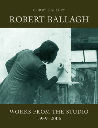
  • 1. WORKS FROM THE STUDIO 1959 - 2006 ROBERTBALLAGHWorksfromtheStudio1959-2006 GORRY GALLERY 20 Molesworth Street, Dublin 2 Tel/Fax 01 6795319 www.gorrygallery.ie GORRY GALLERY ROBERT BALLAGH
  • 2. ROBERT BALLAGH WORKS FROM THE STUDIO 1959-2006
  • 3.
  • 4. THE GORRY GALLERY in Association with DAMIEN MATTHEWS FINE ART Presents ROBERT BALLAGH Works from the Studio 1959 - 2006 at The Gorry Gallery 20 Molesworth Street Dublin 2 Tel/Fax: 01 6795319 www.gorrygallery.ie 20 September - 5 October 2006 DAMIEN MATTHEWS FINE ART 14 Brechin Place, London, SW7 4QA UK 00 44 207 373 9337 IRL 00 353 86 841 4421 matthewsfineart@aol.com
  • 5. 4 DAMIEN MATTHEWS FINE ART 14 Brechin Place London SW7 4QA Telephone 00 44 207 373 9337 00 353 86 841 4421 Email matthewsfineart@aol.com THE GORRY GALLERY 20 Molesworth Street Dublin 2 Tel/Fax 00 353 1 6795319 Web www.gorrygallery.ie All rights reserved. No part of this publication may be used or reproduced in any form whatsoever without prior written permission from the publisher. Copyright © 2006 Damien Matthews Fine Art Publications. All artwork by Robert Ballagh. Copyright © Robert Ballagh 2006. Designed and produced by Damien Matthews Fine Art Publications.
  • 6. 5 Contents Foreword James & Thérèse Gorry and Damien Matthews page 6 Overview Philip Vann page 9 Catalogue Part I page 25 Conversation Karim White page 62 Catalogue Part II page 76 Chronology of Paintings page 107
  • 7. 6 Foreword It may be argued that artists have an obligation to observe and chronicle the world they live in, which, in Robert Ballagh’s case, is predominantly that of urban Ireland – although there are, increasingly, radical rural allusions in his work. Throughout his career, his work has movingly and ingeniously reflected many facets of modern Ireland, its politics, culture, history and potential future developments. His art is marked throughout by an unerringly fresh and often innovative exploration of ideas and concepts, however controversial they may be. Ballagh is a pioneer in this regard. This exhibition of work from his studio - ranging from 1959 to 2006, and encompassing photographs, preliminary studies and finished pieces in an ambitious range of media – bears witness to his spirit of free and fearless philosophical enquiry, and gives an intimate insight into his distinctive political psyche and unique artistic development. We are delighted to have this opportunity to stage this exhibition and trust it will complement his Retrospective at the Royal Hibernian Academy. James and Thérèse Gorry & Damien Matthews.
  • 8.
  • 9.
  • 10. ‘You hope your paintings will transcend their time but they must be of their time as well.’ These words of Robert Ballagh indicate the particular and elemental nature of his gift. His largely self-taught art, made over the last forty years, comes out of an essentially urbane sensibility, rooted in his own immediate perceptions of the world, mediated always by a keen sceptical intelligence. Thus his artistic meditations on diverse subjects are characterised by an eternally open mind, radically playful wit and manifold allusions subtly made by a highly cultured man, well-versed in the history of art and especially in Irish history, politics, art and literature. His work is free from mystifying dogma, trend-setting ego or fear of ruffling critical feathers. Ballagh has never felt hemmed in by pursuing a singular artistic line; he feels free to experiment widely, so that his work has encompassed apparent extremes of Pop Art, stamp and banknote design, theatrical stage-sets and incisive portraiture. He says, ‘You look at the master of the 20th century, Picasso. He did so many different things, had so many styles and approaches. That seems to me the way, the model.’ Yet a coherent approach to composition-making unites Ballagh’s approach to different genres. Increasingly, over the years he has found that he belongs unashamedly to a rich, longstanding western figurative tradition - encompassing Van Eyck and Edward Hopper, Carlo Crivelli and Stanley Spencer - that even post-Modernism cannot dispel. Above all, there appears to be a lucid self-assurance and palpable humaneness at the root of his work - the non- melodramatic yet sure mark of a man and artist who has always trusted to his own intuitions ultimately to find his own way, personally, politically and artistically. His route to becoming an artist seems, in retrospect, quite circuitous yet it also contains a distinctive, ineluctable logic of its own. Born in Dublin in 1943, his parents - his mother from a southern Catholic family, with an affluent farming background, his father a Presbyterian who converted to his wife’s religion - were warmly supportive of their only child yet, as Ballagh says, ‘my mother was a very respectable woman who thought art was not a serious profession. But there was also a personal tragedy in the family, in that I had a cousin who was a very good artist, who committed suicide. So it absolutely confirmed that this was not the profession for her son.’ As a teenager at school, he painted oils of such archetypal subjects as Maternity and The Blessing (both 1959) both of which, heavily impastoed (unlike his later work), show the influence of Giacometti and Louis le Brocquy, whose works he had seen in reproduction. Earlier in that same year he painted a shadowed, wry Self-Portrait, precocious in its suave use of line, light and shade and its ambiguous attitude, partly sullen, partly challenging. He went on to study architecture for three years at the College of Technology in Dublin. But this wasn’t a second- best compromise. ‘I was very fortunate that my tutor was Robin Walker, who had worked with Le Corbusier in Paris and Mies van der Rohe in Chicago. He’d come back recently from Chicago full of belief in modern architecture, and to be taught by someone with that kind of passion was fantastic.’ Ballagh imbibed there what has been called a ‘Miesian precision’, which he has carried through his cultural life. And today, he makes an architectural analogy when talking about creating pictures: ‘I generally make very few changes once I’ve worked out the picture. Sometimes you have to but generally the house is built according to the blueprints. More spontaneous artists do that while they’re working on a picture. But for me, that’s all done before I start working. It’s all planned and worked out and developed from there.’ In fact, in his close friendship with the Irish artist Micheal Farrell, it became an in-joke between them that ‘he used consistently to criticise me as “too fussy, too detailed, taking too long, not spontaneous, etc.”’ Robert Ballagh: An Overview Self-Portrait (1959) 9
  • 11. At College, his inventiveness - ‘designing buildings that were outlandish’ - got him into repeated rows with some of his tutors, and he realised that it would be many ‘years before I got to create beautiful buildings - if ever!’ So what he calls ‘an easy choice’ was made - he jettisoned architecture to play bass guitar in a professional showband, which toured the avid market of rural Irish village dance halls. Lucrative and exciting at first, after three years or so this became tedious. So he gave it up, spent time in London, and then worked in Dublin for a time as an engineering draughtsman and a postman. He acquired a useful ‘art education on the hoof’ by doing what he calls some ‘crass commercial work, like labels for supermarkets, where you inevitably pick up skills, learning about typography and layout, for example.’ Two meetings occurred which changed his life essentially. He had met sixteen-year-old Betty Carabini at a beat club, and in 1967 they were married, with Micheal Farrell as best man. It was shortly before this that Farrell had returned from a stay in New York. Ballagh had been introduced to Farrell in a Dublin pub; the latter was looking for an assistant to help him complete two large-scale paintings commissioned for the Bank of Ireland on College Green. A conversation along these lines ensued: Farrell: ‘I hear you’re interested in art. Can you draw a straight line?’ Ballagh: ‘I think I could manage that.’ Farrell: ‘Well, you’ve got a job for £5 a week and all the drink you can take.’ Ballagh gained a good deal from the experience, working for two or three months with Farrell on monumental, hard- edged abstract canvases in the relatively new acrylic medium. There followed a grounding period when Ballagh sought to develop and hone his incipient artistic skills. The Package Series (1967) explores what the American critic Clement Greenberg (whom Ballagh was reading at the time) had called the ‘literal flatness’ asserting ‘itself as the main event of the picture’. Using some of the techniques learned from Farrell, such as the use of masking tape to delineate areas of flat colour, Ballagh painted the abstracted forms of a flattened out matchbox, and to his surprise found that the starkly elegant results ‘looked not unlike those of Gerald Murphy, an American proto-Pop artist from the 1920s and 30s.’ The following year, Ballagh embarked on his Map Series, in which map shapes - actually based on freeform ink blots but elusively evocative of individual yet nameless international territories - were set on grids against oceanic blue backgrounds. He now sees these works as ‘an excuse formally to experiment with acrylic paints, and using some day-glow paints which were very mad altogether.’ The works made a subtle political point too - that ‘sometimes divisions on maps are absolutely arbitrary, man-made by the forces of Empire’ and other reactionary forces. However, politics come vividly into the foreground in his next series portraying marchers, refugees, burning Vietnamese monks and Latin American firing squads - yet these works retain a universal meaning with their subtlety of approach far transcending any didactic or propagandist agenda. The contemporary, rapidly developing Troubles in Northern Ireland, the Civil Rights Movements there and in the United States, as well as the incessantly televised, agonised unfolding of the Vietnam War 10 Robert Ballagh with Micheal Farrell, wedding morning (1967) Match Box (1967) Series 4 No. 3 Marchers (1969)
  • 12. all were part of the impetus behind these imposing works whose forms movingly yet coolly abstract the newsprint- photo forms of protesters and victims of war and civil strife. ‘A terrible beauty is born’ indeed out of these abstracted snapshots of life in the media-snatched front line. The garish, rather sickly sweetness of the modernising Irish economy, with its burgeoning consumer culture, that had emerged in the 1960s is the subject of a series of paintings made in 1971. The trite empty-headedness of a society aiming for purely materialistic ends is hinted at in portrayals of iced cakes and dolly mixtures set with deliberate, discomforting vapidness against collaged, kitsch materials redolent, for example, of fake leopard skin. ‘It is impossible, thirty years later, to appreciate the impact of this first major onslaught of international art on an unsuspecting Irish public’, the critic Dorothy Walker wrote in 1997. She was referring to the first two ground-breaking ROSC exhibitions that took place in Dublin in 1967 and 1971. These showed the most famous living artists from around the world - including Picasso, Bacon, Barnett Newman, Rothko, Tapies and some of the younger American Pop artists like Rauschenberg, Lichtenstein and Jim Dine - though modern Irish art was excluded. Seeing work by the American Pop artists in particular confirmed to Ballagh that he was on the right track, having quite independently come to many similar artistic conclusions. In an article (published in The Dubliner, November 2004), Ballagh recalls the 1967 ROSC exhibition, ‘washed up on Irish shores… the fields of bright acrylic primary colours, the razor sharp outlines and the hopelessly ironic comic book content all overwhelmed me.’ He found ‘gaining access to the modern art scene [in Ireland] was not difficult’, and ‘within a relatively short period I became Ireland’s best- known Pop artist. To be frank, I was probably Ireland’s only Pop artist.’ Yet even at such an early stage in his career, Ballagh could not help contemplating the potential impasse of much contemporary avant-garde art. ‘When I looked at the work of, say, Roy Lichtenstein, an incredibly intelligent artist, I couldn’t help speculating that his chosen technique would inevitably restrict his full development, and sadly, such has been the case. Lichtenstein remained trapped in a prison of Ben Day dots for the rest of his life, and let’s face it, he is not unique. Many other modern artists have suffered the same stylistic incarceration.’ In the late 1960s, Ballagh’s attention was drawn in two apparently disparate directions - researching and contemplating great classical artists, and watching the state of national emergency unfolding in Northern Ireland as Civil Rights marchers were attacked by the B-Special police. Actually, there was no divergence at all in these two aspects, as Ballagh went on make a series of innovative paintings based on Goya’s The Third of May, David’s The Rape of the Sabines and Delacroix’s Liberty at the Barricades. Just as these late 18th and 19th masterpieces convey thoughtful yet viscerally charged responses to contemporaneous political repression, so Ballagh’s Pop Art adaptations - with a stinging succinctness of their own, as in his juxtaposition of a simplified version of Delacroix’s painting with a glimpse of a current Irish newspaper headline reporting events ‘(RIOTS) IN DERRY’ - reflect his own response to events of his own time. In his 1986 book, Robert Ballagh, Ciaran Carty has written: ‘Seamus Heaney made a similar connection in terms of poetry. In August 1969 he saw the Goya painting The Third of May at the Prado in Madrid. That night he turned on the TV in his hotel room to see the B-Specials rampaging up the Catholic Falls Road. For a while he toyed with counterpointing the two images of violence in a poem. Some months later he came across Ballagh’s painting… He thought it intriguing that two Irish artists in two different disciplines had thought of using the same Spanish image of oppression in exactly the same association.’ Carty quotes Ballagh’s comment: ‘Seamus understood very early on what my painting was about - that it wasn’t just a classical pastiche.’ The question of how artists could respond to the increasingly violent situation became an urgent one. Louis le Brocquy painted semi-occluded images where anguished faces are helplessly shielded behind outstretched hands with plaintive palms. Oisín Kelly made a cast aluminium sculpture in 1969 of poignantly vulnerable rows of nearly faceless Marchers. The artist Brian O’Doherty made a public performance in which he changed his name by deed poll to Patrick Ireland (all his subsequent artwork, though not his 11
  • 13. art criticism, being made under that name) ‘until such time as the British military presence is removed from Northern Ireland and all citizens are granted their civil rights’. Micheal Farrell has spoken of the changed direction of his work as a consequence of events in Northern Ireland: ‘In 1969, the Bogside in Derry was ablaze. I made a speech at the opening of the Living Art exhibition in Cork when I was accepting my prize-money, but those assembled did not think much of it. I believed that we could not stand by and let the series of events unfold. The only ones who supported me were Leo Smith, my art dealer, and Robert Ballagh. I donated the prize-money as part of the artists’ fund for refugees who were streaming across the border.’ The traumatic events of January 30 1972, known as Bloody Sunday, when British soldiers opened fire indiscriminately on peaceful demonstrators in the Bogside, Derry, killing thirteen and wounding others, were the spur for Ballagh’s installation at the Irish Exhibition of Living Art in Dublin later that year. He chalked out the rough outline of thirteen figures on the gallery floor, pouring animal blood onto them. This commemoration of victims of the Bloody Sunday atrocities was made as a response to the ‘self- protective apathy’ that, ‘after the initial shock and indignation, many citizens of the Republic of Ireland [felt].’ Now preserved only in the form of a photomontage of nine panels, this ephemeral artwork still has a raw power to disquiet and move. Ballagh’s 1973 painting of the so-called Winchester Eight - IRA members on trial in England - is seen by the artist ‘on one level as simply an early attempt to use oil paint’, reproducing the sepia tones of police file photos of the group. But on another level, the effect is sinister and surreally mundane in the way its attenuated palette, pitifully economical portrayals and mournful mugshot solemnity help implicitly conjure up something of the sufferings and violence of the period. In 1972 Ballagh began an extensive series of pictures depicting people observed looking at paintings by artists such as Mondrian, Warhol, Stella, Jasper Johns, Barnett Newman, Pollock, Motherwell, Soulages and, from Ireland, Farrell and Cecil King. A vast polyptych canvas (1972) of back views of simplified gallery-going figures - often based on his own photos of standing and crouching spectators - peering at modern masterpieces on the museum wall was purchased for the Bank of Ireland Collection. His exhibition of these paintings at the prestigious David Hendriks Gallery in Dublin in 1972 was a sell-out. A series of successful selling exhibitions followed abroad, based on similar themes. (He showed with Hendriks for fifteen years, and later recalled that ‘in the often fractious world of Irish art’ Hendriks offered him ‘generosity, support and encouragement during the difficult beginnings of a career in the arts.’) A 1977 painting, The Conversation, interposes the sunglasses-wearing Ballagh into a Vermeer-like domestic interior, where he appears to ruminate on advice from an admonitory Old Master. This speculatively humourous example of cultural time travel shows how increasingly Ballagh was going beyond Modernist and contemporary influences to contemplate examples of earlier, classical western art - the antithesis perhaps of the instantaneous modern approach. He says, ‘As my career developed, I found myself wandering into the National Gallery rather than the Tate Gallery.’ In 1973, he painted a picture Inside No. 3, set in his inner- city Dublin family home. ‘The nude is such a predominant theme for western painting, I just said I had to have a crack at this. The only model I had was my wife.’ His wife is seen nude, descending a spiral staircase - a reference to Duchamps’ seminal image, and there is a Pop Art reprise of Delacroix’s Liberty over the fireplace. Ballagh had in mind 12 Derry January 30, 1972 (Part View) Two People and a Michael Farrell, 1972
  • 14. here questioning what John Berger in his influential 1972 book Ways of Seeing had characterised as, traditionally in western art, the proprietorial glance of the male spectator towards the female nude. In Ballagh’s picture, all we see of the artist himself are his trouser bottoms and white shoes as he lounges on a chair or sofa. His wife’s face is averted from him towards either the implicitly feminist image of a resurgent Liberty or to Ballagh’s own face in black-and-white grinning on the far corner TV screen. Having painted his wife, Ballagh realised that ‘so as not to be a male chauvinist pig, I had to do a male nude. If I did my wife as the female nude, I didn’t have much choice.’ So in the companion Upstairs Inside No. 3, the artist (wearing only a white tee-shirt and white socks) gazes directly at the spectator, and somewhat obliquely at his wife. Though he initially found portraying himself so ‘a bit tricky and embarrassing’, it is in fact a dignified self-image, wittily subverting any notion of the ‘superior’ male gaze. Two further artistic images within the painting - one of Gustave Caillebotte’s famous 1877 painting of a Parisian street scene in the rain, another of a Japanese erotic print which his wife is perusing - are characteristically allusive. From the early 1970s onwards, Ballagh found himself increasingly admiring and being inspired by the realist tradition in western art - ranging from the gorgeous scrutiny of humanity and the natural world in early Renaissance altar pieces by Carlo Crivelli through the acute seeing of Vermeer and what he has called ‘the meticulous precision of Jan van Eyck’ and other 15th century Flemish painters to the photographically- inspired realism of Caillebotte and the unnervingly honest acerbity of German Neue Sachlikeit art - and, in this context, the Caillebotte representation here is telling. In mid-70s Catholic Ireland, this painting of himself semi- clothed caused mild controversies. What Ballagh himself found ‘hugely ironic’ was the way that, by way of contrast, not one single person remarked on ‘the fiercely rude Japanese print’ - with its dramatically heightened sexual encounter explicit on the pages which his wife is contemplating. Through the open window in this painting, with its view of the King’s Inns, the splendid 18th century headquarters of Dublin’s barristers, we see a helicopter hovering. For Ballagh at the time, this vehicle was emblematic of a more and more militarised world, one intruding inescapably into the state of domestic happiness. This proved to be a somewhat ominous portrayal too, since, as Ballagh notes, a few years later the skies around his home - located near the Special Criminal Courts, which were used for non-jury trials of political prisoners - were buzzing with helicopters whenever there was a trial. Another painting entitled Inside No. 3 after Modernisation intermingles a plethora of artistic styles - Realism, Pop, even Abstract Expressionism - to make a cuttingly amusing comment on a contemporary post-Modernist tendency that encourages artists to be uninihibitedly stylistically liberal and, perhaps, as a result, unfocussed. Dublin, where Ballagh was born and has always lived, is the setting of much of his art and a perennial pleasure and preoccupation. James Joyce’s own words preface Ballagh’s 1981 book, Dublin, which chronicles the artist’s photographic views, taken over a year with a rather cumbersome Roliflex camera. Joyce wrote, ‘For myself, I always write about Dublin, because if I can get to the heart of Dublin I can get to the heart of all the cities of the world. In the particular is contained the universal.’ Ballagh says, ‘In a city like Dublin, you have steps that are just worn from the passage of people over the centuries. I like the patina of human existence.’ He deliberately didn’t photograph places like Trinity College, ‘because they’re in all the books. I photographed places that many Dubliners don’t know but that I love. So it’s a highly personalised view. ‘Joyce said that if Dublin was knocked down, they could rebuild it from his books, since he mentions so many places and streets. But he would not recognise it now. I grew up in Joyce’s city but my children grew up in a completely 13 Solitary Figure, Dublin Tenement (1980)
  • 15. different one. The Georgian squares are still there but the little, daily things that Joyce wrote about, the pork shop where Leopold Bloom in Ulysses got his kidneys - gone!’ Ballagh’s photographed Dublin, largely unpeopled (except for a few rowers on the Liffey), is counterpointed in his 1981 book with brief quotations from Joyce, juxtaposing, for instance, a view of a terraced house façade, with its net curtains and potted plant in the window, with a kind of Hibernian haiku from Ulysses: ‘an old woman peeping. Nose whiteflattened against the pane.’ Similarly a view of weathered gravestones in Mount Jerome cemetery under hauntingly bare trees is paired with these lyrically apocalyptic lines from Ulysses: ‘How many. All these here once walked around Dublin. Faithful departed. As you are now so once were we.’ Dublin now appears, in retrospect, a poignant, elegaic record of a poorer, more distressed yet surely more characterful city than the one it has developed into during the economic boom that has accelerated in recent years, fruits of the so- called ‘Celtic Tiger’ economy. We see here remnants of the superbly crafted 18th and 19th century granite paving which has largely now been torn up in favour of the ‘mundane concrete slab’. We see a doorway covered in corrugated iron, part of a house façade otherwise open to the elements. Ballagh’s text reads: ‘Behind this door and to the back was once the bedroom of Molly Bloom. This house, celebrated in literature, has fallen the victim… of planner’s blight and civic indifference.’ Six similar photographs, in antique-looking photogravure form, have been used most effectively to illustrate a 1986 limited edition publication of Joyce’s Dubliners. Ballagh’s perspective on Dublin reverberates with myriad historical nuances and personal allusions. A stark photograph of boarded-up shops, curiously white-washed all over, is accompanied with the comment: ‘These two facades were painted for the papal visit of 1979. All the vacant… shops looked so shabby that it was decided to brighten them up. Ironically it was to no purpose as the Pope’s tour failed to keep to schedule and passed by in the dark!’ In a 1988 painting, In the Heart of the Hibernian Metropolis, an ingenious yet philosophically credible sepia illusion is created: the figure of Ballagh, in checked shirt, jeans and glasses, is seen accompanying Joyce himself on a stroll down O’Connell Street some day early last century. In fact, the original source photograph of what was then (before Irish Independence) known as Sackville Street was taken in 1904, the year in which Ulysses is set. A print, James Joyce on O’Connell Street, has been made by adapting the 1988 painting, and using some oil paint, to evoke the apparition of the writer apparently stepping out of the street itself, out of history, beyond the picture frame, to confront us now. A self-portrait of Ballagh with his wife Betty and their two young children outside their home at Temple Cottages in Dublin, is scrupulously observant in quotidian details of contemporary clothing and yellow, parked family car. It is an acute period piece, with a subversively sardonic comic note introduced by the publication that the artist is so immersed in that it covers his face. This aspect was based on a reference photograph of the artist in the same posture outside his house, his nose buried in the same American book, with (what is for the serious artist) its comically pathetic title How to Make Your Art Commercial. Ballagh’s reading of recent Irish history informs much of his work. The History Lesson, a 1989 triangular-shaped painting, with a brownish palette redolent of a newspaper archival print, shows the artist in informal checked shirt and glasses, portrayed with two heads, each moving with swift alertness towards the nobly static figures of James Connolly and Patrick Pearse, who are seated either side of a table under an interrogative overhanging light. Ballagh says that he is fascinated by the fact that the political rebellion of 1916 was ‘led by poets, actors, writers, musicians, social reformers, Irish language activists - a truly remarkable gathering of people who wanted to break with England and create an independent Ireland.’ The painting was partly created in response to an extreme climate of censorship and historical re-writing that had grown up in Ireland in the 1970s and 80s when, under the shadow of paramilitary violence in Northern Ireland, rebels such as Connolly and Pearse were often dismissed as dangerous subversives, possibly terrorists - an attitude that is no longer widespread since the end of the Troubles. 14
  • 16. Frequently Ballagh is described as a photo-realist painter. The limitations of such a label are shown by pictures like The History Lesson, which keenly demonstrates the thoughtful playfulness with which the artist selects and transfigures his original source material. In some respects, Ballagh would be better described as at times a photo- surrealist. His deep appreciation of Magritte’s art - itself delineated with such precise clarity and so rich in visual puns, humourous pastiche and literary and cinematic references, yet retaining an ultimate degree of enigma - is relevant here. When visiting Brussels in the early 1970s for his show there, Ballagh was initially disappointed not to encounter any Magrittes in public galleries. By chance, he was invited back to a private home - that of Louis Scutinaire, a close friend of Magritte’s - where he was delighted and felt privileged to see dozens of paintings by the artist. In 1980, Ballagh was commissioned to portray Charles Haughey at the podium receiving the acclaim of the Fianna Fáil ard Fheis, following the leader’s political resurrection after many displaced years. The picture’s title is C.J. Haughey, The Decade of Endeavour. In his 1997 book, An Intelligent Person’s Guide to Modern Ireland, John Waters opined, ‘Haughey became the most controversial figure in Irish politics for the past quarter-century because he alone on the Irish political landscape attempted to straddle the gap between Modern Ireland and its rather eccentric ideas about its own past.’ Ballagh succeeds in portraying Haughey with dispassion, alert though to the politician’s self- projected charismatic presence (accentuated rather disconcertingly by a giant, piercing backdrop photo of the politician) and tenacity. The theatrical, somewhat synthetic paraphernelia of the political party machine is brilliantly evoked through a highly pared-down version of applauding audience, press (just one flash camera) and the waving of a single Irish flag and handfuls of electioneering material. Not only James Joyce but many other Irish writers have been portrayed by Ballagh. These include Laurence Sterne, Joseph Sheridan Le Fanu, Oscar Wilde, Flann O’Brien, Samuel Beckett, Brendan Behan, James Plunkett and Brian Friel. Passages too from Irish novels, plays and poems have inspired many pictures. A 1990 publication, Robert Ballagh on Stage (Project Arts Centre, 1990) chronicles five acclaimed theatre set designs made by Ballagh between 1985-9; these include sets for plays by Wilde, Joyce and Beckett. In the mid 1970s, Ballagh read The Life and Opinions of Tristram Shandy Gentleman, the novel by Laurence Sterne written some two hundred years earlier. He was delighted by Sterne’s meticulous observations and typographical experiments, his subversive parodies of conventional linear narrative, his uproariously solemn footnotes and digressions, his supple scepticism, his ‘quirky genius’. Ballagh says that though some critics dismiss the importance of Sterne’s Irish background (he was born in Clonmel, and spent his early years travelling between Ireland and school in England, settling there as a young man) in terms of his literary achievement, he believes that ‘Sterne sets the pace for a good deal of the Irish sensibility in literature’ - in Joyce, for example, but more obviously in the mid-20th century novels of Flann O’Brien. An early portrait of Sterne by Ballagh, based on the famous Joshua Reynolds portrait of the writer in the National Portrait Gallery in London, is presented as materialising out of a brushstroke on the canvas (the brush itself depicted too) - this technique being a jokey allusion to the animated brushwork device sometimes used by Walt Disney. In 1975, he painted an extensive canvas (36 x 5 ft) in oil and acrylic, illustrating details from Tristram Shandy in a form recalling the Hollywood film format of pages in a book 15 Study for Charles J. Haughey Portrait (1980) Study for Tristram Shandy (1975)
  • 17. flipping away to denote the passage of time. Tristram Shandy himself has become a faceless adult male figure in 20th century suit-and-tie. In one episode, Ballagh portrays Shandy at an open window (alluding to Sterne’s ruminations on windows to the human soul residing in each human breast), his disillusioned countenance appearing surreally as a warping clockface. This is a reference to the novel’s opening, when the author laments his life of misfortune arising from the fact that his mother delayed his moment of conception by asking if his father had wound up the clock. In 1977, Ballagh made a series of paintings and a silkscreen print based on Flann O’Brien’s The Third Policeman (which the author’s own publishers had declined on submission in 1940; it was published posthumously to critical acclaim in 1967). The novel’s hilarious inventiveness and subtle admixture of straightforward observation (as a deadpan murder mystery), fantastically pedantic logic (especially in the endless footnotes, somewhat reminiscent of Sterne) and absurd fantasy, its chilling preoccupation with eternal human guilt (elsewhere the author wrote, ‘Hell goes round and round… it is interminable, repetitive and very nearly unbearable’), inspired six paintings. One of these, The Atomic Theory - a delightfully uncomfortable painting in all respects - showing naked buttocks resting on a saddle-bar, evokes the unrequited love affair between the novel’s protagonist and his bicycle (clearly marked here as a Brooks model) - ‘Her saddle seemed to spread invitingly into the most enchanting of all seats…’ The Atomic Theory itself refers to ‘the queer behaviour of bicycles in these parts’ - ‘when a man let things go far… he is half or more than half a bicycle.’ Ballagh’s impeccably rendered 1990 portrait of Oscar Wilde, the thinner, greying Wilde of later years, is dominated by variegated, quietly modulated blue tones - permeating the writer’s modest, no longer dandified clothes and the swirling, leafy ornamentation of the high-aesthetic wallpaper backdrop. This colour scheme alludes to Wilde’s love of this colour - as, for example, when his rooms as an Oxford undergraduate were filled with blue-and-white china - but does not convey here the exuberant, questing, sparkling wit of his worldly career but rather an air of sad yearning and loss. This air perhaps retains, however, something of the paradoxical sting of such earlier Wildean aphorisms as ‘Life is a mauvais quart d’heure made up of exquisite moments’ (from A Woman of No Importance). His face, beautifully in profile, is wanly abstracted, one clearly marked by suffering and self-knowledge. Brian O’Doherty has written of the ‘William Morris wallpaper design which frames his head in an eccentric halo (his halo has slipped).’ Ballagh designed the stage sets for the 1987 production of Wilde’s The Importance of Being Earnest and the 1988 production of his Salome, both for Dublin’s Gate Theatre. He never sought to become a theatrical stage designer; rather the theatre world sought him out. He has written, ‘If there has been a guiding principle in my approach to stage design it has been my total belief in the primacy of both the text and the performance and, as a consequence, an acceptance that the setting should be both supportive yet, on the other hand, subordinate. When I was studying architecture way back in the 60s, I remember hearing Mies van der Rohe’s famous dictum, “less is more”, it seems to me that this is just as valid today.’ Initially Stephen Berkoff, Salome’s director, said (as the Gate Theatre director Michael Colgan has recorded) that ‘he didn’t want a designer… all he wanted was a black box.’ Ballagh says ‘Berkoff created a striking opening tableau, a Last Supper-type scene with Herod and the court, which wasn’t in the original play. He required a very cool palatial setting.’ The final design, with a table upstage, has an epic yet simple formality - backed by a massive skyscape backcloth, based on details from a painting by Caspar David Friedrich. In his 1981 book of Dublin photographs, Ballagh wrote, ‘If asked to pick out a favourite building in Dublin, without 16 Stage Design - Salome (1989)
  • 18. hesitation I would nominate the Broadstone Station, designed by John Skipton Mulvany.’ The façade of this sublime building built in 1850 as one of Dublin’s four rail termini, became a source of inspiration for the austerely architectonic form that made up the stage-set of The Importance of Being Earnest, itself overlooked by a gigantic reproduction of a painting of Queen Victoria (in an earlier model, Ballagh had proposed a huge copy of the famous photograph of those star-crossed lovers, Oscar and Bosie). Since the drama was acted in modern dress, the looming regal image reinforced the audience’s awareness of the tragic- comic hypocrisy of so-called (Thatcherite) ‘Victorian Values’ that permeate the play. For the second act of I’ll Go On, a drama based on Samuel Beckett’s novels which opened at the Gate in 1986, a clinical setting was required. Ballagh initially made a quick sketch rather resembling his jacket design for a book on the H- Block hunger strikes - a blanketed figure on a catafalque. This severe image had been partly inspired by The Stone of Remembrance, in the Memorial Park at Islandbridge, designed by Edwin Lutyens to commemorate some 50,000 Irishmen who died as British Army volunteers in the First World War. Ballagh’s set had moving resonances for a play dealing with the bleak, sorrowful stream of consciousness of an old dying man. At an early production meeting for the Dublin Theatre Festival production of The Wake (a necessarily and vastly compressed adaptation of Joyce’s Finnegan’s Wake), Ballagh audaciously displayed an array of assorted children’s building blocks. The play itself utilised seven large marbled blocks in various geometric forms (corresponding to Joyce’s own notion of sigla, coded aspects of human character) complemented by a length of coloured material associated with the fluid, archetypally feminine presence of Anna Livia Plurabelle. The imaginative versatility of Ballagh’s set - where blocks ‘became … monuments, streetscapes, tracts of the human anatomy, Finnegan’s corpse’, etc., helped make this production (in the words of the Irish Times critic) ‘accessible and memorable’. Large audiences have seen Ballagh’s sets for Riverdance, the stage show of traditional Irish step dancing, which, since its first full-length performance in Dublin in 1995, has been performed worldwide. He was asked by the show’s producer Moya Doherty to produce hand- crafted images and so created about fifty small works - many of them based on vibrantly painterly skyscape views. These were then photographed so they could be rear-projected onto a screen behind the dancers. The sets have had to be redesigned for various venues, since some could only accommodate frontal projection. Fresh challenges came with demands for a version in which projection was eliminated, and also with the Broadway version in which (as he told an American journalist) he has had to reconcile both ‘back projection and flying scenic items’ such as ‘moon boxes and suns flying in and out.’ Even larger audiences will have handled Irish stamps and banknotes designed by Ballagh. Over the last three and half decades he has designed 66 stamps for An Post, the Irish Post Office, and from 1992-98 all Irish banknotes, before the introduction of the Euro. Throughout he has understandably had to work under numerous constraints of format, technique and the possibility of rejection on grounds of taste or what the authorities might deem politically unsuitable. But he enjoys rising to such challenges. The weather systems over north-western Europe in his 1973 stamp commemorating World Meterological Year, are delineated here as part of a typically succinct and dynamic composition. This stamp caused some unexpected repercussions. The Ulster Unionist 17 Riverdance Design (2004) An Post Stamp Design (1973)
  • 19. politician Dr. Ian Paisley complained to Sir Alec Douglas- Hume in the House of Commons about the absence of an Irish border in the design. The British Foreign Secretary reminded Paisley it was a weather map, not a political one. The way that Ballagh’s artistic and political interests can sympathetically interfuse to make a powerfully original postal image is shown in his 1979 stamp commemorating the anniversary of the birthdate of the revolutionary Patrick Pearse (Pádraig Mac Piarais 1879-1916, as is written on the stamp itself). The left-hand side shows Pearse in black-and- white profile. To the right is the figure of Liberty in the same format as in Ballagh’s earlier Pop Art painting based on Delacroix’s Liberty at the Barricades. The Parisian barricades have been surplanted here by the GPO building in Dublin, headquarters of the 1916 uprising. The French tricolour which Liberty brandishes has been replaced by the Irish flag - a most telling transposition. Early on in this overview, Ballagh was characterised as a quintessentially urbane artist. That has remained true throughout his career. However, as a young man, a bit of ‘a young hell-raiser’ as he has said, he saw himself pretty much as an exclusively urban artist, internationalist in outlook, who eschewed any interest in depicting the Irish landscape. Interviewed in 1980, he said, ‘I never had any access to the culture that many people think is the Irish culture, the rural Gaelic tradition. I can’t paint Connemara fishermen. My experience of Ireland is an urban one. It would be dishonest of me to paint anything else.’ Re-considering this ‘statement’ in 2001, Ballagh wrote, ‘Oh! The certainty of youth!’ As a progressive young Irishman, Ballagh rejected the kind of Catholic conservatism typified at its reactionary extreme by the now (in)famous 1943 radio broadcast made by Eamon de Valera as Taoiseach, in which he said, ‘That Ireland which we dreamed of would be the home of a people who valued material wealth only as the basis of right living… a land whose countryside would be bright with cosy homesteads, whose fields and villages would be joyous with the sounds of industry, with the romping of sturdy children, the contests of athletic youths, and the laughter of happy maidens, whose firesides would be forums for the wisdom of serene old age.’ Ireland under de Valera, who steadfastly resisted modernising tendencies, became desperately impoverished in many areas and increasingly depopulated as many of the younger generation emigrated. By the early 1960s, when a more internationally outgoing, modernising government helped bring about an economic upturn, avant- garde younger Irish artists like Ballagh tended to reject what they viewed as the stifling backwardness of Irish rural life and traditional culture. By the late 1970s, Ballagh had begun to question his previously somewhat clearcut views which had starkly polarised notions of urban modernism and rural insularity. He found himself becoming more sympathetic to what (in the 2002 catalogue for his exhibition, Land and Language) he later called ‘another approach, in line with the Irish bardic tradition, described by Declan Kiberd in Irish Classics… “the effect of the Penal Laws against Catholics after 1691 was that a conservative, even aristocratic longing on the lips of the Poets acquired a radical, even populist purchase, because of the extensive repression: and ever since the Irish have produced a strongly traditionalist radicalism which looked back in order to look forward.”’ Hints of this new approach - of ’a strongly traditionalist radicalism which looked back in order to look forward’ - had emerged in a 1983/84 painting entitled Highfield, in which, he has written, ‘the artist [looks] out from the studio to the landscape, an obvious source of inspiration for many Irish artists, yet the interior canvas remains curiously blank. In addition, the torn Picasso poster on the floor warns of the dangers involved in slavishly following international cultural fashions.’ A 1997 painting, The Bogman, shows the artist in Wellington boots doing something he has never done in his life - digging for turf in a bog. There is more than a note of 18 Highfield (1983)
  • 20. ironic humour in this truly revolutionary state of affairs yet there is an air of fierce dedication as the artist - his face reflecting or indeed emanating an earthy glow - attends to the task in hand, a raven, the bird of prophesy in Celtic mythology, flying above. Ballagh admires Seamus Heaney’s poem Digging (from his 1966 volume, Death of a Naturalist), which makes an intuitive analogy between his own creativity as a poet and his father and grandfather cutting turf: Between my finger and my thumb The squat pen rests; snug as a gun. ……… My grandfather cut more turf in a day Than any other man on Toner’s bog. ……… Nicking and slicing neatly, heaving sods Over his shoulder, going down and down For the good turf. Digging. The Bogman painting is framed literally and literary-wise with an Irish proverb: “Briseann an dúchas tré súilibh an chait” which Ballagh says could be liberally translated as, ‘you can take the man from the bog, but you can’t take the bog from the man.’ At the approach of the millennium, ‘after just thirty five years of painting, I decided to try to paint some landscapes’ (as he noted in the Land and Language catalogue). His usual painstaking technique of ‘layering the oil paint with under- painting and glazing’ was replaced by the more spontaneous method of applying a single layer of paint to the ground. With some exceptions, these landscapes were not based on ‘recognisable locations but rather a non-specific sense of place’. The titles of the ten landscapes are in Gaelic, and each sensually incorporates (in a lower panel beneath the painted panels themselves) actual or metaphorical elements evoked in the landscape. So for the picture entitled Púróga (pebbles), on the lower panel a layer of stones is held behind frosted glass, which has been partly etched with words of an Irish proverb: ‘Is beag an rud is buaine ná an duine’ (‘the smallest of things outlives the human being’). Ballagh here seems to be reclaiming not only elements of the Irish language itself (in his catalogue essay, he quotes stage directions from Brian Friel’s 1981 play Translations: ‘Yolland’s official task… is to take each of the Gaelic names - every hill, stream, rock… - and Anglicise it.’) but also wide elemental aspects of the island’s sky/landscape and ancient culture. He seems to be acknowledging (in the words of Douglas Hyde) ‘Every crag and gnarled tree and lonely valley has its own strange and graceful legend attached to it’. For many years Ballagh had strongly reacted against the romanticising escapism of much 20th century Irish landscape art. ‘It excluded people. There’s very little of the really brutal life of the ordinary people who are inhabiting that landscape. Jack Yeats would be the exception. He was quite a political person. There is a fairly recent essay by David Lloyd about the republicanism and politics of Yeats. Nobody talks about that. They just talk about the swirls of colour and the beautiful expression. His pictures have a lot more to them than just that. I think there’s a tendency here to romanticise Yeats - who wasn’t a romantic in that sense at all. His subject matter was poor people, tinkers, et al.’ The juxtaposition of landscape and, with material literalness, natural elements such as pebbles and sand - supremely represented by Ballagh’s millennial series - was also explored in a major earlier painting, Portrait of Dr. Noel Browne (1985), now in the collection of the National Gallery in Dublin. Here, in a large cruciform composition, an elderly man in a white Aran sweater is portrayed on a pebbly Connemara beach, white- washed cottages either side of him, fields and sea in the far distance. At his feet, a pile of real pebbles seems to spill out from the canvas to accumulate on the gallery floor. To the right of this material accumulation is a pile of three books (actually dummy artefacts though three-dimensional). On the spines of two are names of Samuel Beckett and Karl 19 Dr. Noel Browne, Connemara
  • 21. Marx (Ballagh had asked Browne to nominate two authors who had especially influenced him). On the third spine is written the artist’s name alongside the painting’s title: An Doctúir Nollaig de Brún. Here, the element of landscape is subordinate to the inscape of portraiture yet landscape insistently makes its presence felt as it literally accumulates at both our and the subject’s feet. Yet, as the books piled next to the pebbles show, for Ballagh landscape and human culture cannot ultimately be separated. The dignified upstanding figure of Browne, elusively ruminative in mien, looks integrally at home in the Connemara scene. The pebbles at his feet may suggest his rocky beginnings in life but also a solid, lifelong, beautifully worn piling up of experience. In fact, when Ballagh initially decided to paint the portrait (it was not a commission), he visited Browne at his home in a Dublin suburb, did some sketching yet hadn’t a clue how to proceed. It was Browne’s ‘out of the blue’ question - ‘why don’t you come down and stay with us in Connemara?’ - that provided the leap of inspiration that the artist needed. Ballagh had decided he wanted to paint someone ‘who won’t be commemorated by the State or banks. Dr. Noel Browne came to my mind very quickly. His early life was like a Dickensian story - one of poverty and deprivation. Most of his family was destroyed by TB. He was introduced to an affluent Irish family in England, and they sent him to an English public school. He went to university. Returning to Ireland, he became interested in politics, and joined a new party of the left. In the 1940s, he was elected as a T.D. and Minister of Health on the same day. He tried to introduce a scheme for free medical care for mothers and children. The medical profession didn’t like this at all, and the Catholic Church saw it as the thin end of the wedge of Communism coming into Ireland. So he was basically driven out of office. He continued in politics until he was nearly 70, and retired. That was about the time I got the idea of doing his portrait.’ Strolling on the stony beaches of Connemara and talking with Browne (‘I would say, “how did you find de Valera?” - and he knew all these people’) was, for Ballagh, an illuminating experience. When Ballagh set about making the picture, he felt overwhelmed by the amount of painting of natural details that would be involved - acres of sky and stoniness. So, while making an introductory sketch, he began to reduce the shape so that eventually, to his great surprise, the cruciform design emerged - ‘a fairly powerful shape, which everyone thinks I came up with first - particularly in regard to Browne’s clash with the Catholic Church - and then the picture afterwards. In fact, when the picture was first shown, one critic said, “Noel Browne crucified by Robert Ballagh!” Some people are disappointed when I tell the truth. It was a formal consideration which turned into a great iconic image.’ Over the last 20 years or so, Ballagh has painted other impressively humane portraits of older men - such as the playwright John B. Keane – The Kerryman (1992), his posthumous Portrait of the Artist Micheal Farrell (2003), the Irish writer and journalist Sean MacReamon (2004), the writer J.P. Donleavy (2005), and Michael O’Riordan (1989), a bus driver and socialist activist who had fought in the Spanish Civil war. He says he never set out deliberately ‘to paint portraits of old men but there’s something in their faces of a life lived.’ The 2003 mixed-media portrait of Micheal Farrell, who had died in France in 2000, is a vividly moving and literally multi-layered, multi-media evocation of the man and his close friendship with Ballagh. The face itself is painted with a naturalistic fluency worthy of Ballagh’s love of and respect for painters like Van Eyck, Caillebotte, Pre-Raphaelites and Schad. Wrinkles, folds of skin, areas of stubble, eyebrows, flecks of greying hair are all conveyed with an immaculate precision. Yet this is by no means photo-realism; Ballagh has been most carefully selective in how he has painted the face in all its manifold aspects. Nor is this at all an academic exercise: every mark, every line ‘bespeaks experience and a life lived’. Farrell in his electric blue shirt is seen seated at the counter of a typically Irish pub, a full pint of Guinness to his right awaiting him. Ballagh went to a woodturner, who made the pint and bar counter. ‘I looked at the carved pint and thought, how can I paint over all that beautiful wood- graining. I stained it so the woodgrain creates this bubbling effect under the black.’ The artist’s thumb, holding his literal palette is a three-dimensional painted plaster-cast; the brushes are real; and the three spots of paint on the palette 20
  • 22. are the French tricolour (since Farrell spent most of his life as an artist in France), while the brushes are dabbed with the Irish green, white and orange - conveying Farrell’s consistent concern for his native country. The picture’s background shapes - curvilinear cut- outs covered in blown-up Irish newspaper headlines referring to the worst atrocity of the troubles, the Dublin/Monaghan bombings - pay homage to Farrell’s own Pressé series, his response to the Troubles. (The series’ title had derived from the French citron pressé drink, juice squirting out from between two pestles.) But these shapes in Ballagh’s portrait also express the sheer noisy exuberance of Farrell’s presence ‘because Micheal was a very verbose man; there was never silence when he was around.’ The final element - Farrell’s crossed legs portrayed in the flourishing, shorthand style of his own drawings and etchings - was ‘a kind of in-joke’ since Farrell was always amicably telling Ballagh ‘to loosen up’ his style of painting. Throughout his career, Ballagh has returned to self- portraits. In Still Crazy after all these Years’ (2004), he shows himself from a high, church-like perspective, in repose in the Cork cottage which for many years has been a bolt-hole, a place ‘to relax and walk on beach and cliff, think and ruminate’, though not to paint. The strikingly heightened composition (which infuses the atmosphere of quiet respose with a sense of somewhat vertiginous awe) came about from the way he built up the composition. He took many photographs of the room ‘from all kinds of mad angles’. The photographs were then assembled together in the manner made famous by David Hockney. He then made a drawing of this collage which was later worked up into a larger circular oil painting. ‘The trick is to try and make it look as if someone could see like that. There are no curves in the room’s form, only straight lines’ - yet the overall effect of this orb-shaped work is illusorily curvilinear. On one wall we see Ballagh’s painting of the Third of May after Goya. In this peaceful Cork cottage, modern Irish history - as restated through Ballagh’s own Pop Art treatment of Goya’s masterpiece depicting the execution of Spanish rebels by a French firing squad at night - is intoned. The hearth burns, a vast circular paper lampshade looms overhead. The strange, generous perspective of the antique, vaulted, timbered ceiling over the (by comparison) rather diminutive reclining figure in informal contemporary dress helps give this picture its curious contemplative atmosphere - one of resounding emptiness and stillness. Amusingly and stirringly, Ballagh’s tee-shirt bears the motto, ‘Fuck the begrudgers’, a favourite phrase of Brendan Behan’s when people would attack or challenge him. This is also a verbal play on the FCUK (French Connection clothing chain) motto so popular at the turn of this century - ‘which everyone thought was very daring. If you’re trying to base everything on shock, people are very quickly unshocked.’ This painting is a recent summation of key qualities which make Ballagh’s painting unique: unending preoccupation with irrevocable individuality within a wider context of society, politics and history; a belief in expressing himself in clear, original, authentic terms, without compromise to artistic fashion and extraneous opinion; and a radically exploratory, spacious perspective on the human condition. Philip Vann A writer on the visual arts, Philip Vann is based in Cambridge and London. Since 1984, he has written on art for many publications, including The Economist, RA Magazine, Resurgence and Interiors. His book on the painter Dora Holzhandler was published in 1997 by Lund Humphries, London and in 1998 by The Overlook Press, New York. His critically acclaimed book Face to Face: Self-Portraits in the Twentieth Century was published by Sansom & Co. in 2004. 21 Micheal Farrell (2001) Still Crazy After All these Years (2003)
  • 23.
  • 24. ROBERT BALLAGH Works from the Studio Part I 1959 - 1979
  • 25.
  • 26. 25 1. Self-Portrait (1959) Oil on Board 15” x 10” Signed Verso Lit: Ciaran Carthy, Robert Ballagh, 1986, page 47 That this is a self-portrait by a sixteen-year-old seems astonishing. The young artist’s self- conscious determination is clearly revealed through a self-assured attitude - with its brooding, surly intensity and stylistic force echoing that of many precociously talented young Modernist painters over the years. The background, patterned by the artist’s thumb prints, show his willingness to experiment with unorthodox methods to achieve a desired effect
  • 27. 26 2. Maternity (1959) Oil on Panel 16” x 9” Signed Verso 3. The Blessing (1959) Oil on Panel 14” x 9” Signed Verso Dealing with archetypal themes of human regeneration, the following two early works, also painted when the artist was sixteen years of age, are richly impastoed, evidencing a high degree of spontaneity. They show how, even at this early stage, he was inspired by contemporary art - here the influences of Alberto Giacometti, Louis le Brocquy and Jack Yeats are clear.
  • 28. 27 4. East Wall (1960) Gouache 14” x 13” Signed Verso The following five works were drawn when Ballagh, as a young architectural student, went on sketching trips in Dublin and nearby, with fellow student Michael O’Sullivan. Industrial machinery is rendered by Ballagh with linear precision in his views of East Wall (No. 4) and Misery Hill (No.5). At that time in 1961, the Merrion House Bar (No. 6) resembled a small village pub on the outskirts of Dublin; Ballagh captures its unpretentiousness in an enchantingly atmospheric way. In his view of Bray Harbour (No. 7), he makes a special feature of television aerials subtly echoed by a cross standing on the hills behind. Ballagh, a great admirer of Flann O'Brien's, whose final novel The Dalkey Archive was set in Dalkey in the 1940s, went on to become an artist keen on absurdist philosophical humour. In Bullock Harbour, Dalkey (No. 8) an unerring yet fluid use of line is evident early on in the depiction of electricial wires, ropes and fishing nets, etc.
  • 29. 28 6. Merrion House Bar (1961) Wax Crayon 8” x 11” Signed Verso 5. Misery Hill (1960) Wax Crayon 14” x 14” Signed Verso Titled Lower Left Lit: Ciaran Carthy, Robert Ballagh, 1986, page 55
  • 30. 29 7. Bray Harbour (1961) Charcoal 9” x 13” Signed Verso 8. Bullock Harbour, Dalkey (1961) Wax Crayon 13” x 9” Signed Verso
  • 31. 30 9. Michael O’Sullivan (1960) Oil on Board 15” x 18” Signed Verso 10. Portrait Study of a Girl (1960) Watercolour 24” x 18” Signed Verso Portrayed in a fetching, somewhat Beatnik attitude with his upturned jacket collar and thick mop of hair (the Beatles came on the scene the following year), Michael O’Sullivan became a sculptor and later Professor of Sculpture at the National College of Art & Design, Dublin. This portrait study shows, at an early stage, Ballagh’s acuity in reading psychological attitudes and postures – in this case a girl sensuously baring her face to the elements.
  • 32. 31 11. Match Box (1967) Acyrlic on Canvas 40” x 60” Signed Verso Match Box and Match Book were the first of Ballagh’s Package Series paintings, made soon after he had learned from the painter Micheal Farrell (who had recently returned from New York) new methods of hard-edged abstraction, using masking tape to clearly demarcate areas of flat, bright colour. At the time Ballagh was reading the American art critic Clement Greenberg’s thoughts on the significance of the ‘flatness’ of the two-dimensional picture plane in modern art.
  • 33. 32 12. Match Book (1967) Acyrlic on Canvas 62” x 34” Signed Verso
  • 34. 33 13. Map Series No. 3 (1968) Oil on Canvas 39” x 66” Signed Verso Exh: David Hendriks Gallery 1972 The 1968 Map Series started out as an attempt to use the new medium of acryclic paint with skilful precision. Although the viewer may initially be deceived into recognising individual countries and indeed entire continental fragments, the glowing, rather beautiful map shapes were invented quite arbitrarily from ink blots showing the affinities between the arbitrary nature of political boundaries and randomness in an artist’s drawings.
  • 35. 34 14. Series 4 No.1 (1968) Acrylic on Canvas 66” x 54” Initialled & Dated Verso 1968 Exh: Brown Thomas 1969 David Hendriks Gallery Ballagh describes his abstracted visions of marchers and refugees as ‘series of paintings dealing with my social concerns at the time – relating to Civil Rights in America, Northern Ireland and the Vietnam War’. The portrayal of refugees was partly based on photographic images he had seen – possibly in an Eastern European book or newspaper – of pathetically dishevelled refugees in the snow during the Second World War. He says, ‘whether the pictures of marchers were based on photographs from the Second World War or from Civil Rights marches in Northern Ireland is unimportant – what matters is the statement I was making about man’s inhumanity to man.’ Employing the graphic simplification and abstraction of form characteristic of contemporary Pop Art, though with none of the flippancy usually associated with that movement, Ballagh has made vibrantly original, subtly moving iconic images around some of the key political events and movements of the last century.
  • 36. 35 15. Series 4 No.2 Refugees (1968) Acrylic on Canvas 52” x 66” Initialled & Dated Verso 1968 Exh: Brown Thomas 1969 David Hendriks Gallery
  • 37. 36 16. Series 4 No. 3 Refugees (1969) Acrylic with Silkscreen on Canvas 50” x 50” Initialled & Dated Verso 1968 Exh: Paris Bienalle 1969 Brown Thomas 1969 Lund, Sweden 1971 Hendriks Gallery 1972 Lit: Ciaran Carthy, Robert Ballagh, 1986, page 33
  • 38. 37 17. Series 4 No. 4 Marchers (1969) Acrylic on Canvas 59” x 59” Initialled & Dated Verso 1969 Exh: Brown Thomas Exhibition 1969
  • 39. 38 18. Series 4 Refugees II (1969) Silkscreen with Collage on Board 21” x 24” Signed & Dated Verso 1969 Exh: Brown Thomas 1969
  • 40. 39 19. Tea Cakes (1971) Acrylic on Canvas 54” x 54” Signed & Dated Verso 1971 Exh: Lund, Sweden 1971 David Hendriks Gallery 1972 Tea Cakes and Dolly Mixtures were part of a series commenting on mass culture and popular taste, using very sweet subject matter. Other subjects from 1971 included gob stoppers, liquorice comfits, iced caramels, chocolate beans and liquorice allsorts, all painted as literal examples of monumental contemporary kitsch against patterned backgrounds. Although these works may now appear to have a ‘retro style’, at the time they were quite shocking in their vulgarity, using as they did materials not yet appreciated for their kitsch qualities. The quite hallucinatory intensity with which Ballagh has portrayed his sweet subjects is both amusing and disquieting.
  • 41. 40 20. Dolly Mixtures (1971) Mixed Media With Collage 14” x 20” Signed Verso Exh: Compass Gallery Glasgow David Hendriks Gallery
  • 42. 41 21. Opening Tableau (1971) Watercolour on Board 14” x18” Signed, Titled & Dated Depicting silhouetted gallery-goers looking at Ballagh’s 1968-9 series of images showing marchers and refugees – this work was the very first picture in Ballagh’s extensive series of works portraying people looking at paintings. Initially, the figures of spectators in these pictures were derived from newspaper and magazine images but soon Ballagh began to take his own photographs of standing figures with a second-hand camera.
  • 43. 42 22. Two People Looking at a Micheal Farrell (1972) Acrylic on Canvas with Silkscreen 12” x 24” Signed Lower Right Initialled & Dated 1972 Verso Exh: David Hendriks Gallery 1972 Here Ballagh captures precisely the absorbed yet informal posture of people contemplating an avant-garde work of art – in this case an abstracted painting by his close friend Micheal Farrell whose ‘abstract art of the late 1960s’ has been described ‘as an attempt to marry an international style of painting to Celtic motifs’.
  • 44. 43 23. Derry January 30, 1972 (1972) Original Photomontage on Nine Panels (Unique) 33” x 33” Signed Verso This work was staged for the opening of ‘The Exhibition of Living Art’ in November 1972. Ballagh made an ephemeral installation – recorded in a photomontage known as Derry January 30, 1972 - of crude outlines of human figures drawn in chalk on the gallery floor and bespattered in animal blood. Ballagh says, ‘The subject was an event which came to be known as ‘Bloody Sunday’, in which thirteen people died violently in Derry. After the initial shock and indignation, many citizens of the Republic of Ireland lapsed into a self- protective apathy. This piece was an attempt to stir people into recognising the reality of death on the streets of Northern Ireland.’
  • 45. 44 24. Winchester, 73 (1973) Acrylic on Canvas 12” x 72” Signed Verso This disturbing and poignant series of portraits was based on police file photographs, simple mugshots of IRA members, which includes the Price sisters, who were on trial in Winchester at the time. It is also an early exploration on Ballagh’s part in learning about the facility of oil paint, having worked up until this time solely in acrylic paints.
  • 46. 45 25. Mona Lisa (1973) Acrylic on Canvas 38” x 21” Signed Lower Right Ballagh describes this work as part of his early explorations in learning how to use oil paint in a fluid manner. Here he has chosen to reproduce one of the seminal works of western painting - and, with a simplified, abstracted use of colour, allows us to see this infinitely reproduced image in a fresh manner.
  • 47. 46 26. Girl Looking at a Warhol (1973) Screen Print 60” x 40” Signed Lower Right Artist’s Proof - Published by Damien Matthews Fine Art Graphics Four prints from this edition are available In 1972-73 Ballagh built up an impressive art historical resource of his own when he made a series of paintings of people looking at paintings. Artists whose works he reproduced included many recently acclaimed figures of modern America art, including Rothko, Pollock, Indiana, Gottlieb and Barnett Newman. However, these pictures transcend mere pastiche. Ballagh made his own often idiosyncratic yet credible versions of such avant-garde art, like this Campbell’s soup tin by Andy Warhol. Published in an edition of thirty-five this work faithfully reproduces Ballagh’s original work in size and quality. 27. The Turkish Bath After Ingres (1973) Lithograph 42” Diameter Signed Lower Right Artist’s Proof - Published by Damien Matthews Fine Art Graphics Three prints from this edition are available Published in an edition of thirty-five, this work, while belonging to the earlier politically inspired paintings, depicts with Pop sensibility Ingres’ Turkish Bath, revealing the artists love of silhouette and dark outline. Ballagh found it odd that one contemporary critic should choose to label his work at this time as overly ‘schematized’, given that the automatic look is one of the essential hallmarks of Pop Art. Ballagh has expanded, “I’ve always had this hatred of style. Other painters deliberately cultivate brush strokes to give character to their painting, I feel compelled to remove them” (quoted in Carthy, op. cit., p.115)
  • 48. 47 28. Rape of the Sabines After David (1973) Twenty Four Colour Silk Screen Print 22” x 26” Signed & Dated Lower Left Numbered 65 from an Edition of 75 These two silkscreen prints made in collaboration with Joe Kelly in 1973, resurrect imagery of paintings of the same subjects created a few years earlier in 1969-70. At that time Ballagh no longer felt in thrall to Modernist art as a sole source of inspiration, and decided to paint his own radically refined versions of significant works in the history of western art. His Pop Art distillation of masterpieces by David, Goya and Delacroix especially relate their own politically motivated subject matter to atrocities and struggles in Northern Ireland during Ballagh’s own era. 29. Third of May After Goya (1973) Twenty Four Colour Silk Screen Print 22” x 26” Signed & Dated Lower Left Numbered 60 from an Edition of 100
  • 49. 48 30. Bloom on the Diamond Stone (1973) Acrylic on Board 10” x 7” Signed, Inscribed & Dated Lower Right 31. An Post Stamp Design (1973) Complete Sheet of One Hundred Stamps To Commemorate World Meterologicial Year 17” x 12” Signed & Dated Lower Right 1981 Lit: Ciaran Carthy, Robert Ballagh, 1986, page 48 Bloom on the Diamond Stone is a painting made as art work for a 1972 theatrical production at the Abbey. The play of that title by Wilson John Haire is an Ulster variation on the Romeo and Juliet story, dramatising a love affair in Belfast between a Protestant boy and a Catholic girl. The picture’s surreal admixture of textures (bloody, floral and adamantine) and forms (diamond, rose and blood) has a graphic strength and immediacy reminiscent of the work of Magritte. This postage stamp made to commemorate World Meterological Year in 1973 shows characteristic brevity and clarity of design. Dr. Ian Paisley asked angry questions in the British House of Commons as to why no Irish border is included. The Foreign Secretary Sir Alex Douglas- Home replied that it was because it was a weather map.
  • 50. 49 32. The Artist’s Parents Looking at a Mondrian (1974) Mixed Media With Acyrlic on Canvas 18” x 12” Signed Verso Exh: David Hendriks Gallery Sept 1975 An ironically touching image in its robust contrast between the severe geometric purity of the abstract painting on the wall and the poignant and meticulously observed contemporary clothing of the artist’s parents visiting a gallery of modern art.
  • 51. 50 33. Signing Off The Line Series (1974) Original Photograph (Unique) 8” x 10” Signed Verso Illustrated Front Cover 34. An Post Stamp Design (1975) Complete Sheet of One Hundred Stamps To Commemorate Eamon de Valera 17” x 12” Signed & Dated Lower Right In late 1974 Ballagh decided to ‘retire’ from painting his Line Series, wishing to both move on stylistically and not become too aligned with the art of Patrick Caulfield. Feeling his way technically he had become more proficent in his craft and was progressing to a more challenging medium. This original photograph was used as study for an oil painting depicting him painting his last work in this series. The artist’s attitude to de Valera - whom he had met (and with whose grandson he went to school) - remains ambivalent. The statesman’s policies led, he believes, to an increasingly impoverished and insular Ireland, its rural areas often depopulated as the young perforce emigrated. However, in this image Ballagh delivers on his commission to depict de Valera as statesman.
  • 52. 51 35. Rachel as Marilyn I (1975) Acrylic on Canvas 23” x 20” Signed Verso 36. Rachel as Marilyn II (1975) Acrylic on Canvas 23” x 20” Signed Verso His quasi-cinematic close-ups of Rachel Marilyn I and Rachel Marilyn II derived, he says, partly ‘from an attempt to develop my skills in oils. The use of my six-year-old daughter as a model – pretending to be Marilyn Monroe - was part of an endeavour to explore paradoxical ideas of innocence and celebrity in our society, plus a way to observe the fact that little girls love dressing up.’
  • 53. 52 37. Study for Tristram Shandy (1975) Pencil 8” x 7” Initialled & Dated Lower Right 1975 38. My Studio 1969 (1976) Collage 8” x 10” Signed Verso A preparatory work for the larger painting My Studio 1969 created in 1976 ‘as a comment’, says Ballagh ‘on earlier works [in which he had made his own simplified, hard-edged versions of classical paintings by Goya, Delacroix and David] I had made in 1969/70 concerning events in Northern Ireland. Few people got the message at the time so I created this painting to make my intentions clear.’ This pencil sketch was a study towards a large canvas depicting key events in The Life and Opinions of Tristram Shandy, Gentleman. Ballagh had greatly enjoyed reading Laurence Sterne’s novel (written in instalments between 1759 and 1767), relishing its sceptical wit, non-linear narrative and deliberately absurd philosophical digressions. This image - portraying Tristram in modern dress and, surreally, with a fluid clockface as his countenance - refers to the catastrophic moment at the novel’s start when his mother delays his conception by asking his father, ‘Pray, my dear… have you not forgot to wind up the clock?’
  • 54. 53 39. My Studio 1969 (1976) Giclée Print 40” x 50” Signed Lower Right Artist’s Proof - Published by Damien Matthews Fine Art Graphics Seven prints from this edition are available 40. How to Make Your Art Commercial (1977) Original Photograph (Unique) 8” x 8” Signed Verso This photograph was used as a mordantly ironic reference source for the artist’s self-portrait with his wife Betty and their children outside their home at Temple Cottages, Dublin - the first in a series of figurative paintings based at their home. Here his face is covered by an American book titled somewhat dispiritingly How to Make Your Art Commercial. At this time Ballagh was still signing on the dole, as a sometimes unemployed self- employed artist, as he once described himself at the time. The original painting hangs in the The Dublin City Gallery, The Hugh Lane. Published in an edition of seventy-five, this work faithfully reproduces Ballaghs earlier painting of 1976. In the background we see Ballagh’s Pop Art version of Delacroix’s Liberty at the Barricades; the studio setting is made clear by the inclusion of collaged photographs of various art materials - an ironic usage as redolent of Pop Art as his original version of Delacroix’s masterpiece.
  • 55. 54 41. Oh Mona! (1977) Oileograph on Canvas 11” x 10” Signed Lower Right Numbered Nine of Ten A mischievous attempt to subvert the attitude of reverence with which this icon of western art is usually treated. Created in a series of ten, this piece is number nine. 42. Cell Window (1977) Silkscreen on Mirror 23” x 20” Signed Lower Right Numbered Four of Six Exh: David Hendricks Gallery In 1977 Ballagh made a series of six pictures based on Flann O’Brien’s absurdist allegory, The Third Policeman. He relates O’Brien’s comical wordplay and bizarre blend of logic and fantasy to a longstanding Irish literary tradition, stemming partly from Laurence Sterne. Cell Window evokes a disorientating episode in The Third Policeman, when the protagonist finds himself ‘standing in a tiny police station… inside the walls of it.’ The work here conveys the sensation of an eery moment when, says Ballagh, ‘you look in the cell and see yourself looking out of it.’
  • 56. 55 43. Study for The Conversation I - Self Portrait (1977) Pencil 10” x 8” Signed Verso The following two fluent pencil studies were for Ballagh’s 1977 painting The Conversation, in which the artist, wearing sunglasses and a colourful striped shirt, listens, head in hand, as opposite him the painter Vermeer – in an admonitory gesture or one of friendly advice, it is not clear - wags his finger at him. The painterly clarity of the finished painting’s setting - transposed from the Dutch Master’s art – is indicative of the increasingly realistic yet poetic style Ballagh was now discovering for himself. 44. Study for The Conversation II - Self Portrait (1977) Pencil 11” x 10” Signed Verso
  • 57. 56 46. Ice Cream Cone (1977) Pen & Ink on Board 9” x 5” Dated Verso Signed Lower Right Over more than three decades Ballagh has designed sixty-six stamps for An Post. He brings to the genre an ability to make taut, original designs suitable for such an economical format, a deep awareness of Irish culture, politics and history and a transfiguring imagination. His stamps have depicted many Irish politicians, revolutionaries, thinkers, artists, musicians and poets. Ice Cream Cone is an illustration for a long poem, Immram by leading Northern Irish poet Paul Muldoon (b.1951). The poem takes the form of a modern version of a ninth-century Irish poem about a once literal and universal voyage undertaken, updated here in slangy American vernacular. In a 1980 publication of Immram, Ballagh’s ice cream cone image is repeated five-fold in a fan-like format. 45. An Post Stamp Design (1977) Complete Sheet of One Hundred Stamps To Celebrate The Electricity Supply Board 12” x 17” Signed & Dated Lower Right 1977 Lit: Ciaran Carthy, Robert Ballagh,1986, page 48
  • 58. 57 48. Jim Larkin (1978) Pen & Ink Study 10” x 8” Signed Verso This postage stamp commemorates the first East-West transatlantic flight and conveys something of the liberating nature, ethereal aerial perspectives and thrilling closeness to the elements enjoyed by early aviators. This study of the Irish trade unionist and Labour leader Jim Larkin, depicts him in stirring oratorical flow urging workers during the great industrial lock-out of Dublin in 1913. The statue of him erected in O’Connell Street in 1980, is in similar pose with dramatically upraised arms. This statue is also based on a famous original photograph. 47. An Post Stamp Design (1978) Complete Sheet of One Hundred Stamps To Commemorate First East - West Flight 17” x 12” Signed & Dated Lower Right 1978
  • 59. 58 50. Branohm – The Voyage of Bran (1978) Pen & Ink on Board 10” x 10” Signed Lower Right A study for his oil portrait of the novelist James Plunkett, it differs in some details from the finished painting. The two background pictures on the wall eventually became one, representing the famous photograph of an impassioned Jim Larkin in Dublin in 1913 (see previous work). Larkin is one of many contemporaneous Irish (and English) characers, both fictional and historical, in Strumpet City (1969), Plunkett’s epic, eminently humane novel of working class Dublin at that violent time. The books piled on Plunkett’s desk are his own published works. On the wall hangs a viola, and on the edge of the desk is a sheet of classical viola music. Branohm – The Voyage of Bran is a drawing towards a painting used on a record cover for traditional Irish music by the renowned fiddler Máire Breatnach. The sticks on the foreshore are inscribed with line lettering from the Irish Ogham (pronounced Ohm) alphabet, which dates back almost 2,000 years. 49. James Plunkett (1978) Pen & Ink with Watercolour 10” x 8” Signed & Dated Lower Right 1978
  • 60. 59 52. Hugh Leonard (1979) Pen & Ink Study 14” x 17” Signed & Dated Lower Right 1979 Exh: David Hendriks Gallery The Irish playwright Hugh Leonard is depicted in his library at home in the seaside town of Dalkey. Leonard’s acclaimed 1975 play Da was described by the New York Times ‘as a beguiling play about a son’s need to come to terms with his father’. In Ballagh’s 1979 oil painting of Leonard, the page of script emerging from the Olivetti typewriter intriguingly sets up the scene of how the artist went about portraying the dramatist. This pencil study for the Bernadette McGreevey portrait depicts a wooden cabinet filled with artefacts referring to her singing career and musical inspirations. Realised forms include a bust of Beethoven, a tape recorder and headphones. The semi-drawn curtain also recalls her love of performing on stage. Ballagh’s 1979 oil painting of the same subject – a kind of creative inventory as portrait – fills in many details. Within it are three literal portraits of Greevey – one a framed photograph, another on a record album cover, the third on a cassette cover. We can also read the spines of books on Elgar, Mahler and Berlioz. 51. Study for Bernadette McGreevy Portrait (1979) Pencil 12” x 12” Signed Verso
  • 61.
  • 62. Conversation between Robert Ballagh and Karim White 20th August 2006
  • 63. 62 KARIM : So you have these two big shows in Dublin documenting your career this year, both large retrospectives. The show at the RHA is vast, ambitious and designed by you but this show has a similar scope, doesn’t it? BALLAGH : Yes, in fact, this show goes back even further. The earliest pictures in the RHA are from 1968-9 whereas this show goes back to the 1950s. KARIM : I expect that Damien Matthews just rummaged through your files and said “Right, I’ll have that, that, that, that…” BALLAGH : Oh yes, yes, to use the phrase, “he went through my drawers.” And at one point, he picked up something and said, “This is nice!” and I said, “I know, it’s by my daughter!” KARIM : Hm, well that aside, it’s just as well really because the show does build up a good picture of your total output and practice. BALLAGH : Yes, this show is probably more accurate because for the RHA show I had to impose a sort of narrative and when you do that you inevitably make sacrifices. In the RHA the early work has just one or two rooms whereas there’s a much wider selection here. KARIM : After the early pictures, we can clearly see how your work has developed, with the various influences of art movements, politics but also by individual commissions. BALLAGH : Yes, that’s something that Ciaran Carty picked up on too, how several key developments in my work were driven by commissions in that I found myself going in directions that I probably would never have thought of myself. Obviously stage design is an example. Michael Colgan called me up in 1985 and asked if I would design this one-man show that Barry McGovern was doing on Beckett, and actually it’s coming back this year coinciding with my retrospective. So my involvement with theatre started with that. I would never have thought of working in theatre otherwise. KARIM : But then you became very visible in the theatre world where you always maintained a very good reputation. BALLAGH : Yes, and that is because working in the theatre is an entirely collaborative activity as opposed to being a painter in a studio which is often quite lonely. And I’ve been enormously privileged to have worked with some of the best directors, actors and lighting designers. But you know, my early involvement was hysterical because it was all a bit of an accident and yes, I’m visually literate but I’m nearly innumerate and can never remember a phone number or anything like that. So that led to all sorts of confusion when it came to dimensions and stage directions and that sort of thing, even though now it all seems very simple. KARIM : And the cross-fertilisation that has occurred has been beneficial both personally and artistically? BALLAGH : Oh yes, it has been fantastic that way and one of the reasons why the RHA show has such an enormous theatrical element to it, the skills I have picked up have definitely crossed over. I’d like to think that people have found me to be a pleasant collaborator. I’ve been able to develop these professional relationships all over the world. I’ve worked in every continent in the world except Africa and I imagine that the promoters of Riverdance are working on that!
  • 64. 63 KARIM : And yet, despite all, you’ve always remained committed to Dublin. Why? BALLAGH : Well I did briefly live in London but then I made this very conscious decision to come home. A lot of it is that I understand Ireland and my work is not abstract, it deals with concepts of place, history and people, all sorts of things, which by and large are related to the country I have grown up in. I know when I quote something or someone that I understand the relevance. If I was living elsewhere and was commissioned to paint some big wallah in that country, I would feel intellectually restricted. You know, history and context, that all comes free for me in Ireland. But I wouldn’t say that it has not been frustrating, you know, living in a country that at an administrative level is so uninterested in art and culture. KARIM : Didn’t Joyce say that if he could get to the heart of Dublin, he could get to the heart of all the cities of the world? BALLAGH : Yes, he did and I use that quotation at the beginning of my book of photographs of Dublin, the important phrase is for “in the particular is contained the universal” because that is certainly true. When you tell the truth about something particular, it will resonate beyond that one thing. Great art has always done that. KARIM: Since you mentioned those Dublin photographs, let’s consider them. Your photographs are not ironic, they’re not political things either, they’re sort of deadpan and yet demonstrate this strong emotional link. BALLAGH : Yes, well they’re highly nostalgic things and with the Dublin photographs I had some very strong models for them such as Atget and Robert French’s photographs of Dublin taken at the turn of the century. Berenice Abbott had written about the Atget photographs and she said that they were rather like stage-sets before the actors arrived. One of the reasons why those photographs excluded people was because the long exposure times meant that people would often come out blurred but the fact that they’re unpeopled does give a certain quality, a surreal aspect to the work and I really liked that and it certainly influenced my approach. And other things too, I was trying to make them a bit timeless so I had to leave out cars, which was just about possible to do then but you couldn’t do it in Dublin now. Even then, I had to wait and wait in the middle of the street for the cars to zoom by and for the roads to be clear before I could take the empty shot. So they are contrived in terms of trying to create that look, just the stark architecture. KARIM : In remaining committed to Dublin, did you sense that it was all about to change? BALLAGH : Well I think what they’re building now is better on the whole but I’m old enough to remember what they were tearing down. The destruction of Georgian Dublin was scandalous, I mean I did support the sit-ins in Hume Street to try to stop them pulling that street down. We’ve lost so much and now the destruction is more subtle and it’s very hard to monitor it changing. The replacements, by and large, are better than what they built in the sixties and seventies which were mostly appalling buildings. But you know my father grew up in a city identical to James Joyce’s. I grew up in the fifties and actually there was no change. More dilapidated but no development. When I read Ulysses, which I do from time to time, I know all the shops and all the streets. But my children know a completely different city, the rate of change has been absolutely phenomenal. So much of it is driven simply by greed, which is fearful. Other cities are protected, you know Paris and Rome have largely survived but I suppose similar destruction has happened in London too.
  • 65. 64 KARIM : When we see how much of yourself there is in the work, it appears that you’re engaged in a semi- autobiographical painting which is situated often at this crossroads between art, life and politics. BALLAGH : Yes, and I’ll have to paraphrase Antony Cronin now, he said this of poets but it’s true of painters too! ‘If the poet tells the truth about his position in society then he’s doing as great a political act as any politician.’ You know, you don’t have to man the barricades or anything like that, simply by telling the truth you are making these political statements. KARIM : Yes, and yet many people seem to retreat from this idea of themselves as political creatures but you’ve always been aware of this idea that the personal is political. BALLAGH : I can deal with anyone who is telling the truth. Okay I’m on the left but I can have a discourse with someone from the right as long as they’re truthful about where they’re coming from. But I cannot understand people who say they are non-political and then they proceed to voice extremely political opinions. People forget that politics is about what they themselves do. I work political ideas out intellectually through my work but it happens the other way too. I think Picasso said there are times when it can be dishonest of the artist not to take a stand but then I suppose those times are rare. He was probably referring to the Spanish Civil War or something like that. In my own life there have been these things which I have felt very strongly about, say the Troubles and that of course has ended up in the work. KARIM : That puts me in mind of The History Lesson. Tell me about that painting. BALLAGH : The date of the picture is important because it was painted when what became known as Revisionism began, although I’ve difficulty with the phrase because I think if new information comes to hand, then of course you should revise history but what I think it means in the Irish context is an attempt to rewrite Irish history from a non- nationalist perspective or to put it in stronger political terms, a non-anti-imperialist analysis. This is why a lot of the revisionist efforts went into downplaying the British role in the Famine, that it was a tragic accident and that the Imperial masters were not so much at fault. I think certainly contemporary historians of that bent had enormous difficulty with the surge of nationalist violence in the North. They saw it as wrong and immoral and feeding back from that you couldn’t be praising the insurgents of 1916 and demolishing the insurgents of 1970. So it created enormous difficulty and as a consequence the movement known as Revisionism was born. In fact, Irish Revisionism began in the 1930s in Cambridge University with this idea that history can be written from a neutral, non-prejudicial point of view but of course that is rubbish. Everybody has a point of view, you’re not human if you don’t. It’s nonsense to talk about history as being anything else, the important thing is to declare those points of view. Anyway, because of the Troubles, 1916 became difficult to absorb particularly because the Northern Republicans were claiming Pearse and Connolly as their figureheads. So 1916 then came to be seen as violent and undemocratic, really by using the politics of the North and telescoping them backwards which I thought was inaccurate. What really concerned me as an artist was that this revisionism was seeping into so many other areas of cultural life. For example, RTE would no longer play rebel songs, they now belonged to the Provisional IRA. And then an actor friend from the North was turned down for a role by RTE, and when he asked why was told that his Northern accent sounded threatening. I thought then that we’d reached a sorry state of affairs. And then the Section 31 thing that Thatcher saw as depriving the paramilitaries of the oxygen of publicity, I mean, I believe in freedom of speech so I thought it was wrong but as if that wasn’t bad enough, the legislation was only supposed to prevent spokesmen from proscribed organisations from speaking and yet it began to be extended to any or all members of these organisations. We ended up with this ludicrous situation on RTE when they had to have an investigation after they had televised a member of Sinn Fein reading from the Gospel at Mass in Clonard Monastery in Belfast. So in the midst of all
  • 66. 65 this madness I decided to make a painting that would, well, challenge is the wrong word, but do what was not permitted – engage in dialogue. So I did it with two of the leaders of the 1916 Rising and then the picture evolved into this triangular shape to sort of play up the idea of a conspiratorial dialogue. You know, to engage in any of this was seen as subversive and dangerous at the time. So there they are hiding in a back room somewhere illuminated by the pendant light. KARIM : And many of your peers would have sidestepped outright political engagement of that kind. You know, preferring to develop an abstract language of introspection or an emotional field of pure aesthetics. BALLAGH : Yes, that’s true but I would never criticise anyone for going down that particular road. And even then, the political stand may still have been made but not necessarily through the work. I know artists here whose work cannot pictorially or otherwise accommodate political comment but they’re never shy of supporting, say, Amnesty International or something like that because generally, as a rule, most artists are fuelled by human concern in some shape or form. Even if they cannot articulate it through their work, when they are called upon they have nevertheless been supportive of whatever the good cause was. KARIM : What do you think happens to politics when you give it the pop treatment in your pictures? BALLAGH : Well, in the past critics have talked about ‘the cool look’, an unemotional, detached way of treating events and subjects. But actually that is very much a formal treatment because I had no formal training as an artist and the cool look is also a minimal look to reflect the minimal skills I had at the time! But also you could say that this cool look was really the defining aesthetic of the sixties. I mean Warhol, Lichtenstein, Indiana, all these people were using very slick, minimal images so apart from this issue of technique, or lack thereof, this was the way of the sixties. And I was consciously trying to emulate that because it was coupled to anti-bourgeois thinking, you know, the brushstroke was the enemy, it was indulgent and so I went to great lengths to eradicate any traces of the brushstroke in my work. And I would have subscribed to that way of thinking. You’ll notice in those works that there’s no sign of a signature because that was seen as pretentious and pretentiousness was to be avoided. KARIM : And then all those paintings ended up in the bourgeois galleries! BALLAGH : Yes, well that’s the irony. And so it was with the museum paintings, you know the paintings of people observing modern art. There would have been a huge amount of irony at work. That is more about me however, I have always enjoyed being ironic. I remember once going to the States to give a lecture in the eighties and the university sent me a little note which said “In the course of your lecture, try to avoid the use of irony, American audiences find this concept difficult to apprehend.” They’ve kind of caught up since but in those days it was only Jewish Americans like Woody Allen who knew how to use it. Being self-deflating is not a typical American characteristic. KARIM : Perhaps that capacity for self-deflation protects you from the critical fallout you’ve incurred from a small elitist artistic class by working creatively across traditional categories as a painter, a set designer, a graphic designer and so on but always with this very graphic style. BALLAGH : Yes, but you know I think that old snobbery is at an end thankfully and in any case, I never made any of those sorts of distinctions. It is all just what I do. Every morning I go to the studio at 8.30 or 9 and I work until 5.30 or 6. And the way I paint lends itself to me working on a number of different projects simultaneously because I use a very old-fashioned technique that goes back to early days of oil painting. I’ll paint the ground on and then I’ll add transparent glazes or whatever the next layer is and then I have to leave them for a day or two before I can do anything else. So then I find something to do in the graphic or the