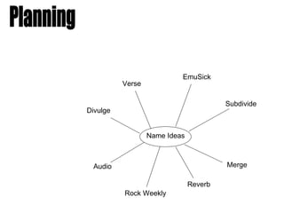
1. EmuSick
Verse
Subdivide
Divulge
Name Ideas
Audio Merge
Reverb
Rock Weekly
2. I chose Reverb and Verse as my two favourite
names from my ideas.
In order to find out which name I should use (which
would suit my target audience best) and would be
most succesful, I asked 12 people which one they
preferred. These are my results:
Reverb – 8 people
Verse - 4 people
After hearing what people’s opinions were, I have decided to choose
Reverb as the name for my music magazine.
3. I am now going to decide on a font for my magazine
title.
Possible Fonts:
I chose to use the 2nd font (Freeroad)
because I feel that it is the most
recognisable and bold font which
could stick in people’s minds. I also
did not want a font with too much going on
that may look childish. I also felt this was
the most stylish font.
4. Colour Scheme:
After taking my pictures, I decided on my colour
scheme by looking at what the musician in
my photo was wearing, and matching the
colour scheme partly to that. The two main colours
I chose were Dark red and White.
I am also going to use Yellow because it stands
out from the background/setting I’ve taken my front cover
photo in.
Layout:
The front cover for my magazine will be quite sparse,
there wont be much text. I have chosen to do this
because during my market research, I found out
that most of my target audience preferred the layout
of a front cover on a music magazine to be quite
spaced out and simple. I also think keeping the layout
simple will be effective and look professional.