
Recomendados
Más contenido relacionado
Último
Último (20)
Destacado
Destacado (20)
Ed sheeran digipak
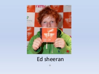
- 1. Ed sheeran +
- 2. Front cover • The different genres of music included on this album include : pop, hip hop, grime and acoustic • The colours used on the album cover consist of different shades of orange, and I think this is very effective as this makes Ed Sheeran look mysterious and doesn’t give much away about his character. • His face is positioned in the middle of the cover which connotes he is the centre of attention, and the album name is very unusual as its just a symbol + and placed on the bottom right of the cover. This is very clever as when ever people see this symbol + they will instantly think of Ed Sheeran and they associate that symbol with him. • He is looking straight at the audience • Record labels – asylum, atlantic and elektra
- 3. Spine • The spine continues with the orange theme and the text written on the spine is ‘Ed Sheeran’ placed on the left and in the middle is the album name +. • On the right is the record label ‘Asylum’ • Text is all in white
- 4. Back cover • The Song list is placed in the middle of the cover, in simple white text. • Record labels also shown (asylum and atlantic) along with any other information about the album. • Production credits – in a very small black font at the bottom, as it is not as important to the fans. However, it concerns the production teams and copyright information. • On the bottom left Ed Sheerans website is printed – edsheeran.com – maybe connoting his website isnt as important as his songs but is still there for his fans to view. • Barcode
- 5. Inside panes • Lyrics of all the songs on the album are included in the inside panes. It is very simplistic which is similar to the front and back cover.
- 6. • If you click on the image below, you will be able to watch and listen to one of Ed Sheeran’s more popular song from his album +