
Recomendados
Más contenido relacionado
La actualidad más candente
La actualidad más candente (17)
Destacado
Destacado (11)
Similar a Evaluation
Similar a Evaluation (20)
Más de charliemae1999
Último
Último (20)
Evaluation
- 4. EVALUATION QUESTION 1 In what ways does your media product use, develop or challenge forms and conventions of real media products?
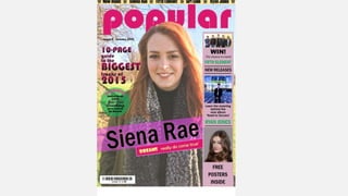
- 5. On my front cover, I have used the conventions of mastheads, straplines, cover lines, puffs and a barcode. My Masthead is the word ‘popular’ because pop music means popular and it will link to the theory of Maslow because hopefully reading this magazine, my target audience will feel as though they belong with everyone else. I decided on the colour of pink because it is a very girly colour. I wanted the masthead to be near the top of the page, because you read from left to right and from top to bottom, so that is the first thing that you will see. On my strapline, I have included the names of my singers and groups to give the readers a feel of who is in the magazine. I chose stars as spacers between the names because I saw that as quite girly but not too immature as hearts would potentially be. I also chose the background colour of yellow because it contrasted from the pink in the masthead.
- 6. On the left hand side of the page, I added a purple rectangle to create more space for cover lines. This features my boyband ‘Fifth Element’, my male singer ‘Ryan Jones’ and what would be another female singer. I chose the purple colour as the background because it complimented the pink in the masthead and the blue in the background of my main image. Some of the cover lines were in a dark/lime green colour because that contrasted well from the purple and added more to it as the black came across as quite boring. My main image is of my female singer ‘Siena Rae’. I chose to have her name spell with one ‘n’ rather than two to show her as slightly different and not having a completely ordinary name. I put the cover line that goes along with my main image in quotation marks to show that it was a quote that she said it. I emphasised the word ‘DREAMS’ because I wanted that the most important factor. My main image uses direct address so it makes the reader feel as though she is looking directly at them and engaging with them. I have challenged the convention of having a typical girl in pink on my front cover because I wanted to create a more mature role model. She is not wearing much make up allowing my target audience to feel as though they don’t have to wear it. I asked my model to smile in this photo because I wanted the parents of the magazine to see her as mature and a positive role model.
- 7. My Double Page Spread is about my girl band ‘Girl Code’. I chose this name as I thought it represented the idea of females sticking together because there is lots of talk of sticking to the “girl code”. I tried to again challenge the convention of a stereotypical female. So, I asked the girls in the band to wear what they normally would to show more of their personality. To add more to their personality, I also decided to keep their names. The background of my double page spread is a light purple and this was because I wanted to create synergy throughout my products as I had used this colour on my cover and contents pages. On my contents I have my male singer ‘Ryan Jones’. He is holding a guitar which shows that the magazine is a music magazine. I wanted to represent him as the typical boy crush of the majority of teenage girls. I asked him to look directly at the camera so that these girls felt as though he was looking directly at them.
- 8. EVALUATION QUESTION 2 How does your media product represent particular social groups?
- 9. • My media product is based on teenagers. All my characters are teenagers and can come across as role models to my target audience. Teenagers and young adults are the main social group that I have presented in my media products. That and females. As my magazine is based on the genre of pop music, I mostly relate that kind of music to younger females. The main reason I think that my product would represent this particular social group is because of the colours I used. The pink in the masthead and on the contents page and the double page spread show the girly side of the magazine for the younger teenagers, but the purple adds more maturity for the older teenagers.
- 10. EVALUATION QUESTION 3 What kind of media institution might distribute your media product and why?
- 11. • Magazine publishers such as Bauer would be ideal for distributing my media product as they are popular and quite well known. I would not put this magazine in places such as 'HMV' because although it is a popular music shop, stereotypically the male gender are more associated with it. I think that my product would sell better in supermarkets such as 'Tesco' and ‘Asda' or even clothes or make up shops, as that is a popular place for female teenagers to like to go to. It would make more sense to do this as my target audience are maturing and growing up, so they will be buying things for themselves.
- 12. EVALUATION QUESTION 4 Who would be the audience for your media product?
- 13. • The genre of music I chose to base my magazine on was pop and I most associate teenage females with this type of music. When looking into pop magazines, I noticed that the majority were for young teenagers. Some examples include 'top of the pops' and 'we love pop', I thought that it would be interesting to create a magazine for older teenagers who are maturing. I decided on the age range of 14-18. Being a 16 year old myself I don’t feel as though there are many magazines out their for me so I began creating one on ideas I liked. After brainstorming these, I then gave out a questionnaire on my characters and ideas to my target audience to see if they agreed with me. The majority did which boosted my confidence to include more things to me and my friends like. I feel that having older girls in my target audience and good role models would encourage the younger ones that growing up is fine and be able to have someone to look up to. My main character 'Siena Rae' is meant to be seen as the good, positive role model. She is smiling creating a kinder looking role model that parents wuld want their children to look up to.
- 14. EVALUATION QUESTION 5 How did you attract/address your audience?
- 15. The colours I used were my main focus on how to attract my target audience. Seeing as pink was quite a girly colour I thought it would work well with engaging my specific target audience. I see purple as a girly colour as well, but I think that it shows a more mature side of girls. As I wanted to achieve a more mature looking magazine, I thought that adding purple and pink together would create a nice look. I also added the two contrast of those colours; yell and green. This added a lot more effect and definitely attracted those I asked more. When speaking to people from my target audience they suggested that I should have my characters the same sort of age as them or slightly older. This would make them easier to relate to and more likely for the younger people to look up to because they wont feel intimidated by the age difference. I found this feedback really useful and it helped me to connect my target audience to the magazine rather than just making a magazine that is fun to look at.
- 16. EVALUATION QUESTION 6 What have you learnt about technologies from the process of constructing this product?
- 17. Whilst planning, researching and making my product, I have gained better skills that have allowed me to explore different ways of presenting my work. For example, using Prezi, SlideShare and Survey Monkey. Figuring out how to use all of this really raised my awareness of how many different ways there are to show what you have done. I have also learnt how to use photoshop and publisher. I mainly used publisher to create my magazine and it was fun to work with and allowed me to explore new things. I used Photoshop to help me on my front page. I wanted to put my models head in front of the masthead to try to put across the point that the magazine would be popular as you can not see all of the logo. I also learnt how to create an online survey. This was really useful as it allowed people from other places to answer the questionnaire. I got lots of feedback from this that helped me create better characters and things that would relate to my target audience better.
- 18. EVALUATION QUESTION 7 Looking back at your preliminary task, what do you feel you have learnt in the progression from it to the full product?
- 19. • For the preliminary task, we were given a brief of creating a school magazine. I created one for the sixth form at my school and it was to be the first issue of it. Looking back at this task and comparing it to my final products, I have definitely developed my skills. I have researched into typical conventions for a magazine, including mastheads, straplines and cover lines. As I have done this research, I now have a better understanding of them, better than what I did when creating the pages for my school magazine. Looking at the front cover I created, it comes across as more of a poster rather than a magazine front cover. I feel that my final product does look like a magazine as I have used more of the conventions. I have a better awareness now of what to include to make it appropriate for my target audience. • Another thing that I have learnt throughout this progression is about the hierarchy of needs; a theory by Maslow. The idea of love and belonging is one that I have kept in mind throughout the process of making my pop magazine. This was because I wanted my target audience to look at my magazine and believe that they were part of group. That they had other people like them. It is important to feel as though you belong to reach a higher position in the pyramid of needs.