4. Analyzing The Photos and Style
• When looking at the music artists you can see that most of
them are double acts or sometimes more.
• Nearly all of the artists have logos or a text style in there
names.
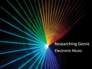
• The lighting in the photos are dark with strobe like colors
on the some of the pictures. This represents the darkness
and strobe lights in the areas that they play there music.
• When looking at electronic music you normally hear it at
night when people go out so this goes with look of the
music artists of the genre.
• The clothing worn is in some photos different and the
hairstyles are strange and different to make the artists
stand out as a person which is a form of advertising.
7. Analyzing Magazine
covers
• When looking at the front covers of the magazines I can see
the use of clean crisp text, this gives a sophisticated look to
the magazine.
• there is a pop art style look to the covers and there is a
balance of sophisticated black and white and then bold
bright colors in all of the ,magazine covers.
• Each cover has a main color pallet which is used in the
pictures and text for which ever issue it is of the magazine.
The only thing that stays the same on the covers is the font
of the title of the magazine at the top.
• Each cover has a famous electronic music artist on the front
and the sub titles talk about the artists and other events
and interviews inside the magazine.
8. Key elements to use in my
magazine cover.
• When designing my magazine cover I will keep in mind these
things
• Using a matching color pallet with everything on the cover ,
for example the text, pictures, clothes etc.
• Using my own picture on the front which can be edited and
on a white background so editing can be used also.
• Using text that will lure the target audience of the music for
example, electronic festivals, interviews, competions etc.