
Recommended
More Related Content
What's hot
What's hot (14)
Viewers also liked
Viewers also liked (15)
Similar to Changing Masthead Direction and Colour Scheme
Similar to Changing Masthead Direction and Colour Scheme (20)
Recently uploaded
Recently uploaded (20)
Changing Masthead Direction and Colour Scheme
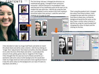
- 1. The first thing I did was I changed the direction my masthead was going, I changed it from vertical to horizontal. I did this because in my feedback it was said that part of my masthead could not be seen as my models hair was dark also. I did this by using the text tool I just deleted it and re-wrote it this time making it horizontal rather than vertical. I used the same font however as it is easy to read. Then using the gradient tool I changed the colour from blue to black, I then changed the box with the contents in from blue to black also, so that the background would be the same as the box ( have a similar colour scheme ) I did this by using the ‘paint bucket tool’ changing the colour to black and the clicking on the box. I then decided to make my image itself black and white to match the whole black and white colour scheme. I did this by clicking on ‘image’ then ‘adjustments’ then black and white, this then allowed me to alter the tone of the black and white. I could adjust the amount of red, yellow, green, blue or magenta in the image. I then thought that this was too much of black and white so I wanted to add some colour to the background, this would also make my image stand out more and seem more significant than if it was the same colour as the background ( as it was if it were to stay black and white. )
- 2. As I felt my background should have some colour I tested different types of colours using the gradient tool and the bucket tool. However they did not look right or professional enough. So I looked through my photos that I took on the photo shoot and found on with a blossom flower from a blossom tree. I opened the image on a new document on Photoshop, I then used the ‘quick select tool’ to cut out the flower. Using the ‘move tool’ I then dragged it along to the document that I was creating my contents page on. I flipped the image and made it larger and placed it behind all of my other layers. I did this several times changing the angel of the flowers and size so that it didn’t look as though I has cropped the same flowers over and over again. This made the background more colourful and my contents page less dull! It also made my image stand out more ( which is what I wanted )
- 3. FINAL CONTENTS PAGE The reason I chose this photo is because the front cover already had my model holding a guitar and I didn’t want every picture to be similar, also it was a close up which represents one of the camera angles that I have learnt. I also like this picture as it shows her smiling which shows that she is happy , I believe that this would attract more readers than if it were a serious photo where the model may look angry