
Recomendados
Más contenido relacionado
La actualidad más candente
La actualidad más candente (18)
Destacado
Destacado (15)
Similar a Final dps
Similar a Final dps (20)
Último
Último (20)
Final dps
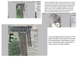
- 1. The first thing that I did to improve my front cover was to make sure that the readers could read my article. I did this by making my background image opaque by changing the opacity. This made the background lighter and the text easier to read. I then changed the opacity on the other page of my double page spread to the same opacity so that it would match and not look bad and clash. I also rearranged the font so that the ‘F’ the larger first letter of the article fit in with the first word and didn’t look off beat or out of place. I did this by sing the ‘select tool’ to move it about until I was satisfied.
- 2. Using the spot healing took I was able to blend in a stain on my models dress. Although it was not very noticeable I felt that it still looked sloppy and unprofessional! I then changed the size of the headline and the subheading so that it would be more attractive to the readers. I also made it easier to look at as before I moved it the word was overlapping with the roof of the shed so was a bit distracting, by moving it under the rood of the shed it looks neater and like a boarder.
- 3. I also decided to fix the square that I tried to cover up a plastic bag with. I used the ‘spot healing tool’ to blend in the edges with the surrounding greenery. I zoomed in really close using a smaller brush so that I could be ore accurate. This benefited as it looks like nothing ever was cropped and moved, it looks real.
- 4. The reason I chose to do this photo was because it was taken landscape and using the rule of thirds so my subject/ model is to one side. I also chose it because she is playing the guitar and looks like she is having fun. I thought that this would be a good image to present to readers so show the fun side of being a star, and that Charmaine is not all serious. FINAL DOUBLE PAGE SPREAD