1. ANALYSING MAGAZINE NAMES/MASTHEADS
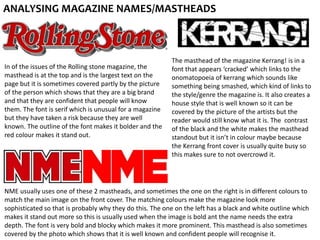
In of the issues of the Rolling stone magazine, the
masthead is at the top and is the largest text on the
page but it is sometimes covered partly by the picture
of the person which shows that they are a big brand
and that they are confident that people will know
them. The font is serif which is unusual for a magazine
but they have taken a risk because they are well
known. The outline of the font makes it bolder and the
red colour makes it stand out.
The masthead of the magazine Kerrang! is in a
font that appears ‘cracked’ which links to the
onomatopoeia of kerrang which sounds like
something being smashed, which kind of links to
the style/genre the magazine is. It also creates a
house style that is well known so it can be
covered by the picture of the artists but the
reader would still know what it is. The contrast
of the black and the white makes the masthead
standout but it isn’t in colour maybe because
the Kerrang front cover is usually quite busy so
this makes sure to not overcrowd it.
NME usually uses one of these 2 mastheads, and sometimes the one on the right is in different colours to
match the main image on the front cover. The matching colours make the magazine look more
sophisticated so that is probably why they do this. The one on the left has a black and white outline which
makes it stand out more so this is usually used when the image is bold ant the name needs the extra
depth. The font is very bold and blocky which makes it more prominent. This masthead is also sometimes
covered by the photo which shows that it is well known and confident people will recognise it.