
Recomendados
Más contenido relacionado
La actualidad más candente
La actualidad más candente (14)
Similar a Question 2.
Similar a Question 2. (20)
Question 2.
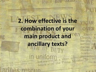
- 1. 2. How effective is the combination of your main product and ancillary texts?
- 3. My main product.. •Uses appropriate colour schemes and text/font styles throughout the production •Has all of the conventions of the typical local newspaper, including; title, slogan, interesting adverts/stories that are appropriate and eye-catching •I have attempted to make my stories look as interesting as possible to catch peoples eyes, after doing my research I found that newspapers with too much text to read are less likely to be bought that one with less text to get through. •I think my newspaper fits in to the typical working-class audience from within the local area.
- 4. ANCILLARY TEXTS. My ancillary texts are my poster advertisement and my radio advertisement, these both work well together as they both contain my newspaper slogan which is; ‘THE BEST NEWS AT THE RIGHT PRICE’. This is also featured in the actual newspaper on the front cover so the theme stays the same throughout all of my products including the colour scheme as well.
- 5. This is showing how I used the same colour scheme and logo running throughout my products, I also added the facebook/twitter logos from my newspaper front cover on to my poster to make it look professional.
- 6. HOW EFFECTIVE? By using the same logo and colour scheme throughout all of my products I think this helped with making it more recognisable making it more familiar to people compared to others. LINKS. I think it is quite easy to see the links between my products as I have used the slogan on all of my products including in my radio ad. Also the logo also appears on both products.