
Recomendados
Más contenido relacionado
La actualidad más candente
La actualidad más candente (20)
Destacado
Similar a Making Contents Page
Similar a Making Contents Page (20)
Más de ct04929306
Último
Último (20)
Making Contents Page
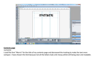
- 1. Contents page 11/12/13 I used the font "Morris" for the title of my contents page and decreased the tracking to make the text more compact. I have chosen this font because not all the letters look a bit messy whilst still being clear and readable.
- 2. 16/12/13 I've left some space at the top of the page for the main picture of my contents page which will be a picture of the band Imperium. Underneath that, I've placed my headings: Features, News, Reviews, Regulars and Competitions using the same font as the title, only in a smaller size. I have also started writing out my article titles and their accompanying text in "Alte Haas Grotesk". For the article titles I've made the font bold and the size a little bit smaller than the headings. As for the little bit of information underneath, I have used a slightly smaller font size than the article title and kept the font style to regular.
- 3. 16/12/13 Then I finished adding all the article information to the page and arranged the layout properly to accommodate the texts and images present. I have also added a border and drop shadow to my images to make them stand out more against the plain background.
- 4. 19/12/13 I added more colour to the page by making the page numbers red and adding a red line under the headings. I have made the lines slightly slanted so that it looks more creative and not too ordinary. Changing the colour of the page numbers gives a very clear and visual separation between the pieces of written information which are close to each other.
- 5. 08/01/14 Through playing around and trying out different fonts, I have decided to change the fonts of my title and headings to “Punk Rock Show”. I think this font gives more of a rock genre vibe because of the punk-style black blocks behind each letter. I also changed the font of the issue information under the title, the headlines and the page numbers to “Dirty Headline”. I had to increase the tracking of the letters, otherwise some particular letters would look like they were stuck together and be very difficult to read. Finally, I added a small masthead to beside the title of the page, and the page number at the corner of the page.
- 6. 16/01/14 I placed all of my images on the page and moved around some of the text on the page. I added some black bars behind the headings which I found particularly useful when I still hadn’t added on my main image. Because there was a lot of empty space at the top right, I added the magazine’s website information there and edited the colour scheme of the page. Firstly, I made the some parts of the website information red to highlight the magazine’s name. Then I also changed the colour of the masthead from black to red, as well as the headings of each section from black to red.
- 7. 22/01/14 I changed the background colour of the page to black, therefore I had to also change the font colours in order for them to be seen. I changed all the previously black text to white and all the other previously black shapes to white. I also dragged the images out to the very edge of the pages and added captions and page numbers next to each picture. For the page number, I used the font “Future Rot” in a size 12 font and for the captions I used “Alte Haas Grotesk” in a size 7 font.
- 8. 23/01/14 I switched the font colour of the title of the page to red and the masthead colour to white. Then I added the subscription information at the top right of the page using the font “Broken Detroit”. To highlight some of the key information, I made them red, and as for the “Subscribe Now” title, I made the size of it bigger so that it stands out more. I also moved the contact information and issue information to the right of the title, to make space for the subscription information.
- 9. 29/01/14 I added an image of the band in my double-page spread to this page and moved the articles around. I also centred the subscription information at the top right of the page.
- 10. 30/01/14 I moved the title and other information at the top of the page higher so that I could make more room for articles. Then I removed the image of Nothing Yet and also decreased the size of Jakob Brennan’s image.