
Recomendados
Más contenido relacionado
La actualidad más candente
La actualidad más candente (20)
Destacado
Destacado (20)
Similar a High voltage presentation
Similar a High voltage presentation (20)
Último
Último (20)
High voltage presentation
- 1. Daniel Cowie
- 2. Contents The Cover Purpose The Audience Language Layout Coverlines Pictures Masthead Genre Font Price and Frequency Incentive to buy Contents Page Contents Layout Q&A
- 3. The Cover
- 4. Purpose The purpose of this magazine is to inform readers of the goings on of the current genre of ‘grime/electric/club’ music. The magazine contains interviews with stars of this genre and contains other events associated with the genre, an example of this is ‘the house party of the year’. The initial purpose of a magazine cover is to attract a customer into purchasing the mag.
- 5. The Audience The Audience of this magazine is of a specialized area as it is targeted at people who enjoy this genre but also I have involved a new audience by including features which teenagers will be interested in, this is the house party of the year section. I believe the magazine is predominately aimed at males but I have included a section of artists of the genre who are women which hopefully will attract female readers.
- 6. Language The language of the magazine is simple as I believe teenagers will not be interested in magazine with long words which they do not understand as this is seen as ‘not cool’.
- 7. Layout This section up the The most important part top tells the reader of a magazine is the key information masthead as without it a when reader will not be able to purchasing, this is distinguish the the price which is magazine. I have made it needed when buying large to stand out from a mag. other magazine This is the largest picture on the front cover as he is a star and this should attract the reader as he is These are the coverlines well known Also I have placed which are situated on the him in front of a graffiti wall as it left hand side so the reader relates to his genre can see them when in shops when only the left column is viewable. I have the barcode in the corner for the shops to scan when the magazine is sold. I have put this in the corner as it looks Most magazines have like a piece of the page has been turned barcodes in this over. This shows like a sneak preview of corner. what’s inside.
- 8. Coverlines My coverlines are – .The biggest rave in the UK’s history as Kingpin Dogg takes the stage . Our top 10 female MC’s in the business . Unknown rappers FOUND. I believe these appeal to the reader as they are all to do with the genre they are down the left hand side of the magazine and stand out in white on the black background, I believe this is like the genre of music these opposites make it very vibrant just like the energy of the music.
- 9. Pictures (above)These are two of the many pictures I took of ICE DADDY who is the artist I am interviewing in my magazine. We dressed him up in this clothing which appeals to teenagers as it is the latest fashion and this artist is someone they look up to. I placed ICE DADDY in front of a blank wall to make him stand out. (below) This is a picture of a club/rave where strobe lighting is being shot in all directions. I chose this picture as it relates to the genre and looks good against my black background.
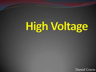
- 10. Masthead My masthead is called High Voltage, this relates to the genre of music. This is an electric bolt where the L should be in high voltage. This ties into the word voltage to do with electricity like the music. It is in a bold font so it shouts out and is loud like the music in a club.
- 11. Genre The genre of the music is club music mostly but a bit of grime and hip-hop are in their to, I think that the 3 genres should be tied into one as they are quite closely linked. There are very few magazines which delve in these genres most magazines are to do with the rock culture. As there are 3 genres involved I believe that we will appeal to a larger audience without being to mainstream by avoiding the pop genre. Many teenagers mostly boys are not interested in pop music any more so seek new genres and I believe this magazine helps them to find a genre they truly enjoy.
- 12. Font I have kept the same font throughout the whole cover as I believe the cover looks to full when you have many fonts on the same page. The font relates to the boldness of the genre. The font colour has changed throughout, all the colours of the font are dynamic and are neon colours. These are the colours you expect to see in clubs in glow sticks and lighting and UV paint. The colours all stand out upon the black background so the readers attention is instantly grabbed.
- 13. Price and Frequency The price of the magazine is 99p this is almost a trick of the mind. As if you see 99p you think bargain yet it is £1 customers my not want to purchase the magazine as you wont get change from a £1 coin. Also the audience of teenagers don’t want to be spending £3 on a magazine keeping it cheap we don’t deter potential customers. The frequency of the magazine is weekly so it will only contain 60 pages.
- 14. Incentive to Buy There are many incentives to buy this magazines these being the exclusive interview with ICEDADDY the 99p pricing which is cheap for a magazine. The free CD which will be included with the magazine is a freebie so customers will think buying this magazine is a bargain. Also the unique selling of ‘the only club music magazine in the UK’.
- 15. Contents Page
- 16. Contents Layout I will also have a few Also I will create a pictures no more than message from an 6 around the Editor about this thunderbolt to give a weeks edition. sneak preview of what’s inside I have decided to My idea is to have a have an thunderbolt(red) on a advertisement of white background with hair gel as it appeals white text inside the to teenagers thunderbolt which lists the contents on the magazine.
- 17. Any Questions? Fin