
Recomendados
Más contenido relacionado
Destacado
Destacado (16)
Más de darakolajo
Último
Último (20)
In what ways does your media products use
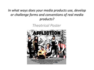
- 1. In what ways does your media products use, develop or challenge forms and conventions of real media products? Theatrical Poster
- 2. Research • Before starting the design of the poster, We looked at existing film posters with a similar genre to get initial ideas. So straight away we developed our ideas with real forms of media. • We paid particular attention to three film posters: • All these films are set in London and focuses on a group of young people. The poster shows off uninviting characters in a grim setting. When taking our photos for the poster we ensured that we captured this.
- 3. Research Own Photos Photo shoot 1) Used similar setting as research pictures. To add an authentic look. This is necessary as our film is a real life drama. 2) Facial Expression is key, this helps convey emotion. As well as being a drama, we want wanted our storyline to be hard hitting. That is why during the photo shoot we made sure that all models had a hard exterior about them. Whilst looking at other posters rarely did we see models smiling. 3) The position of every person was thought about careful and this again was on the basis of our research. We wanted to make it cleat to the audience through the poster that this was ‘their’ territory and home. So they had to look comfortable and confident. 4) Clothing helps the audience establish the genre of the film. Models wore casual attire, generally we got this idea from research again.
- 4. Clothing • As a group we decided to use the clothing to express personality and character. All our actresses are living in the same area, of similar age collectively they should be alike in representation. In our research of clothing of young people in the media this was the case. To differentiate each charter we instructed to where different colours but they were still wearing similar clothing. Using a desaturating tool to create a greyscale background to strongly enforce these colours. This idea was formed after closely analysing the ‘Sket’ theatrical poster.
- 5. Font • This was the common factor with every poster that we looked at. The tile of the film was clear, a bold statement and this was applied to our own design. This idea is following the theme of a hard hitting drama at the same time developing existing ideas. Bold fonts used. Helps makes the name memorable to a target audience remember the name of the film this is extremely important as the poster is a marketing and advertising tool. To add there will of the competitors for the same target audience Final Font
- 6. Text The main text you see on a theatrical poster is the release date and a form of credits, stating who is in the film, directors and film producers. From ‘Adulthood’ poster Additionally there is a form of slogan relating to the film (another advertising tool) From ‘Sket’ poster From ‘kidulthood’ poster
- 7. Conclusion • My partner and I stuck strictly with our research, therefore meaning that we mainly developed forms and conventions of real media products. For out design there was no need to challenge existing products. We always looked back at already made posters for guidance.