SlideShare a Scribd company logo
1 of 22
How to Make Noise Maps
       with PowerPoint

   This presentation outlines the process of
    automating area noise map creation and
    coloring with Microsoft PowerPoint
   A similar work product can be obtained
    using the graphing functions of Excel

                                 Dale Rhodes
                                 Ferndale Refinery
Target Work Product

                      98-101
                      95-98
                      92-95
                      89-92
                      86-89
                      83-86
                      80-83
                      77-80
                      74-77
                      71-74
Set Up a Data Grid

  For a square city block sized area a
  20 X 20 data grid will give you
  reasonable noise map resolution.
 The size of the grid can be adjusted to
  fit each plot plan after matching the
  two up as the next few pages will
  demonstrate.
Setting Up a Data Grid
   Select “Insert” / “Chart” from the
    PowerPoint menu and you will get
    a data table and a chart template
    similar to these:
Setting Up a Data Grid

   We will first work with the data table.
        On the PowerPoint menu select
        “Data” and then set “Series in
        columns”. This will make the data table upper Left
        hand cell correspond with the northwest corner of
        your drawing if it is oriented with north end of the
        drawing on the left side of the paper.
        You can play with different
        orientations later when you gain
        familiarity with the process.
Setting Up a Data Grid
1. You will need to replace column and row titles in the
   PowerPoint Master with grid references to create a 20 X 20
   matrix.
2. Number them 1 – 20 starting with the template cell labeled
   “East” and going down that column.
3. Repeat for the titles in the title row. For instance “1st Qtr”
   becomes “1” and so forth through 20.
Setting Up a Data Grid
4. For now, fill all data cells with “0” for a place holder to force the
   program to draw those grid cells for your map plot. (use copy,
   and paste to multiple cells to speed this task)
Your chart should now look like this:
                                                                    1
                           1
                         0.9                                        2
                         0.8                                        3
                         0.7                                        4
                         0.6                                        5
                         0.5                                        6
                         0.4                                        7
                         0.3                                        8
                         0.2                                        9
                         0.1                                        10
                           0                                        11
                               1   3   5   7   9   11 13 15 17 19
                                                                    12
                                                                    13

                  1. Next, double left click on the chart. This
                     should change the page top PowerPoint
                     menu to the one you need.
                  2. Select Chart / Chart Type from the
                     menu.
                  3. Select Surface chart and pick the 2-D
                     colored option which is the lower left
                     hand option of the four examples shown
The Map Grid
                                                   You should now have a chart
                                                    that looks similar to the one at
                                 19
                                 17
                                                    the left
                                 15                You can keep the reference
                                 13   0.8-1         labels 1-20 on each axes or
                                      0.6-0.8
                                 11                 turn them off using the chart
                                      0.4-0.6
                                 9
                                      0.2-0.4
                                                    menu “Chart Options” / “Axes”
                                 7                  menu selections and un-
                                      0-0.2
                                 5
                                                    checking the boxes (see
                                 3
                                                    below)
                                 1
 1

     4

         7

             10

                  13

                       16

                            19


If you later want to customize the
grid size or shape you can come
back and add or delete data table
columns and rows to fit your
situation or preferences.
The Map Grid
   I prefer to either turn off display of the X and Y axes labels (1 to
    20) or go back to the data table and enter distance coordinates
    for those labels. (This is done after I get the plot plan matched up to the grid
    and know the scale of distance on the ground between the data points.)


   The next step is pasting the plot plan over the grid and adjusting
    it’s size to match the portion for which you want to display noise
    data.

   This is a good point to save what you have already done as a
    template for setting up all of your noise area data grids.

   At this point I need to digress to the side issue of creating your
    plot plan graphics files
Preparing Your Plot Plans
                   Using Microsoft Photo
                      Editor or any
                      program that has a
                      function for setting
                      the background to
                      “Transparent”:
                   1) Open the graphics
                      file you want to
                      work with
                   2) Select “Set
                      Transparent Color “
                      function
Preparing Your Plot Plans
                  3. Using the pointer for
                     the “Set Transparent
                     Color” function, Point to
                     any location on the
                     white drawing
                     background and right
                     click your mouse.
Preparing Your Plot Plans
                  4. The background in
                     Photo Editor will take
                     on a checkered
                     appearance indicating it
                     is transparent.
                  5. The background will no
                     longer obscure your
                     noise map color coding.
                  6. You can now resize,
                     crop or proceed directly
                     to save the drawing.
                  7. Save as *.GIF type file
                     for easy use with
                     PowerPoint.
Matching Plot Plan and Grid
                   1.   From the PowerPoint menu use
                        the “Insert / Picture/ From File”
                        function and select your graphic
                        file for the noise map.
                   2.   Align your graphic with the
                        lower left hand corner of the
                        grid and resize it to match using
                        the mouse to click on it and
                        move the upper right hand
                        corner in.
                   3.  This step is easier if the lowest
                      0.8-1 range is set to the color
                       data
                      0.6-0.8 Skip to instructions.
                       white.
                   4. 0.4-0.6 Grid cross point
                       Each
                      0.2-0.4
                       corresponds to a field noise
                      0-0.2 collection point except
                       data
                       where inaccessible.
                   5.   You will save this chart as the
                        template for this process area
                        and print this chart to go collect
                        data.
Matching Plot Plan and Grid
                  1.   If you want to adjust the
                       number of rows or columns in
                       your grid to match the aspect
                       ratio of the drawing, double
                       click on the chart (grid) to
                       bring up the data table.
                  2.   Turn off the number of
                       desired bottom rows by
                       clicking on icon for toggling
                       display of the row
Matching Plot Plan and Grid
                  3.   To adjust the number of
                       columns to make the grid
                       smaller in the horizontal
                       dimension, use your mouse
                       to select the number of right
                       hand data columns
                       corresponding to the number
                       of grid columns you need to
                       remove.
                  4.   Use the PowerPoint “Edit /
                       Delete” function to eliminate
                       those columns.
                  5.   Final adjustments can be
                       made by dragging the corners
                       of the chart area or the
                       drawing to make them match
                       up to your satisfaction.
The Noise Data
You’ve collected your noise data and now you’re back from the field and are ready to fill
    in your area noise data. See PowerPoint instructions if you need help with data tables.
Remember, data cell A1 is the NW corner of your map and A20 is the SW corner.
The Noise Data

   As you fill in data, if you exit the data chart to
    look at the noise map, you will notice it will start
    to color up as PowerPoint auto assigns ranges
    and colors to the data series.
   You will need to adjust, data minimum,
    maximum and range colors to make the noise
    map convey the situation with greatest clarity.
Adjusting Data Range Colors


Mouse click on a single legend color box to select for editing. Brackets will
appear when you have achieved a selection.
Next double left click to bring up the edit pop-up menu.
Adjusting Data Range Colors


1.   This menu allows you to choose colors for each data range or “noise isopleth” to
     create a color scale that conveys the relative noise levels at a glance.
2.   Repeat color selection process for each data range.
Adjusting Scales

                 If you double click on
                  the legend box a pop-
                  up menu comes up
                  that allows you to
                  modify data ranges
                  and scales.
                 Set minor units to 1
                 Experiment with other
                  factors to get the data
                  breaks that best
                  convey your data.
Completed Noise Map
                      98-101

                      95-98

                      92-95

                      89-92

                      86-89

                      83-86

                      80-83

                      77-80

                      74-77

                      71-74

More Related Content

What's hot

What's hot (20)

High volume air sampler
High volume air samplerHigh volume air sampler
High volume air sampler
 
Permissible limits of water pollutants in drinking water.
Permissible limits of water pollutants in drinking water.Permissible limits of water pollutants in drinking water.
Permissible limits of water pollutants in drinking water.
 
Quality of water - analysis
Quality of water - analysisQuality of water - analysis
Quality of water - analysis
 
Laboratory testing of water quality parameters
Laboratory testing of water quality parametersLaboratory testing of water quality parameters
Laboratory testing of water quality parameters
 
L 13 bod
L 13 bodL 13 bod
L 13 bod
 
Drinking water and wastewater monitoring
Drinking water and wastewater monitoringDrinking water and wastewater monitoring
Drinking water and wastewater monitoring
 
Radar ppt
Radar pptRadar ppt
Radar ppt
 
Water test methods
Water test methodsWater test methods
Water test methods
 
Solid waste management
Solid waste managementSolid waste management
Solid waste management
 
EIA PRESENTATION ON NARMDA RIVER
EIA PRESENTATION ON NARMDA RIVEREIA PRESENTATION ON NARMDA RIVER
EIA PRESENTATION ON NARMDA RIVER
 
POTABLE WATER
POTABLE WATERPOTABLE WATER
POTABLE WATER
 
Quality of potable water
Quality of potable waterQuality of potable water
Quality of potable water
 
Chapter 5 water quality
Chapter 5 water qualityChapter 5 water quality
Chapter 5 water quality
 
Water desalination
Water desalinationWater desalination
Water desalination
 
Smart safety jacket
Smart safety jacketSmart safety jacket
Smart safety jacket
 
Estimation of types of alkalinity in waste water samples
Estimation of types of alkalinity in waste water samplesEstimation of types of alkalinity in waste water samples
Estimation of types of alkalinity in waste water samples
 
Water testing
Water testingWater testing
Water testing
 
Desalination of Sea Water PPP 060310
Desalination of Sea Water PPP 060310Desalination of Sea Water PPP 060310
Desalination of Sea Water PPP 060310
 
Noise environment impact analysis
Noise environment impact analysisNoise environment impact analysis
Noise environment impact analysis
 
Water Quality Index
Water Quality IndexWater Quality Index
Water Quality Index
 

Viewers also liked

How to Conduct a Noise Survey
How to Conduct a Noise SurveyHow to Conduct a Noise Survey
How to Conduct a Noise Survey
Tristan Landers
 
Noise pollution
Noise pollutionNoise pollution
Noise pollution
berneyr
 
Noise pollution,sources,causes and effects
Noise pollution,sources,causes and effectsNoise pollution,sources,causes and effects
Noise pollution,sources,causes and effects
Saba Shahzadi
 

Viewers also liked (18)

Sound Level Meter
Sound Level MeterSound Level Meter
Sound Level Meter
 
How to Conduct a Noise Survey
How to Conduct a Noise SurveyHow to Conduct a Noise Survey
How to Conduct a Noise Survey
 
Sound level meters
Sound level metersSound level meters
Sound level meters
 
Sound level meter
Sound level meterSound level meter
Sound level meter
 
UV Light Meter by ACMAS Technologies Pvt Ltd.
UV Light Meter by ACMAS Technologies Pvt Ltd.UV Light Meter by ACMAS Technologies Pvt Ltd.
UV Light Meter by ACMAS Technologies Pvt Ltd.
 
Twinfinity uv meter
Twinfinity uv meterTwinfinity uv meter
Twinfinity uv meter
 
Clasificación de los plásticos
Clasificación de los plásticosClasificación de los plásticos
Clasificación de los plásticos
 
Types of audio monitoring devices
Types of audio monitoring devicesTypes of audio monitoring devices
Types of audio monitoring devices
 
What's new in Femap 11.3 • FEA Analisten Stream
What's new in Femap 11.3 • FEA Analisten StreamWhat's new in Femap 11.3 • FEA Analisten Stream
What's new in Femap 11.3 • FEA Analisten Stream
 
Sound Level Meter by ACMAS Technologies Pvt Ltd.
Sound Level Meter by ACMAS Technologies Pvt Ltd.Sound Level Meter by ACMAS Technologies Pvt Ltd.
Sound Level Meter by ACMAS Technologies Pvt Ltd.
 
Risk Assessments
Risk AssessmentsRisk Assessments
Risk Assessments
 
Noise pollution
Noise pollutionNoise pollution
Noise pollution
 
Noise pollution
Noise pollutionNoise pollution
Noise pollution
 
Noise pollution,sources,causes and effects
Noise pollution,sources,causes and effectsNoise pollution,sources,causes and effects
Noise pollution,sources,causes and effects
 
Noise pollution presentation
Noise pollution presentationNoise pollution presentation
Noise pollution presentation
 
Noise Pollution
Noise PollutionNoise Pollution
Noise Pollution
 
Noise pollution
Noise pollutionNoise pollution
Noise pollution
 
Writing chapter 3
Writing chapter 3Writing chapter 3
Writing chapter 3
 

Similar to Noise Mapping

Tutorial 1 - Computer Aided Design (Final Release)
Tutorial 1 - Computer Aided Design (Final Release)Tutorial 1 - Computer Aided Design (Final Release)
Tutorial 1 - Computer Aided Design (Final Release)
Charling Li
 
Auto cad 2007-tutorial
Auto cad 2007-tutorialAuto cad 2007-tutorial
Auto cad 2007-tutorial
Syed Javeed
 
TAO Fayan_Canvas design by tcltk_Final report
TAO Fayan_Canvas design by tcltk_Final reportTAO Fayan_Canvas design by tcltk_Final report
TAO Fayan_Canvas design by tcltk_Final report
Fayan TAO
 
Pivot tableinfo
Pivot tableinfoPivot tableinfo
Pivot tableinfo
KA25EE855
 
Plan601 e session 4 demo
Plan601 e session 4 demoPlan601 e session 4 demo
Plan601 e session 4 demo
rkottam
 

Similar to Noise Mapping (20)

Advanced Excel, Day 2
Advanced Excel, Day 2Advanced Excel, Day 2
Advanced Excel, Day 2
 
ENVI Pocket Guide: Volume 2 | Intermediate
ENVI Pocket Guide: Volume 2 | IntermediateENVI Pocket Guide: Volume 2 | Intermediate
ENVI Pocket Guide: Volume 2 | Intermediate
 
Autocad 2007 Workbook Tutorial
Autocad 2007 Workbook TutorialAutocad 2007 Workbook Tutorial
Autocad 2007 Workbook Tutorial
 
Lecture 10: introduction to computer
Lecture 10: introduction to computerLecture 10: introduction to computer
Lecture 10: introduction to computer
 
Tutorial 1 - Computer Aided Design (Final Release)
Tutorial 1 - Computer Aided Design (Final Release)Tutorial 1 - Computer Aided Design (Final Release)
Tutorial 1 - Computer Aided Design (Final Release)
 
ENVI Pocket Guide: Volume 1 | Basics
ENVI Pocket Guide: Volume 1 | BasicsENVI Pocket Guide: Volume 1 | Basics
ENVI Pocket Guide: Volume 1 | Basics
 
Microsoft excel part 2
Microsoft excel part 2Microsoft excel part 2
Microsoft excel part 2
 
Tableau Visual Guidebook
Tableau Visual GuidebookTableau Visual Guidebook
Tableau Visual Guidebook
 
Auto cad 2007-tutorial
Auto cad 2007-tutorialAuto cad 2007-tutorial
Auto cad 2007-tutorial
 
Get the Sheet out of here! Plan production for jobs due yesterday
Get the Sheet out of here! Plan production for jobs due yesterdayGet the Sheet out of here! Plan production for jobs due yesterday
Get the Sheet out of here! Plan production for jobs due yesterday
 
Manual autocad 2010 english
Manual autocad 2010 englishManual autocad 2010 english
Manual autocad 2010 english
 
Workshop10 creep-jop
Workshop10 creep-jopWorkshop10 creep-jop
Workshop10 creep-jop
 
Grapher final
Grapher finalGrapher final
Grapher final
 
Coord transform 082014
Coord transform 082014Coord transform 082014
Coord transform 082014
 
TAO Fayan_Canvas design by tcltk_Final report
TAO Fayan_Canvas design by tcltk_Final reportTAO Fayan_Canvas design by tcltk_Final report
TAO Fayan_Canvas design by tcltk_Final report
 
Civil 3d alignments and profile traning
Civil 3d alignments and profile traningCivil 3d alignments and profile traning
Civil 3d alignments and profile traning
 
Pivot tableinfo
Pivot tableinfoPivot tableinfo
Pivot tableinfo
 
Acad civil3 d_points_manual
Acad civil3 d_points_manualAcad civil3 d_points_manual
Acad civil3 d_points_manual
 
Plan601 e session 4 demo
Plan601 e session 4 demoPlan601 e session 4 demo
Plan601 e session 4 demo
 
Power BI Overview Manual
Power BI Overview ManualPower BI Overview Manual
Power BI Overview Manual
 

Noise Mapping

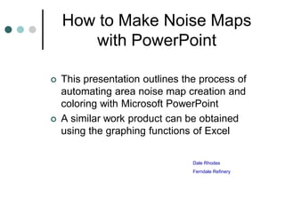
  • 1. How to Make Noise Maps with PowerPoint  This presentation outlines the process of automating area noise map creation and coloring with Microsoft PowerPoint  A similar work product can be obtained using the graphing functions of Excel Dale Rhodes Ferndale Refinery
  • 2. Target Work Product 98-101 95-98 92-95 89-92 86-89 83-86 80-83 77-80 74-77 71-74
  • 3. Set Up a Data Grid  For a square city block sized area a 20 X 20 data grid will give you reasonable noise map resolution.  The size of the grid can be adjusted to fit each plot plan after matching the two up as the next few pages will demonstrate.
  • 4. Setting Up a Data Grid  Select “Insert” / “Chart” from the PowerPoint menu and you will get a data table and a chart template similar to these:
  • 5. Setting Up a Data Grid  We will first work with the data table.  On the PowerPoint menu select “Data” and then set “Series in columns”. This will make the data table upper Left hand cell correspond with the northwest corner of your drawing if it is oriented with north end of the drawing on the left side of the paper.  You can play with different orientations later when you gain familiarity with the process.
  • 6. Setting Up a Data Grid 1. You will need to replace column and row titles in the PowerPoint Master with grid references to create a 20 X 20 matrix. 2. Number them 1 – 20 starting with the template cell labeled “East” and going down that column. 3. Repeat for the titles in the title row. For instance “1st Qtr” becomes “1” and so forth through 20.
  • 7. Setting Up a Data Grid 4. For now, fill all data cells with “0” for a place holder to force the program to draw those grid cells for your map plot. (use copy, and paste to multiple cells to speed this task)
  • 8. Your chart should now look like this: 1 1 0.9 2 0.8 3 0.7 4 0.6 5 0.5 6 0.4 7 0.3 8 0.2 9 0.1 10 0 11 1 3 5 7 9 11 13 15 17 19 12 13 1. Next, double left click on the chart. This should change the page top PowerPoint menu to the one you need. 2. Select Chart / Chart Type from the menu. 3. Select Surface chart and pick the 2-D colored option which is the lower left hand option of the four examples shown
  • 9. The Map Grid  You should now have a chart that looks similar to the one at 19 17 the left 15  You can keep the reference 13 0.8-1 labels 1-20 on each axes or 0.6-0.8 11 turn them off using the chart 0.4-0.6 9 0.2-0.4 menu “Chart Options” / “Axes” 7 menu selections and un- 0-0.2 5 checking the boxes (see 3 below) 1 1 4 7 10 13 16 19 If you later want to customize the grid size or shape you can come back and add or delete data table columns and rows to fit your situation or preferences.
  • 10. The Map Grid  I prefer to either turn off display of the X and Y axes labels (1 to 20) or go back to the data table and enter distance coordinates for those labels. (This is done after I get the plot plan matched up to the grid and know the scale of distance on the ground between the data points.)  The next step is pasting the plot plan over the grid and adjusting it’s size to match the portion for which you want to display noise data.  This is a good point to save what you have already done as a template for setting up all of your noise area data grids.  At this point I need to digress to the side issue of creating your plot plan graphics files
  • 11. Preparing Your Plot Plans Using Microsoft Photo Editor or any program that has a function for setting the background to “Transparent”: 1) Open the graphics file you want to work with 2) Select “Set Transparent Color “ function
  • 12. Preparing Your Plot Plans 3. Using the pointer for the “Set Transparent Color” function, Point to any location on the white drawing background and right click your mouse.
  • 13. Preparing Your Plot Plans 4. The background in Photo Editor will take on a checkered appearance indicating it is transparent. 5. The background will no longer obscure your noise map color coding. 6. You can now resize, crop or proceed directly to save the drawing. 7. Save as *.GIF type file for easy use with PowerPoint.
  • 14. Matching Plot Plan and Grid 1. From the PowerPoint menu use the “Insert / Picture/ From File” function and select your graphic file for the noise map. 2. Align your graphic with the lower left hand corner of the grid and resize it to match using the mouse to click on it and move the upper right hand corner in. 3. This step is easier if the lowest 0.8-1 range is set to the color data 0.6-0.8 Skip to instructions. white. 4. 0.4-0.6 Grid cross point Each 0.2-0.4 corresponds to a field noise 0-0.2 collection point except data where inaccessible. 5. You will save this chart as the template for this process area and print this chart to go collect data.
  • 15. Matching Plot Plan and Grid 1. If you want to adjust the number of rows or columns in your grid to match the aspect ratio of the drawing, double click on the chart (grid) to bring up the data table. 2. Turn off the number of desired bottom rows by clicking on icon for toggling display of the row
  • 16. Matching Plot Plan and Grid 3. To adjust the number of columns to make the grid smaller in the horizontal dimension, use your mouse to select the number of right hand data columns corresponding to the number of grid columns you need to remove. 4. Use the PowerPoint “Edit / Delete” function to eliminate those columns. 5. Final adjustments can be made by dragging the corners of the chart area or the drawing to make them match up to your satisfaction.
  • 17. The Noise Data You’ve collected your noise data and now you’re back from the field and are ready to fill in your area noise data. See PowerPoint instructions if you need help with data tables. Remember, data cell A1 is the NW corner of your map and A20 is the SW corner.
  • 18. The Noise Data  As you fill in data, if you exit the data chart to look at the noise map, you will notice it will start to color up as PowerPoint auto assigns ranges and colors to the data series.  You will need to adjust, data minimum, maximum and range colors to make the noise map convey the situation with greatest clarity.
  • 19. Adjusting Data Range Colors Mouse click on a single legend color box to select for editing. Brackets will appear when you have achieved a selection. Next double left click to bring up the edit pop-up menu.
  • 20. Adjusting Data Range Colors 1. This menu allows you to choose colors for each data range or “noise isopleth” to create a color scale that conveys the relative noise levels at a glance. 2. Repeat color selection process for each data range.
  • 21. Adjusting Scales  If you double click on the legend box a pop- up menu comes up that allows you to modify data ranges and scales.  Set minor units to 1  Experiment with other factors to get the data breaks that best convey your data.
  • 22. Completed Noise Map 98-101 95-98 92-95 89-92 86-89 83-86 80-83 77-80 74-77 71-74