
Recomendados
Más contenido relacionado
La actualidad más candente
La actualidad más candente (14)
Destacado
Destacado (19)
Más de djardine94
Más de djardine94 (15)
Último
Último (20)
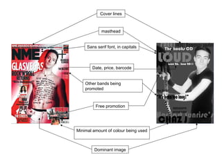
Similarities between a professional magazine to my own design.
- 1. Sans serif font, in capitals Minimal amount of colour being used Free promotion Other bands being promoted Cover lines masthead Dominant image Date, price, barcode
- 2. Text/ actual contents in blocks Title of magazine at the top, in bold and capitals Subscription offer in the same place More colours used on the contents compared to front cover Same text used throughout the magazine Image of the featured artist on this months magazine
- 3. Quote from the interview, used effects too for example, bold and change of colour Image of featured artist placed right in the middle A different text has been used for the double page spread compared to the front cover and contents page