Page furtinture lwl
•
0 recomendaciones•202 vistas

This document provides details on the layout and design elements of a magazine article about Zach Snyder's film Superman. Key elements included are a punny header to draw readers in, a mysterious sub-header question to intrigue them, and consistent visual motifs like the letter Z and Superman iconography threaded throughout the issue related to the film topic. Photos and graphics are creatively incorporated and modified to fit the overall design aesthetic.

Recomendados
Más contenido relacionado
Similar a Page furtinture lwl
Más de Lucy Taylor
Más de Lucy Taylor (20)
Page furtinture lwl
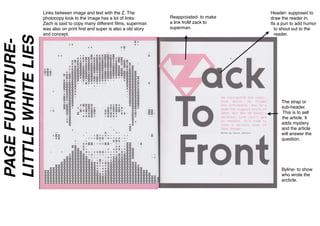
- 1. Header- supposed to draw the reader in. Its a pun to add humor to shout out to the reader. Reapproiated- to make a link froM zack to superman. The strap or sub-header. This is to sell the article. It adds mystery and the article will answer the question. Links between image and text with the Z. The photocopy look to the image has a lot of links: Zach is said to copy many different films, superman was also on print first and super is also a old story and concept. Byline- to show who wrote the arcticle. PAGEFURNITURE- LITTLEWHITELIES
- 2. The dropcap- This is to show the reader where to start reading. Gutter in the middle of the page. The icons are used as subdivider. It plays on the ʻIt is a bird is it a plane , not its superman” The folio, page number and issue number. The slug is shown of a superman icon and it runs throughout all of the superman information. Instead of the full stop they have a LWL icon.This works as branding for LWL. Its still from the film, however it is tinted in pink. This shows us that the design takes more importance over the photo. The Z motif shows consistently throughout the issue. The info sector, shows the basic information about the film and when it comes out. This reminds you to actually go watch it. The whole page has a two page structure