
Recomendados
Más contenido relacionado
La actualidad más candente
La actualidad más candente (20)
Destacado
Similar a MAGAZINE ANALYSIS: SIMPLE YET EFFECTIVE COVER DESIGN
Similar a MAGAZINE ANALYSIS: SIMPLE YET EFFECTIVE COVER DESIGN (20)
Más de ehallassmith
Más de ehallassmith (20)
Último
Último (20)
MAGAZINE ANALYSIS: SIMPLE YET EFFECTIVE COVER DESIGN
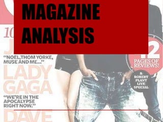
- 2. Mast head The mast head it simple, bright and bold. This icon/picture is Header used whenever the magazine is advertised. Because if its simplicity it is well known by the readers and others. Splatter(s) Main Kicker The splatter itself is a Explanatory. kicker with a splatter underneath it, which is There isn't one particular main like an explanatory kicker. Although there are three because it gives more of main articles/interviews that an insight into the are shown on the front cover – magazine. so the articles could count and one whole main kicker. The text suggests the importance of This gives the audience more each musician. Each kicker is a vision into what musicians are musicians name and each in the magazine. explanatory is a quote from that musician Barcode The date is included in the barcode and so is the price of the magazine.
- 3. The eye flow of this cover only goes through the main picture. The musicians are the main focus of the articles and the cover. The text doesn’t go through the eye flow at all so the point was to bring the main focus to the musicians and that has been achieved. Also in the eye flow are too of the artists, the third one seems to not be included in it. This highlights the importance of the two musicians on the right and how less important the one on the left is. Eye Flow
- 4. The masthead of this magazine stands out from the rest of the cover. However, it doesn’t cover most of the top of the cover. the icon is just two simple statement colours: red and white, which has not been altered for any cover of the magazine, even if the colour scheme doesn’t match. The masthead is partly covered by a person on the front cover, this can be a signal of how recognisable the masthead is as the whole thing doesn’t need to be shown. The colour scheme of this is read, white, black and peach. The read, white and black is the usual colour scheme for this magazine and it gives a rock feel to the cover. The most prominent colour is the red as the ‘Q’ icon as the top left is plain red and it has always stayed that way. The light peachy colour is also another colour that really stands out as most of the text is either that colour or in front of the colour. The peach gives the cover a softer feel. The musicians on the cover are mainly wearing black which matches the colour scheme and this means they don’t clash with the rest of the cover.
- 5. Text and language. There isn't much text on the cover and this highlights the main focus of that issue, which is mainly interviews with musicians. Each main musician from the main picture also has their name in large letters with a quote underneath. The size of the font is the same for each person so this shows the equal importance of each musician. Each quote is a small insight into what they say in their interview. The word ‘exciting’ is highlighted as its in capitals and it gives a sense of status to the musicians. The language doesn’t seem to be formal or informal as it mainly states musicians and quotes, its mainly informative.
- 6. Mise en scene All of the musicians have direct eye contact which suggests their collaboration with the magazine. The stance of the artists in the front gives a sense of casualness and the tilting of his head shows some sort of arrogance and distain. The positioning of each person highlights their importance. Jay-Z is in front of the other artists but behind the splatter, Lady Gaga is in front of the ‘Q’ icon which shows her high importance but she is behind Jay-Z. the artist at the far right isn't in front of any text and is behind both of the other artists which signifies how more important Jay-Z and Lady Gaga are compared to him.
- 7. I particularly like some of the simplicity of this cover. I like the simplicity of the masthead as its bold and memorable. I like the scarcity of text and the how the main picture isn't too busy. To make it better I would possibly move some text around to suit the eye flow more. I would also use less colours as I feel it makes the cover too busy. I also might have used less artists and advertised more like the 3 main kickers. What Inspires me