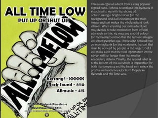
1. This is an official advert from a very popular
signed band. I chose to analyse this because it
stood out to me with the choice of
colour, using a bright colour for the
background and dull colours for the main
image and text makes the whole advert look
vibrant. When creating our own advert, we
may decide to take inspiration from official
ads such as this, we may use a solid colour
for the background so that the text and images
will catch peoples eye. I have also noticed that
on most adverts for big musicians, the text that
must be noticed by people is the larger font. I
will make sure that the vital information on the
advert will be larger than the smaller
secondary details. Finally, the record label is
at the bottom of this ad which is imperative for
both the company and the band as it raises the
profits and audiences for both Hopeless
Records and All Time Low.
2. This is an example of a students music video
advert from last year in Media Studies. It
caught our attention because it’s well
constructed and the fact they have managed
to use Photoshop to edit the boy into the
mirror which looks exceptionally unique. I
think the use of colours matches the song and
narrative perfectly because it’s about being
judged before know the truth. They have used
quite dull and him colours as the song is not a
happy one. One thing I would’ve added to this
advert is the record label for the band as this
will make it seem a lot more realistic and show
the examiner that they have covered all areas.
In comparison to the official advert for a
signed band (slide above) this advert looks
quite professional also as its not
overcrowded. However, they have missed out
one thing that lets it down, which is the record
label.