1. The magazine uses the same band index on the left The use of the ‘NME’ logo in big bold red text, followed by this week in
hand side on all of there magazines. This is very bold white text gives the whole page a clean and clear title. This gives the
useful for both a reader and someone who is looking reader a constant reminder of the company leading the magazine, The
into the magazine as it can tell them all of the artists font, colours and house style are all the same type which gives the
that will feature in this magazine. By calling it a band magazine a bold, but effective way of presenting their pieces, by keeping
index rather that a artist index reinforces the fat that the same font and layout for there page helps them to stick to there
it is an indie magazine rather than a pop one. The brand identity. You can see that throughout the whole page very few
colours that are used in the band index create a link colours are used and the ones that are are all taken from the title to help
between itself, this shows that this is a very create a connection between the two.
important part of the magazine.
The use of sub-headings puts each piece of
content into easier and clearer categories,
making the magazine make sense and clearer.
The heading are short and snappy to give the
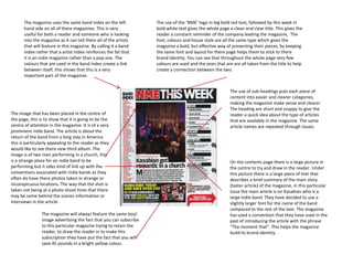
The image that has been placed in the centre of reader a quick idea about the type of articles
the page, this is to show that it is going to be the that are available in the magazine. The same
centre of attention in the magazine. It is of a very article names are repeated through issues.
prominent indie band. The article is about the
return of the band from a long stay in America
this is particularly appealing to the reader as they
would like to see there new third album. The
image is of two men performing in a church, this
is a strange place for an indie band to be On the contents page there is a large picture in
performing but it odes kind of link up with the the centre to try and draw in the reader. Under
conventions associated with indie bands as they this picture there is a large piece of text that
often do have there photos taken in strange or describes a brief summary of the main story
inconspicuous locations. The way that the shot is (taster article) of the magazine, in this particular
taken not being at a photo shoot hints that there issue the main article is on Kasabian who is a
may be some behind the scenes information or large indie band. They have decided to use a
interviews in the article. slightly larger font for the name of the band
compared to the rest of the text. The magazine
The magazine will always feature the same box/ has used a convention that they have used in the
image advertising the fact that you can subscribe past of introducing the article with the phrase
to this particular magazine trying to retain the “The moment that”. This helps the magazine
reader, to draw the reader in to make this build its brand identity.
subscription they have put the fact that you will
save 45 pounds in a bright yellow colour.
2. The images on the contents page are all related to different stories in the magazine next to each of
the images is a number to help the reader navigate to the story related to the image. This is a
technique that Q magazine has tried to implement into all of there magazines. This is very good for
attracting new readers as they can just look at the image and work out what band are going to be
featured in this particular issue. This is particularly appealing to the male readership as for on there The images on the contents page are all stacked
is a picture of a beautiful women on the front cover and that it is scientifically proven that men on top of each other at strange angles to create a
react more to visual stimuli than text based stimuli. more hectic style of magazine, this is symbolic of
the hectic messed up feel of the music and
Also on the page they have also featured an array of small pieces of text related to specific headings artists that feature in its pages, allot of the time
giving you more detail about those stories. These sell lines give the reader I quick insight into what the images that are placed on this page are taken
the story will cover. so that they look like they are in dismay. Q
magazine try's to keep this as a running theme
Q magazine is one of the few magazines throughout there magazine to try and maintain
that presents there contents page across there brand identity.
to pages, this allow them to use a large
amount of images, creating a more
enticing page. This challenges the wider
used convention of having your contents
page only cover one page. The magazine will place
numbers next to there image
Also at the top of the contents page there to navigate you to the correct
is a piece of text that can tell you what page, the size of these
issue you are currently reading, this is numbers will correspond to
useful as it can tell you if you have missed how important the story is.
an issue. This also corresponds with
the size of the image used,
normally the largest Image on
the page will be one of the
artist that features on the
front cover.
The contents page will always feature the signature large Q in
the top left hand corner to help advertise the magazine. They
will also stick to there signature colour of red that will feature
heavily on most of there pages. As you can see there is very The image above features an electric guitar which is a
limited use of colour on this page and if colour is used it is convention of the indie genre as most bands will feature at least
normally re black or white this is a convention that is carried on of these. Another image on this page (top left hand corner)
across allot of indie magazines as these colours are seen to be features an electric guitar also reinforcing the convention.
more manly, appealing to the target audience.