SlideShare una empresa de Scribd logo
1 de 73
Descargar para leer sin conexión
2009 JMP Seminar Series 4/16/2009
© 2009 Stephen Few, Perceptual Edge 1
2009 JMP Seminar Series 4/16/2009
© 2009 Stephen Few, Perceptual Edge 2
This poem by Edna St. Vincent Millay eloquently and poignantly describes our
situation today. Our problem is not a lack of data, but rather our inability to make
sense and use of what we have.
2009 JMP Seminar Series 4/16/2009
© 2009 Stephen Few, Perceptual Edge 3
The amount of information that is available to us has grown much faster than
our ability to make use of it. Most organizations lack both the skills in data
analysis and the tools that are required to productively support the process.
2009 JMP Seminar Series 4/16/2009
© 2009 Stephen Few, Perceptual Edge 4
According to Richards J. Heuer, Jr.:
Once an experienced analyst has the minimum information necessary to
make an informed judgment, obtaining additional information generally
does not improve the accuracy of his or her estimates.
(Psychology of Intelligence Analysis, 1999)
Tableau 2008 Users Conference July 22, 2008
5© 2008 Stephen Few, Perceptual Edge
Good tools, from stones for crushing or cutting to computers for augmenting
cognition, when used properly, set us free and make the world a better place. When
misused, they make us lazy, dumb, slaves. The choice is ours.
2009 JMP Seminar Series 4/16/2009
© 2009 Stephen Few, Perceptual Edge 6
To date, business intelligence has mostly focused on technology and project
methodology, resulting in great advances. As a result, we have huge and fast
warehouses of information. It is now time to focus on the true essence of business
intelligence—important, meaningful, and actionable information—and the most
powerful resources for tapping into its value are those that engage the tremendous
capacities of visual perception and cognition to make sense of and communicate
information.
Today much of science and engineering takes a machine-centered view of the
design of machines and, for that matter, the understanding of people. As a result,
the technology that is intended to aid human cognition and enjoyment more often
interferes and confuses than aids and clarifies.
It will take extra effort do design systems that complement human processing
needs. It will not always be easy, but it can be done. If people insisted, it would
be done. But people don’t insist: Somehow, we have learned to accept the
machine-dominated world. If a system is to accommodate human needs, it has
to be designed by people who are sensitive to and understand human needs. I
would have hoped such a statement was an unnecessary truism. Alas, it is not.
(Things That Make Us Smart, Donald A. Norman, Basic Books, New York, 1993,
page s 9 and 227)
2009 JMP Seminar Series 4/16/2009
© 2009 Stephen Few, Perceptual Edge 7
Data visualization is necessary for business intelligence to fulfill its promise of
helping organizations function intelligently.
2009 JMP Seminar Series 4/16/2009
© 2009 Stephen Few, Perceptual Edge 8
Data visualization is the loom that will weave the data that we collect into the fabric
of understanding. Pictures of data can make visible the meanings that might forever
otherwise remain hidden.
2009 JMP Seminar Series 4/16/2009
© 2009 Stephen Few, Perceptual Edge 9
Though data visualization has become a popular tool of business intelligence
only recently, people have been using graphs to display data visually for a long
time. In 1786, a roguish Scot—William Playfair—published a small atlas that
introduced or greatly improved most of the quantitative graphs that we use
today. Prior to this, graphs of quantitative data were little known.
2009 JMP Seminar Series 4/16/2009
© 2009 Stephen Few, Perceptual Edge 10
Today, 220 years later, graphs are commonplace, fully integrated into the fabric
of modern communication. Surprisingly, however, Playfair‟s innovative efforts—
spring from meager precedent—are superior to most of the graphs produced
today.
2009 JMP Seminar Series 4/16/2009
11© 2009 Stephen Few, Perceptual Edge
2009 JMP Seminar Series 4/16/2009
12
Imagine that you‟ve been invited to another of those many meetings that you‟re
required to attend. You‟re one of several managers in the IT department. Like most
meetings, this one begins with the light of a projector suddenly illuminating a screen.
Bursting with excitement, a young fellow at the front of the room announces that you
will now receive a daily report that will inform you how the network is being utilized,
and then the graph on the next slide appears.
© 2009 Stephen Few, Perceptual Edge
2009 JMP Seminar Series 4/16/2009
13
You stare at this graph intently, trying your best to keep any hint of confusion from
showing on your face. From your peripheral vision you can see that the CIO (Chief
Information Officer) is smiling broadly and nodding with obvious understanding. You
and everyone else in the room begin to nod enthusiastically as well. You feel dumb,
because you have no idea what this graph is trying to say. What you don‟t realize is
that you are not alone.
© 2009 Stephen Few, Perceptual Edge
2009 JMP Seminar Series 4/16/2009
14
In 2004, I wrote the book Show Me the Numbers to help people like you respond in
practical ways to the challenges that you face every day when presenting
quantitative information.
© 2009 Stephen Few, Perceptual Edge
2009 JMP Seminar Series 4/16/2009
15
Data visualization essentially helps us to do two things: (1) think about information
more effectively so we can understand it means, and then (2) tell its story clearly
and accurately to others.
© 2009 Stephen Few, Perceptual Edge
2009 JMP Seminar Series 4/16/2009
16
All business data analysis begins with (1) searching through the data to discover
potentially meaningful facts, then involves (2) examining that data more closely to
understand it, including what caused it to occur, so that you can then (3) explain
what you‟ve learned to those who can use that knowledge to make good decisions.
Most of what we need to recognize and understand in our business data is not all
that complicated.
© 2009 Stephen Few, Perceptual Edge
2009 JMP Seminar Series 4/16/2009
17
The presentation of data as text, such as you see in this table, is perfect when you
need precise values or when the purpose is to look up or compare individual values,
but not when you wish to see patterns, trends, and exceptions, or to make
comparisons. When this is your goal, visualizations work best.
When data is presented visually, it is given visible form, and from this we can easily
glean insights that would take a long time to piece together from the same data
presented textually, if ever. This graph of the same data that appears in the table
makes brings to light several of the stories contained in the data that weren‟t
obvious before, and it did so instantly.
When] we visualize the data effectively and suddenly, there is what Joseph
Berkson called ‘interocular traumatic impact’: a conclusion that hits us between
the eyes.
(Visualizing Data, William S. Cleveland, Hobart Press, 1993, page 12)
Modern data graphics can do much more than simply substitute for small
statistical tables. At their best, graphics are instruments for reasoning about
quantitative information. Often the most effective way to describe, explore, and
summarize a set of numbers – even a very large set – is to look at pictures of
those numbers. Furthermore, of all methods for analyzing and communicating
statistical information, well-designed data graphics are usually the simplest and
at the same time the most powerful.
(The Visual Display of Quantitative Information, Edward R. Tufte, Graphics
Press: Cheshire, CT 1983, Introduction)
© 2009 Stephen Few, Perceptual Edge
2009 JMP Seminar Series 4/16/2009
18
Human perception is amazing. I cherish all five of the senses that connect us to the world, that allow
us to experience beauty and an inexhaustible and diverse wealth of sensation. But of all the senses,
one stands out dramatically as our primary and most powerful channel of input from the world around
us, and that is vision. Approximately 70% of the body‟s sense receptors reside in the eye.
Perhaps the world‟s top expert in visual perception and how its power can be harnessed for the
effective display of information is Colin Ware, who has convincingly described the importance of data
visualization. He asks:
Why should we be interested in visualization? Because the human visual system is a pattern
seeker of enormous power and subtlety. The eye and the visual cortex of the brain form a
massively parallel processor that provides the highest-bandwidth channel into human cognitive
centers. At higher levels of processing, perception and cognition are closely interrelated, which is
the reason why the words ‘understanding’ and ‘seeing’ are synonymous. However, the visual
system has its own rules. We can easily see patterns presented in certain ways, but if they are
presented in other ways, they become invisible…The more general point is that when data is
presented in certain ways, the patterns can be readily perceived. If we can understand how
perception works, our knowledge can be translated into rules for displaying information.
Following perception-based rules, we can present our data in such a way that the important and
informative patterns stand out. If we disobey the rules, our data will be incomprehensible or
misleading.
(Information Visualization: Perception for Design, Second Edition, Colin Ware, Morgan Kaufmann
Publishers, 2004, page xxi)
Perhaps the best known expert in data visualization, Edward Tufte, says: “Clear and precise seeing
becomes as one with clear and precise thinking.” (Visual Explanations, Edward R. Tufte, Graphics
Press: Cheshire, CT.1997 page 53)
© 2009 Stephen Few, Perceptual Edge
2009 JMP Seminar Series 4/16/2009
© 2009 Stephen Few, Perceptual Edge 19
So much of what is called “data visualization” today, however, gives it a bad name
and causes confusion about what it is, how it works, and what can be accomplished
when it is properly done.
2009 JMP Seminar Series 4/16/2009
© 2009 Stephen Few, Perceptual Edge 20
Many business intelligence software vendors are competing to out-dazzle one
another with silly visual effects that treat data visualization like it‟s a video game.
2009 JMP Seminar Series 4/16/2009
© 2009 Stephen Few, Perceptual Edge 21
Their notion of data visualization is not about understanding and communication, it‟s
about “bling.”
2009 JMP Seminar Series 4/16/2009
22
Dressing things up is appropriate for advertising, because the illusion pleases and
sells. When you‟re responsible for discovering the truth and understanding it,
however, makeup only gets in the way.
© 2009 Stephen Few, Perceptual Edge
2009 JMP Seminar Series 4/16/2009
23
“In anything at all, perfection is finally attained not when there is no longer anything
to add, but when there is no longer anything to take away.” Antoine de St. Exupery
John Maeda, in The Laws of Simplicity, offers a maxim about design simplicity,
which I have massaged into the following statement:
Simplicity is about eliminating the obvious (and everything else that doesn’t
support your purpose), and enhancing the meaningful.
© 2009 Stephen Few, Perceptual Edge
2009 JMP Seminar Series 4/16/2009
24
One of the common themes of most software vendors is that 2-D displays are
boring; never as good as 3D.
Adding a third dimension of depth to the bars on the right without adding a
corresponding third variable, however, is not only meaningless, it makes it more
difficult to decode the data.
© 2009 Stephen Few, Perceptual Edge
2009 JMP Seminar Series 4/16/2009
25
Can you determine which of the lines in the graph on the right represents the
East region? Are you sure?
A third dimension with a corresponding variable is too hard to read.
© 2009 Stephen Few, Perceptual Edge
2009 JMP Seminar Series 4/16/2009
26© 2009 Stephen Few, Perceptual Edge
This chart of Escher‟s changing popularity through time was created by B. Brucker. I
found it at www.GraphJam.com.
Vendors add visual effects without ever questioning their worth. The graphics in this
dashboard from Infommersion (recently acquired by Business Objects) are
beautifully rendered, but are each of the different items of information displayed in
the most effective way possible? The folks at Infommersion clearly possess
exceptionable graphical skill, but they seem to lack communication skill. This is not
a video game; this is supposed to be a business tool for effective and efficient
communication.
2009 JMP Seminar Series 4/16/2009
27© 2009 Stephen Few, Perceptual Edge
2009 JMP Seminar Series 4/16/2009
28
Pie charts use 2-D areas and the angles formed by slices to encode quantitative
values. Unfortunately, our perception of 2-D areas and angles as measures of
quantity is poor.
Since all graphs have one or more axes with scales, there must be one on a pie
chart, but where is it? The circumference of the circle is where its quantitative scale
would appear, but it is rarely shown.
Try using either one of the pie graphs to put the slices in order by size. Can‟t do it,
can you? Now see how easy this is to do when the same data is encoded in a bar
graph.
Coda Hale once expressed his opinion of pie charts quite colorfully:
Pie charts are the information visualization equivalent of a roofing hammer to
the frontal lobe…[Piecharts] have no place in the world of grownups, and
occupy the same semiotic space as short pants, a runny nose, and chocolate
smeared on one’s face. They are as professional as a pair of assless chaps.
Anyone who suggests their use should be instinctively slapped.
© 2009 Stephen Few, Perceptual Edge
2009 JMP Seminar Series 4/16/2009
29© 2009 Stephen Few, Perceptual Edge
Tableau 2008 Users Conference July 22, 2008
© 2008 Stephen Few, Perceptual Edge 30
Data visualization is much more than just graphical reporting, more than
dashboards. Beyond its use for communicating information that cannot be
communicated with tabular data, its greatest potential is exhibited in its use for
analysis. The best techniques for making sense of business data are visual
techniques, which extend our ability to find and understand meaningful patterns in
data by offloading much of the work traditionally performed by the conscious mind to
preconscious and parallel processors in the brain‟s visual cortex. Most BI vendors
provide some graphical functionality in their software, but few actually support visual
analysis in more than rudimentary ways.
2009 JMP Seminar Series 4/16/2009
© 2009 Stephen Few, Perceptual Edge 31
During the last year I wrote a new book, Now You See It, to help you develop the
fundamental skills that are needed to make sense of quantitative information.
2009 JMP Seminar Series 4/16/2009
32© 2009 Stephen Few, Perceptual Edge
2009 JMP Seminar Series 4/16/2009
© 2009 Stephen Few, Perceptual Edge 33
Many of the ways that visual perception work are not intuitive.
Looking at these two sets of objects, we naturally see those on the left as convex
and on those the right as concave.
2009 JMP Seminar Series 4/16/2009
© 2009 Stephen Few, Perceptual Edge 34
The effect has now been reversed: we see the objects on the left as concave and
those on the right as convex. All I did, however, was turn each sets of objects
upside down—I didn‟t switch them. The reason that we now see those on the left
as concave is because, through eons of evolution, visual perception learned to
assume that light was shining from above, which causes us to see the objects on
the left as concave, because the shadows are on the top, and those on the right
as convex, because the shadows are on the bottom.
2009 JMP Seminar Series 4/16/2009
35© 2009 Stephen Few, Perceptual Edge
Unlike a camera, visual perception does not record absolute values of the things
that we see, but differences between them.
2009 JMP Seminar Series 4/16/2009
36
Despite how differently they look in the original image, squares A and B are
exactly the same color. What we see is not a simple recording of what is actually
out there. Seeing is an active process that involves interpretations by our brains
of data that is sensed by our eyes in an effort to make sense of it in context. The
presence of the cylinder and its shadow in the image of the checkerboard triggers
an adjustment in our minds to perceive the square labeled B as lighter than it
actually is. The illusion is also created by the fact that the sensors in our eyes do
not register actual color but rather the difference in color between something and
what‟s nearby. The contrast between square A and the light squares that surround
it and square B and the dark squares that surround it cause us to perceive
squares A and B quite differently, even though they are actually the same color,
as you can clearly see above after all of the surrounding context has been
removed.
The ability to use graphs effectively requires a basic understanding of how we
unconsciously interpret what we see.
© 2009 Stephen Few, Perceptual Edge
2009 JMP Seminar Series 4/16/2009
37
This image illustrates the surprising effect that a simple change in the lightness of
the background alone has on our perception of color. The large rectangle displays
a simple color gradient of a gray-scale from fully light to fully dark. The small
rectangle is the same exact color everywhere it appears, but it doesn‟t look that
way because our brains perceive visual differences rather than absolute values,
in this case between the color of the small rectangle and the color that
immediately surrounds it.
Among other things, understanding this should tell us that using a color gradient
as the background of a graph should be avoided.
© 2009 Stephen Few, Perceptual Edge
2009 JMP Seminar Series 4/16/2009
38
There is a distinct image that has been worked into the picture of the rose, which isn‟t noticeable
unless we know to look for it. Once primed with the image of the dolphin, however, we can easily spot
it in the rose.
(Note: The image of the rose was found at www.coolbubble.com.)
© 2009 Stephen Few, Perceptual Edge
2009 JMP Seminar Series 4/16/2009
39
Visual analysis involves comparing the magnitudes of values, but not just one to
another. We must compare many values. To do so, we must see how they relate to
one another to form patterns. We not only compare the magnitudes of values; we
also compare patterns formed by sets of values. We look for how they are similar
and we look for how they are different, especially differences that appear to be
dramatic departures from the norm. When we spot these visual characteristics in the
data, we then interact with the data to find out why these things have happened.
© 2009 Stephen Few, Perceptual Edge
2009 JMP Seminar Series 4/16/2009
40
The process of visual data analysis involves several common interactions with data to uncover what‟s meaningful. Here are
some of the primary interactions:
• Sorting. The act of sorting data, especially by the magnitude of the values from high to low or low to high, features the ranking
relationship between those values and makes it easier to compare the magnitude of value to the next.
• Adding/removing variables. You might need to view different variable at different times during the analysis process, so it is
common to add or remove field of data from view as necessary
• Filtering. When you want to focus on a subset of data, nothing makes it easier to do so than filtering—the removal from view of
everything your not interested in at the moment.
• Highlighting. Sometimes you want to focus on a subset of information, but do so in a way that allows you to maintain a sense of
how that subset relates to the whole. Rather than filtering out the data that falls outside your range of focus, you can simply
reduce its visual salience or increase the visual salience of the data you wish to focus on. This allows you to focus on the subset
with less distraction from the whole in a way that allow you to remain aware of the whole. This is one way of achieving what‟s
called a focus+context view.
• Aggregating/Disaggregating. Analysis often requires that you examine data a different levels of detail. Aggregation involves
viewing data at a higher level of summarization. Disaggregation involves viewing data at a lower level of detail.
• Drilling. Similar to disaggregation, drilling involves viewing data at a lower level of detail, but in a specific manner. Drilling also
means that you are changing the view to the next level in a defined hierarchy, and excluding from view all data that is not directly
related to the specific data value that you chose to drill into. For instance, if you drill into a particular product family, your next
view only products that belong to that product family. In other words, a form of filtering is involved.
• Grouping. Sometimes it is useful to combine members of a variable together, treating them as a single member of the variable.
This may take the form of combining some members and leaving others as they are, or of creating an entirely new variable that
combines all members of an existing variable into a groups to form members of a higher level variable.
• Zooming/Panning. When a data visualization contains so much that it is difficult to clearly see all the data at once, it is useful to
zoom in on that portion that you want to see more clearly. Panning involves moving around (for example, up, down, right, or left)
in a zoomed view to focus on a different part of the larger visualization.
• Re-visualizing. No one visual representation of data can show you everything there is to see, so visual analysis involves shifting
from one type of visualization to another to explore data from various perspectives.
• Re-expressing. Sometimes it is useful to express a quantitative variable as a different unit of measure, such as expressing
dollars as percentages.
• Re-scaling. No single quantitative scale on a graph can serve every analytical need. Rescaling involves changing the range of
the quantitative scale to make it easier to see particular patterns and sometimes even changing the nature of the scale, such as
from a normal scale to a logarithmic scale.
© 2009 Stephen Few, Perceptual Edge
2009 JMP Seminar Series 4/16/2009
© 2009 Stephen Few, Perceptual Edge 41
Direct dynamic interaction with the properly visualized data allows us to see
discover meaningful patterns, trends, and exceptions in the display and to interact
with it directly to filter out what we don‟t need, drill into details, combine multiple
variables for comparison, etc., in ways that promote a smooth flow between seeing
something, thinking about it, and manipulating it, with no distracting lags in between.
This is what I call “visual analysis at the speed of thought.”
Great analysts, like great scientists, great artists, great people of all sorts, accept
the call to serve as a voice for data. Important stories can be found in data. We can
learn to discern the meanings that live in information and to unravel the stories that
are woven through it. What I do isn‟t just work; it is my mission. I work hard to learn
the world‟s stories and to tell them truthfully. I believe that there is no higher calling. I
fight against those who try to hide or alter the truth. I believe that the truth really can
set us free.
I applaud JMP‟s success in developing software that combines statistical
sophistication with an effective use of visualization. I appreciate the team‟s efforts to
make more and more of what JMP does easier to use and thus available to a
broader audience, including those with little or no statistical training. The world
needs this. I‟ll continue to watch JMP‟s progress, both with JMP 8 and beyond, with
great enthusiasm and a sincere desire to do what I can to help them succeed.
2009 JMP Seminar Series 4/16/2009
42
Direct dynamic interaction with the data allows you to manipulate the data easily
and immediately (such as by filtering it), without interrupting your stream of
thought.
© 2009 Stephen Few, Perceptual Edge
2009 JMP Seminar Series 4/16/2009
© 2009 Stephen Few, Perceptual Edge 43
When new recruits by intelligence organizations are trained in spy craft, they are
taught a method of observation that begins by getting an overview of the scene
around them while being sensitive to things that appear abnormal, not quite right,
which they should then focus in on for close observation and analysis.
A visual information-seeking mantra for designers: ‘Overview first, zoom and
filter, then details-on-demand.’
(Readings in Information Visualization: Using Vision to Think, Stuart K. Card,
Jock D. Mackinlay, and Ben Shneiderman, Academic Press, San Diego,
California, 1999, page 625)
Having an overview is very important. It reduces search, allows the detection of
overall patterns, and aids the user in choosing the next move. A general heuristic
of visualization design, therefore, is to start with an overview. But it is also
necessary for the user to access details rapidly. One solution is overview +
detail: to provide multiple views, an overview for orientation, and a detailed view
for further work.
(Ibid., page 285)
Users often try to make a ‘good’ choice by deciding first what they do not want,
i.e. they first try to reduce the data set to a smaller, more manageable size. After
some iterations, it is easier to make the final selection(s) from the reduced data
set. This iterative refinement or progressive querying of data sets is sometimes
known as hierarchical decision-making.
(Ibid., page 295)
2009 JMP Seminar Series 4/16/2009
© 2009 Stephen Few, Perceptual Edge 44
Shneiderman‟s technique begins with an overview of the data—the big picture. Let
your eyes search for particular points of interest in the whole.
2009 JMP Seminar Series 4/16/2009
© 2009 Stephen Few, Perceptual Edge 45
When you see a particular point of interest, then zoom in on it.
2009 JMP Seminar Series 4/16/2009
© 2009 Stephen Few, Perceptual Edge 46
Once you‟ve zoomed in on it, you can examine it more closely and in greater detail.
2009 JMP Seminar Series 4/16/2009
© 2009 Stephen Few, Perceptual Edge 47
Often you must remove data that is extraneous to your investigation to better focus
on the relevant data.
2009 JMP Seminar Series 4/16/2009
© 2009 Stephen Few, Perceptual Edge 48
Filtering out extraneous data removes distractions from the data under investigation.
2009 JMP Seminar Series 4/16/2009
© 2009 Stephen Few, Perceptual Edge 49
Visual data analysis relies mostly on the shape of the data to provide needed
insights, but there are still times when you need to see the details behind the shape
of the data. Having a means to easily see the details when you need them, without
having them in the way when you don‟t works best.
2009 JMP Seminar Series 4/16/2009
50
In addition to understanding visual perception, visual analysis tools must also be
rooted in an understanding of how people think. Only then can they recognize and
support the cognitive operations that are necessary to make sense of information.
Memory plays an important role in human cognition. Because memory suffers from
certain limitations, visual analysis tools must be able to augment memory.
The example above illustrates one of the limitations of working memory. We only
remember that to which we attend. Any part of this image that never gets our
attention will not be missed when we shift to another version of the image that lacks
that particular part. If we don‟t attend to it, we might notice the change from one
version of the image to the next, but only if the transition shift immediately from one
to another, without even a split second of blank space between them.
In addition to not remembering, we also don‟t clearly see that on which we don‟t
focus. To see something clearly, we must focus on it, for only a small area of
receptors on the retinas of our eyes are designed for high-resolution vision.
(Source: This demonstration of change blindness was prepared by Ronald A.
Rensink of the University of British Columbia. Several other examples of this visual
phenomenon can be found at
http://www.psych.ubc.ca/%7erensink/flicker/download/index.html.)
© 2009 Stephen Few, Perceptual Edge
2009 JMP Seminar Series 4/16/2009
© 2009 Stephen Few, Perceptual Edge 51
When we think about things, trying to make sense of them, the place where
information is temporarily stored to support this process is called working
memory. Working memory is a lot like RAM (random access memory) in a
computer in that it is limited in capacity and designed for temporary storage.
Compared to that hard disk drive, which is built into your computer or attached
to it externally, RAM seems very limited, but compared to working memory in
the human brain, RAM seems enormous. Only around three chunks of visual
information can be stored in working memory at any one time. Information that
comes in through our eyes or that is retrieved from long-term memory in the
moment of thought is extremely limited in capacity. If all four storage slots are
occupied, you must let something go to allow something new to come in. When
you release information from working memory, it can take one of two possible
routes on its way out: 1) it can be stored permanently in long-term memory by
means of a rehearsal process that we call memorization, or 2) it can simply be
forgotten.
2009 JMP Seminar Series 4/16/2009
© 2009 Stephen Few, Perceptual Edge 52
To compare facts, you must hold them in working memory simultaneously.
Because we can hold so little in working memory at any one time, however, to
do analysis effectively, we must rely on external aids to memory. This is an
ideal job for a computer. Even a piece of paper that you jot down notes on to
keep track of information as you‟re analyzing data is an external memory aid
that is quite powerful despite being low-tech. A computer running properly
designed software, however, can augment our ability to think about information
much better than pencil and paper.
2009 JMP Seminar Series 4/16/2009
© 2009 Stephen Few, Perceptual Edge 53
Good visual analysis software can help us overcome the limitations of working
memory in several ways. The goal is to enable as many meaningful
comparisons as possible. Good tools can help us increase:
• The amount of information that we can compare (that is, greater
quantity)
• The range of information that we can compare (that is, more
dimensions)
• The different views of the information that we can compare (that is,
multiple perspectives)
2009 JMP Seminar Series 4/16/2009
© 2009 Stephen Few, Perceptual Edge 54
Traditional BI relies mostly on tabular data displays. Tables are wonderful if you
need to look up individual values, compare a single value to another, or know
values precisely, but they don‟t display patterns or trends. This is a problem,
because data analysis relies heavily on our ability to spot and make sense of
patterns and trends in data. Take a look at the table and compare it to this line
graph, which displays the same data. Relying on the table to discern the ups
and downs of sales through time and to compare the patterns of change from
region to region would yield very little of the information that is obvious in this
graph. Visual representations give form to data, making pattern, trends, and
exceptions easy to see.
Another advantage of properly designed graphs over tables for analytical
purposes is less obvious. If you needed to remember information in the table,
you could hold only about four of the values (that is, four of the monthly sales
numbers) in working memory at any one time. But by relying on the graph, 12
values are combined into each of the four lines to form a pattern that you could
hold entirely as a single chunk in working memory. Simply by giving visual form
to the values, you can hold much more information in memory.
2009 JMP Seminar Series 4/16/2009
© 2009 Stephen Few, Perceptual Edge 55
You can extend the benefits of data visualization further by arranging several
graphs on the screen at the same time, such as shown in this visual crosstab.
Here you can see 24 small graphs arranged in familiar crosstab fashion to
present sales across four different dimensions at once: products within product
types by row, regions by column, and market size by the color of the line. Not
only does this approach make a great deal of data available to your eyes, it
does so across several dimensions, thus expanding the dimensionality of the
data well beyond traditional graphical displays.
2009 JMP Seminar Series 4/16/2009
© 2009 Stephen Few, Perceptual Edge 56
The traditional BI approach to analyzing data using tables of text, including
crosstabs or pivot tables, is severely limited and discouraging. It is so time
consuming and cumbersome, people are discouraged from exploration.
2009 JMP Seminar Series 4/16/2009
© 2009 Stephen Few, Perceptual Edge 57
The tabular model forces us to view small slices of information one piece at a
time, which cannot possibly be stitched together in our brains to tell the whole
story.
2009 JMP Seminar Series 4/16/2009
© 2009 Stephen Few, Perceptual Edge 58
To understand something, we often have to examine it from many angles and
focus on many parts. Too much business data analysis involves looking only for
one thing in particular. Is revenue going up? The answer is “yes” or “no”—end
of story. Perhaps, however, you ought to look at revenues, expenses, profits,
marketing campaigns, seasonality, composition of the sales force, new product
introductions, and the competition to understand the richer story that your data
has to tell.
2009 JMP Seminar Series 4/16/2009
© 2009 Stephen Few, Perceptual Edge 59
There‟s an old folktale that you‟ve probably all heard about three blind men who encounter an
elephant one day for the first time and do their best to learn about it by touch alone. The
experience of each is unique because each touches a different part of the elephant. This
ancient story, originally from China, can teach us something important today about business
intelligence (BI). According to the original Chinese tale, the first man touches the elephant‟s
ear, the second his legs, and the third his tail. From this point, here‟s how the story goes:
The three blind men then went their way. Each one was secretly excited over the
experience and had a lot to say, yet all walked rapidly without saying a word.
"Let's sit down and have a discussion about this queer animal," the second blind man said,
breaking the silence.
"A very good idea. Very good." the other two agreed for they also had this in mind. Without
waiting for anyone to be properly seated, the second one blurted out, "This queer animal is
like our straw fans swinging back and forth to give us a breeze. However, it's not so big or
well made. The main portion is rather wispy."
"No, no!" the first blind man shouted in disagreement. "This queer animal resembles two
big trees without any branches."
"You're both wrong." the third man replied. "This queer animal is similar to a snake; it's long
and round, and very strong."
How they argued! Each one insisted that he alone was correct. Of course, there was no
conclusion for not one had thoroughly examined the whole elephant. How can anyone
describe the whole until he has learned the total of the parts.
If I retold this story today to teach a lesson about BI, I might call it “Three blind analysts and a
data warehouse.” Business people struggle every day to make sense of data, stumbling blindly,
touching only small parts of the information, and coming away with a narrow and fragmented
understanding of what it means.
Perceptual Edge 4/16/2009
60
You are the key that opens the door for good data to result in good decisions. Software, no matter
how sophisticated, is useless if you don‟t possess the fundamental skills of data analysis. Data
analysis is for one purpose: to enable good decisions. Do you need to be an Einstein to make sense
of your business data? For most business data analysis, the answer is “No”, but when statistical
sophistication required, you need a statistically sophisticated tool.
Copyright © Stephen Few 2005-2009
2009 JMP Seminar Series 4/16/2009
© 2009 Stephen Few, Perceptual Edge 61
JMP Webcast January 21, 2009
Copyright 2009 © Stephen Few, Perceptual Edge 62
Let‟s clarify the meaning of predictive analytics. Like many terms that get tossed
around by software vendors and even by thought leaders in the field of business
intelligence, predictive analytics seems to mean whatever‟s convenient at the
moment. It might be useful for marketing purposes to keep definitions loose and
adaptable to the occasion, but it doesn‟t help us at all. We‟ll start by turning to
everyone‟s favorite dictionary these days: Wikipedia.
“Predictive analytics encompass a variety of techniques from statistics and data
mining that analyze current and historical data to make predictions about future
events. Such predictions rarely take the form of absolute statements, and are
more likely to be expressed as values that correspond to the odds of a particular
event or behavior taking place in the future.
In business, predictive models exploit patterns found in historical and
transactional data to identify risks and opportunities. Models capture
relationships among many factors to allow assessment of risk or potential
associated with a particular set of conditions, guiding decision making for
candidate transactions.”
Wikipedia entry for “predictive analytics” as of December 15, 2008.
2009 JMP Seminar Series 4/16/2009
© 2009 Stephen Few, Perceptual Edge 63
Don‟t let the terms statistical model or predictive model throw you. In concept,
they‟re quite simple, just like more familiar models of other types. Generally
speaking, models are representations of things or events, which we use to examine
and understand those things or events when it isn‟t possible or practical to observe
or interact with them directly. Statistical models represent mathematical
relationships between the parts that make up the thing or event. Predictive models
are those that we can interact with to investigate the results of hypothetical
conditions, such as by changing the values of particular variables.
Predictive models make it possible for us to do what some people call what-if
analysis. What if such and such a condition existed or event occurred? What would
happen as a result? Predictive models give us the means to predict what would
probably happen (the probable outcomes of dependent variables) if particular
conditions arose naturally or by intention (specified input values to one or more
independent variables).
2009 JMP Seminar Series 4/16/2009
© 2009 Stephen Few, Perceptual Edge 64
A model must capture the essence of the thing it represents, finding the right balance
between too much information and too little. To build an effective model, you must
understand the thing being modeled well enough to pick out the important parts and ignore
the others, and to represent only the aspects of those important parts that are relevant to
the task. If a model is more complicated than the thing it represents, it‟s a bad model. If it‟s
so simple that it leaves out information that must be seen and understood, it‟s a bad model.
For purposes of analysis or presentation, viewing and interacting with a good model works
better than viewing and interacting with the real thing. The model removes extraneous
features and details, making it easy for us to focus only on what pertains to our purpose.
For this reason, good instruction manuals often use simple line drawings to illustrate how
things should be put together or repaired, rather than photographs. It would be difficult to
pick out the important features of the things you need to interact with from a photograph.
Like the real world, photographs are filled with shadows, subtle details are buried in visual
complexity, and what you need to see can be hidden behind something else. In this same
vein, comic book artist Scott McCloud, a talented artist and thoughtful communicator,
explains how the pared down design of comic book illustrations works as “a form of
amplification through simplification.”
“When we abstract an image through cartooning, we‟re not so much eliminating details
as we are focusing on specific details. By stripping down an image to its essential
„meaning,‟ an artist can amplify that meaning in a way that realistic art can‟t.”
Scott McCloud, Understanding Comics, Harper Collins, New York, NY, 1993, p. 30
2009 JMP Seminar Series 4/16/2009
© 2009 Stephen Few, Perceptual Edge 65
Most of the applications that I‟ve seen marketed by business intelligence software
vendors for predictive analytics allow data to be entered on one end (inputs) and
then results (outputs) pop out the other; what goes on in between remains hidden in
a black box. Unfortunately, without seeing what goes on in that black box, our brains
aren‟t fully engaged in the process and too much is missed.
Predictive analytics are most revealing when they allow us to see how all the
variables that contribute either directly or indirectly to the outcomes that concern us
relate to those outcomes and to one another. To understand these relationships, we
must see them; we must watch how changes in one variable directly cause or
indirectly influence changes in the others. For this to happen, predictive models
must be displayed visually in a way that allows: (1) our eyes to see the relationships
and changes; and (2) our minds to make sense of them.
Tableau 2008 Users Conference July 22, 2008
© 2008 Stephen Few, Perceptual Edge 66
Information cannot speak for itself. It needs our help. It relies on us to give it a voice.
When we do, information can tell its story, and will thus become knowledge. The
ultimate goal, however, isn‟t knowledge; it is wisdom. Knowledge becomes wisdom
when it is used to do something good. Only when we use what we know to make
the world a better place has information served its purpose and we have done our
job.
Our networks are awash in data. A little of it is information. A smidgen of this
shows up as knowledge. Combined with ideas, some of that is actually useful.
Mix in experience, context, compassion, discipline, humor, tolerance, and
humility, and perhaps knowledge becomes wisdom.
Turning Numbers into Knowledge, Jonathan G. Koomey, 2001, Analytics Press:
Oakland, CA page 5, quoting Clifford Stoll.
2009 JMP Seminar Series 4/16/2009
67© 2009 Stephen Few, Perceptual Edge
O perpetual revolution of configured stars,
O perpetual recurrence of determined seasons,
O world of spring and autumn, birth and dying!
The endless cycle of idea and action,
Endless invention, endless experiment,
Brings knowledge of motion, but not of stillness;
Knowledge of speech, but not of silence;
Knowledge of words, and ignorance of The Word.
All our knowledge brings us nearer to our ignorance,
All our ignorance brings us nearer to death,
But nearness to death no nearer to God.
Where is the Life we have lost in living?
Where is the wisdom we have lost in knowledge?
Where is the knowledge we have lost in information?
Excerpt from The Rock, 1930, T.S. Elliot
[Image source: www.irishastronomy.org]
2009 JMP Seminar Series 4/16/2009
68© 2009 Stephen Few, Perceptual Edge
O perpetual revolution of configured stars,
O perpetual recurrence of determined seasons,
O world of spring and autumn, birth and dying!
The endless cycle of idea and action,
Endless invention, endless experiment,
Brings knowledge of motion, but not of stillness;
Knowledge of speech, but not of silence;
Knowledge of words, and ignorance of The Word.
All our knowledge brings us nearer to our ignorance,
All our ignorance brings us nearer to death,
But nearness to death no nearer to God.
Where is the Life we have lost in living?
Where is the wisdom we have lost in knowledge?
Where is the knowledge we have lost in information?
Excerpt from The Rock, 1930, T.S. Elliot
[Image source: www.trekvisual.com]
2009 JMP Seminar Series 4/16/2009
69© 2009 Stephen Few, Perceptual Edge
O perpetual revolution of configured stars,
O perpetual recurrence of determined seasons,
O world of spring and autumn, birth and dying!
The endless cycle of idea and action,
Endless invention, endless experiment,
Brings knowledge of motion, but not of stillness;
Knowledge of speech, but not of silence;
Knowledge of words, and ignorance of The Word.
All our knowledge brings us nearer to our ignorance,
All our ignorance brings us nearer to death,
But nearness to death no nearer to God.
Where is the Life we have lost in living?
Where is the wisdom we have lost in knowledge?
Where is the knowledge we have lost in information?
Excerpt from The Rock, 1930, T.S. Elliot
[Image source: www.i.pbase.com]
2009 JMP Seminar Series 4/16/2009
70© 2009 Stephen Few, Perceptual Edge
O perpetual revolution of configured stars,
O perpetual recurrence of determined seasons,
O world of spring and autumn, birth and dying!
The endless cycle of idea and action,
Endless invention, endless experiment,
Brings knowledge of motion, but not of stillness;
Knowledge of speech, but not of silence;
Knowledge of words, and ignorance of The Word.
All our knowledge brings us nearer to our ignorance,
All our ignorance brings us nearer to death,
But nearness to death no nearer to God.
Where is the Life we have lost in living?
Where is the wisdom we have lost in knowledge?
Where is the knowledge we have lost in information?
Excerpt from The Rock, 1930, T.S. Elliot
[Image source: www.]
2009 JMP Seminar Series 4/16/2009
71© 2009 Stephen Few, Perceptual Edge
O perpetual revolution of configured stars,
O perpetual recurrence of determined seasons,
O world of spring and autumn, birth and dying!
The endless cycle of idea and action,
Endless invention, endless experiment,
Brings knowledge of motion, but not of stillness;
Knowledge of speech, but not of silence;
Knowledge of words, and ignorance of The Word.
All our knowledge brings us nearer to our ignorance,
All our ignorance brings us nearer to death,
But nearness to death no nearer to God.
Where is the Life we have lost in living?
Where is the wisdom we have lost in knowledge?
Where is the knowledge we have lost in information?
Excerpt from The Rock, 1930, T.S. Elliot
[Image source: www.shepherdpics.com]
2009 JMP Seminar Series 4/16/2009
72© 2009 Stephen Few, Perceptual Edge
O perpetual revolution of configured stars,
O perpetual recurrence of determined seasons,
O world of spring and autumn, birth and dying!
The endless cycle of idea and action,
Endless invention, endless experiment,
Brings knowledge of motion, but not of stillness;
Knowledge of speech, but not of silence;
Knowledge of words, and ignorance of The Word.
All our knowledge brings us nearer to our ignorance,
All our ignorance brings us nearer to death,
But nearness to death no nearer to God.
Where is the Life we have lost in living?
Where is the wisdom we have lost in knowledge?
Where is the knowledge we have lost in information?
Excerpt from The Rock, 1930, T.S. Elliot
[Image source: www.i163.photobucket.com]
2009 JMP Seminar Series 4/16/2009
73© 2009 Stephen Few, Perceptual Edge
O perpetual revolution of configured stars,
O perpetual recurrence of determined seasons,
O world of spring and autumn, birth and dying!
The endless cycle of idea and action,
Endless invention, endless experiment,
Brings knowledge of motion, but not of stillness;
Knowledge of speech, but not of silence;
Knowledge of words, and ignorance of The Word.
All our knowledge brings us nearer to our ignorance,
All our ignorance brings us nearer to death,
But nearness to death no nearer to God.
Where is the Life we have lost in living?
Where is the wisdom we have lost in knowledge?
Where is the knowledge we have lost in information?
Excerpt from The Rock, 1930, T.S. Elliot
[Image source: www.jamin.org]

Más contenido relacionado

Destacado

Holy Work of Raising Soil, Sample Chapters2016
Holy Work of Raising Soil, Sample Chapters2016Holy Work of Raising Soil, Sample Chapters2016
Holy Work of Raising Soil, Sample Chapters2016Anita Amstutz
 
CloudSurance - We backup web application data
CloudSurance - We backup web application dataCloudSurance - We backup web application data
CloudSurance - We backup web application dataSam Bowen
 
Sikeres nemzetközi márkázott alkalmazások
Sikeres nemzetközi márkázott alkalmazásokSikeres nemzetközi márkázott alkalmazások
Sikeres nemzetközi márkázott alkalmazásokMÖBIUS Mobile Marketing
 
Эффективные кампании в интернете для разных задач МСБ.
Эффективные кампании в интернете для разных задач МСБ.Эффективные кампании в интернете для разных задач МСБ.
Эффективные кампании в интернете для разных задач МСБ.Serhii Stasko
 
Innovative Uses of Technology in International Education
Innovative Uses of Technology in International Education Innovative Uses of Technology in International Education
Innovative Uses of Technology in International Education Marty Bennett
 
Baala bhaavana (neethi satakamu) బాల భావన ( నీతి శతకము.)
Baala bhaavana (neethi satakamu) బాల భావన ( నీతి శతకము.)Baala bhaavana (neethi satakamu) బాల భావన ( నీతి శతకము.)
Baala bhaavana (neethi satakamu) బాల భావన ( నీతి శతకము.)Chinta Rama Krishna Rao
 
電子書刺激擴大閱讀產業
電子書刺激擴大閱讀產業電子書刺激擴大閱讀產業
電子書刺激擴大閱讀產業Sophie Pang
 
Dependency management with Composer
Dependency management with ComposerDependency management with Composer
Dependency management with ComposerJason Grimes
 
תוכנית המהפכה בחינוך של נתניהו 2009
תוכנית המהפכה בחינוך של נתניהו 2009תוכנית המהפכה בחינוך של נתניהו 2009
תוכנית המהפכה בחינוך של נתניהו 2009Eli Hurvitz
 
Educar valores a traves del futbol
Educar valores a traves del futbolEducar valores a traves del futbol
Educar valores a traves del futbolDiego Menino
 

Destacado (20)

Holy Work of Raising Soil, Sample Chapters2016
Holy Work of Raising Soil, Sample Chapters2016Holy Work of Raising Soil, Sample Chapters2016
Holy Work of Raising Soil, Sample Chapters2016
 
CloudSurance - We backup web application data
CloudSurance - We backup web application dataCloudSurance - We backup web application data
CloudSurance - We backup web application data
 
Retallos 2008
Retallos 2008Retallos 2008
Retallos 2008
 
721- Pets and kids-2
721- Pets and kids-2721- Pets and kids-2
721- Pets and kids-2
 
Sikeres nemzetközi márkázott alkalmazások
Sikeres nemzetközi márkázott alkalmazásokSikeres nemzetközi márkázott alkalmazások
Sikeres nemzetközi márkázott alkalmazások
 
Эффективные кампании в интернете для разных задач МСБ.
Эффективные кампании в интернете для разных задач МСБ.Эффективные кампании в интернете для разных задач МСБ.
Эффективные кампании в интернете для разных задач МСБ.
 
Innovative Uses of Technology in International Education
Innovative Uses of Technology in International Education Innovative Uses of Technology in International Education
Innovative Uses of Technology in International Education
 
ΒΑΚΑΛΟΥΔΗ - ΠΡΟΣΚΛΗΣΗ
ΒΑΚΑΛΟΥΔΗ - ΠΡΟΣΚΛΗΣΗΒΑΚΑΛΟΥΔΗ - ΠΡΟΣΚΛΗΣΗ
ΒΑΚΑΛΟΥΔΗ - ΠΡΟΣΚΛΗΣΗ
 
Aseemearth
AseemearthAseemearth
Aseemearth
 
Mis02 Hc04
Mis02 Hc04Mis02 Hc04
Mis02 Hc04
 
Lucy redes sociales myspace
Lucy redes sociales myspaceLucy redes sociales myspace
Lucy redes sociales myspace
 
Baala bhaavana (neethi satakamu) బాల భావన ( నీతి శతకము.)
Baala bhaavana (neethi satakamu) బాల భావన ( నీతి శతకము.)Baala bhaavana (neethi satakamu) బాల భావన ( నీతి శతకము.)
Baala bhaavana (neethi satakamu) బాల భావన ( నీతి శతకము.)
 
電子書刺激擴大閱讀產業
電子書刺激擴大閱讀產業電子書刺激擴大閱讀產業
電子書刺激擴大閱讀產業
 
שירותי מוסך רייך
שירותי מוסך רייךשירותי מוסך רייך
שירותי מוסך רייך
 
Dependency management with Composer
Dependency management with ComposerDependency management with Composer
Dependency management with Composer
 
Como realizar un plan de clases
Como realizar un plan de clasesComo realizar un plan de clases
Como realizar un plan de clases
 
תוכנית המהפכה בחינוך של נתניהו 2009
תוכנית המהפכה בחינוך של נתניהו 2009תוכנית המהפכה בחינוך של נתניהו 2009
תוכנית המהפכה בחינוך של נתניהו 2009
 
Educar valores a traves del futbol
Educar valores a traves del futbolEducar valores a traves del futbol
Educar valores a traves del futbol
 
I16092.00_E501-E501
I16092.00_E501-E501I16092.00_E501-E501
I16092.00_E501-E501
 
WONDERFUL
WONDERFULWONDERFUL
WONDERFUL
 

Similar a Few data visualization-extending_the_analytical_horizon

Infographics And The Brain
Infographics And The BrainInfographics And The Brain
Infographics And The Braingonzoin
 
DEEP Scott Killoh-3
DEEP Scott Killoh-3DEEP Scott Killoh-3
DEEP Scott Killoh-3jonobermeyer
 
Effective Presentations using Data Visualization
Effective Presentations using Data VisualizationEffective Presentations using Data Visualization
Effective Presentations using Data VisualizationHeather Wilmore Hornbeak
 
2008 ANA Masters of Marketing Speech
2008 ANA Masters of Marketing Speech2008 ANA Masters of Marketing Speech
2008 ANA Masters of Marketing Speechpaulnprice
 
Physical Terrain Modeling in a Digital Age
Physical Terrain Modeling in a Digital AgePhysical Terrain Modeling in a Digital Age
Physical Terrain Modeling in a Digital AgeWatson Mary
 
The IT Intelligence Foundation For Digital Business Transformation Builds fro...
The IT Intelligence Foundation For Digital Business Transformation Builds fro...The IT Intelligence Foundation For Digital Business Transformation Builds fro...
The IT Intelligence Foundation For Digital Business Transformation Builds fro...Dana Gardner
 
TED Wiley Visualizing .docx
TED  Wiley Visualizing .docxTED  Wiley Visualizing .docx
TED Wiley Visualizing .docxssuserf9c51d
 
Excellence in visulization
Excellence in visulizationExcellence in visulization
Excellence in visulizationArchanaMani2
 
Please accept this assignment 25 pages minimum double space courie.docx
Please accept this assignment 25 pages minimum double space courie.docxPlease accept this assignment 25 pages minimum double space courie.docx
Please accept this assignment 25 pages minimum double space courie.docxrandymartin91030
 
Data-driven journalism: What is there to learn? (Stanford, June 2010) #ddj
Data-driven journalism: What is there to learn? (Stanford, June 2010) #ddjData-driven journalism: What is there to learn? (Stanford, June 2010) #ddj
Data-driven journalism: What is there to learn? (Stanford, June 2010) #ddjMirko Lorenz
 
Sharing Advisory Board newsletter #8
Sharing Advisory Board newsletter #8Sharing Advisory Board newsletter #8
Sharing Advisory Board newsletter #8Carlo Vaccari
 
Analysis of the ted talk by Jer Thorp on 'Make Data more Human.
Analysis of the ted talk by Jer Thorp on 'Make Data more Human.Analysis of the ted talk by Jer Thorp on 'Make Data more Human.
Analysis of the ted talk by Jer Thorp on 'Make Data more Human.Vaibhav Srivastav
 
Discussion Question 1 The Emergency Medical Treatment and Active .docx
Discussion Question 1 The Emergency Medical Treatment and Active .docxDiscussion Question 1 The Emergency Medical Treatment and Active .docx
Discussion Question 1 The Emergency Medical Treatment and Active .docxduketjoy27252
 
Discussion Question 1 The Emergency Medical Treatment and Active .docx
Discussion Question 1 The Emergency Medical Treatment and Active .docxDiscussion Question 1 The Emergency Medical Treatment and Active .docx
Discussion Question 1 The Emergency Medical Treatment and Active .docxedgar6wallace88877
 
Data Visualization
Data Visualization Data Visualization
Data Visualization Madelyn Cox
 
What I learned about AI, ML and Blockchain from one Wired conference!
What I learned about AI, ML and Blockchain from one Wired conference!What I learned about AI, ML and Blockchain from one Wired conference!
What I learned about AI, ML and Blockchain from one Wired conference!John Powers
 
Vt Overview Iab Cpres 92011
Vt Overview Iab Cpres 92011Vt Overview Iab Cpres 92011
Vt Overview Iab Cpres 92011mark_allen
 
Skip Cole, USIP, techatstate
Skip Cole, USIP, techatstateSkip Cole, USIP, techatstate
Skip Cole, USIP, techatstatetechatstate
 
Introduction to Data Visualisation
Introduction to Data VisualisationIntroduction to Data Visualisation
Introduction to Data VisualisationShiralee Saul
 

Similar a Few data visualization-extending_the_analytical_horizon (20)

Infographics And The Brain
Infographics And The BrainInfographics And The Brain
Infographics And The Brain
 
DEEP Scott Killoh-3
DEEP Scott Killoh-3DEEP Scott Killoh-3
DEEP Scott Killoh-3
 
Effective Presentations using Data Visualization
Effective Presentations using Data VisualizationEffective Presentations using Data Visualization
Effective Presentations using Data Visualization
 
2008 ANA Masters of Marketing Speech
2008 ANA Masters of Marketing Speech2008 ANA Masters of Marketing Speech
2008 ANA Masters of Marketing Speech
 
Physical Terrain Modeling in a Digital Age
Physical Terrain Modeling in a Digital AgePhysical Terrain Modeling in a Digital Age
Physical Terrain Modeling in a Digital Age
 
The IT Intelligence Foundation For Digital Business Transformation Builds fro...
The IT Intelligence Foundation For Digital Business Transformation Builds fro...The IT Intelligence Foundation For Digital Business Transformation Builds fro...
The IT Intelligence Foundation For Digital Business Transformation Builds fro...
 
TED Wiley Visualizing .docx
TED  Wiley Visualizing .docxTED  Wiley Visualizing .docx
TED Wiley Visualizing .docx
 
Excellence in visulization
Excellence in visulizationExcellence in visulization
Excellence in visulization
 
Please accept this assignment 25 pages minimum double space courie.docx
Please accept this assignment 25 pages minimum double space courie.docxPlease accept this assignment 25 pages minimum double space courie.docx
Please accept this assignment 25 pages minimum double space courie.docx
 
Data-driven journalism: What is there to learn? (Stanford, June 2010) #ddj
Data-driven journalism: What is there to learn? (Stanford, June 2010) #ddjData-driven journalism: What is there to learn? (Stanford, June 2010) #ddj
Data-driven journalism: What is there to learn? (Stanford, June 2010) #ddj
 
Sharing Advisory Board newsletter #8
Sharing Advisory Board newsletter #8Sharing Advisory Board newsletter #8
Sharing Advisory Board newsletter #8
 
Analysis of the ted talk by Jer Thorp on 'Make Data more Human.
Analysis of the ted talk by Jer Thorp on 'Make Data more Human.Analysis of the ted talk by Jer Thorp on 'Make Data more Human.
Analysis of the ted talk by Jer Thorp on 'Make Data more Human.
 
Discussion Question 1 The Emergency Medical Treatment and Active .docx
Discussion Question 1 The Emergency Medical Treatment and Active .docxDiscussion Question 1 The Emergency Medical Treatment and Active .docx
Discussion Question 1 The Emergency Medical Treatment and Active .docx
 
Discussion Question 1 The Emergency Medical Treatment and Active .docx
Discussion Question 1 The Emergency Medical Treatment and Active .docxDiscussion Question 1 The Emergency Medical Treatment and Active .docx
Discussion Question 1 The Emergency Medical Treatment and Active .docx
 
Data Visualization
Data Visualization Data Visualization
Data Visualization
 
What I learned about AI, ML and Blockchain from one Wired conference!
What I learned about AI, ML and Blockchain from one Wired conference!What I learned about AI, ML and Blockchain from one Wired conference!
What I learned about AI, ML and Blockchain from one Wired conference!
 
Vt Overview Iab Cpres 92011
Vt Overview Iab Cpres 92011Vt Overview Iab Cpres 92011
Vt Overview Iab Cpres 92011
 
08 f 06
08 f 0608 f 06
08 f 06
 
Skip Cole, USIP, techatstate
Skip Cole, USIP, techatstateSkip Cole, USIP, techatstate
Skip Cole, USIP, techatstate
 
Introduction to Data Visualisation
Introduction to Data VisualisationIntroduction to Data Visualisation
Introduction to Data Visualisation
 

Más de Elsa von Licy

Styles of Scientific Reasoning, Scientific Practices and Argument in Science ...
Styles of Scientific Reasoning, Scientific Practices and Argument in Science ...Styles of Scientific Reasoning, Scientific Practices and Argument in Science ...
Styles of Scientific Reasoning, Scientific Practices and Argument in Science ...Elsa von Licy
 
Strategie Decisions Incertitude Actes conference fnege xerfi
Strategie Decisions Incertitude Actes conference fnege xerfiStrategie Decisions Incertitude Actes conference fnege xerfi
Strategie Decisions Incertitude Actes conference fnege xerfiElsa von Licy
 
Neuropsychophysiologie
NeuropsychophysiologieNeuropsychophysiologie
NeuropsychophysiologieElsa von Licy
 
L agressivite en psychanalyse (21 pages 184 ko)
L agressivite en psychanalyse (21 pages   184 ko)L agressivite en psychanalyse (21 pages   184 ko)
L agressivite en psychanalyse (21 pages 184 ko)Elsa von Licy
 
C1 clef pour_la_neuro
C1 clef pour_la_neuroC1 clef pour_la_neuro
C1 clef pour_la_neuroElsa von Licy
 
Vuillez jean philippe_p01
Vuillez jean philippe_p01Vuillez jean philippe_p01
Vuillez jean philippe_p01Elsa von Licy
 
Spr ue3.1 poly cours et exercices
Spr ue3.1   poly cours et exercicesSpr ue3.1   poly cours et exercices
Spr ue3.1 poly cours et exercicesElsa von Licy
 
Plan de cours all l1 l2l3m1m2 p
Plan de cours all l1 l2l3m1m2 pPlan de cours all l1 l2l3m1m2 p
Plan de cours all l1 l2l3m1m2 pElsa von Licy
 
Bioph pharm 1an-viscosit-des_liquides_et_des_solutions
Bioph pharm 1an-viscosit-des_liquides_et_des_solutionsBioph pharm 1an-viscosit-des_liquides_et_des_solutions
Bioph pharm 1an-viscosit-des_liquides_et_des_solutionsElsa von Licy
 
Poly histologie-et-embryologie-medicales
Poly histologie-et-embryologie-medicalesPoly histologie-et-embryologie-medicales
Poly histologie-et-embryologie-medicalesElsa von Licy
 
Methodes travail etudiants
Methodes travail etudiantsMethodes travail etudiants
Methodes travail etudiantsElsa von Licy
 
Atelier.etude.efficace
Atelier.etude.efficaceAtelier.etude.efficace
Atelier.etude.efficaceElsa von Licy
 
There is no_such_thing_as_a_social_science_intro
There is no_such_thing_as_a_social_science_introThere is no_such_thing_as_a_social_science_intro
There is no_such_thing_as_a_social_science_introElsa von Licy
 

Más de Elsa von Licy (20)

Styles of Scientific Reasoning, Scientific Practices and Argument in Science ...
Styles of Scientific Reasoning, Scientific Practices and Argument in Science ...Styles of Scientific Reasoning, Scientific Practices and Argument in Science ...
Styles of Scientific Reasoning, Scientific Practices and Argument in Science ...
 
Strategie Decisions Incertitude Actes conference fnege xerfi
Strategie Decisions Incertitude Actes conference fnege xerfiStrategie Decisions Incertitude Actes conference fnege xerfi
Strategie Decisions Incertitude Actes conference fnege xerfi
 
Rainville pierre
Rainville pierreRainville pierre
Rainville pierre
 
Neuropsychophysiologie
NeuropsychophysiologieNeuropsychophysiologie
Neuropsychophysiologie
 
L agressivite en psychanalyse (21 pages 184 ko)
L agressivite en psychanalyse (21 pages   184 ko)L agressivite en psychanalyse (21 pages   184 ko)
L agressivite en psychanalyse (21 pages 184 ko)
 
C1 clef pour_la_neuro
C1 clef pour_la_neuroC1 clef pour_la_neuro
C1 clef pour_la_neuro
 
Hemostase polycop
Hemostase polycopHemostase polycop
Hemostase polycop
 
Antiphilos
AntiphilosAntiphilos
Antiphilos
 
Vuillez jean philippe_p01
Vuillez jean philippe_p01Vuillez jean philippe_p01
Vuillez jean philippe_p01
 
Spr ue3.1 poly cours et exercices
Spr ue3.1   poly cours et exercicesSpr ue3.1   poly cours et exercices
Spr ue3.1 poly cours et exercices
 
Plan de cours all l1 l2l3m1m2 p
Plan de cours all l1 l2l3m1m2 pPlan de cours all l1 l2l3m1m2 p
Plan de cours all l1 l2l3m1m2 p
 
M2 bmc2007 cours01
M2 bmc2007 cours01M2 bmc2007 cours01
M2 bmc2007 cours01
 
Feuilletage
FeuilletageFeuilletage
Feuilletage
 
Chapitre 1
Chapitre 1Chapitre 1
Chapitre 1
 
Biophy
BiophyBiophy
Biophy
 
Bioph pharm 1an-viscosit-des_liquides_et_des_solutions
Bioph pharm 1an-viscosit-des_liquides_et_des_solutionsBioph pharm 1an-viscosit-des_liquides_et_des_solutions
Bioph pharm 1an-viscosit-des_liquides_et_des_solutions
 
Poly histologie-et-embryologie-medicales
Poly histologie-et-embryologie-medicalesPoly histologie-et-embryologie-medicales
Poly histologie-et-embryologie-medicales
 
Methodes travail etudiants
Methodes travail etudiantsMethodes travail etudiants
Methodes travail etudiants
 
Atelier.etude.efficace
Atelier.etude.efficaceAtelier.etude.efficace
Atelier.etude.efficace
 
There is no_such_thing_as_a_social_science_intro
There is no_such_thing_as_a_social_science_introThere is no_such_thing_as_a_social_science_intro
There is no_such_thing_as_a_social_science_intro
 

Último

Computed Fields and api Depends in the Odoo 17
Computed Fields and api Depends in the Odoo 17Computed Fields and api Depends in the Odoo 17
Computed Fields and api Depends in the Odoo 17Celine George
 
DATA STRUCTURE AND ALGORITHM for beginners
DATA STRUCTURE AND ALGORITHM for beginnersDATA STRUCTURE AND ALGORITHM for beginners
DATA STRUCTURE AND ALGORITHM for beginnersSabitha Banu
 
THEORIES OF ORGANIZATION-PUBLIC ADMINISTRATION
THEORIES OF ORGANIZATION-PUBLIC ADMINISTRATIONTHEORIES OF ORGANIZATION-PUBLIC ADMINISTRATION
THEORIES OF ORGANIZATION-PUBLIC ADMINISTRATIONHumphrey A Beña
 
call girls in Kamla Market (DELHI) 🔝 >༒9953330565🔝 genuine Escort Service 🔝✔️✔️
call girls in Kamla Market (DELHI) 🔝 >༒9953330565🔝 genuine Escort Service 🔝✔️✔️call girls in Kamla Market (DELHI) 🔝 >༒9953330565🔝 genuine Escort Service 🔝✔️✔️
call girls in Kamla Market (DELHI) 🔝 >༒9953330565🔝 genuine Escort Service 🔝✔️✔️9953056974 Low Rate Call Girls In Saket, Delhi NCR
 
USPS® Forced Meter Migration - How to Know if Your Postage Meter Will Soon be...
USPS® Forced Meter Migration - How to Know if Your Postage Meter Will Soon be...USPS® Forced Meter Migration - How to Know if Your Postage Meter Will Soon be...
USPS® Forced Meter Migration - How to Know if Your Postage Meter Will Soon be...Postal Advocate Inc.
 
ECONOMIC CONTEXT - LONG FORM TV DRAMA - PPT
ECONOMIC CONTEXT - LONG FORM TV DRAMA - PPTECONOMIC CONTEXT - LONG FORM TV DRAMA - PPT
ECONOMIC CONTEXT - LONG FORM TV DRAMA - PPTiammrhaywood
 
Karra SKD Conference Presentation Revised.pptx
Karra SKD Conference Presentation Revised.pptxKarra SKD Conference Presentation Revised.pptx
Karra SKD Conference Presentation Revised.pptxAshokKarra1
 
INTRODUCTION TO CATHOLIC CHRISTOLOGY.pptx
INTRODUCTION TO CATHOLIC CHRISTOLOGY.pptxINTRODUCTION TO CATHOLIC CHRISTOLOGY.pptx
INTRODUCTION TO CATHOLIC CHRISTOLOGY.pptxHumphrey A Beña
 
Choosing the Right CBSE School A Comprehensive Guide for Parents
Choosing the Right CBSE School A Comprehensive Guide for ParentsChoosing the Right CBSE School A Comprehensive Guide for Parents
Choosing the Right CBSE School A Comprehensive Guide for Parentsnavabharathschool99
 
Like-prefer-love -hate+verb+ing & silent letters & citizenship text.pdf
Like-prefer-love -hate+verb+ing & silent letters & citizenship text.pdfLike-prefer-love -hate+verb+ing & silent letters & citizenship text.pdf
Like-prefer-love -hate+verb+ing & silent letters & citizenship text.pdfMr Bounab Samir
 
MULTIDISCIPLINRY NATURE OF THE ENVIRONMENTAL STUDIES.pptx
MULTIDISCIPLINRY NATURE OF THE ENVIRONMENTAL STUDIES.pptxMULTIDISCIPLINRY NATURE OF THE ENVIRONMENTAL STUDIES.pptx
MULTIDISCIPLINRY NATURE OF THE ENVIRONMENTAL STUDIES.pptxAnupkumar Sharma
 
Keynote by Prof. Wurzer at Nordex about IP-design
Keynote by Prof. Wurzer at Nordex about IP-designKeynote by Prof. Wurzer at Nordex about IP-design
Keynote by Prof. Wurzer at Nordex about IP-designMIPLM
 
What is Model Inheritance in Odoo 17 ERP
What is Model Inheritance in Odoo 17 ERPWhat is Model Inheritance in Odoo 17 ERP
What is Model Inheritance in Odoo 17 ERPCeline George
 
ECONOMIC CONTEXT - PAPER 1 Q3: NEWSPAPERS.pptx
ECONOMIC CONTEXT - PAPER 1 Q3: NEWSPAPERS.pptxECONOMIC CONTEXT - PAPER 1 Q3: NEWSPAPERS.pptx
ECONOMIC CONTEXT - PAPER 1 Q3: NEWSPAPERS.pptxiammrhaywood
 
ISYU TUNGKOL SA SEKSWLADIDA (ISSUE ABOUT SEXUALITY
ISYU TUNGKOL SA SEKSWLADIDA (ISSUE ABOUT SEXUALITYISYU TUNGKOL SA SEKSWLADIDA (ISSUE ABOUT SEXUALITY
ISYU TUNGKOL SA SEKSWLADIDA (ISSUE ABOUT SEXUALITYKayeClaireEstoconing
 
Incoming and Outgoing Shipments in 3 STEPS Using Odoo 17
Incoming and Outgoing Shipments in 3 STEPS Using Odoo 17Incoming and Outgoing Shipments in 3 STEPS Using Odoo 17
Incoming and Outgoing Shipments in 3 STEPS Using Odoo 17Celine George
 

Último (20)

Computed Fields and api Depends in the Odoo 17
Computed Fields and api Depends in the Odoo 17Computed Fields and api Depends in the Odoo 17
Computed Fields and api Depends in the Odoo 17
 
DATA STRUCTURE AND ALGORITHM for beginners
DATA STRUCTURE AND ALGORITHM for beginnersDATA STRUCTURE AND ALGORITHM for beginners
DATA STRUCTURE AND ALGORITHM for beginners
 
FINALS_OF_LEFT_ON_C'N_EL_DORADO_2024.pptx
FINALS_OF_LEFT_ON_C'N_EL_DORADO_2024.pptxFINALS_OF_LEFT_ON_C'N_EL_DORADO_2024.pptx
FINALS_OF_LEFT_ON_C'N_EL_DORADO_2024.pptx
 
THEORIES OF ORGANIZATION-PUBLIC ADMINISTRATION
THEORIES OF ORGANIZATION-PUBLIC ADMINISTRATIONTHEORIES OF ORGANIZATION-PUBLIC ADMINISTRATION
THEORIES OF ORGANIZATION-PUBLIC ADMINISTRATION
 
call girls in Kamla Market (DELHI) 🔝 >༒9953330565🔝 genuine Escort Service 🔝✔️✔️
call girls in Kamla Market (DELHI) 🔝 >༒9953330565🔝 genuine Escort Service 🔝✔️✔️call girls in Kamla Market (DELHI) 🔝 >༒9953330565🔝 genuine Escort Service 🔝✔️✔️
call girls in Kamla Market (DELHI) 🔝 >༒9953330565🔝 genuine Escort Service 🔝✔️✔️
 
YOUVE_GOT_EMAIL_PRELIMS_EL_DORADO_2024.pptx
YOUVE_GOT_EMAIL_PRELIMS_EL_DORADO_2024.pptxYOUVE_GOT_EMAIL_PRELIMS_EL_DORADO_2024.pptx
YOUVE_GOT_EMAIL_PRELIMS_EL_DORADO_2024.pptx
 
LEFT_ON_C'N_ PRELIMS_EL_DORADO_2024.pptx
LEFT_ON_C'N_ PRELIMS_EL_DORADO_2024.pptxLEFT_ON_C'N_ PRELIMS_EL_DORADO_2024.pptx
LEFT_ON_C'N_ PRELIMS_EL_DORADO_2024.pptx
 
USPS® Forced Meter Migration - How to Know if Your Postage Meter Will Soon be...
USPS® Forced Meter Migration - How to Know if Your Postage Meter Will Soon be...USPS® Forced Meter Migration - How to Know if Your Postage Meter Will Soon be...
USPS® Forced Meter Migration - How to Know if Your Postage Meter Will Soon be...
 
ECONOMIC CONTEXT - LONG FORM TV DRAMA - PPT
ECONOMIC CONTEXT - LONG FORM TV DRAMA - PPTECONOMIC CONTEXT - LONG FORM TV DRAMA - PPT
ECONOMIC CONTEXT - LONG FORM TV DRAMA - PPT
 
Karra SKD Conference Presentation Revised.pptx
Karra SKD Conference Presentation Revised.pptxKarra SKD Conference Presentation Revised.pptx
Karra SKD Conference Presentation Revised.pptx
 
INTRODUCTION TO CATHOLIC CHRISTOLOGY.pptx
INTRODUCTION TO CATHOLIC CHRISTOLOGY.pptxINTRODUCTION TO CATHOLIC CHRISTOLOGY.pptx
INTRODUCTION TO CATHOLIC CHRISTOLOGY.pptx
 
Choosing the Right CBSE School A Comprehensive Guide for Parents
Choosing the Right CBSE School A Comprehensive Guide for ParentsChoosing the Right CBSE School A Comprehensive Guide for Parents
Choosing the Right CBSE School A Comprehensive Guide for Parents
 
Like-prefer-love -hate+verb+ing & silent letters & citizenship text.pdf
Like-prefer-love -hate+verb+ing & silent letters & citizenship text.pdfLike-prefer-love -hate+verb+ing & silent letters & citizenship text.pdf
Like-prefer-love -hate+verb+ing & silent letters & citizenship text.pdf
 
MULTIDISCIPLINRY NATURE OF THE ENVIRONMENTAL STUDIES.pptx
MULTIDISCIPLINRY NATURE OF THE ENVIRONMENTAL STUDIES.pptxMULTIDISCIPLINRY NATURE OF THE ENVIRONMENTAL STUDIES.pptx
MULTIDISCIPLINRY NATURE OF THE ENVIRONMENTAL STUDIES.pptx
 
Keynote by Prof. Wurzer at Nordex about IP-design
Keynote by Prof. Wurzer at Nordex about IP-designKeynote by Prof. Wurzer at Nordex about IP-design
Keynote by Prof. Wurzer at Nordex about IP-design
 
What is Model Inheritance in Odoo 17 ERP
What is Model Inheritance in Odoo 17 ERPWhat is Model Inheritance in Odoo 17 ERP
What is Model Inheritance in Odoo 17 ERP
 
Model Call Girl in Tilak Nagar Delhi reach out to us at 🔝9953056974🔝
Model Call Girl in Tilak Nagar Delhi reach out to us at 🔝9953056974🔝Model Call Girl in Tilak Nagar Delhi reach out to us at 🔝9953056974🔝
Model Call Girl in Tilak Nagar Delhi reach out to us at 🔝9953056974🔝
 
ECONOMIC CONTEXT - PAPER 1 Q3: NEWSPAPERS.pptx
ECONOMIC CONTEXT - PAPER 1 Q3: NEWSPAPERS.pptxECONOMIC CONTEXT - PAPER 1 Q3: NEWSPAPERS.pptx
ECONOMIC CONTEXT - PAPER 1 Q3: NEWSPAPERS.pptx
 
ISYU TUNGKOL SA SEKSWLADIDA (ISSUE ABOUT SEXUALITY
ISYU TUNGKOL SA SEKSWLADIDA (ISSUE ABOUT SEXUALITYISYU TUNGKOL SA SEKSWLADIDA (ISSUE ABOUT SEXUALITY
ISYU TUNGKOL SA SEKSWLADIDA (ISSUE ABOUT SEXUALITY
 
Incoming and Outgoing Shipments in 3 STEPS Using Odoo 17
Incoming and Outgoing Shipments in 3 STEPS Using Odoo 17Incoming and Outgoing Shipments in 3 STEPS Using Odoo 17
Incoming and Outgoing Shipments in 3 STEPS Using Odoo 17
 

Few data visualization-extending_the_analytical_horizon

  • 1. 2009 JMP Seminar Series 4/16/2009 © 2009 Stephen Few, Perceptual Edge 1
  • 2. 2009 JMP Seminar Series 4/16/2009 © 2009 Stephen Few, Perceptual Edge 2 This poem by Edna St. Vincent Millay eloquently and poignantly describes our situation today. Our problem is not a lack of data, but rather our inability to make sense and use of what we have.
  • 3. 2009 JMP Seminar Series 4/16/2009 © 2009 Stephen Few, Perceptual Edge 3 The amount of information that is available to us has grown much faster than our ability to make use of it. Most organizations lack both the skills in data analysis and the tools that are required to productively support the process.
  • 4. 2009 JMP Seminar Series 4/16/2009 © 2009 Stephen Few, Perceptual Edge 4 According to Richards J. Heuer, Jr.: Once an experienced analyst has the minimum information necessary to make an informed judgment, obtaining additional information generally does not improve the accuracy of his or her estimates. (Psychology of Intelligence Analysis, 1999)
  • 5. Tableau 2008 Users Conference July 22, 2008 5© 2008 Stephen Few, Perceptual Edge Good tools, from stones for crushing or cutting to computers for augmenting cognition, when used properly, set us free and make the world a better place. When misused, they make us lazy, dumb, slaves. The choice is ours.
  • 6. 2009 JMP Seminar Series 4/16/2009 © 2009 Stephen Few, Perceptual Edge 6 To date, business intelligence has mostly focused on technology and project methodology, resulting in great advances. As a result, we have huge and fast warehouses of information. It is now time to focus on the true essence of business intelligence—important, meaningful, and actionable information—and the most powerful resources for tapping into its value are those that engage the tremendous capacities of visual perception and cognition to make sense of and communicate information. Today much of science and engineering takes a machine-centered view of the design of machines and, for that matter, the understanding of people. As a result, the technology that is intended to aid human cognition and enjoyment more often interferes and confuses than aids and clarifies. It will take extra effort do design systems that complement human processing needs. It will not always be easy, but it can be done. If people insisted, it would be done. But people don’t insist: Somehow, we have learned to accept the machine-dominated world. If a system is to accommodate human needs, it has to be designed by people who are sensitive to and understand human needs. I would have hoped such a statement was an unnecessary truism. Alas, it is not. (Things That Make Us Smart, Donald A. Norman, Basic Books, New York, 1993, page s 9 and 227)
  • 7. 2009 JMP Seminar Series 4/16/2009 © 2009 Stephen Few, Perceptual Edge 7 Data visualization is necessary for business intelligence to fulfill its promise of helping organizations function intelligently.
  • 8. 2009 JMP Seminar Series 4/16/2009 © 2009 Stephen Few, Perceptual Edge 8 Data visualization is the loom that will weave the data that we collect into the fabric of understanding. Pictures of data can make visible the meanings that might forever otherwise remain hidden.
  • 9. 2009 JMP Seminar Series 4/16/2009 © 2009 Stephen Few, Perceptual Edge 9 Though data visualization has become a popular tool of business intelligence only recently, people have been using graphs to display data visually for a long time. In 1786, a roguish Scot—William Playfair—published a small atlas that introduced or greatly improved most of the quantitative graphs that we use today. Prior to this, graphs of quantitative data were little known.
  • 10. 2009 JMP Seminar Series 4/16/2009 © 2009 Stephen Few, Perceptual Edge 10 Today, 220 years later, graphs are commonplace, fully integrated into the fabric of modern communication. Surprisingly, however, Playfair‟s innovative efforts— spring from meager precedent—are superior to most of the graphs produced today.
  • 11. 2009 JMP Seminar Series 4/16/2009 11© 2009 Stephen Few, Perceptual Edge
  • 12. 2009 JMP Seminar Series 4/16/2009 12 Imagine that you‟ve been invited to another of those many meetings that you‟re required to attend. You‟re one of several managers in the IT department. Like most meetings, this one begins with the light of a projector suddenly illuminating a screen. Bursting with excitement, a young fellow at the front of the room announces that you will now receive a daily report that will inform you how the network is being utilized, and then the graph on the next slide appears. © 2009 Stephen Few, Perceptual Edge
  • 13. 2009 JMP Seminar Series 4/16/2009 13 You stare at this graph intently, trying your best to keep any hint of confusion from showing on your face. From your peripheral vision you can see that the CIO (Chief Information Officer) is smiling broadly and nodding with obvious understanding. You and everyone else in the room begin to nod enthusiastically as well. You feel dumb, because you have no idea what this graph is trying to say. What you don‟t realize is that you are not alone. © 2009 Stephen Few, Perceptual Edge
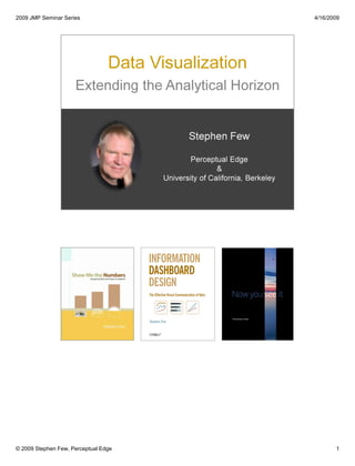
  • 14. 2009 JMP Seminar Series 4/16/2009 14 In 2004, I wrote the book Show Me the Numbers to help people like you respond in practical ways to the challenges that you face every day when presenting quantitative information. © 2009 Stephen Few, Perceptual Edge
  • 15. 2009 JMP Seminar Series 4/16/2009 15 Data visualization essentially helps us to do two things: (1) think about information more effectively so we can understand it means, and then (2) tell its story clearly and accurately to others. © 2009 Stephen Few, Perceptual Edge
  • 16. 2009 JMP Seminar Series 4/16/2009 16 All business data analysis begins with (1) searching through the data to discover potentially meaningful facts, then involves (2) examining that data more closely to understand it, including what caused it to occur, so that you can then (3) explain what you‟ve learned to those who can use that knowledge to make good decisions. Most of what we need to recognize and understand in our business data is not all that complicated. © 2009 Stephen Few, Perceptual Edge
  • 17. 2009 JMP Seminar Series 4/16/2009 17 The presentation of data as text, such as you see in this table, is perfect when you need precise values or when the purpose is to look up or compare individual values, but not when you wish to see patterns, trends, and exceptions, or to make comparisons. When this is your goal, visualizations work best. When data is presented visually, it is given visible form, and from this we can easily glean insights that would take a long time to piece together from the same data presented textually, if ever. This graph of the same data that appears in the table makes brings to light several of the stories contained in the data that weren‟t obvious before, and it did so instantly. When] we visualize the data effectively and suddenly, there is what Joseph Berkson called ‘interocular traumatic impact’: a conclusion that hits us between the eyes. (Visualizing Data, William S. Cleveland, Hobart Press, 1993, page 12) Modern data graphics can do much more than simply substitute for small statistical tables. At their best, graphics are instruments for reasoning about quantitative information. Often the most effective way to describe, explore, and summarize a set of numbers – even a very large set – is to look at pictures of those numbers. Furthermore, of all methods for analyzing and communicating statistical information, well-designed data graphics are usually the simplest and at the same time the most powerful. (The Visual Display of Quantitative Information, Edward R. Tufte, Graphics Press: Cheshire, CT 1983, Introduction) © 2009 Stephen Few, Perceptual Edge
  • 18. 2009 JMP Seminar Series 4/16/2009 18 Human perception is amazing. I cherish all five of the senses that connect us to the world, that allow us to experience beauty and an inexhaustible and diverse wealth of sensation. But of all the senses, one stands out dramatically as our primary and most powerful channel of input from the world around us, and that is vision. Approximately 70% of the body‟s sense receptors reside in the eye. Perhaps the world‟s top expert in visual perception and how its power can be harnessed for the effective display of information is Colin Ware, who has convincingly described the importance of data visualization. He asks: Why should we be interested in visualization? Because the human visual system is a pattern seeker of enormous power and subtlety. The eye and the visual cortex of the brain form a massively parallel processor that provides the highest-bandwidth channel into human cognitive centers. At higher levels of processing, perception and cognition are closely interrelated, which is the reason why the words ‘understanding’ and ‘seeing’ are synonymous. However, the visual system has its own rules. We can easily see patterns presented in certain ways, but if they are presented in other ways, they become invisible…The more general point is that when data is presented in certain ways, the patterns can be readily perceived. If we can understand how perception works, our knowledge can be translated into rules for displaying information. Following perception-based rules, we can present our data in such a way that the important and informative patterns stand out. If we disobey the rules, our data will be incomprehensible or misleading. (Information Visualization: Perception for Design, Second Edition, Colin Ware, Morgan Kaufmann Publishers, 2004, page xxi) Perhaps the best known expert in data visualization, Edward Tufte, says: “Clear and precise seeing becomes as one with clear and precise thinking.” (Visual Explanations, Edward R. Tufte, Graphics Press: Cheshire, CT.1997 page 53) © 2009 Stephen Few, Perceptual Edge
  • 19. 2009 JMP Seminar Series 4/16/2009 © 2009 Stephen Few, Perceptual Edge 19 So much of what is called “data visualization” today, however, gives it a bad name and causes confusion about what it is, how it works, and what can be accomplished when it is properly done.
  • 20. 2009 JMP Seminar Series 4/16/2009 © 2009 Stephen Few, Perceptual Edge 20 Many business intelligence software vendors are competing to out-dazzle one another with silly visual effects that treat data visualization like it‟s a video game.
  • 21. 2009 JMP Seminar Series 4/16/2009 © 2009 Stephen Few, Perceptual Edge 21 Their notion of data visualization is not about understanding and communication, it‟s about “bling.”
  • 22. 2009 JMP Seminar Series 4/16/2009 22 Dressing things up is appropriate for advertising, because the illusion pleases and sells. When you‟re responsible for discovering the truth and understanding it, however, makeup only gets in the way. © 2009 Stephen Few, Perceptual Edge
  • 23. 2009 JMP Seminar Series 4/16/2009 23 “In anything at all, perfection is finally attained not when there is no longer anything to add, but when there is no longer anything to take away.” Antoine de St. Exupery John Maeda, in The Laws of Simplicity, offers a maxim about design simplicity, which I have massaged into the following statement: Simplicity is about eliminating the obvious (and everything else that doesn’t support your purpose), and enhancing the meaningful. © 2009 Stephen Few, Perceptual Edge
  • 24. 2009 JMP Seminar Series 4/16/2009 24 One of the common themes of most software vendors is that 2-D displays are boring; never as good as 3D. Adding a third dimension of depth to the bars on the right without adding a corresponding third variable, however, is not only meaningless, it makes it more difficult to decode the data. © 2009 Stephen Few, Perceptual Edge
  • 25. 2009 JMP Seminar Series 4/16/2009 25 Can you determine which of the lines in the graph on the right represents the East region? Are you sure? A third dimension with a corresponding variable is too hard to read. © 2009 Stephen Few, Perceptual Edge
  • 26. 2009 JMP Seminar Series 4/16/2009 26© 2009 Stephen Few, Perceptual Edge This chart of Escher‟s changing popularity through time was created by B. Brucker. I found it at www.GraphJam.com.
  • 27. Vendors add visual effects without ever questioning their worth. The graphics in this dashboard from Infommersion (recently acquired by Business Objects) are beautifully rendered, but are each of the different items of information displayed in the most effective way possible? The folks at Infommersion clearly possess exceptionable graphical skill, but they seem to lack communication skill. This is not a video game; this is supposed to be a business tool for effective and efficient communication. 2009 JMP Seminar Series 4/16/2009 27© 2009 Stephen Few, Perceptual Edge
  • 28. 2009 JMP Seminar Series 4/16/2009 28 Pie charts use 2-D areas and the angles formed by slices to encode quantitative values. Unfortunately, our perception of 2-D areas and angles as measures of quantity is poor. Since all graphs have one or more axes with scales, there must be one on a pie chart, but where is it? The circumference of the circle is where its quantitative scale would appear, but it is rarely shown. Try using either one of the pie graphs to put the slices in order by size. Can‟t do it, can you? Now see how easy this is to do when the same data is encoded in a bar graph. Coda Hale once expressed his opinion of pie charts quite colorfully: Pie charts are the information visualization equivalent of a roofing hammer to the frontal lobe…[Piecharts] have no place in the world of grownups, and occupy the same semiotic space as short pants, a runny nose, and chocolate smeared on one’s face. They are as professional as a pair of assless chaps. Anyone who suggests their use should be instinctively slapped. © 2009 Stephen Few, Perceptual Edge
  • 29. 2009 JMP Seminar Series 4/16/2009 29© 2009 Stephen Few, Perceptual Edge
  • 30. Tableau 2008 Users Conference July 22, 2008 © 2008 Stephen Few, Perceptual Edge 30 Data visualization is much more than just graphical reporting, more than dashboards. Beyond its use for communicating information that cannot be communicated with tabular data, its greatest potential is exhibited in its use for analysis. The best techniques for making sense of business data are visual techniques, which extend our ability to find and understand meaningful patterns in data by offloading much of the work traditionally performed by the conscious mind to preconscious and parallel processors in the brain‟s visual cortex. Most BI vendors provide some graphical functionality in their software, but few actually support visual analysis in more than rudimentary ways.
  • 31. 2009 JMP Seminar Series 4/16/2009 © 2009 Stephen Few, Perceptual Edge 31 During the last year I wrote a new book, Now You See It, to help you develop the fundamental skills that are needed to make sense of quantitative information.
  • 32. 2009 JMP Seminar Series 4/16/2009 32© 2009 Stephen Few, Perceptual Edge
  • 33. 2009 JMP Seminar Series 4/16/2009 © 2009 Stephen Few, Perceptual Edge 33 Many of the ways that visual perception work are not intuitive. Looking at these two sets of objects, we naturally see those on the left as convex and on those the right as concave.
  • 34. 2009 JMP Seminar Series 4/16/2009 © 2009 Stephen Few, Perceptual Edge 34 The effect has now been reversed: we see the objects on the left as concave and those on the right as convex. All I did, however, was turn each sets of objects upside down—I didn‟t switch them. The reason that we now see those on the left as concave is because, through eons of evolution, visual perception learned to assume that light was shining from above, which causes us to see the objects on the left as concave, because the shadows are on the top, and those on the right as convex, because the shadows are on the bottom.
  • 35. 2009 JMP Seminar Series 4/16/2009 35© 2009 Stephen Few, Perceptual Edge Unlike a camera, visual perception does not record absolute values of the things that we see, but differences between them.
  • 36. 2009 JMP Seminar Series 4/16/2009 36 Despite how differently they look in the original image, squares A and B are exactly the same color. What we see is not a simple recording of what is actually out there. Seeing is an active process that involves interpretations by our brains of data that is sensed by our eyes in an effort to make sense of it in context. The presence of the cylinder and its shadow in the image of the checkerboard triggers an adjustment in our minds to perceive the square labeled B as lighter than it actually is. The illusion is also created by the fact that the sensors in our eyes do not register actual color but rather the difference in color between something and what‟s nearby. The contrast between square A and the light squares that surround it and square B and the dark squares that surround it cause us to perceive squares A and B quite differently, even though they are actually the same color, as you can clearly see above after all of the surrounding context has been removed. The ability to use graphs effectively requires a basic understanding of how we unconsciously interpret what we see. © 2009 Stephen Few, Perceptual Edge
  • 37. 2009 JMP Seminar Series 4/16/2009 37 This image illustrates the surprising effect that a simple change in the lightness of the background alone has on our perception of color. The large rectangle displays a simple color gradient of a gray-scale from fully light to fully dark. The small rectangle is the same exact color everywhere it appears, but it doesn‟t look that way because our brains perceive visual differences rather than absolute values, in this case between the color of the small rectangle and the color that immediately surrounds it. Among other things, understanding this should tell us that using a color gradient as the background of a graph should be avoided. © 2009 Stephen Few, Perceptual Edge
  • 38. 2009 JMP Seminar Series 4/16/2009 38 There is a distinct image that has been worked into the picture of the rose, which isn‟t noticeable unless we know to look for it. Once primed with the image of the dolphin, however, we can easily spot it in the rose. (Note: The image of the rose was found at www.coolbubble.com.) © 2009 Stephen Few, Perceptual Edge
  • 39. 2009 JMP Seminar Series 4/16/2009 39 Visual analysis involves comparing the magnitudes of values, but not just one to another. We must compare many values. To do so, we must see how they relate to one another to form patterns. We not only compare the magnitudes of values; we also compare patterns formed by sets of values. We look for how they are similar and we look for how they are different, especially differences that appear to be dramatic departures from the norm. When we spot these visual characteristics in the data, we then interact with the data to find out why these things have happened. © 2009 Stephen Few, Perceptual Edge
  • 40. 2009 JMP Seminar Series 4/16/2009 40 The process of visual data analysis involves several common interactions with data to uncover what‟s meaningful. Here are some of the primary interactions: • Sorting. The act of sorting data, especially by the magnitude of the values from high to low or low to high, features the ranking relationship between those values and makes it easier to compare the magnitude of value to the next. • Adding/removing variables. You might need to view different variable at different times during the analysis process, so it is common to add or remove field of data from view as necessary • Filtering. When you want to focus on a subset of data, nothing makes it easier to do so than filtering—the removal from view of everything your not interested in at the moment. • Highlighting. Sometimes you want to focus on a subset of information, but do so in a way that allows you to maintain a sense of how that subset relates to the whole. Rather than filtering out the data that falls outside your range of focus, you can simply reduce its visual salience or increase the visual salience of the data you wish to focus on. This allows you to focus on the subset with less distraction from the whole in a way that allow you to remain aware of the whole. This is one way of achieving what‟s called a focus+context view. • Aggregating/Disaggregating. Analysis often requires that you examine data a different levels of detail. Aggregation involves viewing data at a higher level of summarization. Disaggregation involves viewing data at a lower level of detail. • Drilling. Similar to disaggregation, drilling involves viewing data at a lower level of detail, but in a specific manner. Drilling also means that you are changing the view to the next level in a defined hierarchy, and excluding from view all data that is not directly related to the specific data value that you chose to drill into. For instance, if you drill into a particular product family, your next view only products that belong to that product family. In other words, a form of filtering is involved. • Grouping. Sometimes it is useful to combine members of a variable together, treating them as a single member of the variable. This may take the form of combining some members and leaving others as they are, or of creating an entirely new variable that combines all members of an existing variable into a groups to form members of a higher level variable. • Zooming/Panning. When a data visualization contains so much that it is difficult to clearly see all the data at once, it is useful to zoom in on that portion that you want to see more clearly. Panning involves moving around (for example, up, down, right, or left) in a zoomed view to focus on a different part of the larger visualization. • Re-visualizing. No one visual representation of data can show you everything there is to see, so visual analysis involves shifting from one type of visualization to another to explore data from various perspectives. • Re-expressing. Sometimes it is useful to express a quantitative variable as a different unit of measure, such as expressing dollars as percentages. • Re-scaling. No single quantitative scale on a graph can serve every analytical need. Rescaling involves changing the range of the quantitative scale to make it easier to see particular patterns and sometimes even changing the nature of the scale, such as from a normal scale to a logarithmic scale. © 2009 Stephen Few, Perceptual Edge
  • 41. 2009 JMP Seminar Series 4/16/2009 © 2009 Stephen Few, Perceptual Edge 41 Direct dynamic interaction with the properly visualized data allows us to see discover meaningful patterns, trends, and exceptions in the display and to interact with it directly to filter out what we don‟t need, drill into details, combine multiple variables for comparison, etc., in ways that promote a smooth flow between seeing something, thinking about it, and manipulating it, with no distracting lags in between. This is what I call “visual analysis at the speed of thought.” Great analysts, like great scientists, great artists, great people of all sorts, accept the call to serve as a voice for data. Important stories can be found in data. We can learn to discern the meanings that live in information and to unravel the stories that are woven through it. What I do isn‟t just work; it is my mission. I work hard to learn the world‟s stories and to tell them truthfully. I believe that there is no higher calling. I fight against those who try to hide or alter the truth. I believe that the truth really can set us free. I applaud JMP‟s success in developing software that combines statistical sophistication with an effective use of visualization. I appreciate the team‟s efforts to make more and more of what JMP does easier to use and thus available to a broader audience, including those with little or no statistical training. The world needs this. I‟ll continue to watch JMP‟s progress, both with JMP 8 and beyond, with great enthusiasm and a sincere desire to do what I can to help them succeed.
  • 42. 2009 JMP Seminar Series 4/16/2009 42 Direct dynamic interaction with the data allows you to manipulate the data easily and immediately (such as by filtering it), without interrupting your stream of thought. © 2009 Stephen Few, Perceptual Edge
  • 43. 2009 JMP Seminar Series 4/16/2009 © 2009 Stephen Few, Perceptual Edge 43 When new recruits by intelligence organizations are trained in spy craft, they are taught a method of observation that begins by getting an overview of the scene around them while being sensitive to things that appear abnormal, not quite right, which they should then focus in on for close observation and analysis. A visual information-seeking mantra for designers: ‘Overview first, zoom and filter, then details-on-demand.’ (Readings in Information Visualization: Using Vision to Think, Stuart K. Card, Jock D. Mackinlay, and Ben Shneiderman, Academic Press, San Diego, California, 1999, page 625) Having an overview is very important. It reduces search, allows the detection of overall patterns, and aids the user in choosing the next move. A general heuristic of visualization design, therefore, is to start with an overview. But it is also necessary for the user to access details rapidly. One solution is overview + detail: to provide multiple views, an overview for orientation, and a detailed view for further work. (Ibid., page 285) Users often try to make a ‘good’ choice by deciding first what they do not want, i.e. they first try to reduce the data set to a smaller, more manageable size. After some iterations, it is easier to make the final selection(s) from the reduced data set. This iterative refinement or progressive querying of data sets is sometimes known as hierarchical decision-making. (Ibid., page 295)
  • 44. 2009 JMP Seminar Series 4/16/2009 © 2009 Stephen Few, Perceptual Edge 44 Shneiderman‟s technique begins with an overview of the data—the big picture. Let your eyes search for particular points of interest in the whole.
  • 45. 2009 JMP Seminar Series 4/16/2009 © 2009 Stephen Few, Perceptual Edge 45 When you see a particular point of interest, then zoom in on it.
  • 46. 2009 JMP Seminar Series 4/16/2009 © 2009 Stephen Few, Perceptual Edge 46 Once you‟ve zoomed in on it, you can examine it more closely and in greater detail.
  • 47. 2009 JMP Seminar Series 4/16/2009 © 2009 Stephen Few, Perceptual Edge 47 Often you must remove data that is extraneous to your investigation to better focus on the relevant data.
  • 48. 2009 JMP Seminar Series 4/16/2009 © 2009 Stephen Few, Perceptual Edge 48 Filtering out extraneous data removes distractions from the data under investigation.
  • 49. 2009 JMP Seminar Series 4/16/2009 © 2009 Stephen Few, Perceptual Edge 49 Visual data analysis relies mostly on the shape of the data to provide needed insights, but there are still times when you need to see the details behind the shape of the data. Having a means to easily see the details when you need them, without having them in the way when you don‟t works best.
  • 50. 2009 JMP Seminar Series 4/16/2009 50 In addition to understanding visual perception, visual analysis tools must also be rooted in an understanding of how people think. Only then can they recognize and support the cognitive operations that are necessary to make sense of information. Memory plays an important role in human cognition. Because memory suffers from certain limitations, visual analysis tools must be able to augment memory. The example above illustrates one of the limitations of working memory. We only remember that to which we attend. Any part of this image that never gets our attention will not be missed when we shift to another version of the image that lacks that particular part. If we don‟t attend to it, we might notice the change from one version of the image to the next, but only if the transition shift immediately from one to another, without even a split second of blank space between them. In addition to not remembering, we also don‟t clearly see that on which we don‟t focus. To see something clearly, we must focus on it, for only a small area of receptors on the retinas of our eyes are designed for high-resolution vision. (Source: This demonstration of change blindness was prepared by Ronald A. Rensink of the University of British Columbia. Several other examples of this visual phenomenon can be found at http://www.psych.ubc.ca/%7erensink/flicker/download/index.html.) © 2009 Stephen Few, Perceptual Edge
  • 51. 2009 JMP Seminar Series 4/16/2009 © 2009 Stephen Few, Perceptual Edge 51 When we think about things, trying to make sense of them, the place where information is temporarily stored to support this process is called working memory. Working memory is a lot like RAM (random access memory) in a computer in that it is limited in capacity and designed for temporary storage. Compared to that hard disk drive, which is built into your computer or attached to it externally, RAM seems very limited, but compared to working memory in the human brain, RAM seems enormous. Only around three chunks of visual information can be stored in working memory at any one time. Information that comes in through our eyes or that is retrieved from long-term memory in the moment of thought is extremely limited in capacity. If all four storage slots are occupied, you must let something go to allow something new to come in. When you release information from working memory, it can take one of two possible routes on its way out: 1) it can be stored permanently in long-term memory by means of a rehearsal process that we call memorization, or 2) it can simply be forgotten.
  • 52. 2009 JMP Seminar Series 4/16/2009 © 2009 Stephen Few, Perceptual Edge 52 To compare facts, you must hold them in working memory simultaneously. Because we can hold so little in working memory at any one time, however, to do analysis effectively, we must rely on external aids to memory. This is an ideal job for a computer. Even a piece of paper that you jot down notes on to keep track of information as you‟re analyzing data is an external memory aid that is quite powerful despite being low-tech. A computer running properly designed software, however, can augment our ability to think about information much better than pencil and paper.
  • 53. 2009 JMP Seminar Series 4/16/2009 © 2009 Stephen Few, Perceptual Edge 53 Good visual analysis software can help us overcome the limitations of working memory in several ways. The goal is to enable as many meaningful comparisons as possible. Good tools can help us increase: • The amount of information that we can compare (that is, greater quantity) • The range of information that we can compare (that is, more dimensions) • The different views of the information that we can compare (that is, multiple perspectives)
  • 54. 2009 JMP Seminar Series 4/16/2009 © 2009 Stephen Few, Perceptual Edge 54 Traditional BI relies mostly on tabular data displays. Tables are wonderful if you need to look up individual values, compare a single value to another, or know values precisely, but they don‟t display patterns or trends. This is a problem, because data analysis relies heavily on our ability to spot and make sense of patterns and trends in data. Take a look at the table and compare it to this line graph, which displays the same data. Relying on the table to discern the ups and downs of sales through time and to compare the patterns of change from region to region would yield very little of the information that is obvious in this graph. Visual representations give form to data, making pattern, trends, and exceptions easy to see. Another advantage of properly designed graphs over tables for analytical purposes is less obvious. If you needed to remember information in the table, you could hold only about four of the values (that is, four of the monthly sales numbers) in working memory at any one time. But by relying on the graph, 12 values are combined into each of the four lines to form a pattern that you could hold entirely as a single chunk in working memory. Simply by giving visual form to the values, you can hold much more information in memory.
  • 55. 2009 JMP Seminar Series 4/16/2009 © 2009 Stephen Few, Perceptual Edge 55 You can extend the benefits of data visualization further by arranging several graphs on the screen at the same time, such as shown in this visual crosstab. Here you can see 24 small graphs arranged in familiar crosstab fashion to present sales across four different dimensions at once: products within product types by row, regions by column, and market size by the color of the line. Not only does this approach make a great deal of data available to your eyes, it does so across several dimensions, thus expanding the dimensionality of the data well beyond traditional graphical displays.
  • 56. 2009 JMP Seminar Series 4/16/2009 © 2009 Stephen Few, Perceptual Edge 56 The traditional BI approach to analyzing data using tables of text, including crosstabs or pivot tables, is severely limited and discouraging. It is so time consuming and cumbersome, people are discouraged from exploration.
  • 57. 2009 JMP Seminar Series 4/16/2009 © 2009 Stephen Few, Perceptual Edge 57 The tabular model forces us to view small slices of information one piece at a time, which cannot possibly be stitched together in our brains to tell the whole story.
  • 58. 2009 JMP Seminar Series 4/16/2009 © 2009 Stephen Few, Perceptual Edge 58 To understand something, we often have to examine it from many angles and focus on many parts. Too much business data analysis involves looking only for one thing in particular. Is revenue going up? The answer is “yes” or “no”—end of story. Perhaps, however, you ought to look at revenues, expenses, profits, marketing campaigns, seasonality, composition of the sales force, new product introductions, and the competition to understand the richer story that your data has to tell.
  • 59. 2009 JMP Seminar Series 4/16/2009 © 2009 Stephen Few, Perceptual Edge 59 There‟s an old folktale that you‟ve probably all heard about three blind men who encounter an elephant one day for the first time and do their best to learn about it by touch alone. The experience of each is unique because each touches a different part of the elephant. This ancient story, originally from China, can teach us something important today about business intelligence (BI). According to the original Chinese tale, the first man touches the elephant‟s ear, the second his legs, and the third his tail. From this point, here‟s how the story goes: The three blind men then went their way. Each one was secretly excited over the experience and had a lot to say, yet all walked rapidly without saying a word. "Let's sit down and have a discussion about this queer animal," the second blind man said, breaking the silence. "A very good idea. Very good." the other two agreed for they also had this in mind. Without waiting for anyone to be properly seated, the second one blurted out, "This queer animal is like our straw fans swinging back and forth to give us a breeze. However, it's not so big or well made. The main portion is rather wispy." "No, no!" the first blind man shouted in disagreement. "This queer animal resembles two big trees without any branches." "You're both wrong." the third man replied. "This queer animal is similar to a snake; it's long and round, and very strong." How they argued! Each one insisted that he alone was correct. Of course, there was no conclusion for not one had thoroughly examined the whole elephant. How can anyone describe the whole until he has learned the total of the parts. If I retold this story today to teach a lesson about BI, I might call it “Three blind analysts and a data warehouse.” Business people struggle every day to make sense of data, stumbling blindly, touching only small parts of the information, and coming away with a narrow and fragmented understanding of what it means.
  • 60. Perceptual Edge 4/16/2009 60 You are the key that opens the door for good data to result in good decisions. Software, no matter how sophisticated, is useless if you don‟t possess the fundamental skills of data analysis. Data analysis is for one purpose: to enable good decisions. Do you need to be an Einstein to make sense of your business data? For most business data analysis, the answer is “No”, but when statistical sophistication required, you need a statistically sophisticated tool. Copyright © Stephen Few 2005-2009
  • 61. 2009 JMP Seminar Series 4/16/2009 © 2009 Stephen Few, Perceptual Edge 61
  • 62. JMP Webcast January 21, 2009 Copyright 2009 © Stephen Few, Perceptual Edge 62 Let‟s clarify the meaning of predictive analytics. Like many terms that get tossed around by software vendors and even by thought leaders in the field of business intelligence, predictive analytics seems to mean whatever‟s convenient at the moment. It might be useful for marketing purposes to keep definitions loose and adaptable to the occasion, but it doesn‟t help us at all. We‟ll start by turning to everyone‟s favorite dictionary these days: Wikipedia. “Predictive analytics encompass a variety of techniques from statistics and data mining that analyze current and historical data to make predictions about future events. Such predictions rarely take the form of absolute statements, and are more likely to be expressed as values that correspond to the odds of a particular event or behavior taking place in the future. In business, predictive models exploit patterns found in historical and transactional data to identify risks and opportunities. Models capture relationships among many factors to allow assessment of risk or potential associated with a particular set of conditions, guiding decision making for candidate transactions.” Wikipedia entry for “predictive analytics” as of December 15, 2008.
  • 63. 2009 JMP Seminar Series 4/16/2009 © 2009 Stephen Few, Perceptual Edge 63 Don‟t let the terms statistical model or predictive model throw you. In concept, they‟re quite simple, just like more familiar models of other types. Generally speaking, models are representations of things or events, which we use to examine and understand those things or events when it isn‟t possible or practical to observe or interact with them directly. Statistical models represent mathematical relationships between the parts that make up the thing or event. Predictive models are those that we can interact with to investigate the results of hypothetical conditions, such as by changing the values of particular variables. Predictive models make it possible for us to do what some people call what-if analysis. What if such and such a condition existed or event occurred? What would happen as a result? Predictive models give us the means to predict what would probably happen (the probable outcomes of dependent variables) if particular conditions arose naturally or by intention (specified input values to one or more independent variables).
  • 64. 2009 JMP Seminar Series 4/16/2009 © 2009 Stephen Few, Perceptual Edge 64 A model must capture the essence of the thing it represents, finding the right balance between too much information and too little. To build an effective model, you must understand the thing being modeled well enough to pick out the important parts and ignore the others, and to represent only the aspects of those important parts that are relevant to the task. If a model is more complicated than the thing it represents, it‟s a bad model. If it‟s so simple that it leaves out information that must be seen and understood, it‟s a bad model. For purposes of analysis or presentation, viewing and interacting with a good model works better than viewing and interacting with the real thing. The model removes extraneous features and details, making it easy for us to focus only on what pertains to our purpose. For this reason, good instruction manuals often use simple line drawings to illustrate how things should be put together or repaired, rather than photographs. It would be difficult to pick out the important features of the things you need to interact with from a photograph. Like the real world, photographs are filled with shadows, subtle details are buried in visual complexity, and what you need to see can be hidden behind something else. In this same vein, comic book artist Scott McCloud, a talented artist and thoughtful communicator, explains how the pared down design of comic book illustrations works as “a form of amplification through simplification.” “When we abstract an image through cartooning, we‟re not so much eliminating details as we are focusing on specific details. By stripping down an image to its essential „meaning,‟ an artist can amplify that meaning in a way that realistic art can‟t.” Scott McCloud, Understanding Comics, Harper Collins, New York, NY, 1993, p. 30
  • 65. 2009 JMP Seminar Series 4/16/2009 © 2009 Stephen Few, Perceptual Edge 65 Most of the applications that I‟ve seen marketed by business intelligence software vendors for predictive analytics allow data to be entered on one end (inputs) and then results (outputs) pop out the other; what goes on in between remains hidden in a black box. Unfortunately, without seeing what goes on in that black box, our brains aren‟t fully engaged in the process and too much is missed. Predictive analytics are most revealing when they allow us to see how all the variables that contribute either directly or indirectly to the outcomes that concern us relate to those outcomes and to one another. To understand these relationships, we must see them; we must watch how changes in one variable directly cause or indirectly influence changes in the others. For this to happen, predictive models must be displayed visually in a way that allows: (1) our eyes to see the relationships and changes; and (2) our minds to make sense of them.
  • 66. Tableau 2008 Users Conference July 22, 2008 © 2008 Stephen Few, Perceptual Edge 66 Information cannot speak for itself. It needs our help. It relies on us to give it a voice. When we do, information can tell its story, and will thus become knowledge. The ultimate goal, however, isn‟t knowledge; it is wisdom. Knowledge becomes wisdom when it is used to do something good. Only when we use what we know to make the world a better place has information served its purpose and we have done our job. Our networks are awash in data. A little of it is information. A smidgen of this shows up as knowledge. Combined with ideas, some of that is actually useful. Mix in experience, context, compassion, discipline, humor, tolerance, and humility, and perhaps knowledge becomes wisdom. Turning Numbers into Knowledge, Jonathan G. Koomey, 2001, Analytics Press: Oakland, CA page 5, quoting Clifford Stoll.
  • 67. 2009 JMP Seminar Series 4/16/2009 67© 2009 Stephen Few, Perceptual Edge O perpetual revolution of configured stars, O perpetual recurrence of determined seasons, O world of spring and autumn, birth and dying! The endless cycle of idea and action, Endless invention, endless experiment, Brings knowledge of motion, but not of stillness; Knowledge of speech, but not of silence; Knowledge of words, and ignorance of The Word. All our knowledge brings us nearer to our ignorance, All our ignorance brings us nearer to death, But nearness to death no nearer to God. Where is the Life we have lost in living? Where is the wisdom we have lost in knowledge? Where is the knowledge we have lost in information? Excerpt from The Rock, 1930, T.S. Elliot [Image source: www.irishastronomy.org]
  • 68. 2009 JMP Seminar Series 4/16/2009 68© 2009 Stephen Few, Perceptual Edge O perpetual revolution of configured stars, O perpetual recurrence of determined seasons, O world of spring and autumn, birth and dying! The endless cycle of idea and action, Endless invention, endless experiment, Brings knowledge of motion, but not of stillness; Knowledge of speech, but not of silence; Knowledge of words, and ignorance of The Word. All our knowledge brings us nearer to our ignorance, All our ignorance brings us nearer to death, But nearness to death no nearer to God. Where is the Life we have lost in living? Where is the wisdom we have lost in knowledge? Where is the knowledge we have lost in information? Excerpt from The Rock, 1930, T.S. Elliot [Image source: www.trekvisual.com]
  • 69. 2009 JMP Seminar Series 4/16/2009 69© 2009 Stephen Few, Perceptual Edge O perpetual revolution of configured stars, O perpetual recurrence of determined seasons, O world of spring and autumn, birth and dying! The endless cycle of idea and action, Endless invention, endless experiment, Brings knowledge of motion, but not of stillness; Knowledge of speech, but not of silence; Knowledge of words, and ignorance of The Word. All our knowledge brings us nearer to our ignorance, All our ignorance brings us nearer to death, But nearness to death no nearer to God. Where is the Life we have lost in living? Where is the wisdom we have lost in knowledge? Where is the knowledge we have lost in information? Excerpt from The Rock, 1930, T.S. Elliot [Image source: www.i.pbase.com]
  • 70. 2009 JMP Seminar Series 4/16/2009 70© 2009 Stephen Few, Perceptual Edge O perpetual revolution of configured stars, O perpetual recurrence of determined seasons, O world of spring and autumn, birth and dying! The endless cycle of idea and action, Endless invention, endless experiment, Brings knowledge of motion, but not of stillness; Knowledge of speech, but not of silence; Knowledge of words, and ignorance of The Word. All our knowledge brings us nearer to our ignorance, All our ignorance brings us nearer to death, But nearness to death no nearer to God. Where is the Life we have lost in living? Where is the wisdom we have lost in knowledge? Where is the knowledge we have lost in information? Excerpt from The Rock, 1930, T.S. Elliot [Image source: www.]
  • 71. 2009 JMP Seminar Series 4/16/2009 71© 2009 Stephen Few, Perceptual Edge O perpetual revolution of configured stars, O perpetual recurrence of determined seasons, O world of spring and autumn, birth and dying! The endless cycle of idea and action, Endless invention, endless experiment, Brings knowledge of motion, but not of stillness; Knowledge of speech, but not of silence; Knowledge of words, and ignorance of The Word. All our knowledge brings us nearer to our ignorance, All our ignorance brings us nearer to death, But nearness to death no nearer to God. Where is the Life we have lost in living? Where is the wisdom we have lost in knowledge? Where is the knowledge we have lost in information? Excerpt from The Rock, 1930, T.S. Elliot [Image source: www.shepherdpics.com]
  • 72. 2009 JMP Seminar Series 4/16/2009 72© 2009 Stephen Few, Perceptual Edge O perpetual revolution of configured stars, O perpetual recurrence of determined seasons, O world of spring and autumn, birth and dying! The endless cycle of idea and action, Endless invention, endless experiment, Brings knowledge of motion, but not of stillness; Knowledge of speech, but not of silence; Knowledge of words, and ignorance of The Word. All our knowledge brings us nearer to our ignorance, All our ignorance brings us nearer to death, But nearness to death no nearer to God. Where is the Life we have lost in living? Where is the wisdom we have lost in knowledge? Where is the knowledge we have lost in information? Excerpt from The Rock, 1930, T.S. Elliot [Image source: www.i163.photobucket.com]
  • 73. 2009 JMP Seminar Series 4/16/2009 73© 2009 Stephen Few, Perceptual Edge O perpetual revolution of configured stars, O perpetual recurrence of determined seasons, O world of spring and autumn, birth and dying! The endless cycle of idea and action, Endless invention, endless experiment, Brings knowledge of motion, but not of stillness; Knowledge of speech, but not of silence; Knowledge of words, and ignorance of The Word. All our knowledge brings us nearer to our ignorance, All our ignorance brings us nearer to death, But nearness to death no nearer to God. Where is the Life we have lost in living? Where is the wisdom we have lost in knowledge? Where is the knowledge we have lost in information? Excerpt from The Rock, 1930, T.S. Elliot [Image source: www.jamin.org]