SlideShare una empresa de Scribd logo
1 de 29
Splash Magazine Evaluation Ellen McDonald
In what ways does your media product use, develop or challenge forms and conventions of real media products?   Throughout the research and planning for my magazine front cover, I analysed two music magazines- Kerrang and Q magazine. These gave me an insight as to what I needed to include in my music magazine front cover, as I took various elements from each magazine.  This style of masthead appealed to me most as it spans the full width of the front cover. Therefore I decided that my masthead would be the same. I felt that having an image blocking the masthead was appropriate in a well established magazine like Kerrang, however for an unknown magazine it wouldn’t be suitable.  Use of coverlines to the left side of the magazine seemed to establish an orderly layout and so I felt this was the best place to add my own coverlines.  I instantly knew, during my research, that I would use an image of the main band for my magazine as the background for my music magazine front cover- meaning it would span the whole size of the page. I felt this looked most professional and it was used in the two music magazines I analysed in detail Use of coverlines written over the top of the main magazine image is space saving and aesthetically effective. This is used in many music magazines and so I knew it would be effective in Splash magazine. Taking inspiration from Q Magazine, I decided I would place a slogan above the masthead, to attract reader attention and generate excitement about the magazine.
This was my final outcome of my music magazine front cover. I feel it is in-keeping with the conventions of other music magazines in terms of the masthead, main image and coverlines.  As with almost all music magazines I have looked at, the masthead is in a prime position for competition against other music magazines on a newsagent’s shelf. This is essential as often the masthead is all a perspective buyer will see, so it must stand out Music  magazines will conventionally include a few sentences of coverlines over the main image to encourage people to buy the magazines. These lines are often enticing and may tease the reader by only providing a little information. “MySpace Sensation” Indicates great  internet hype and causes the reader to want to buy the magazine to find out more.  These coverlines are succinct, snappy and enticing. “Beyonce musical influences” will appeal to Beyonce fans, while “Top ten break-though UK Acts of 2009” appeals to those who enjoy unsigned acts. These coverlines correspond to my questionnaires- where I learnt that articles on both famous artists and new or unsigned acts are most popular.
To research contents pages, I analysed NME magazine and Q Magazine. Like my music magazine front cover, I found various elements that I liked and wanted to imitate in my contents page.  Organisation of articles into sub headings is something I found in both NME, Q and in other music magazines I looked at. This immediately establishes a firm layout and results in an easily understood contents page. Both NME and Q used “Features” as a sub-heading therefore I included this. Q magazine have an “every month” feature, so I included this also.  I included a section “Splash Review” as I got this idea from the Q magazine contents page. This details a review of gigs, albums and unsigned acts and I felt it would work well in Splash magazine I used the unconventional style of Polaroid images on my contents page to add a little variety to Splash Magazine. The contents pages I looked at had one singular image, however I wished to use two- one of my main band and one of another artist.  I found this image of a Glasgow band on the internet when I began my research and wanted to imitate this somewhere in my magazine. I found that in NME, they used a part of the contents page to promote the magazine. Therefore I dedicated the bottom to promoting a free gift in this issue. I found from my questionnaires that promotions like these will attract more buyers to my magazine. The idea for the CD itself came from free CD’s that Kerrang magazine have given away in the past.
To plan my double page spread, I analysed Kerrang and NME magazine. While Kerrang was quite Gothic and dark, NME provided helpful elements I could use in my own work.  Like NME and Kerrang which both used many images, I decided to dedicate the left side  of my double page spread to images. Through my questionnaire research I found that perspective readers enjoy use of images in the magazine and so I think my use of five images is appropriate.  To continue with the theme of the contents page, I added further Polaroid images here to establish a house style. Magazines spend great time developing a firm house style. Q magazine continually uses red, white and black thought every magazine they issue.  Use of a drop cap is important in setting the scene to the article. Like NME, the Splash drop cap introduces the band and the writer I included sub headings to organise my double page spread more neatly.  Pull quotes are a regular occurrence on music magazine double page spreads. These are usually larger than the main text and in a different colour. I added two pull quotes to my article to attract instant attention.  This title suggests a relatively new band and that this article will provide detailed background information. The colours reflect the house style of Splash also. The titles of articles are often catchy like this and entice the reader
Challenging Conventions My music magazine front cover just contains one main image, whereas on other magazines there tend to be three or four. I found through my questionnaire that my target audience prefer a simple layout with just one or two images and so I chose to go against this usual convention and create a magazine with just one front cover image. In my double page spread I chose to have the title or headline of the page in the centre of the page, rather than on the top left as is conventional of other music magazines. I didn’t want the title to overshadow the top of the main image and so I decided to place it over the photo near the middle. This too adds diversity to the double page spread and adds a little character.  My contents page is generally conventional, although the use of Polaroid images is a little diverse and is rarely used in magazines. I feel this gives a laid back presence to the indie magazine and is attractive also.
How does your media product represent particular social groups?   ,[object Object],[object Object],[object Object],[object Object],I have used four different fonts throughout the music magazine front cover, contents page and double page spread. These, to me, represent an indie or punk style magazine as the fonts are edgy and bold.  I added this exclusively for the Uncut double page spread to act as the logo for the band. It represents an edgy band, with the blue reflecting the Splash house style This is a neutral font used throughout the project. It is appealing to both genders and works well to represent an indie magazine As with all the music magazines I looked at, simple Arial text was used for the main body of text. This allows the magazine to be simple and easy to read This is the main font used for the masthead. It is innovative and edgy and comes to represent Splash any time it is used
[object Object],[object Object],I feel that my readership may look and dress like this These are the kinds of bands that will be featured on a monthly basis in Splash
[object Object],[object Object],[object Object]
[object Object],[object Object],[object Object],[object Object],[object Object],[object Object],What kind of media institution might distribute your media product and why?   Other IPC Media products This variety indicates that IPC Media are well established and accomplished at attracting interest in a huge variety of magazine genre.
Bauer Media ,[object Object],[object Object],[object Object],[object Object],Q magazine is another successful magazine published by Bauer Media Group. Since launch in 1986, Q has been the UK’s best selling music monthly magazine.  The magazine has an extensive review section, featuring: new releases, music compilations, film and live concert reviews, as well as radio and television reviews. This is where I took for the review section of Splash magazine and so this is particularly important to me. Inspiration Bauer Media define the readers of Q as “Open minded experience seekers, the Q audience don’t define themselves by the music they listen to. Music is an important passion, but their love of music will never be to the detriment of their other passions, such as film, sport and comedy.” Other Bauer Media Group products
[object Object]
Who would be the audience for your media product?   ,[object Object],[object Object],[object Object],[object Object],[object Object],[object Object],[object Object]
  How did you attract/address your audience?   ,[object Object],The new/unsigned act that I created was Uncut, an indie band with two male members. This was documented extensively throughout my front cover and contents page, while my double page spread was written exclusively about the band itself. I felt this would appeal to my target audience, as I had learnt that this kind of discovery of new bands was pleasing to the people I questioned. Marketing the band as indie increased their appeal also, as this was a genre of music noted as being popular by my target audience.  I mentioned the music awards twice throughout my magazine, on my front cover and contents page. On the front cover I added it as a cover line to the left side of my page, another element sited by my target readership as being appealing- as summaries of the main stories in the magazine were welcomed. Elsewhere, I added text a little more substantial to the contents page indicating that the article could be found on page 3.  New or unsigned acts Articles relating to music awards
[object Object],Free gifts Pictures Competitions Feature articles In my magazine, I therefore included, the feature article on the band Uncut, eight images throughout my magazine and a free gift as promoted on the contents page. Through researching an NME contents page, I decided that a free gift should be documented on the bottom of the page, so I created a CD featuring both unsigned acts and new artists. The inspiration for the CD came from the Kerrang! Free gifts that they release round once a year. The main image is appealing to both genders, the style indicates indie music- a popular music genre, the boys look approachable, amicable and are easy to relate to for other teenagers.  My front cover appeals to the readership in a variety of ways. The masthead of the magazine should appeal to my readership as blue was sighted as a preferred colour for the magazine in its entirety. The font is edgy and reflects an indie magazine I found in my questionnaires that coverlines were preferred and these help a perspective reader in their decision to buy the magazine or not My questionnaires indicated that one or two images would be preferred for the front cover as opposed to a variety of images, I took this to mean that a simple front cover is desirable and so my front cover avoids over-complication
Many images as opposed to one appeal to the target audience that have indicated that images are appealing. Also avoids an overload of text that will loose the interest of the reader quickly.  Drop cap to inform the reader of the background to the article and writer  Pull quotes attract readers attention and are instantly appealing .  Emphases the humility and friendly nature of the band- readers will relate to them.  Overall calming colour scheme of blue, white and grey. The reader becomes familiarised with the house style of the magazine and appreciates it.  Colloquial language allows the reader to feel at ease, as the article feels friendly and conversational. “We just recorded one of our own songs one evening and posted the video on the net.”  Double page spread- attractive to the audience Article ends on an upbeat and positive note- “At Splash we’re confident for the future of these Irish teenagers.” Various quotations embedded into the text “This felt like the breakthrough the band needed- ‘We finally had hope we could go beyond our internet roots.’”  Whole left hand side dedicated to images. Images of the boys in the style of Polaroid's interest the reader and are consistent with the contents page
What have you learnt about technologies from the process of constructing this product?   ,[object Object],Although these are basic they provided me with a set of skills that I could develop into my main outcomes.  After I had completed my preliminary task, I began taking photos using a digital camera for my main task. For each of these framing, composition, Mise-en-scene, lighting and editing had to be considered. Learning to take good-quality photos on a digital camera can be difficult, especially as there were time constraints in terms of how much time I had with my models. These photos denote two teenage boys in checked shirts and jeans. However the connotative meanings of this are an indie band, a laid back magazine, a relaxed new act and a specific genre of music- denoted especially with the guitars.
Photoshop- skills ,[object Object],I cropped this image and made it black and white so it looked more professional on my double page spread The background here was dull and boring. Therefore I used the background eraser tool to remove it. I had to alter my tolerance however, as I got closer to the parts of my model’s hair and clothes that I wanted to keep in the photo. I also used the blur tool around the edges slightly to remove any imperfections in the image after I cut out the background. I changed the background to grey, to follow the house style of Splash magazine. Using layers confused me at first, but I learnt how to navigate between layers eventually and found this a useful way to isolate the section of the image I was working on.  ,[object Object],[object Object],[object Object],[object Object],[object Object],[object Object],[object Object],[object Object]
I learned to use grid guidelines when completing my tasks as these help to align the work and ensure everything I used was straight and accurate. Fonts For my fonts I used 1001 fonts, an internet site and copied them into a windows folder for fonts. I was then able to open these in Photoshop and use them throughout my magazine. This font is called ‘If’ and is the font I decided to use for my masthead, title on the contents page and sub headings. These other fonts were downloaded from 1001 fonts also and are used in both the front cover, contents page and double page spread.  This splash mark used throughout my magazine is also downloaded from Google and pasted into a windows folder for brushes. This adds to the Splash theme of my magazine and is aesthetically pleasing
Microsoft Publisher ,[object Object],This is the flatplan of my music magazine front cover. I created this on publisher before completing another flatplan on Photoshop. These are the contents page flatplans I created on publisher. These reflect the two colour schemes I was originally considering when planning my magazine Becoming more accomplished at Photoshop, I decided to create the flatplan for my double page spread on Photoshop instead
Microsoft Excel This graph was created in conjunction with the results I received on the most popular articles that could be placed in a music magazine. The graph clearly illustrates that new or unsigned acts and music awards articles would be most popular.  This graph illustrates the results found when I asked people what images they would like to see most in a music magazine. The clear favourite was of both famous and new or unsigned acts. However, as all of my images had to be original I simply included the names of famous artists and filled my magazine with original images.  I inserted the data like this into various cells on Excel and was able to make these into graphs to illustrate the results I obtained ,[object Object]
Blogging ,[object Object],On my front page, I have been keeping a blog up to date on the various work I have completed and on which dates. This blog provides links to individual pages. These links then follow onto full pages of work that I have completed- for instance, this reader profile page.  Through my blog I was also able to upload all of the images I had taken associated with my project and get peer opinions Lisa  said at 1:00 pm on Feb 11, 2010 I like photo 1 and 8 as possible front cover images and I think you should use photos 3,5 and 7 in your contents page On my blog I can also  keep up to date by viewing my classmates blog sites and seeing their work.  I was also able to keep a sidebar which includes links to all of my work, and this was separated into preliminary task work, planning and research and construction
  Looking back at your preliminary task, what do you feel you have learnt in the progression from it to the full product?   ,[object Object],I learnt how to rotate this text by clicking edit, transform and rotate. As I had no previous experience with Photoshop, I learnt how to create text boxes and fill these with colour and text I learned to insert, crop and edit the colour of images Due to learning this previously, I then was able to rotate my Polaroid images on my contents page and double page spread
[object Object],[object Object],[object Object],[object Object]
[object Object],I also learnt a lot about media institutions- learning that companies like IPC Media and Bauer Media and the National Magazine Company are responsible for the hundreds of magazines on the shelves of newsagent’s each week.  I learned that magazines have particular conventions they follow in terms of the layout of their magazine- masthead at the top, coverlines, buzz words and drop caps. As well as their house style and tone in addressing the reader. Many magazines, like Splash are conversational in their writing, often use the personal pronoun “we” and frequently use quotations to anchor their points.  I know that getting the masthead style and position is vital as this is the first and possibly only part of the magazine a perspective reader will see on a newsagent’s shelf. Each magazines is in competition with hundreds of others and they need a unique selling point to be noticed. I learnt that almost all of magazine revenue is generated through advertising so this is one of  the most important elements to get right. This is all driven by the target audience which I had firmly in mind throughout my production- both male and female from age 14-22.
Communication skills ,[object Object],[object Object],This is the St Catherine's teacher’s blog, on this work for each week that needed to be completed was posted on the blog and so we could keep up to date on the tasks that needed to be completed. This discussion forum could be used to get peer opinion or to simply chat about YouTube clips and was a useful way to keep in touch Using a questionnaire to gauge peer opinion is another useful means to communicate with a wide group of people and this is something I used at the beginning of my task
My final products Music magazine front cover
Music magazine contents page
Music magazine double page spread

Más contenido relacionado

La actualidad más candente

As Media Evaluation Salim Jeylani Saeed
As Media Evaluation Salim Jeylani SaeedAs Media Evaluation Salim Jeylani Saeed
As Media Evaluation Salim Jeylani Saeedswaleh1234
 
Evaluation powerpoint
Evaluation powerpointEvaluation powerpoint
Evaluation powerpointAlice Bates
 
Evaluation powerpoint
Evaluation powerpointEvaluation powerpoint
Evaluation powerpointAlice Bates
 
Evaluation powerpoint
Evaluation powerpointEvaluation powerpoint
Evaluation powerpointAlice Bates
 
Evaluating my magazine
Evaluating my magazineEvaluating my magazine
Evaluating my magazineabcdsmile
 
In what way does your media product use, develop or challenge forms and conve...
In what way does your media product use, develop or challenge forms and conve...In what way does your media product use, develop or challenge forms and conve...
In what way does your media product use, develop or challenge forms and conve...charliewhitmore
 
Proposal of the magazine2
Proposal of the magazine2Proposal of the magazine2
Proposal of the magazine2samsamleyton6
 
Notorious evaluation
Notorious evaluationNotorious evaluation
Notorious evaluationEllieSwan
 
Music magazine Evaluation
Music magazine Evaluation Music magazine Evaluation
Music magazine Evaluation GeeTamck
 

La actualidad más candente (20)

Magazine Evaluation
Magazine EvaluationMagazine Evaluation
Magazine Evaluation
 
Evaluation
EvaluationEvaluation
Evaluation
 
Evaluation
EvaluationEvaluation
Evaluation
 
As Media Evaluation Salim Jeylani Saeed
As Media Evaluation Salim Jeylani SaeedAs Media Evaluation Salim Jeylani Saeed
As Media Evaluation Salim Jeylani Saeed
 
Evaluation powerpoint
Evaluation powerpointEvaluation powerpoint
Evaluation powerpoint
 
Evaluation powerpoint
Evaluation powerpointEvaluation powerpoint
Evaluation powerpoint
 
Evaluation powerpoint
Evaluation powerpointEvaluation powerpoint
Evaluation powerpoint
 
Evaluation
EvaluationEvaluation
Evaluation
 
Evaluating my magazine
Evaluating my magazineEvaluating my magazine
Evaluating my magazine
 
In what way does your media product use, develop or challenge forms and conve...
In what way does your media product use, develop or challenge forms and conve...In what way does your media product use, develop or challenge forms and conve...
In what way does your media product use, develop or challenge forms and conve...
 
Proposal of the magazine2
Proposal of the magazine2Proposal of the magazine2
Proposal of the magazine2
 
Q5: media coursework
Q5: media courseworkQ5: media coursework
Q5: media coursework
 
Notorious evaluation
Notorious evaluationNotorious evaluation
Notorious evaluation
 
Evaluation q1-4
Evaluation   q1-4Evaluation   q1-4
Evaluation q1-4
 
Music magazine Evaluation
Music magazine Evaluation Music magazine Evaluation
Music magazine Evaluation
 
Evaluation 1
Evaluation 1Evaluation 1
Evaluation 1
 
Evaluation 1
Evaluation 1Evaluation 1
Evaluation 1
 
Evaluation 1
Evaluation 1Evaluation 1
Evaluation 1
 
Evaluation
EvaluationEvaluation
Evaluation
 
Evaluation 1
Evaluation 1Evaluation 1
Evaluation 1
 

Destacado

Dr. Iffic Lecture 1 - The Mystery of the Non-Colliding Particles
Dr. Iffic Lecture 1 - The Mystery of the Non-Colliding ParticlesDr. Iffic Lecture 1 - The Mystery of the Non-Colliding Particles
Dr. Iffic Lecture 1 - The Mystery of the Non-Colliding ParticlesTyr Iffic
 
The Adoption Option
The Adoption OptionThe Adoption Option
The Adoption Optiondiziyouyou
 
Grown Up Digital Chapter 4
Grown Up Digital Chapter 4Grown Up Digital Chapter 4
Grown Up Digital Chapter 4RTCUDL
 
Grown Up Digital Chapter 5
Grown Up Digital Chapter 5Grown Up Digital Chapter 5
Grown Up Digital Chapter 5RTCUDL
 
Dr. Iffic Lecture 2
Dr. Iffic Lecture 2Dr. Iffic Lecture 2
Dr. Iffic Lecture 2Tyr Iffic
 
Dr.iffic Lecture 3: Tryptophan and Other Mighty Molecules
Dr.iffic Lecture 3: Tryptophan and Other Mighty MoleculesDr.iffic Lecture 3: Tryptophan and Other Mighty Molecules
Dr.iffic Lecture 3: Tryptophan and Other Mighty MoleculesTyr Iffic
 
Study: The Future of VR, AR and Self-Driving Cars
Study: The Future of VR, AR and Self-Driving CarsStudy: The Future of VR, AR and Self-Driving Cars
Study: The Future of VR, AR and Self-Driving CarsLinkedIn
 

Destacado (8)

Dr. Iffic Lecture 1 - The Mystery of the Non-Colliding Particles
Dr. Iffic Lecture 1 - The Mystery of the Non-Colliding ParticlesDr. Iffic Lecture 1 - The Mystery of the Non-Colliding Particles
Dr. Iffic Lecture 1 - The Mystery of the Non-Colliding Particles
 
complain_less
complain_lesscomplain_less
complain_less
 
The Adoption Option
The Adoption OptionThe Adoption Option
The Adoption Option
 
Grown Up Digital Chapter 4
Grown Up Digital Chapter 4Grown Up Digital Chapter 4
Grown Up Digital Chapter 4
 
Grown Up Digital Chapter 5
Grown Up Digital Chapter 5Grown Up Digital Chapter 5
Grown Up Digital Chapter 5
 
Dr. Iffic Lecture 2
Dr. Iffic Lecture 2Dr. Iffic Lecture 2
Dr. Iffic Lecture 2
 
Dr.iffic Lecture 3: Tryptophan and Other Mighty Molecules
Dr.iffic Lecture 3: Tryptophan and Other Mighty MoleculesDr.iffic Lecture 3: Tryptophan and Other Mighty Molecules
Dr.iffic Lecture 3: Tryptophan and Other Mighty Molecules
 
Study: The Future of VR, AR and Self-Driving Cars
Study: The Future of VR, AR and Self-Driving CarsStudy: The Future of VR, AR and Self-Driving Cars
Study: The Future of VR, AR and Self-Driving Cars
 

Similar a Media Evaluation

Media evaluation
Media evaluationMedia evaluation
Media evaluationmegan
 
Music Magazine Evaluation
Music Magazine EvaluationMusic Magazine Evaluation
Music Magazine EvaluationAmy170494
 
As media course work- evaluation
As media course work- evaluationAs media course work- evaluation
As media course work- evaluationBillysmedia
 
Media evaluation presentation
Media evaluation presentationMedia evaluation presentation
Media evaluation presentationmuminab
 
Media evaluation presentation
Media evaluation presentationMedia evaluation presentation
Media evaluation presentationmuminab
 
Media evaluation presentation
Media evaluation presentationMedia evaluation presentation
Media evaluation presentationmuminab
 
As media presentation
As media presentationAs media presentation
As media presentationKorrinaalbert
 
Evaluation of my own music magazine production
Evaluation of my own music magazine productionEvaluation of my own music magazine production
Evaluation of my own music magazine productionAshleigh Foy
 
Evaluation of my music magazine production
Evaluation of my music magazine productionEvaluation of my music magazine production
Evaluation of my music magazine productionAshleigh Foy
 
Evaluation 1 in what ways does your media product use, develop or challenge ...
Evaluation 1  in what ways does your media product use, develop or challenge ...Evaluation 1  in what ways does your media product use, develop or challenge ...
Evaluation 1 in what ways does your media product use, develop or challenge ...FrancoisAli
 
My evaluation!
My evaluation!My evaluation!
My evaluation!chlozfox
 
AS Media Final Evaluation
AS Media  Final EvaluationAS Media  Final Evaluation
AS Media Final EvaluationNav Man
 

Similar a Media Evaluation (20)

Media evaluation
Media evaluationMedia evaluation
Media evaluation
 
Music Magazine Evaluation
Music Magazine EvaluationMusic Magazine Evaluation
Music Magazine Evaluation
 
Evaluation
EvaluationEvaluation
Evaluation
 
Media eval
Media evalMedia eval
Media eval
 
Media Evaluation
Media EvaluationMedia Evaluation
Media Evaluation
 
As media course work- evaluation
As media course work- evaluationAs media course work- evaluation
As media course work- evaluation
 
My evaluation2
My evaluation2My evaluation2
My evaluation2
 
Media evaluation presentation
Media evaluation presentationMedia evaluation presentation
Media evaluation presentation
 
Media evaluation presentation
Media evaluation presentationMedia evaluation presentation
Media evaluation presentation
 
Media evaluation presentation
Media evaluation presentationMedia evaluation presentation
Media evaluation presentation
 
My Evaluation Presentation
My Evaluation PresentationMy Evaluation Presentation
My Evaluation Presentation
 
As media presentation
As media presentationAs media presentation
As media presentation
 
Evaluation of my own music magazine production
Evaluation of my own music magazine productionEvaluation of my own music magazine production
Evaluation of my own music magazine production
 
Evaluation
EvaluationEvaluation
Evaluation
 
Evaluation
EvaluationEvaluation
Evaluation
 
Evaluation of my music magazine production
Evaluation of my music magazine productionEvaluation of my music magazine production
Evaluation of my music magazine production
 
Evaluation 1 in what ways does your media product use, develop or challenge ...
Evaluation 1  in what ways does your media product use, develop or challenge ...Evaluation 1  in what ways does your media product use, develop or challenge ...
Evaluation 1 in what ways does your media product use, develop or challenge ...
 
My evaluation!
My evaluation!My evaluation!
My evaluation!
 
AS Media Final Evaluation
AS Media  Final EvaluationAS Media  Final Evaluation
AS Media Final Evaluation
 
Powerpoint Evaluation
Powerpoint EvaluationPowerpoint Evaluation
Powerpoint Evaluation
 

Último

Arihant handbook biology for class 11 .pdf
Arihant handbook biology for class 11 .pdfArihant handbook biology for class 11 .pdf
Arihant handbook biology for class 11 .pdfchloefrazer622
 
Organic Name Reactions for the students and aspirants of Chemistry12th.pptx
Organic Name Reactions  for the students and aspirants of Chemistry12th.pptxOrganic Name Reactions  for the students and aspirants of Chemistry12th.pptx
Organic Name Reactions for the students and aspirants of Chemistry12th.pptxVS Mahajan Coaching Centre
 
MENTAL STATUS EXAMINATION format.docx
MENTAL     STATUS EXAMINATION format.docxMENTAL     STATUS EXAMINATION format.docx
MENTAL STATUS EXAMINATION format.docxPoojaSen20
 
Presiding Officer Training module 2024 lok sabha elections
Presiding Officer Training module 2024 lok sabha electionsPresiding Officer Training module 2024 lok sabha elections
Presiding Officer Training module 2024 lok sabha electionsanshu789521
 
Q4-W6-Restating Informational Text Grade 3
Q4-W6-Restating Informational Text Grade 3Q4-W6-Restating Informational Text Grade 3
Q4-W6-Restating Informational Text Grade 3JemimahLaneBuaron
 
Introduction to ArtificiaI Intelligence in Higher Education
Introduction to ArtificiaI Intelligence in Higher EducationIntroduction to ArtificiaI Intelligence in Higher Education
Introduction to ArtificiaI Intelligence in Higher Educationpboyjonauth
 
APM Welcome, APM North West Network Conference, Synergies Across Sectors
APM Welcome, APM North West Network Conference, Synergies Across SectorsAPM Welcome, APM North West Network Conference, Synergies Across Sectors
APM Welcome, APM North West Network Conference, Synergies Across SectorsAssociation for Project Management
 
Sanyam Choudhary Chemistry practical.pdf
Sanyam Choudhary Chemistry practical.pdfSanyam Choudhary Chemistry practical.pdf
Sanyam Choudhary Chemistry practical.pdfsanyamsingh5019
 
Alper Gobel In Media Res Media Component
Alper Gobel In Media Res Media ComponentAlper Gobel In Media Res Media Component
Alper Gobel In Media Res Media ComponentInMediaRes1
 
A Critique of the Proposed National Education Policy Reform
A Critique of the Proposed National Education Policy ReformA Critique of the Proposed National Education Policy Reform
A Critique of the Proposed National Education Policy ReformChameera Dedduwage
 
“Oh GOSH! Reflecting on Hackteria's Collaborative Practices in a Global Do-It...
“Oh GOSH! Reflecting on Hackteria's Collaborative Practices in a Global Do-It...“Oh GOSH! Reflecting on Hackteria's Collaborative Practices in a Global Do-It...
“Oh GOSH! Reflecting on Hackteria's Collaborative Practices in a Global Do-It...Marc Dusseiller Dusjagr
 
Mastering the Unannounced Regulatory Inspection
Mastering the Unannounced Regulatory InspectionMastering the Unannounced Regulatory Inspection
Mastering the Unannounced Regulatory InspectionSafetyChain Software
 
Contemporary philippine arts from the regions_PPT_Module_12 [Autosaved] (1).pptx
Contemporary philippine arts from the regions_PPT_Module_12 [Autosaved] (1).pptxContemporary philippine arts from the regions_PPT_Module_12 [Autosaved] (1).pptx
Contemporary philippine arts from the regions_PPT_Module_12 [Autosaved] (1).pptxRoyAbrique
 
Measures of Central Tendency: Mean, Median and Mode
Measures of Central Tendency: Mean, Median and ModeMeasures of Central Tendency: Mean, Median and Mode
Measures of Central Tendency: Mean, Median and ModeThiyagu K
 
Incoming and Outgoing Shipments in 1 STEP Using Odoo 17
Incoming and Outgoing Shipments in 1 STEP Using Odoo 17Incoming and Outgoing Shipments in 1 STEP Using Odoo 17
Incoming and Outgoing Shipments in 1 STEP Using Odoo 17Celine George
 
Introduction to AI in Higher Education_draft.pptx
Introduction to AI in Higher Education_draft.pptxIntroduction to AI in Higher Education_draft.pptx
Introduction to AI in Higher Education_draft.pptxpboyjonauth
 
Industrial Policy - 1948, 1956, 1973, 1977, 1980, 1991
Industrial Policy - 1948, 1956, 1973, 1977, 1980, 1991Industrial Policy - 1948, 1956, 1973, 1977, 1980, 1991
Industrial Policy - 1948, 1956, 1973, 1977, 1980, 1991RKavithamani
 
BASLIQ CURRENT LOOKBOOK LOOKBOOK(1) (1).pdf
BASLIQ CURRENT LOOKBOOK  LOOKBOOK(1) (1).pdfBASLIQ CURRENT LOOKBOOK  LOOKBOOK(1) (1).pdf
BASLIQ CURRENT LOOKBOOK LOOKBOOK(1) (1).pdfSoniaTolstoy
 

Último (20)

Arihant handbook biology for class 11 .pdf
Arihant handbook biology for class 11 .pdfArihant handbook biology for class 11 .pdf
Arihant handbook biology for class 11 .pdf
 
Organic Name Reactions for the students and aspirants of Chemistry12th.pptx
Organic Name Reactions  for the students and aspirants of Chemistry12th.pptxOrganic Name Reactions  for the students and aspirants of Chemistry12th.pptx
Organic Name Reactions for the students and aspirants of Chemistry12th.pptx
 
MENTAL STATUS EXAMINATION format.docx
MENTAL     STATUS EXAMINATION format.docxMENTAL     STATUS EXAMINATION format.docx
MENTAL STATUS EXAMINATION format.docx
 
Código Creativo y Arte de Software | Unidad 1
Código Creativo y Arte de Software | Unidad 1Código Creativo y Arte de Software | Unidad 1
Código Creativo y Arte de Software | Unidad 1
 
Presiding Officer Training module 2024 lok sabha elections
Presiding Officer Training module 2024 lok sabha electionsPresiding Officer Training module 2024 lok sabha elections
Presiding Officer Training module 2024 lok sabha elections
 
Q4-W6-Restating Informational Text Grade 3
Q4-W6-Restating Informational Text Grade 3Q4-W6-Restating Informational Text Grade 3
Q4-W6-Restating Informational Text Grade 3
 
Introduction to ArtificiaI Intelligence in Higher Education
Introduction to ArtificiaI Intelligence in Higher EducationIntroduction to ArtificiaI Intelligence in Higher Education
Introduction to ArtificiaI Intelligence in Higher Education
 
APM Welcome, APM North West Network Conference, Synergies Across Sectors
APM Welcome, APM North West Network Conference, Synergies Across SectorsAPM Welcome, APM North West Network Conference, Synergies Across Sectors
APM Welcome, APM North West Network Conference, Synergies Across Sectors
 
Sanyam Choudhary Chemistry practical.pdf
Sanyam Choudhary Chemistry practical.pdfSanyam Choudhary Chemistry practical.pdf
Sanyam Choudhary Chemistry practical.pdf
 
Alper Gobel In Media Res Media Component
Alper Gobel In Media Res Media ComponentAlper Gobel In Media Res Media Component
Alper Gobel In Media Res Media Component
 
A Critique of the Proposed National Education Policy Reform
A Critique of the Proposed National Education Policy ReformA Critique of the Proposed National Education Policy Reform
A Critique of the Proposed National Education Policy Reform
 
“Oh GOSH! Reflecting on Hackteria's Collaborative Practices in a Global Do-It...
“Oh GOSH! Reflecting on Hackteria's Collaborative Practices in a Global Do-It...“Oh GOSH! Reflecting on Hackteria's Collaborative Practices in a Global Do-It...
“Oh GOSH! Reflecting on Hackteria's Collaborative Practices in a Global Do-It...
 
Mastering the Unannounced Regulatory Inspection
Mastering the Unannounced Regulatory InspectionMastering the Unannounced Regulatory Inspection
Mastering the Unannounced Regulatory Inspection
 
Contemporary philippine arts from the regions_PPT_Module_12 [Autosaved] (1).pptx
Contemporary philippine arts from the regions_PPT_Module_12 [Autosaved] (1).pptxContemporary philippine arts from the regions_PPT_Module_12 [Autosaved] (1).pptx
Contemporary philippine arts from the regions_PPT_Module_12 [Autosaved] (1).pptx
 
Measures of Central Tendency: Mean, Median and Mode
Measures of Central Tendency: Mean, Median and ModeMeasures of Central Tendency: Mean, Median and Mode
Measures of Central Tendency: Mean, Median and Mode
 
Incoming and Outgoing Shipments in 1 STEP Using Odoo 17
Incoming and Outgoing Shipments in 1 STEP Using Odoo 17Incoming and Outgoing Shipments in 1 STEP Using Odoo 17
Incoming and Outgoing Shipments in 1 STEP Using Odoo 17
 
Introduction to AI in Higher Education_draft.pptx
Introduction to AI in Higher Education_draft.pptxIntroduction to AI in Higher Education_draft.pptx
Introduction to AI in Higher Education_draft.pptx
 
Model Call Girl in Bikash Puri Delhi reach out to us at 🔝9953056974🔝
Model Call Girl in Bikash Puri  Delhi reach out to us at 🔝9953056974🔝Model Call Girl in Bikash Puri  Delhi reach out to us at 🔝9953056974🔝
Model Call Girl in Bikash Puri Delhi reach out to us at 🔝9953056974🔝
 
Industrial Policy - 1948, 1956, 1973, 1977, 1980, 1991
Industrial Policy - 1948, 1956, 1973, 1977, 1980, 1991Industrial Policy - 1948, 1956, 1973, 1977, 1980, 1991
Industrial Policy - 1948, 1956, 1973, 1977, 1980, 1991
 
BASLIQ CURRENT LOOKBOOK LOOKBOOK(1) (1).pdf
BASLIQ CURRENT LOOKBOOK  LOOKBOOK(1) (1).pdfBASLIQ CURRENT LOOKBOOK  LOOKBOOK(1) (1).pdf
BASLIQ CURRENT LOOKBOOK LOOKBOOK(1) (1).pdf
 

Media Evaluation

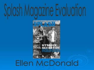
  • 1. Splash Magazine Evaluation Ellen McDonald
  • 2. In what ways does your media product use, develop or challenge forms and conventions of real media products? Throughout the research and planning for my magazine front cover, I analysed two music magazines- Kerrang and Q magazine. These gave me an insight as to what I needed to include in my music magazine front cover, as I took various elements from each magazine. This style of masthead appealed to me most as it spans the full width of the front cover. Therefore I decided that my masthead would be the same. I felt that having an image blocking the masthead was appropriate in a well established magazine like Kerrang, however for an unknown magazine it wouldn’t be suitable. Use of coverlines to the left side of the magazine seemed to establish an orderly layout and so I felt this was the best place to add my own coverlines. I instantly knew, during my research, that I would use an image of the main band for my magazine as the background for my music magazine front cover- meaning it would span the whole size of the page. I felt this looked most professional and it was used in the two music magazines I analysed in detail Use of coverlines written over the top of the main magazine image is space saving and aesthetically effective. This is used in many music magazines and so I knew it would be effective in Splash magazine. Taking inspiration from Q Magazine, I decided I would place a slogan above the masthead, to attract reader attention and generate excitement about the magazine.
  • 3. This was my final outcome of my music magazine front cover. I feel it is in-keeping with the conventions of other music magazines in terms of the masthead, main image and coverlines. As with almost all music magazines I have looked at, the masthead is in a prime position for competition against other music magazines on a newsagent’s shelf. This is essential as often the masthead is all a perspective buyer will see, so it must stand out Music magazines will conventionally include a few sentences of coverlines over the main image to encourage people to buy the magazines. These lines are often enticing and may tease the reader by only providing a little information. “MySpace Sensation” Indicates great internet hype and causes the reader to want to buy the magazine to find out more. These coverlines are succinct, snappy and enticing. “Beyonce musical influences” will appeal to Beyonce fans, while “Top ten break-though UK Acts of 2009” appeals to those who enjoy unsigned acts. These coverlines correspond to my questionnaires- where I learnt that articles on both famous artists and new or unsigned acts are most popular.
  • 4. To research contents pages, I analysed NME magazine and Q Magazine. Like my music magazine front cover, I found various elements that I liked and wanted to imitate in my contents page. Organisation of articles into sub headings is something I found in both NME, Q and in other music magazines I looked at. This immediately establishes a firm layout and results in an easily understood contents page. Both NME and Q used “Features” as a sub-heading therefore I included this. Q magazine have an “every month” feature, so I included this also. I included a section “Splash Review” as I got this idea from the Q magazine contents page. This details a review of gigs, albums and unsigned acts and I felt it would work well in Splash magazine I used the unconventional style of Polaroid images on my contents page to add a little variety to Splash Magazine. The contents pages I looked at had one singular image, however I wished to use two- one of my main band and one of another artist. I found this image of a Glasgow band on the internet when I began my research and wanted to imitate this somewhere in my magazine. I found that in NME, they used a part of the contents page to promote the magazine. Therefore I dedicated the bottom to promoting a free gift in this issue. I found from my questionnaires that promotions like these will attract more buyers to my magazine. The idea for the CD itself came from free CD’s that Kerrang magazine have given away in the past.
  • 5. To plan my double page spread, I analysed Kerrang and NME magazine. While Kerrang was quite Gothic and dark, NME provided helpful elements I could use in my own work. Like NME and Kerrang which both used many images, I decided to dedicate the left side of my double page spread to images. Through my questionnaire research I found that perspective readers enjoy use of images in the magazine and so I think my use of five images is appropriate. To continue with the theme of the contents page, I added further Polaroid images here to establish a house style. Magazines spend great time developing a firm house style. Q magazine continually uses red, white and black thought every magazine they issue. Use of a drop cap is important in setting the scene to the article. Like NME, the Splash drop cap introduces the band and the writer I included sub headings to organise my double page spread more neatly. Pull quotes are a regular occurrence on music magazine double page spreads. These are usually larger than the main text and in a different colour. I added two pull quotes to my article to attract instant attention. This title suggests a relatively new band and that this article will provide detailed background information. The colours reflect the house style of Splash also. The titles of articles are often catchy like this and entice the reader
  • 6. Challenging Conventions My music magazine front cover just contains one main image, whereas on other magazines there tend to be three or four. I found through my questionnaire that my target audience prefer a simple layout with just one or two images and so I chose to go against this usual convention and create a magazine with just one front cover image. In my double page spread I chose to have the title or headline of the page in the centre of the page, rather than on the top left as is conventional of other music magazines. I didn’t want the title to overshadow the top of the main image and so I decided to place it over the photo near the middle. This too adds diversity to the double page spread and adds a little character. My contents page is generally conventional, although the use of Polaroid images is a little diverse and is rarely used in magazines. I feel this gives a laid back presence to the indie magazine and is attractive also.
  • 7.
  • 8.
  • 9.
  • 10.
  • 11.
  • 12.
  • 13.
  • 14.
  • 15.
  • 16. Many images as opposed to one appeal to the target audience that have indicated that images are appealing. Also avoids an overload of text that will loose the interest of the reader quickly. Drop cap to inform the reader of the background to the article and writer Pull quotes attract readers attention and are instantly appealing . Emphases the humility and friendly nature of the band- readers will relate to them. Overall calming colour scheme of blue, white and grey. The reader becomes familiarised with the house style of the magazine and appreciates it. Colloquial language allows the reader to feel at ease, as the article feels friendly and conversational. “We just recorded one of our own songs one evening and posted the video on the net.” Double page spread- attractive to the audience Article ends on an upbeat and positive note- “At Splash we’re confident for the future of these Irish teenagers.” Various quotations embedded into the text “This felt like the breakthrough the band needed- ‘We finally had hope we could go beyond our internet roots.’” Whole left hand side dedicated to images. Images of the boys in the style of Polaroid's interest the reader and are consistent with the contents page
  • 17.
  • 18.
  • 19. I learned to use grid guidelines when completing my tasks as these help to align the work and ensure everything I used was straight and accurate. Fonts For my fonts I used 1001 fonts, an internet site and copied them into a windows folder for fonts. I was then able to open these in Photoshop and use them throughout my magazine. This font is called ‘If’ and is the font I decided to use for my masthead, title on the contents page and sub headings. These other fonts were downloaded from 1001 fonts also and are used in both the front cover, contents page and double page spread. This splash mark used throughout my magazine is also downloaded from Google and pasted into a windows folder for brushes. This adds to the Splash theme of my magazine and is aesthetically pleasing
  • 20.
  • 21.
  • 22.
  • 23.
  • 24.
  • 25.
  • 26.
  • 27. My final products Music magazine front cover
  • 29. Music magazine double page spread