
Recomendados
Más contenido relacionado
La actualidad más candente
La actualidad más candente (17)
Destacado
Destacado (20)
Similar a Market research with contents page and article
Similar a Market research with contents page and article (20)
Más de emmarignall
Market research with contents page and article
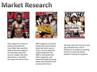
- 1. Vibe magazine is aimed at NME magazine is aimed at people who prefer the people who want to know Kerrang! caters for more of a rock music R&B, they would be about the latest news in age and advertises a lot of likely to buy this magazine music, not just about the freebies to its audience, knowing for interviews about the singer/songwriters life, that this is what will attract artist or maybe a life story NME is more gritty than people to buying the magazine. about them, it would be other magazines, and less about the actual music. would be bought by young adults who wanted to find out about the music.
- 2. The main R&B magazine available on the market is Vibe and as there aren't many R&B magazines available it means The Anchorage for this magazine is there is a gap in the market for a new specific to the target one. audience of this genre as if they were not interested in The dominant image of this R&B they wouldn’t magazine is a very strong understand what rapping image, showing that ‘new juice’ means. people who were interested in pop magazines would not be interested in this very strong, serious image. The main colour scheme for this magazine, are red, white and black which shows serious rapping magazine instead of being based in girly The main artists of the magazine colours like pinks and being in bold means, if the target purples. audience were into that artist at the time they would see their name and be more interested in buying the magazine.
- 3. Putting this header at the top of the The colour scheme of page with ‘exclusive this magazine is Drake interview’ mainly red, blue, white means people that and black. This shows might normally read that the magazine is another more rough and ready magazine, will now than a magazine that buy this one. would have brighter, lighter colours. The dominant image of this magazine, is a man holding a CD making it clear to buyers that The list of bands down didn’t already know the side of the front cover that this was a music means that the fans of magazine what genre this band will of magazine it is, this automatically want to means that they will know what's written be appealing outside about their favourite their target audience band and will be more as well as appealing to likely to purchase NME them. than anything else.
- 4. The broken title shows that the magazine, is loud and rocky as the title has been blown The dominant image up there is that much of this magazine is a volume. man screaming which means people who are into rock music will identify with the image and think that they will want to buy the magazine. Putting Linkin Park in bold letters in front of the dominant image means that fans of the band will want to buy this magazine in order to find out more about what the band is working on, and by having Linkin Park in front of the dominant image people will identify with what genre of music the magazine is about.
- 5. I have decided the genre of magazine I would like to create is going to be R&B, this is because the only real magazine I have found in the R&B genre is the magazine Vibe, so there isn't much competition on the market.
- 6. The conventions of R&B magazines are mostly the same, for example all of these magazines have colour co-ordinated their titles with the dominant image of the text so my magazine will have to conform with this. Also the image is always the main part of the magazine, meaning that my main image will have to be a strong picture that sounds out among the rest of the front cover. The Anchorage around the outside is all relative to the magazine and all relative to the R&B genre meaning I will have to do research around the time to find out what the R&B audience want to know about.
- 7. • A black, white and red themed front cover, as this way people will realise that my magazine stands out from the rest and is also quite bright and the red colour will signify danger • A wet look dominant image to show my magazine is new on the market and not like anything anyone has seen before. • Proper R&B news stories anchorage around the outside so fans of the genre will choose to buy my magazine over the other magazines on the market
- 8. I am going to take these names to my target audience along with some other questions about my magazine, in order to make the decision in what to call my magazine and also what to put in it.
- 9. On all the contents pages for Vibe magazine the image The fact that the is more dominant heading of the than the contents of contents page is the magazine only small and in the corner shows The dominant that this is image is also taken probably not the in quite grungy most important colours which also page in the R&B signifies the R&B magazine genre The body stance of these two is very strong showing that the The Contents page dominant image is sectioned into in an R&B little bits so it is magazine should easier to find the also be of two actual section you dominant are looking for characters
- 10. The name of the artist however is made bold, showing that if the The image in readers like the artist this article they are going to read spreads out this article. over one full page which shows images are a big part of R&B magazines and images should be very dominant in my magazine. The fact that the picture blends with Also the text is quite small and the colours that are in the other side they don’t need to catch the of the page shows there is a clear readers eye, showing this must bond and both of the pages are be an important story that the connected together. readers will read anyway.