Why presentations are boring but movies interesting
•Descargar como PPTX, PDF•
3 recomendaciones•3,641 vistas

This document discusses why presentations are often boring compared to movies and provides tips for making presentations more engaging like movies. It notes that movies tell stories with characters and are visual, while presentations often just tell facts with data slides. The document then discusses how the author used to create boring PowerPoint presentations with walls of text and jargon but learned to use design principles like typefaces, colors, and visual storytelling to create more cinematic presentations that keep audiences engaged. It encourages learning to present like a visual storyteller to make slideshows memorable like movies.

Recomendados
Recomendados
Más contenido relacionado
Similar a Why presentations are boring but movies interesting
Similar a Why presentations are boring but movies interesting (20)
Último
Último (20)
Why presentations are boring but movies interesting
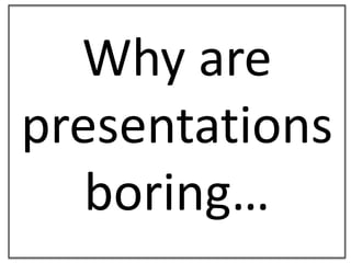
- 1. Why are presentations boring…
- 3. And movies interesting?
- 4. ?
- 5. What is the last presentationYOU remember?
- 6. Can slides be as good as a movie?
- 7. ?
- 8. I thought they should
- 9. I used to look like this (Actual picture from 2004)
- 10. Iused to look like this (Actual picture from 2004) (no kids yet)
- 11. My documents looked like this (Actual document from 2003)
- 12. My presentations looked like this(Actual presentation from 2004)
- 13. The Strategy Hexagon Goal Measurement Action Plan Evaluation Formulate (EMEA) Refine (SA! / EMEA) Communicate (EMEA / SA) Understand (SA) Feedback (SA!) Act (SA!)
- 14. Act-Feedback axis: how Combination of research and training. More interviews. Environmental Scanning (Based on the CIA’s model) Measure External feedback sources Audit efficiency of Internal feedback structures / processes Deliver Strategic thinking tools (SCAMPER) Measure amount and impact of Feedback from macro- environment Goal Measurement Action Plan Evaluation
- 15. Why are movies successful?
- 16. Then I realised! Movies…
- 17. Tell stories
- 18. Presentations…
- 19. Tell facts
- 20. Then I realised! Movies…
- 21. Have characters
- 22. Presentations…
- 23. Have data
- 24. Then I realised! Movies…
- 25. Are visual
- 26. Presentations…
- 27. About Powerpoint The software suggests a heading and bullet points, so that’s what people go for Once you’re typing, it’s hard to remember you’re not using a word processor to write a book We’re used to seeing boring powerpoints so we think it’s acceptable We’re not trained visual storytellers, so we don’t know how to make the slides look good We think the data is more important than the message There’s so much on the slide we feel we have to read the slide to the poor suckers at the back of the room You get extra “Pro” points for using lots of jargon
- 28. That was me, five years ago
- 30. I wanted to learn how to do this:
- 32. I realised that this was bad:
- 33. Southern Africa Long-Term Trends Note: each member pays 2 x per year (6-monthly subs to USA) Green line = number of clubs Red line = number of membership payments
- 34. I studied
- 35. typefaces
- 36. and how they work…
- 37. …together
- 38. Put away my
- 40. And picked up my
- 42. I learned what colours work…
- 43. And which don’t
- 44. Now…
- 45. I can tell stories like this:
- 46. Club Club growth and decline 1979-2009
- 47. Club Club growth and decline 15 yrs 13 yrs
- 48. Club Club growth and decline 15 yrs 13 yrs +104 -41
- 49. My documents look like this now
- 51. My presentations look like this…
- 53. And this…
- 55. Make your slideshows like a movie
- 56. Then I realised!
- 58. Will remember your presentation for years to come
- 59. Erich Viedge Johannesburg South Africa www.pepper.co.za +27 74-1-VIEDGE +27 74 184-3343 @erichv
Notas del editor
- Then I realised I was a movie maker:
- Well?What’s the last presentation you remember?I hope you never forget this one!
- It’s hard to believe I was ever this boring.I took myself SO seriously.
- And notice how the punctuation is all over the place.Why are some words in capital letters here? Who knows.
- Then I realised I was a movie maker:
- Then I realised I was a movie maker:
- Then I realised I was a movie maker:
- Many professionals will say they don’t have stories.
- Stock photo
- If you don’t have a story, don’t present.
- If you don’t have a story, don’t present.
- If you don’t have a story, don’t present.
- If you don’t have a story, don’t present.
- If you don’t have a story, don’t present.
- If you don’t have a story, don’t present.
- If you don’t have a story, don’t present.
- Actual proposals
- Actual presentations
- Then I realised I was a movie maker:
- Well?What’s the last presentation you remember?I hope you never forget this one!