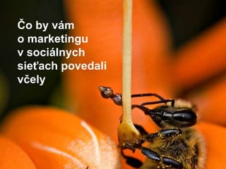
Čo by vám o marketingu v sociálnych sieťach povedali včely
•Descargar como PPTX, PDF•
0 recomendaciones•415 vistas

Čo by vám o marketingu v sociálnych sieťach povedali včely

Recomendados
Más contenido relacionado
Más de Etarget
Más de Etarget (20)
Čo by vám o marketingu v sociálnych sieťach povedali včely
- 1. Čo by vám o marketingu v sociálnych sieťach povedali včely
- 2. K včelám som sa dostal vďaka medovine
- 3. * Med je nektár ovievaný krídlami
- 4. * Pol kila medu: návšteva 2 miliónov kvetov
- 5. * Čajová lyžička medu: celoživotná práca dvanástich včiel
- 6. * Včely opeľujú jedno z troch súst, ktoré zjeme
- 7. * Včely komunikujú a myslia.
- 8. * Sú jediný tvor bez chrbtice, ktorý má symbolický jazyk
- 9. * Vedia počítať do štyroch. * Dokážu rozoznať tváre
- 10. * Sú pracovité! Denne navštívia 10 tisíc kvetov.
- 12. 1. Nesústreďte všetky svoje sily na internet, len preto že je to nové
- 13. Včely vedia, že najlepšia stratégia pre okamžitú hojnosť je kalkulovať dlhodobo.
- 14. Internet je nové médium, ale nie jediné médium
- 15. Ľudia sa vždy rozprávali. Dnes to voláme UserGeneratedContent.
- 16. O čom sa rozprávame? O sociálnych objektoch. fotky „ako sa máš“ hudba politika
- 17. O čom sa rozprávame? O sociálnych objektoch. fotky Flickr „ako sa máš“ Facebook v.1, Twitter hudba Last.fm politika diskusie Facebook v.2 = platforma pre všetky sociálne objekty
- 18. 2. Robte pri minimálnych energetických nákladoch
- 19. Včely produkujú maximum pri minimálnych nákladoch, nie pri maximálnych.
- 22. Ženy sú skutoční surferi – chodia z miesta na miesto bez konkrétneho cieľa
- 23. Muži idú za konkrétnym cieľom –pozrieť si správu XY na portál ZQ
- 24. Koho oslovujete reklamou? 1. Hľadajú. Kúpia tu a teraz. 2. Nehľadajú. Kúpia, ak ich oslovíte a vysvetlíte im, prečo by mali kúpiť.
- 25. Koho oslovujete reklamou? search 4% zákazníkov 1. Hľadajú. Kúpia tu a teraz. 2. Nehľadajú. Kúpia, ak ich oslovíte a vysvetlíte im, prečo by mali kúpiť.
- 26. Koho oslovujete reklamou? search, SEO 4% zákaazníkov médiá sociálne siete 1. Hľadajú. Kúpia tu a teraz. 2. Nehľadajú. Kúpia, ak ich oslovíte a vysvetlíte im, prečo by mali kúpiť. 80% zákazníkov
- 27. Facebook je váš nástroj pre sociologický výskum
- 32. 3. Ak chcete jesť med, musíte prispieť k chodu úľa
- 33. Včely pred zimou vyhadzujú trúdov preč z úľa.
- 34. Vyhadzujte staré marketingové nástroje.
- 35. 4. Distribuujte autoritu
- 36. Nedohliadajte osobne na chod komunikácie na sociálnych sieťach. Rozhodnutie má robiť ten, kto je najbližšie k zdroju informácií.
- 37. Zo 100 ľudí: 1 obsah tvorí 9 komentujú 90 sa prizerá
- 39. 6. Určite si pevné princípy
- 40. Včely sa riadia pevnými konštantami pri hodnotení výnosnosti pastviny.
- 41. Dve konštanty na sociálnych sieťach: Kvalita idey, nie počet fanúšikov
- 43. Dve konštanty na sociálnych sieťach: 2. Hovorte s ľuďmi ako s deťmi zo základnej školy 2
- 44. web = náročnejší na čítanie
- 45. web = aktívne médium a zmena sústredenia
- 46. 25 % pomalšie čítanie 79 % skenuje text očami
- 48. Píšte ako pre ôsmaka na základnej škole.
- 50. Nielsen Úloha Test: 7 úloh Spokojnosť
- 55. Jednoduché vety
- 56. Ak napíšete takúto krátku vetu, výborne jej porozumie 13-ročný žiak.
- 57. Bežnébankovéoperácieakoprezretiezostatkunaúčte, pohybynaúčtečikreditnýchkartáchaleboodoslanieplatobnéhopríkazu, budúmaťvšetciklientiTatrabanky a zároveňmajiteliatelefónuiPhone k dispozíciiajcezpohodlnú a štýlovúaplikáciu.
- 58. Vlastníte iPhone? Zaplaťte svoju dovolenku priamo z neho, alebo si pozrite zostatok na účte. Tatra banka prináša štýlovú aplikáciu, ktorá vám to umožní.
- 59. Žiadny žargón
- 60. Dôležitejšie je to, ako hovoria ľudia, nie náš firemný jazyk
- 61. Hovorte, čo to znamená pre klienta
- 62. Čo to znamená pre firmu: Zníženéúrokovésadzbypritrojročnejalebopäťročnejfixácií garantujemekaždémužiadateľovi, ktorý v termíne 8.10.-14.11.2010podážiadosť o BusinessÚverTBHypo. Čo to znamená pre zákazníka: Požiadajte o BusinessÚverTBHypo do 14.11 a my vám dáme nižšie úrokové sadzby. Akcia platí pri viazanosti na 3 alebo 5 rokov.
- 63. Aktívny hlas, nie pasívny
- 64. Investujte čas do prvých 2 – 3 slov. Musia niesť informáciu
- 67. Stop balastu
Notas del editor
- More research is needed to truly know why 79 percent of Web users scan rather than read, but here are four plausible reasons:Reading from computer screens is tiring for the eyes and about 25 percent slower than reading from paper. No wonder people attempt to minimize the number of words they read. To the extent this reason explains users' behavior, they should read more when we get high-resolution, high-scanrate monitors in five years since lab studies have shown such screens to have the same readability as paper.The Web is a user-driven medium where users feel that they have to move on and click on things. One of our users said: "If I have to sit here and read the whole article, then I'm not productive." People want to feel that they are active when they are on the Web.Each page has to compete with hundreds of millions of other pages for the user's attention. Users don't know whether this page is the one they need or whether some other page would be better: they are not willing to commit the investment of reading the page in the hope that it will be good. Most pages are in fact not worth the users' time, so experience encourages them to rely on information foraging. Instead of spending a lot of time on a single page, users move between many pages and try to pick the most tasty segments of each.Modern life is hectic and people simply don't have time to work too hard for their information. As one of our test users said, "If this [long page with blocks of text] happened to me at work, where I get 70 emails and 50 voicemails a day, then that would be the end of it. If it doesn't come right out at me, I'm going to give up on it."
- Users first read in a horizontal movement, usually across the upper part of the content area. This initial element forms the F's top bar.Next, users move down the page a bit and then read across in a second horizontal movement that typically covers a shorter area than the previous movement. This additional element forms the F's lower bar.Finally, users scan the content's left side in a vertical movement. Sometimes this is a fairly slow and systematic scan that appears as a solid stripe on an eyetrackingheatmap. Other times users move faster, creating a spottier heatmap. This last element forms the F's stem.Users won't read your text thoroughly in a word-by-word manner. Exhaustive reading is rare, especially when prospective customers are conducting their initial research to compile a shortlist of vendors. Yes, some people will read more, but most won't.The first two paragraphs must state the most important information. There's some hope that users will actually read this material, though they'll probably read more of the first paragraph than the second.Start subheads, paragraphs, and bullet points with information-carrying words that users will notice when scanning down the left side of your content in the final stem of their F-behavior. They'll read the third word on a line much less often than the first two words.
- The main and most obvious advice is to simplify the text: use text aimed at a 6th grade reading level on the homepage, important category pages, and landing pages. On other pages, use text geared to an 8th grade reading level.You can also improve your site's usability for lower-literacy users in several other ways.Prioritize information. Place the main point at the very top of the page, where even readers who typically give up after a few lines will see it. Place any other important information above the fold, to minimize the risk of users losing their place after scrolling. This is always good practice; even the most skilled readers will leave a page if the first few paragraphs don't seem valuable. It's even better to avoid scrolling all together (which also helps teenagers) unless eliminating it requires you to chop content into unnaturally short sections, which can be even more confusing.Avoid text that moves or changes, such as animations and fly-out menus. Static text is easier to read. This guideline also helps international users (who might need to look up words in a dictionary) and users with motor skills impairments (who have difficulty catching things that move).Streamline the page design. Place important content in a single main column, so users don't have to scan the page and pick out design elements in a two-dimensional layout. This guideline also helps low-vision users and users of handheld devices (such as smartphones), which narrow the field of view.Simplify navigation by placing the main choices in a linear menu. This helps users clearly understand the next place to go, without requiring them to scan the page for options.Optimize search. Make your search tolerant of misspellings (which also helps seniors, who are particularly prone to making typos). Ideally, a user's first search hit should answer the query, and all hits should provide short, easy-to-read summaries.
- Dĺžka veta je najdôležitejší faktor. Držte vety čo najjednoduchšie.
- Alebo: V prípade, žedosiahneteminimálnebankoustanovenýobjembezhotovostnýchplatiebuskutočnenýchprostredníctvomhlavnej a všetkýchdodatkovýchkarietvydaných k jednémukartovémuúčtu, v deňzúčtovaniamesačnéhopoplatkuzahlavnúkartuvámuhradenýpoplatokobratomvrátime.
- Dodatočná autentifikácia pri prihlasovaní Čítačka čipových platobných karietDoba fixácie Objem bezhotovostných platiebKartový účet Deň zúčtovania Portfóliofondu
- Zhoršenie čitateľnosti znamená to, že nechávame ľudí, aby si transformovali našu vetu na svoju akciu.
- Požiadajte o BusinessÚverTBHypo do 14.11 a my vám dáme nižšie úrokové sadzby. Akcia platí pri viazanosti na 3 alebo 5 rokov. BežnébankovéoperáciebudúmaťvšetciklientiTatrabanky k dispozíciiajcezpohodlnú a štýlovúaplikáciu.