CMD Interaction Design - Y2 Q2 les 5 - Responsive Design
•Descargar como PPTX, PDF•
3 recomendaciones•321 vistas


Recomendados
Recomendados
Más contenido relacionado
Más de Ferry den Dopper
Más de Ferry den Dopper (20)
Último
Último (20)
CMD Interaction Design - Y2 Q2 les 5 - Responsive Design
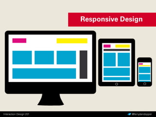
- 4. Moet je allemaal losse sites maken voor desktop, tablets, touch phones en smartphones? (kost veel werk en dus geld)
- 12.
- 13. “Responsive web design is not a down-scaling. it’s an optimization for the different viewports of today… if it’s done right!” Markus (onbekend)
- 14. “Truncation is not a content strategy. Don’t just chop content off to make it fit onto small screens” Karen McGrane Truncation: ‘snoeien’, ‘afhakken’ of zelfs ‘mutileren’
- 16. “You need to know what matters most. Thanks to progressive enhancement (and let’s face it, responsive design done right is a perfect example of progressive enhancement) we can serve up the content that people want and display it to the best ability of any particular device. That’s the key difference: start with the content, not the device.” Luke Wroblewski
- 17. “We need to think and therefore wireframe them polymorphically [and] have to ensure that everything can morph gracefully to higher and lower resolutions. Changing layout as necessary, making use of wider resolutions more effectively and possibly omitting some of the content altogether at lower resolutions.” Leigh Howells, Headscape
- 19. “We ontwerpen content die beweegt, van vorm verandert en transformeert in zijn verschillende stadia, of het nu gaat om desktops, mobiele telefoons of iets geheel anders”. Nicklas Persson
- 28. Maak een responsive design voor de • Homepage • Vraag • Contact
- 29.