
Recomendados
Más contenido relacionado
La actualidad más candente
La actualidad más candente (19)
Destacado
Destacado (13)
Similar a Empire Sherlock Holmes Cover Analysis
Similar a Empire Sherlock Holmes Cover Analysis (20)
Más de flamingdodo
Empire Sherlock Holmes Cover Analysis
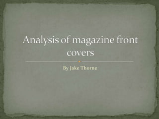
- 1. By Jake Thorne Analysis of magazine front covers
- 2. This front cover was taken from a recent issue of "Empire" magazine, andfeatures the new action film "SherlockHolmes" which was released onDecember 26th 2009. The masthead of the magazine ispresented in large, capitalized red font,which makes it very eye-catchingagainst the pale blue and blackbackground. The feature photograph onthe front cover is also covering up someletters of the masthead, suggesting thatthe publishers are confident that themagazine's popularity will overcomethis. Empire: Sherlock Holmes Edition 2010
- 3. The headline for the main article withinthe magazine is situated over the top ofthe feature photograph and in thecentre of the page where is will be mostlikely to capture the audience'sattention. The title of the featured film"Sherlock Holmes" has been capitalized, again making it more eye-catching. The name of the actor playing this starring role (Robert DowneyJr) is located above this main headline. If the audience are fans of thisparticular actor, this line plus the feature photograph will persuade themto buy the magazine. Another conventional feature of this magazine front cover is the use ofplugs to give the audience an insight into what other articles can be foundwithin the magazine. These snippets will persuade the audience to buythe magazine to find out more about these other articles. The plugs arealso laid out conventionally around the edge of the page so they do notobstruct the feature photograph. The sub-headings accompanying theseplugs have been backed onto a plain white background so that theydeliver maximum impact against the darker background.
- 4. The magazines strap line "Best Preview Issue Ever!" has been placed just above the magazines masthead. The fact that this sentence is exclamatory will create excitement amongst the audience and convincethem that they should buy this magazine because it is 'the best'. The fontof the strap line is also eye-catching as it is in pale silver, making it standout against the dark background. However it also does not draw too muchattention away from the bright red masthead situated below. The colours used within the front cover are also iconic of the feature filmsaction genre. The dark blacks and blues create a sense of suspense andmystery. The bright red connotes action and blood, whilst the metallicsilvers can be linked to weaponry. Therefore this issue will be particularlyattractive to audience's who enjoy films of this genre.
- 5. Masthead – Bright red which is bold and recognisable to readers, also contrasts against the pale blues and browns. Always across the top of the front cover and has the largest font on the page to stand out.Date and priceLimited colour scheme to not appear too over crowded. However, some colour to be eye catching. Tagline – Claims to be ‘THE WORLD’S BIGGEST MOVIE MAGAZINE which makes viewers believe this is the ‘best’ film magazine to read’Barcode and website to show where fans can view more information. Empire: Transformers (Megan Fox) 2009
- 6. The Star Personas name is also the second largest font to emphasise that she will be in this magazine and to people who do not know who she is but like her photograph may want to find out who she is. It also reads ‘And have lunch with Transformer 2’s Meagan Fox’ this encourages to sell the magazine as fans would love to have this opportunity.
- 7. Star Persona – Megan Fox helps sell the magazine as fans would be encouraged to buy this magazine, if she was shown on the front cover. Especially as the accompanied image of her shows she is half naked, which also fulfils the convention that ‘sex sells’ Implying that the film target audience is aimed at men. This photograph of Megan fulfils the traditional view of her covering the majority of the front cover and is positioned in the middle and to the right of the page, where she has a direct mode of address to engage the audience.Shows what else is featured in this magazine issue.
- 8. Empire: Batman (The Joker) The date and the price of the magazine is very small and doesn’t stand out. This could be as it may not attract the readers as much, and the film may also be taking over the whole page and divert their attention to that instead. The head of the joker covers the ‘P’ in empire, which gives the sense that it is overpowering the magazine itself because the film is so big and successful. These words show that the film is that successful and gives the impression that this is a rare opportunity to read this anywhere else so as it promotes the magazine!
- 9. The red title of the magazine enhances the darkness and sense of the film, giving clues or reinforcing the genre and the general narrative. The writing shows that the film is/will be relatively eerie. The font used looks handwritten and looks as if it has been carved. The bright colours make the magazine stand out and the different shapes around the letters shows that it is unique. The picture of the film is the main aspect of the cover. The other features are written over the picture, as opposed to the picture being a small feature on the magazine.
- 10. The colour of his socks are shown, which, with the different colours, they relate to the word ‘Joker'; his title in the film. The white font used for the ‘extra’ information shows a sense of innocence for those topics, but more so enhances the horror genre of The Dark Night. The use of the word ‘PLUS’ shows that the film situated on the front of the poster is the main focus and anything else is just ‘extra’. The website is fairly small underneath the title of the magazine, which shows where you can find out more about what is in the magazine. The barcode is a typical convention of a magazine.