SlideShare una empresa de Scribd logo
1 de 58
Smashing Conference 2014, Oxford UK • Fabio Carneiro • @flcarneiro
HARD-WON
LESSONS IN
RESPONSIVE
EMAIL DESIGN
- I’ve been involved in web design since 1998, and I’ve worked at MailChimp for 5 years as a UX & Email Designer,
- My day job involves building the emails that are used by MC, MC’s customers, and refining the experience the MC
email editor provides,
- I’m going to talk about mobile email from my perspective at MC, and how I approach mobile email design for
us and our users...
image credit: http://goo.gl/E8o33u
- A little background first,
- MailChimp currently has more than 4 million users, the majority of whom know nothing about design in general, let
alone responsive design,
- We wanted to help them get the most out of their emails, while at the same time helping them adjust to a
more mobile web...
- So, In November 2012, we introduced a new email designer, dubbed ‘Neapolitan’, that only outputs responsive email,
- It’s proven successful: In 2013, we sent 70 billion emails in total, from 24 million campaigns,
- Over 65% of all emails sent in 2013 were responsive...
- In 2014, we expect that number will radically increase to near 100%, because of two factors:
- MailChimp currently adds roughly 10,000 new users a day,
- We’ve killed our fixed-width editor, and we’re getting rid of all fixed-width templates over the next couple of
months,
- There’s a reason we’re pushing so hard towards responsive-only email...
A PHONE IN
EVERY HAND
- It’s because the mobile web is evolving faster and faster. As web designers, we all know that mobile internet usage is
skyrocketing,
- You may not know that it’s especially true of email, because it is the thing that’s ubiquitous to pretty much every
device,
- In Europe, for example...
image credit: http://goo.gl/qNA90
IN THE EU OWN
A MOBILE PHONE
91%
- According to Eurostat,
- Of a total population of 507 million, 91% of people in the EU own a mobile phone,
- That’s a total of roughly ~460 million people,
- 43% of them actively use the internet every day...
source: http://goo.gl/VMjkJH
http://goo.gl/f7WH6w
Internet activities via mobile device (% mobile internet users)
- How do they most use their mobile connections? For sending and receiving email...
source: http://goo.gl/VMjkJH
SEND & RECEIVE EMAIL
VIA MOBILE DEVICE
67%
- 67% of mobile internet users in the EU28 use their devices to send and receive emails,
- Numbers on my side of the planet are similar...
source: http://goo.gl/VMjkJH
IN THE US OWN
A MOBILE PHONE
90%
- According to the Pew Internet & American Life Project,
- Of a total population of 317 million, 90% of people own a mobile phone,
- That’s a total of roughly ~290 million people,
- 63% use their phones to go online...
source: http://goo.gl/0m6dEM
Internet activities via mobile device (% mobile internet users)
- More than half of all cell phone-owning Americans use their devices to send and receive email...
source: http://goo.gl/0m6dEM
SEND & RECEIVE EMAIL
VIA MOBILE DEVICE
52%
- 52% of mobile internet users in the US use their devices to send and receive emails,
- That number was just 27% in 2009, indicating a 25% increase over four years,
- I’ve only touched on the two most developed economies on Earth. The rest of the world is catching up fast...
source: http://goo.gl/0m6dEM
OF THE WORLD HAVE
MOBILE INTERNET
30%
- 29.5% of the world’s population have mobile internet access,
- That’s ~2.1 billion people, and it’s growing quickly as developing economies come online,
- Mobile-broadband subscriptions climbed from 268 million in 2007 to 2.1 billion in 2013,
- As the web becomes more and more mobile to meet those new users, email has to follow...
source: http://goo.gl/4egHur
USER
EXPERIENCE
IN EMAIL
- Those who have dabbled in email design know that, a lot of the time, it’s easier said than done,
- In traditional web design, there are tons of tools and techniques that help make responsiveness happen,
- In email design however, there’s very little; there isn’t widespread support for HTML5, or CSS3, or JavaScript,
- The email designer’s tools are dated by at least ten years, which leads a lot of people to think that responsive
can’t be done, or that it’s near impossible...
image credit: http://goo.gl/E8o33u
DESIGN
WITHIN
CONSTRAINTS
- It may not be simple, but it’s definitely not impossible. Email design has a steep learning curve, but I follow four
cardinal rules that make it easier,
- They’re what I’ve come up with after 5 years of being an email designer at MailChimp. The first rule is Design Within
Constraints,
- The email ecosystem has been largely ignored throughout the lifetime of the web. The W3C is only now beginning to
talk about it,
- That’s the root of one of the major constraints in email design; there are also no standards; it’s the wild west. But
because there aren’t any standards to follow, you’re afforded a great deal of freedom,
- That means you end up with free rein to experiment, devise creative solutions, and otherwise do things that
would Jeffrey Zeldman sick to his stomach...
- The basis for the second major constraint in email design is the existence of a few very, very terrible email clients,
- These clients force email designers to build to the lowest common denominator,
- Some of the worst come from Google, which might surprise some, because this is a company that’s building driverless
cars,
- The Gmail web and mobile app clients lack media query support, and they require all CSS to be inlined within email
markup,
- For those reasons, they rank among the worst email clients, but they’re not alone...
- Microsoft Outlook (desktop) is the most notorious. Ask any email designer which email client they wish never existed,
and it’s this one,
- That’s because Outlook doesn’t run a traditional HTML rendering engine; In 2007, it moved from an engine powered by
IE6 to one powered by Word,
- Email client limitations like these make design differences from client to client pretty much necessary, but that’s a good
thing,
- Having to account for so many differences frees you having to strive for pixel perfection between clients,
- In responsive web design, we write different stylesheets for different platforms; it’s no worse to write an Outlook-
specific stylesheet that you then serve with conditional comments
- There’s no reason not to use all of the tools available to you within these constraints to just make an email work,
- And you should strive to make it work better for people on the receiving end...
DESIGN
FOR
DISTRACTION
- And designing for those on the receiving end is the second rule: Design For Distraction,
- The mobile web is, well, mobile. And people are busy. Email is something we’re checking on the drive into the office, or
- That mobility means that email can’t be an interruption; it has to work into people’s lives almost seamlessly. To that
end:
- When building emails, there’s one foundational standard to meet: that an email should be usable with just one
eyeball, one thumb, and at arm’s length...
- One eyeball means the email is usable when a person is distracted, whether it’s a newsletter, a product sales email, or
a transactional message,
- One thumb means that major calls to action are at least 46px squared, and link groups have adequate separation,
- Arm’s length means primary copy has a 16px minimum font size, images are nicely-sized, and contrast is adequate,
- These three principles are great, but they’re ultimately meaningless until you apply them to specific ends...
DESIGN
WITH
PURPOSE
- Which brings us to the third rule: Design With Purpose,
- A website is generally made to cater to everyone; there’s a whole planet of people out there that can come to you, so
you stay as broad as you can,
- When you design for everyone, you can end up designing for no one; email allows you to do the reverse by making
designs narrow and focused,
- That can be immensely powerful provided you can focus enough to give that one person - or a group of people that
think in similar ways - what they want,
- One way to achieve that focus is to design an email to be one thing, to achieve a particular goal...
- Generally speaking, there are four main categories for email,
- “Buy Me” are ecommerce-based; they use concise copy, simple calls to action, and rely on compelling imagery to build
an enticement to spend money,
- “Join Me” are event notices or invitations; copy is usually limited to important details and there are clear, bold calls to
action to urge participation,
- “Read Me” are newsletter emails; they rely upon well-written copy and great typography to make large amounts of
content easy to digest,
- The last category is a bit of an outlier, but is no less prevalent in the world of email...
- “Transactional” emails are messages that convey receipts, order updates, and similar one-time info. It’s important to
make them:
- “Focused”; a credit card declined message should be nothing more than that; no sales links, no unnecessary
information,
- ”Comprehensive”; they should contain as much relevant information as possible, made as concise as possible,
- “Appropriate”; this credit card declined message contains none of the typical MC humor that can be found in other
emails,
- “Practical”; the message is obvious, the content is actionable, the email is readable on any device and is easily
printable,
- “Spartan”; there’s no excessive design, no bells and whistles - transactional means short and to the point,
- By sticking to these categories as close as you can, your emails can end up less full of cruft...
DESIGN
FOR
EMAIL
- Which is great, because what you’ve ultimately got to do is Design For Email, and that involves four major
considerations
- 1. Don’t design emails like websites, 2. Be personal and personable, 3. Know and design to your audience, 4.
Remember email is an ecosystem,
- The first, that emails are not websites, is something where many people almost immediately fail,
- A lot of people design an email just as they would a website; you couldn’t find a more incorrect way to go about it if
you tried,
- Designing an email like a website means you end up with something like the emails from Zappos...
- They contain page navigation that only serves to distract from the message and interferes with the course of action
you’d like the recipient to take,
- Why give them an option to do anything else but buy the product you’re highlighting? It’s the same at the bottom:
there are 19 links in the blue footer area!
- An email like this happens when designers don’t care, and marketers are allowed to run wild,
- There are always exceptions, but more often than not emails like this can be incredibly ineffective, especially
compared to an email like...
- This one, from Steam,
- It’s properly designed, singular in purpose and free of superfluous content,
- I wasn’t distracted by other games on sale that I may not be interested in, or links to other genres of games I’d be
forced to search through,
- This is the game I wanted, that I showed interested in and saved to MY wishlist; when this email hit my inbox, I
immediately acted and bought the game,
- Steam took advantage of that knowledge and made the email for ME; that personal touch is simple with
email...
- And that’s the second consideration: making email personal and personable; email is the perfect medium for this,
better than social media,
- It’s something a lot of email designers ignore, even though it doesn’t have to be as involved as Steam’s,
- Including a person’s name or location is very powerful. Paul Boag uses subscriber names in Headscape’s campaigns,
- When this email showed up in my inbox, I actually did a double take. “Holy shit, does he really want to feature my
project?”
- It wasn’t targeted to just me, of course, but for a moment? I thought it was. “Paul is all about web design. I’ve web
designed!”
- Not only did he take advantage of personal data available to him, he also geared the message toward a
specific audience...
- That’s the third consideration, and one of the best ways of designing for email,
- While a site’s ‘audience’ may be a vague group, in email it can be much clearer,
- With email, you can better tailor your content to build interest, foster engagement, and grow trust with the audience,
- One example is MailChimp’s UX newsletter, which we send out roughly twice a month; it’s a long-form email
that focuses on what we do at MCUX...
- It currently has over 13,000 subscribers,
- Because we know our audience, and know that they can and want to read these long articles, and prefer them in email
form, it works,
- The email also works as a conversational tool by encouraging questions, and that brings us closer to other people in
the web design world,
- After an issue goes out, we spend days responding to questions, which builds a relationship with the readers and
grows interest in the newsletter,
- The emails are long, but they’re only sent twice a month to lessen fatigue, and allow breathing room between
issues...
- And that’s where the fourth consideration comes in; knowledge of email as an ecosystem,
- Knowing when and how often to send an email is important to its success; people suffer email fatigue, which has led to
things like the ‘inbox zero’ movement,
- Be considerate of the time investment you’re asking of people, and strive to make your email painless to read through,
- It’s also good to remember that email is not a closed-off thing; it’s part of the web, so transitioning from email to web
should be seamless,
- If you’re pushing someone from an email to a site, and the email is responsive, then the site should be as well,
- The more painless you can make email, the more successful it’ll be...
- So, these four rules, 1. Design within Constraints, 2. Design for Distraction, 3. Design with Purpose, and 4. Design for
Email act as a focusing mechanism,
- As you make your way through each rule, the experience that you’re creating for your users becomes more well-
defined,
- The email becomes more finely-crafted as well,
- So, even though web and email design are worlds apart, we follow similar methods for crafting better
experiences for people out in the world...
BUILDING
RESPONSIVE
EMAIL
- So once you’re got the experience nailed down, what do you do to put it together? Where do you start?
- You can start with some development techniques that help in the creation of good email,
- First, by breaking email down to smaller bits...
MODULAR
PATTERN-BASED
EMAIL
- A modular, pattern-based approach is what drives MC’s drag-and-drop email designer, and even underpins the
MailChimp application itself,
- This method allows great layout flexibility because layout is abstracted into content blocks, which means the email can
be built quickly,
- It’s helpful because not only are you reducing dependency on having lots of standard CSS, you also reduce the size of
the media query you need to write,
- This is also a very stable method with which to build emails, because you end up with abstracted blocks of
code...
- These abstracted blocks are common design patterns you can find all over the web, and particularly in email,
- I start with mapping out common design patterns like buttons and calendar pages, creating them outside the context
of the email,
- They’re not just any random patterns; they’re particular to the email’s purpose; a ‘Join Me’ email would need a calendar
page to show off its date, for example,
- The emails I designed for Zendesk, customer support service, work on this principle...
- This email is one of those “Read Me” emails, which means it’s a jack-of-all-trades message and contains a lot of
patterns,
- This is the email scaffold, and it’s the only part of the code with defined pixel sizes,
- It also has some basic patterns included, like the preheader and social block at the top,
- The rest of the content blocks are built as separate entities that can be placed into the scaffold in any order to create
specific layouts,
- For this email, there were several different patterns, but the major ones were...
- The email’s header, complete with a webfont-driven type stack...
- Then there’s the title block, also driven by a webfont stack,
- It’s also fully HTML - those lines are borders on empty table cells, which means it’s more efficient data-wise
- And it scales more easily across different display sizes...
- It’s followed by the feature block...
- And finally by a utility link block...
- Everything is combined to form the full email.
- All of the code blocks are discrete, contained in isolated files that can be easily copied and pasted by anyone,
- It’s all well and good to use this pattern-based approach to make email that easy, but making that easy and responsive
is more difficult,
- More so when you have many email clients to consider, all of which have varying degrees of mobile-
friendliness...
MOBILE FIRST
IN EMAIL
- In traditional web design, everyone likes to say, “start with mobile first”, but it’s not such a simple proposition in email,
- Why? Because most clients don’t support media queries. And some don’t support max-width. And some support
media queries, but not max-width,
- It goes on and on like this, all of these roadblocks; but there are solutions that make mobile-first possible,
- My most recent experience with the mobile-first issue was in designing Khoi Vinh’s new Subtraction.com
newsletter...
- The email was originally desktop-first, but Khoi wanted a solution to the email not being responsive in webmail clients,
- Going fluid wasn’t an option, because this is an email whose content is varied and injected via RSS; it all had to be
fluidish, or ‘spongy’,
- How different email clients handle CSS required for mobile-friendly and responsive style shifts was also a
consideration,
- For example; Outlook has issues with max-width, and so does Apple Mail/iOS Mail, all web-based clients have issues
rendering media queries,
- Because there are a few problems to account for, a few techniques for a workable solution were employed...
- The email is built around the concept that just one container does all of the work in determining width; that’s
‘emailContainer’ here,
- Instead of defining a specific width to be overridden, it gets a 100% width via attribute, which is limited via ‘max-width’
CSS,
- The main media query takes care of adapting the width on supporting displays,
- This method fails in Outlook, so a fixed-width container was made and placed within conditional comments...
- That solves the max-width issue there, but there’s still a major max-width problem in Apple Mail...
- And that is dealt with by a min-width media query and a client-specific style adjustment for iOS,
- That’s how much it takes to do mobile-first in email, but it works,
- It’s messy, but effective, and the email looks right on each of the most important email clients that Khoi’s subscribers
use,
- This solution is based on the idea that all of the parts in an email are always fluid or near fluid, and can be
placed anywhere and manipulated easily...
TABLE LAYOUT
SHIFTING
- In traditional web design, this kind of thing is easily done with floats and positioning,
- Floats and positioning don’t work well in email clients, regardless of whether they’re desktop, web, or mobile-
based, so email designers must resort to different methods...
- Here’s a standard two-column layout email; it’s a layout you see all the time,
- Ideally, on small screens, the email switches to a single-column layout...
- With the right column wrapping under the left when the media query is triggered,
- We can use two primary methods to achieve this result. The first method involves using forcing the table’s
<td>’s into a block-level layout...
- This first method is more stable, because you code email columns in the traditional <td> layout,
- The two columns here sit inside an overall wrapper table, with the left and right columns inside the cells
“templateColumnContainer”,
- We target these cells with the block-level rule to force the columns to snap under each other...
- That’s all the CSS you need; one line,
- (Side note, here: the media query rules are written with attribute selectors to prevent Yahoo Mail from rendering
media query styles instead of desktop styles),
- The advantage of this method is that it’s stable; this is how columns are always done, in two <td>’s,
- There’s a disadvantage, though: it’s not very flexible, especially when semantic layouts need to be
accommodated...
- Layouts like this, with a sidebar on the left and main content on the right, where the expectation is that the secondary
content snaps under the main content,
- In the code, the sidebar comes before the main content, but we don’t want that to happen then the email snaps to a
single-column layout,
- The block-level <td> method doesn’t let us swap the <td> order without resorting to float or position, which can
present issues,
- That’s where the second responsive column method comes in, with the use of the align attribute...
- The align attribute mimics CSS float, and it’s supported in older email clients; this is the perfect situation in which to
use this method,
- Because generally a sidebar is reserved for secondary information, when the email shifts to 1-column view in mobile, it
should come after the main content,
- In the email HTML that order needs to be preserved so it makes semantic sense, while still allowing the column orders
to be reversed in desktop view,
- By preserving the semantic column order and adding align attributes that reverse it on desktop, the layout issue is
solved
- The heavy lifting is done in the media query...
- When the media query is triggered, each table gets a width of 100%,
- They’re also set as block-level elements for email clients that have trouble with the align attribute and width 100%,
- Because they’re aligned, the left aligned table will always come first, the right-aligned table will come second,
- Because the order of the columns is dictated by their alignment direction, we can actually swap the order of
elements by changing their position in the markup or manipulating their alignment direction...
- The sidebar snaps under the main body area, and your content hierarchy is preserved,
- The beauty of this method is that it can be used to do more complex layout shifts as well...
- Which is done in the AllThingsD newsletter; here, the mobile version is on the left and the desktop version is on the
right,
- Each story element is contained within an aligned table; title, byline, image, and summary; each of these items get
shuffled on mobile view,
- This method obviously allows a great deal of flexibility, but it can be very brittle; whether you use the block-level <td>
method or the aligned-table method depends on your circumstances,
- These three basic development principles allow a really strong foundation for responsive email...
EMAIL DESIGN
RESOURCES
- Unfortunately, they’re just the tip of the iceberg; all I’ve talked about here barely touches upon the whole of email
design,
- I’m not going to leave you in the lurch, of course; there’s a lot to learn, and I’m constantly working to
demystify email design...
templates.mailchimp.com
- This is my current effort, MailChimp’s Email Design Reference,
- It’s a lengthy, comprehensive reference that covers email design from the ground up, beginning with basic principles
like typography usage to more complicated subjects like responsive email,
- It’s also got a library of pre-built email templates ready to be used for your own campaigns or as a learning
tool...
theuxnewsletter.com
- I also write occasionally about email design for MailChimpUX’s newsletter...
litmus.com/email-community
- Finally, the email analytics service Litmus recently opened an email design community...
Fabio Carneiro • @flcarneiro
THANK YOU
- Hopefully, this talk has made HTML email a little less daunting and frustrating,
- I’m open to chatting about email design; drop me a line via Twitter @flcarneiro, or shoot me an email via
flcarneiro.com,
- Thanks!

Más contenido relacionado

La actualidad más candente

Big Data : Risks and Opportunities
Big Data : Risks and OpportunitiesBig Data : Risks and Opportunities
Big Data : Risks and OpportunitiesKenny Huang Ph.D.
 
Prompt Engineering by Dr. Naveed.pdf
Prompt Engineering by Dr. Naveed.pdfPrompt Engineering by Dr. Naveed.pdf
Prompt Engineering by Dr. Naveed.pdfNaveed Ahmed Siddiqui
 
Understanding User Journey using Google Analytics (360)
Understanding User Journey using Google Analytics (360)Understanding User Journey using Google Analytics (360)
Understanding User Journey using Google Analytics (360)Dmitry Klymenko
 
Big data unit 2
Big data unit 2Big data unit 2
Big data unit 2RojaT4
 
Knowledge graphs for knowing more and knowing for sure
Knowledge graphs for knowing more and knowing for sureKnowledge graphs for knowing more and knowing for sure
Knowledge graphs for knowing more and knowing for sureSteffen Staab
 
Blablacar Pitch Deck
Blablacar Pitch DeckBlablacar Pitch Deck
Blablacar Pitch DeckLukaMitchell
 
Introduction to Information Retrieval
Introduction to Information RetrievalIntroduction to Information Retrieval
Introduction to Information RetrievalCarsten Eickhoff
 
Implications of Computer Misuse and Cyber Security (Teaching) (1).pdf
Implications of Computer Misuse and Cyber Security (Teaching) (1).pdfImplications of Computer Misuse and Cyber Security (Teaching) (1).pdf
Implications of Computer Misuse and Cyber Security (Teaching) (1).pdfsrtwgwfwwgw
 
Manual Instruction Led Light for LEGO 42096 Porsche 911 RSR Brick Kits
Manual Instruction Led Light for LEGO 42096 Porsche 911 RSR Brick KitsManual Instruction Led Light for LEGO 42096 Porsche 911 RSR Brick Kits
Manual Instruction Led Light for LEGO 42096 Porsche 911 RSR Brick KitsWiki Brick
 
Episode 2: The LLM / GPT / AI Prompt / Data Engineer Roadmap
Episode 2: The LLM / GPT / AI Prompt / Data Engineer RoadmapEpisode 2: The LLM / GPT / AI Prompt / Data Engineer Roadmap
Episode 2: The LLM / GPT / AI Prompt / Data Engineer RoadmapAnant Corporation
 
The nature of the data
The nature of the dataThe nature of the data
The nature of the dataKen Plummer
 
Data mining Measuring similarity and desimilarity
Data mining Measuring similarity and desimilarityData mining Measuring similarity and desimilarity
Data mining Measuring similarity and desimilarityRushali Deshmukh
 
Google BARD v/s ChatGPT _ A review
Google BARD v/s ChatGPT _ A reviewGoogle BARD v/s ChatGPT _ A review
Google BARD v/s ChatGPT _ A reviewDR. Ram Kumar Pathak
 
Accelerate Revenue with a Customer Data Platform
Accelerate Revenue with a Customer Data PlatformAccelerate Revenue with a Customer Data Platform
Accelerate Revenue with a Customer Data PlatformLattice Engines
 
Artificial intelligence (ai) multidisciplinary perspectives on emerging chall...
Artificial intelligence (ai) multidisciplinary perspectives on emerging chall...Artificial intelligence (ai) multidisciplinary perspectives on emerging chall...
Artificial intelligence (ai) multidisciplinary perspectives on emerging chall...PanagiotisKeramidis
 
High Dimensional Data Visualization
High Dimensional Data VisualizationHigh Dimensional Data Visualization
High Dimensional Data VisualizationFabian Keller
 
Python Programming ADP VTU CSE 18CS55 Module 1 Chapter 1
Python Programming ADP VTU CSE 18CS55 Module 1 Chapter 1Python Programming ADP VTU CSE 18CS55 Module 1 Chapter 1
Python Programming ADP VTU CSE 18CS55 Module 1 Chapter 1Demian Antony DMello
 

La actualidad más candente (20)

Big Data : Risks and Opportunities
Big Data : Risks and OpportunitiesBig Data : Risks and Opportunities
Big Data : Risks and Opportunities
 
Prompt Engineering by Dr. Naveed.pdf
Prompt Engineering by Dr. Naveed.pdfPrompt Engineering by Dr. Naveed.pdf
Prompt Engineering by Dr. Naveed.pdf
 
Understanding User Journey using Google Analytics (360)
Understanding User Journey using Google Analytics (360)Understanding User Journey using Google Analytics (360)
Understanding User Journey using Google Analytics (360)
 
Big data unit 2
Big data unit 2Big data unit 2
Big data unit 2
 
Knowledge graphs for knowing more and knowing for sure
Knowledge graphs for knowing more and knowing for sureKnowledge graphs for knowing more and knowing for sure
Knowledge graphs for knowing more and knowing for sure
 
Blablacar Pitch Deck
Blablacar Pitch DeckBlablacar Pitch Deck
Blablacar Pitch Deck
 
DMARC Overview
DMARC OverviewDMARC Overview
DMARC Overview
 
Introduction to Information Retrieval
Introduction to Information RetrievalIntroduction to Information Retrieval
Introduction to Information Retrieval
 
Implications of Computer Misuse and Cyber Security (Teaching) (1).pdf
Implications of Computer Misuse and Cyber Security (Teaching) (1).pdfImplications of Computer Misuse and Cyber Security (Teaching) (1).pdf
Implications of Computer Misuse and Cyber Security (Teaching) (1).pdf
 
Manual Instruction Led Light for LEGO 42096 Porsche 911 RSR Brick Kits
Manual Instruction Led Light for LEGO 42096 Porsche 911 RSR Brick KitsManual Instruction Led Light for LEGO 42096 Porsche 911 RSR Brick Kits
Manual Instruction Led Light for LEGO 42096 Porsche 911 RSR Brick Kits
 
Episode 2: The LLM / GPT / AI Prompt / Data Engineer Roadmap
Episode 2: The LLM / GPT / AI Prompt / Data Engineer RoadmapEpisode 2: The LLM / GPT / AI Prompt / Data Engineer Roadmap
Episode 2: The LLM / GPT / AI Prompt / Data Engineer Roadmap
 
The nature of the data
The nature of the dataThe nature of the data
The nature of the data
 
Data mining Measuring similarity and desimilarity
Data mining Measuring similarity and desimilarityData mining Measuring similarity and desimilarity
Data mining Measuring similarity and desimilarity
 
Google BARD v/s ChatGPT _ A review
Google BARD v/s ChatGPT _ A reviewGoogle BARD v/s ChatGPT _ A review
Google BARD v/s ChatGPT _ A review
 
Accelerate Revenue with a Customer Data Platform
Accelerate Revenue with a Customer Data PlatformAccelerate Revenue with a Customer Data Platform
Accelerate Revenue with a Customer Data Platform
 
Artificial intelligence (ai) multidisciplinary perspectives on emerging chall...
Artificial intelligence (ai) multidisciplinary perspectives on emerging chall...Artificial intelligence (ai) multidisciplinary perspectives on emerging chall...
Artificial intelligence (ai) multidisciplinary perspectives on emerging chall...
 
CHATGPT.pptx
CHATGPT.pptxCHATGPT.pptx
CHATGPT.pptx
 
Inspector Gadget 2023 - CalCPA.pdf
Inspector Gadget 2023 - CalCPA.pdfInspector Gadget 2023 - CalCPA.pdf
Inspector Gadget 2023 - CalCPA.pdf
 
High Dimensional Data Visualization
High Dimensional Data VisualizationHigh Dimensional Data Visualization
High Dimensional Data Visualization
 
Python Programming ADP VTU CSE 18CS55 Module 1 Chapter 1
Python Programming ADP VTU CSE 18CS55 Module 1 Chapter 1Python Programming ADP VTU CSE 18CS55 Module 1 Chapter 1
Python Programming ADP VTU CSE 18CS55 Module 1 Chapter 1
 

Destacado

Hard-Won Lessons in Responsive Email Design - ConvergeSE 2014
Hard-Won Lessons in Responsive Email Design - ConvergeSE 2014Hard-Won Lessons in Responsive Email Design - ConvergeSE 2014
Hard-Won Lessons in Responsive Email Design - ConvergeSE 2014Fabio Carneiro
 
Coding for Responsive Email
Coding for Responsive EmailCoding for Responsive Email
Coding for Responsive EmailBrian Graves
 
Smashing Conf Review - Part 1
Smashing Conf Review - Part 1Smashing Conf Review - Part 1
Smashing Conf Review - Part 1Kathleen MacAinsh
 
Monsters university
Monsters universityMonsters university
Monsters universityhelenmoch
 
Responsive HTML Email
Responsive HTML EmailResponsive HTML Email
Responsive HTML EmailBenjy Stanton
 
Tutorial para crear un newsletter responsive con Mailchimp
Tutorial para crear un newsletter responsive con MailchimpTutorial para crear un newsletter responsive con Mailchimp
Tutorial para crear un newsletter responsive con MailchimpSocial Biz Solutions
 
Beyond Email Open Rates: How to Unlock the Potential in Your Audience
Beyond Email Open Rates: How to Unlock the Potential in Your AudienceBeyond Email Open Rates: How to Unlock the Potential in Your Audience
Beyond Email Open Rates: How to Unlock the Potential in Your AudienceKissmetrics on SlideShare
 
From Spark to Ignition: Fueling Your Business on Real-Time Analytics
From Spark to Ignition: Fueling Your Business on Real-Time AnalyticsFrom Spark to Ignition: Fueling Your Business on Real-Time Analytics
From Spark to Ignition: Fueling Your Business on Real-Time AnalyticsSingleStore
 
In-Memory Database System Built for Speed and Scale
In-Memory Database System Built for Speed and ScaleIn-Memory Database System Built for Speed and Scale
In-Memory Database System Built for Speed and ScaleSingleStore
 
Mobile HTML, CSS, and JavaScript
Mobile HTML, CSS, and JavaScriptMobile HTML, CSS, and JavaScript
Mobile HTML, CSS, and JavaScriptfranksvalli
 
The Road To RAM - Carlos Bueno, MemSQL
The Road To RAM - Carlos Bueno, MemSQLThe Road To RAM - Carlos Bueno, MemSQL
The Road To RAM - Carlos Bueno, MemSQLSingleStore
 
The Value of a Digital Ad
The Value of a Digital AdThe Value of a Digital Ad
The Value of a Digital AdcomScore, Inc.
 
Futuro Digital Colombia 2015
Futuro Digital Colombia 2015Futuro Digital Colombia 2015
Futuro Digital Colombia 2015comScore, Inc.
 
Responsive Email Design
Responsive Email DesignResponsive Email Design
Responsive Email DesignAnna Yeaman
 
Smashing Conference Short Talk on Sustainable Webdesign and coding practices
Smashing Conference Short Talk on Sustainable Webdesign and coding practicesSmashing Conference Short Talk on Sustainable Webdesign and coding practices
Smashing Conference Short Talk on Sustainable Webdesign and coding practicesMightybytes
 
How to Embed a PowerPoint Presentation Using SlideShare
How to Embed a PowerPoint Presentation Using SlideShareHow to Embed a PowerPoint Presentation Using SlideShare
How to Embed a PowerPoint Presentation Using SlideShareJoie Ocon
 
The Top Skills That Can Get You Hired in 2017
The Top Skills That Can Get You Hired in 2017The Top Skills That Can Get You Hired in 2017
The Top Skills That Can Get You Hired in 2017LinkedIn
 
State of the Word 2011
State of the Word 2011State of the Word 2011
State of the Word 2011photomatt
 

Destacado (20)

Hard-Won Lessons in Responsive Email Design - ConvergeSE 2014
Hard-Won Lessons in Responsive Email Design - ConvergeSE 2014Hard-Won Lessons in Responsive Email Design - ConvergeSE 2014
Hard-Won Lessons in Responsive Email Design - ConvergeSE 2014
 
Coding for Responsive Email
Coding for Responsive EmailCoding for Responsive Email
Coding for Responsive Email
 
Smashing Conf Review - Part 1
Smashing Conf Review - Part 1Smashing Conf Review - Part 1
Smashing Conf Review - Part 1
 
Monsters university
Monsters universityMonsters university
Monsters university
 
Responsive HTML Email
Responsive HTML EmailResponsive HTML Email
Responsive HTML Email
 
Tutorial para crear un newsletter responsive con Mailchimp
Tutorial para crear un newsletter responsive con MailchimpTutorial para crear un newsletter responsive con Mailchimp
Tutorial para crear un newsletter responsive con Mailchimp
 
Beyond Email Open Rates: How to Unlock the Potential in Your Audience
Beyond Email Open Rates: How to Unlock the Potential in Your AudienceBeyond Email Open Rates: How to Unlock the Potential in Your Audience
Beyond Email Open Rates: How to Unlock the Potential in Your Audience
 
From Spark to Ignition: Fueling Your Business on Real-Time Analytics
From Spark to Ignition: Fueling Your Business on Real-Time AnalyticsFrom Spark to Ignition: Fueling Your Business on Real-Time Analytics
From Spark to Ignition: Fueling Your Business on Real-Time Analytics
 
In-Memory Database System Built for Speed and Scale
In-Memory Database System Built for Speed and ScaleIn-Memory Database System Built for Speed and Scale
In-Memory Database System Built for Speed and Scale
 
Mobile HTML, CSS, and JavaScript
Mobile HTML, CSS, and JavaScriptMobile HTML, CSS, and JavaScript
Mobile HTML, CSS, and JavaScript
 
The Road To RAM - Carlos Bueno, MemSQL
The Road To RAM - Carlos Bueno, MemSQLThe Road To RAM - Carlos Bueno, MemSQL
The Road To RAM - Carlos Bueno, MemSQL
 
The Value of a Digital Ad
The Value of a Digital AdThe Value of a Digital Ad
The Value of a Digital Ad
 
Futuro Digital Colombia 2015
Futuro Digital Colombia 2015Futuro Digital Colombia 2015
Futuro Digital Colombia 2015
 
Responsive Email Design
Responsive Email DesignResponsive Email Design
Responsive Email Design
 
Livro 4ª edição
Livro 4ª ediçãoLivro 4ª edição
Livro 4ª edição
 
Smashing Conference Short Talk on Sustainable Webdesign and coding practices
Smashing Conference Short Talk on Sustainable Webdesign and coding practicesSmashing Conference Short Talk on Sustainable Webdesign and coding practices
Smashing Conference Short Talk on Sustainable Webdesign and coding practices
 
Html Ppt
Html PptHtml Ppt
Html Ppt
 
How to Embed a PowerPoint Presentation Using SlideShare
How to Embed a PowerPoint Presentation Using SlideShareHow to Embed a PowerPoint Presentation Using SlideShare
How to Embed a PowerPoint Presentation Using SlideShare
 
The Top Skills That Can Get You Hired in 2017
The Top Skills That Can Get You Hired in 2017The Top Skills That Can Get You Hired in 2017
The Top Skills That Can Get You Hired in 2017
 
State of the Word 2011
State of the Word 2011State of the Word 2011
State of the Word 2011
 

Similar a Hard-Won Lessons In Responsive Email Design - SmashingConf Oxford 2014

Email for Mobile Devices | Stream:20 Best Practice
Email for Mobile Devices | Stream:20 Best PracticeEmail for Mobile Devices | Stream:20 Best Practice
Email for Mobile Devices | Stream:20 Best PracticeStream20consultants
 
Samples - web design, blog posts, and infographics
Samples - web design, blog posts, and infographicsSamples - web design, blog posts, and infographics
Samples - web design, blog posts, and infographicsErik Boman
 
Mobile Email Marketing: Small Screen, Big Opportunity
Mobile Email Marketing: Small Screen, Big OpportunityMobile Email Marketing: Small Screen, Big Opportunity
Mobile Email Marketing: Small Screen, Big OpportunityMass Transmit
 
Mobile Email Marketing: Small Screen, Big Opportunity
Mobile Email Marketing: Small Screen, Big OpportunityMobile Email Marketing: Small Screen, Big Opportunity
Mobile Email Marketing: Small Screen, Big OpportunityTheClubhou.se
 
How to maximise email marketing in a social age
How to maximise email marketing in a social ageHow to maximise email marketing in a social age
How to maximise email marketing in a social ageMarketecture
 
ASAE Lunch Learning Webinar: Email Trends: What's in Style for 2017
ASAE Lunch Learning Webinar: Email Trends: What's in Style for 2017ASAE Lunch Learning Webinar: Email Trends: What's in Style for 2017
ASAE Lunch Learning Webinar: Email Trends: What's in Style for 2017HighRoad Solution
 
Unit 4 - Use of Internet and Office Technologies
Unit 4 - Use of Internet and Office TechnologiesUnit 4 - Use of Internet and Office Technologies
Unit 4 - Use of Internet and Office TechnologiesRobbieA
 
Eis tue 0815 sponsor infogroup
Eis tue 0815 sponsor infogroupEis tue 0815 sponsor infogroup
Eis tue 0815 sponsor infogroupMediaPost
 
Building a brand with Mailchimp
Building a brand with MailchimpBuilding a brand with Mailchimp
Building a brand with MailchimpAdriani Leon
 
Growth hack-your-email-marketing
Growth hack-your-email-marketingGrowth hack-your-email-marketing
Growth hack-your-email-marketingSteve Linney
 
Email Marketing Workshop Part 4: Let's Get Creative
Email Marketing Workshop Part 4: Let's Get CreativeEmail Marketing Workshop Part 4: Let's Get Creative
Email Marketing Workshop Part 4: Let's Get CreativeVivastream
 
How Proper E-mail Usage Policies Cultivate Worker Productivity Gains In A Sta...
How Proper E-mail Usage Policies Cultivate Worker Productivity Gains In A Sta...How Proper E-mail Usage Policies Cultivate Worker Productivity Gains In A Sta...
How Proper E-mail Usage Policies Cultivate Worker Productivity Gains In A Sta...NoSnowMan
 
Mobile optimization success guide
Mobile optimization success guideMobile optimization success guide
Mobile optimization success guideArnas Rackauskas
 
Thriving in the Chaotic World of Email Design
Thriving in the Chaotic World of Email DesignThriving in the Chaotic World of Email Design
Thriving in the Chaotic World of Email DesignVivastream
 
Eis tue 0815 sponsor infogroup
Eis tue 0815 sponsor infogroupEis tue 0815 sponsor infogroup
Eis tue 0815 sponsor infogroupMediaPost
 
Mobile Email User Experience Strategies
Mobile Email User Experience StrategiesMobile Email User Experience Strategies
Mobile Email User Experience StrategiesAnushri Thanedar
 
Email Marketing techniques
Email Marketing techniquesEmail Marketing techniques
Email Marketing techniquesJeroen Vos
 
Making email campaigns mobile friendly
Making email campaigns mobile friendlyMaking email campaigns mobile friendly
Making email campaigns mobile friendlyCharityComms
 

Similar a Hard-Won Lessons In Responsive Email Design - SmashingConf Oxford 2014 (20)

Email for Mobile Devices | Stream:20 Best Practice
Email for Mobile Devices | Stream:20 Best PracticeEmail for Mobile Devices | Stream:20 Best Practice
Email for Mobile Devices | Stream:20 Best Practice
 
Samples - web design, blog posts, and infographics
Samples - web design, blog posts, and infographicsSamples - web design, blog posts, and infographics
Samples - web design, blog posts, and infographics
 
Mobile Email Marketing: Small Screen, Big Opportunity
Mobile Email Marketing: Small Screen, Big OpportunityMobile Email Marketing: Small Screen, Big Opportunity
Mobile Email Marketing: Small Screen, Big Opportunity
 
Mobile Email Marketing: Small Screen, Big Opportunity
Mobile Email Marketing: Small Screen, Big OpportunityMobile Email Marketing: Small Screen, Big Opportunity
Mobile Email Marketing: Small Screen, Big Opportunity
 
How to maximise email marketing in a social age
How to maximise email marketing in a social ageHow to maximise email marketing in a social age
How to maximise email marketing in a social age
 
ASAE Lunch Learning Webinar: Email Trends: What's in Style for 2017
ASAE Lunch Learning Webinar: Email Trends: What's in Style for 2017ASAE Lunch Learning Webinar: Email Trends: What's in Style for 2017
ASAE Lunch Learning Webinar: Email Trends: What's in Style for 2017
 
LO4
LO4LO4
LO4
 
Unit 4 - Use of Internet and Office Technologies
Unit 4 - Use of Internet and Office TechnologiesUnit 4 - Use of Internet and Office Technologies
Unit 4 - Use of Internet and Office Technologies
 
Eis tue 0815 sponsor infogroup
Eis tue 0815 sponsor infogroupEis tue 0815 sponsor infogroup
Eis tue 0815 sponsor infogroup
 
Building a brand with Mailchimp
Building a brand with MailchimpBuilding a brand with Mailchimp
Building a brand with Mailchimp
 
Growth hack-your-email-marketing
Growth hack-your-email-marketingGrowth hack-your-email-marketing
Growth hack-your-email-marketing
 
Email Marketing Workshop Part 4: Let's Get Creative
Email Marketing Workshop Part 4: Let's Get CreativeEmail Marketing Workshop Part 4: Let's Get Creative
Email Marketing Workshop Part 4: Let's Get Creative
 
How Proper E-mail Usage Policies Cultivate Worker Productivity Gains In A Sta...
How Proper E-mail Usage Policies Cultivate Worker Productivity Gains In A Sta...How Proper E-mail Usage Policies Cultivate Worker Productivity Gains In A Sta...
How Proper E-mail Usage Policies Cultivate Worker Productivity Gains In A Sta...
 
Mobile optimization success guide
Mobile optimization success guideMobile optimization success guide
Mobile optimization success guide
 
Thriving in the Chaotic World of Email Design
Thriving in the Chaotic World of Email DesignThriving in the Chaotic World of Email Design
Thriving in the Chaotic World of Email Design
 
Eis tue 0815 sponsor infogroup
Eis tue 0815 sponsor infogroupEis tue 0815 sponsor infogroup
Eis tue 0815 sponsor infogroup
 
Nt1330 Unit 7
Nt1330 Unit 7Nt1330 Unit 7
Nt1330 Unit 7
 
Mobile Email User Experience Strategies
Mobile Email User Experience StrategiesMobile Email User Experience Strategies
Mobile Email User Experience Strategies
 
Email Marketing techniques
Email Marketing techniquesEmail Marketing techniques
Email Marketing techniques
 
Making email campaigns mobile friendly
Making email campaigns mobile friendlyMaking email campaigns mobile friendly
Making email campaigns mobile friendly
 

Último

Pooja 9892124323, Call girls Services and Mumbai Escort Service Near Hotel Th...
Pooja 9892124323, Call girls Services and Mumbai Escort Service Near Hotel Th...Pooja 9892124323, Call girls Services and Mumbai Escort Service Near Hotel Th...
Pooja 9892124323, Call girls Services and Mumbai Escort Service Near Hotel Th...Pooja Nehwal
 
Verified Trusted Call Girls Adugodi💘 9352852248 Good Looking standard Profil...
Verified Trusted Call Girls Adugodi💘 9352852248  Good Looking standard Profil...Verified Trusted Call Girls Adugodi💘 9352852248  Good Looking standard Profil...
Verified Trusted Call Girls Adugodi💘 9352852248 Good Looking standard Profil...kumaririma588
 
call girls in Dakshinpuri (DELHI) 🔝 >༒9953056974 🔝 genuine Escort Service 🔝✔️✔️
call girls in Dakshinpuri  (DELHI) 🔝 >༒9953056974 🔝 genuine Escort Service 🔝✔️✔️call girls in Dakshinpuri  (DELHI) 🔝 >༒9953056974 🔝 genuine Escort Service 🔝✔️✔️
call girls in Dakshinpuri (DELHI) 🔝 >༒9953056974 🔝 genuine Escort Service 🔝✔️✔️9953056974 Low Rate Call Girls In Saket, Delhi NCR
 
FULL ENJOY Call Girls In Mahipalpur Delhi Contact Us 8377877756
FULL ENJOY Call Girls In Mahipalpur Delhi Contact Us 8377877756FULL ENJOY Call Girls In Mahipalpur Delhi Contact Us 8377877756
FULL ENJOY Call Girls In Mahipalpur Delhi Contact Us 8377877756dollysharma2066
 
Sweety Planet Packaging Design Process Book.pptx
Sweety Planet Packaging Design Process Book.pptxSweety Planet Packaging Design Process Book.pptx
Sweety Planet Packaging Design Process Book.pptxbingyichin04
 
Booking open Available Pune Call Girls Nanded City 6297143586 Call Hot India...
Booking open Available Pune Call Girls Nanded City  6297143586 Call Hot India...Booking open Available Pune Call Girls Nanded City  6297143586 Call Hot India...
Booking open Available Pune Call Girls Nanded City 6297143586 Call Hot India...Call Girls in Nagpur High Profile
 
Editorial design Magazine design project.pdf
Editorial design Magazine design project.pdfEditorial design Magazine design project.pdf
Editorial design Magazine design project.pdftbatkhuu1
 
Abortion pill for sale in Muscat (+918761049707)) Get Cytotec Cash on deliver...
Abortion pill for sale in Muscat (+918761049707)) Get Cytotec Cash on deliver...Abortion pill for sale in Muscat (+918761049707)) Get Cytotec Cash on deliver...
Abortion pill for sale in Muscat (+918761049707)) Get Cytotec Cash on deliver...instagramfab782445
 
Call Girls Basavanagudi Just Call 👗 7737669865 👗 Top Class Call Girl Service ...
Call Girls Basavanagudi Just Call 👗 7737669865 👗 Top Class Call Girl Service ...Call Girls Basavanagudi Just Call 👗 7737669865 👗 Top Class Call Girl Service ...
Call Girls Basavanagudi Just Call 👗 7737669865 👗 Top Class Call Girl Service ...amitlee9823
 
Recommendable # 971589162217 # philippine Young Call Girls in Dubai By Marina...
Recommendable # 971589162217 # philippine Young Call Girls in Dubai By Marina...Recommendable # 971589162217 # philippine Young Call Girls in Dubai By Marina...
Recommendable # 971589162217 # philippine Young Call Girls in Dubai By Marina...home
 
call girls in Vasundhra (Ghaziabad) 🔝 >༒8448380779 🔝 genuine Escort Service 🔝...
call girls in Vasundhra (Ghaziabad) 🔝 >༒8448380779 🔝 genuine Escort Service 🔝...call girls in Vasundhra (Ghaziabad) 🔝 >༒8448380779 🔝 genuine Escort Service 🔝...
call girls in Vasundhra (Ghaziabad) 🔝 >༒8448380779 🔝 genuine Escort Service 🔝...Delhi Call girls
 
💫✅jodhpur 24×7 BEST GENUINE PERSON LOW PRICE CALL GIRL SERVICE FULL SATISFACT...
💫✅jodhpur 24×7 BEST GENUINE PERSON LOW PRICE CALL GIRL SERVICE FULL SATISFACT...💫✅jodhpur 24×7 BEST GENUINE PERSON LOW PRICE CALL GIRL SERVICE FULL SATISFACT...
💫✅jodhpur 24×7 BEST GENUINE PERSON LOW PRICE CALL GIRL SERVICE FULL SATISFACT...sonalitrivedi431
 
Nisha Yadav Escorts Service Ernakulam ❣️ 7014168258 ❣️ High Cost Unlimited Ha...
Nisha Yadav Escorts Service Ernakulam ❣️ 7014168258 ❣️ High Cost Unlimited Ha...Nisha Yadav Escorts Service Ernakulam ❣️ 7014168258 ❣️ High Cost Unlimited Ha...
Nisha Yadav Escorts Service Ernakulam ❣️ 7014168258 ❣️ High Cost Unlimited Ha...nirzagarg
 
Sector 104, Noida Call girls :8448380779 Model Escorts | 100% verified
Sector 104, Noida Call girls :8448380779 Model Escorts | 100% verifiedSector 104, Noida Call girls :8448380779 Model Escorts | 100% verified
Sector 104, Noida Call girls :8448380779 Model Escorts | 100% verifiedDelhi Call girls
 
VIP Model Call Girls Kalyani Nagar ( Pune ) Call ON 8005736733 Starting From ...
VIP Model Call Girls Kalyani Nagar ( Pune ) Call ON 8005736733 Starting From ...VIP Model Call Girls Kalyani Nagar ( Pune ) Call ON 8005736733 Starting From ...
VIP Model Call Girls Kalyani Nagar ( Pune ) Call ON 8005736733 Starting From ...SUHANI PANDEY
 
call girls in Kaushambi (Ghaziabad) 🔝 >༒8448380779 🔝 genuine Escort Service 🔝...
call girls in Kaushambi (Ghaziabad) 🔝 >༒8448380779 🔝 genuine Escort Service 🔝...call girls in Kaushambi (Ghaziabad) 🔝 >༒8448380779 🔝 genuine Escort Service 🔝...
call girls in Kaushambi (Ghaziabad) 🔝 >༒8448380779 🔝 genuine Escort Service 🔝...Delhi Call girls
 
Peaches App development presentation deck
Peaches App development presentation deckPeaches App development presentation deck
Peaches App development presentation decktbatkhuu1
 
Q4-W4-SCIENCE-5 power point presentation
Q4-W4-SCIENCE-5 power point presentationQ4-W4-SCIENCE-5 power point presentation
Q4-W4-SCIENCE-5 power point presentationZenSeloveres
 

Último (20)

Pooja 9892124323, Call girls Services and Mumbai Escort Service Near Hotel Th...
Pooja 9892124323, Call girls Services and Mumbai Escort Service Near Hotel Th...Pooja 9892124323, Call girls Services and Mumbai Escort Service Near Hotel Th...
Pooja 9892124323, Call girls Services and Mumbai Escort Service Near Hotel Th...
 
Verified Trusted Call Girls Adugodi💘 9352852248 Good Looking standard Profil...
Verified Trusted Call Girls Adugodi💘 9352852248  Good Looking standard Profil...Verified Trusted Call Girls Adugodi💘 9352852248  Good Looking standard Profil...
Verified Trusted Call Girls Adugodi💘 9352852248 Good Looking standard Profil...
 
call girls in Dakshinpuri (DELHI) 🔝 >༒9953056974 🔝 genuine Escort Service 🔝✔️✔️
call girls in Dakshinpuri  (DELHI) 🔝 >༒9953056974 🔝 genuine Escort Service 🔝✔️✔️call girls in Dakshinpuri  (DELHI) 🔝 >༒9953056974 🔝 genuine Escort Service 🔝✔️✔️
call girls in Dakshinpuri (DELHI) 🔝 >༒9953056974 🔝 genuine Escort Service 🔝✔️✔️
 
FULL ENJOY Call Girls In Mahipalpur Delhi Contact Us 8377877756
FULL ENJOY Call Girls In Mahipalpur Delhi Contact Us 8377877756FULL ENJOY Call Girls In Mahipalpur Delhi Contact Us 8377877756
FULL ENJOY Call Girls In Mahipalpur Delhi Contact Us 8377877756
 
Sweety Planet Packaging Design Process Book.pptx
Sweety Planet Packaging Design Process Book.pptxSweety Planet Packaging Design Process Book.pptx
Sweety Planet Packaging Design Process Book.pptx
 
Booking open Available Pune Call Girls Nanded City 6297143586 Call Hot India...
Booking open Available Pune Call Girls Nanded City  6297143586 Call Hot India...Booking open Available Pune Call Girls Nanded City  6297143586 Call Hot India...
Booking open Available Pune Call Girls Nanded City 6297143586 Call Hot India...
 
Editorial design Magazine design project.pdf
Editorial design Magazine design project.pdfEditorial design Magazine design project.pdf
Editorial design Magazine design project.pdf
 
Abortion pill for sale in Muscat (+918761049707)) Get Cytotec Cash on deliver...
Abortion pill for sale in Muscat (+918761049707)) Get Cytotec Cash on deliver...Abortion pill for sale in Muscat (+918761049707)) Get Cytotec Cash on deliver...
Abortion pill for sale in Muscat (+918761049707)) Get Cytotec Cash on deliver...
 
Call Girls Basavanagudi Just Call 👗 7737669865 👗 Top Class Call Girl Service ...
Call Girls Basavanagudi Just Call 👗 7737669865 👗 Top Class Call Girl Service ...Call Girls Basavanagudi Just Call 👗 7737669865 👗 Top Class Call Girl Service ...
Call Girls Basavanagudi Just Call 👗 7737669865 👗 Top Class Call Girl Service ...
 
Recommendable # 971589162217 # philippine Young Call Girls in Dubai By Marina...
Recommendable # 971589162217 # philippine Young Call Girls in Dubai By Marina...Recommendable # 971589162217 # philippine Young Call Girls in Dubai By Marina...
Recommendable # 971589162217 # philippine Young Call Girls in Dubai By Marina...
 
Abortion Pills in Oman (+918133066128) Cytotec clinic buy Oman Muscat
Abortion Pills in Oman (+918133066128) Cytotec clinic buy Oman MuscatAbortion Pills in Oman (+918133066128) Cytotec clinic buy Oman Muscat
Abortion Pills in Oman (+918133066128) Cytotec clinic buy Oman Muscat
 
call girls in Vasundhra (Ghaziabad) 🔝 >༒8448380779 🔝 genuine Escort Service 🔝...
call girls in Vasundhra (Ghaziabad) 🔝 >༒8448380779 🔝 genuine Escort Service 🔝...call girls in Vasundhra (Ghaziabad) 🔝 >༒8448380779 🔝 genuine Escort Service 🔝...
call girls in Vasundhra (Ghaziabad) 🔝 >༒8448380779 🔝 genuine Escort Service 🔝...
 
💫✅jodhpur 24×7 BEST GENUINE PERSON LOW PRICE CALL GIRL SERVICE FULL SATISFACT...
💫✅jodhpur 24×7 BEST GENUINE PERSON LOW PRICE CALL GIRL SERVICE FULL SATISFACT...💫✅jodhpur 24×7 BEST GENUINE PERSON LOW PRICE CALL GIRL SERVICE FULL SATISFACT...
💫✅jodhpur 24×7 BEST GENUINE PERSON LOW PRICE CALL GIRL SERVICE FULL SATISFACT...
 
B. Smith. (Architectural Portfolio.).pdf
B. Smith. (Architectural Portfolio.).pdfB. Smith. (Architectural Portfolio.).pdf
B. Smith. (Architectural Portfolio.).pdf
 
Nisha Yadav Escorts Service Ernakulam ❣️ 7014168258 ❣️ High Cost Unlimited Ha...
Nisha Yadav Escorts Service Ernakulam ❣️ 7014168258 ❣️ High Cost Unlimited Ha...Nisha Yadav Escorts Service Ernakulam ❣️ 7014168258 ❣️ High Cost Unlimited Ha...
Nisha Yadav Escorts Service Ernakulam ❣️ 7014168258 ❣️ High Cost Unlimited Ha...
 
Sector 104, Noida Call girls :8448380779 Model Escorts | 100% verified
Sector 104, Noida Call girls :8448380779 Model Escorts | 100% verifiedSector 104, Noida Call girls :8448380779 Model Escorts | 100% verified
Sector 104, Noida Call girls :8448380779 Model Escorts | 100% verified
 
VIP Model Call Girls Kalyani Nagar ( Pune ) Call ON 8005736733 Starting From ...
VIP Model Call Girls Kalyani Nagar ( Pune ) Call ON 8005736733 Starting From ...VIP Model Call Girls Kalyani Nagar ( Pune ) Call ON 8005736733 Starting From ...
VIP Model Call Girls Kalyani Nagar ( Pune ) Call ON 8005736733 Starting From ...
 
call girls in Kaushambi (Ghaziabad) 🔝 >༒8448380779 🔝 genuine Escort Service 🔝...
call girls in Kaushambi (Ghaziabad) 🔝 >༒8448380779 🔝 genuine Escort Service 🔝...call girls in Kaushambi (Ghaziabad) 🔝 >༒8448380779 🔝 genuine Escort Service 🔝...
call girls in Kaushambi (Ghaziabad) 🔝 >༒8448380779 🔝 genuine Escort Service 🔝...
 
Peaches App development presentation deck
Peaches App development presentation deckPeaches App development presentation deck
Peaches App development presentation deck
 
Q4-W4-SCIENCE-5 power point presentation
Q4-W4-SCIENCE-5 power point presentationQ4-W4-SCIENCE-5 power point presentation
Q4-W4-SCIENCE-5 power point presentation
 

Hard-Won Lessons In Responsive Email Design - SmashingConf Oxford 2014

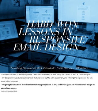
  • 1. Smashing Conference 2014, Oxford UK • Fabio Carneiro • @flcarneiro HARD-WON LESSONS IN RESPONSIVE EMAIL DESIGN - I’ve been involved in web design since 1998, and I’ve worked at MailChimp for 5 years as a UX & Email Designer, - My day job involves building the emails that are used by MC, MC’s customers, and refining the experience the MC email editor provides, - I’m going to talk about mobile email from my perspective at MC, and how I approach mobile email design for us and our users... image credit: http://goo.gl/E8o33u
  • 2. - A little background first, - MailChimp currently has more than 4 million users, the majority of whom know nothing about design in general, let alone responsive design, - We wanted to help them get the most out of their emails, while at the same time helping them adjust to a more mobile web...
  • 3. - So, In November 2012, we introduced a new email designer, dubbed ‘Neapolitan’, that only outputs responsive email, - It’s proven successful: In 2013, we sent 70 billion emails in total, from 24 million campaigns, - Over 65% of all emails sent in 2013 were responsive...
  • 4. - In 2014, we expect that number will radically increase to near 100%, because of two factors: - MailChimp currently adds roughly 10,000 new users a day, - We’ve killed our fixed-width editor, and we’re getting rid of all fixed-width templates over the next couple of months, - There’s a reason we’re pushing so hard towards responsive-only email...
  • 5. A PHONE IN EVERY HAND - It’s because the mobile web is evolving faster and faster. As web designers, we all know that mobile internet usage is skyrocketing, - You may not know that it’s especially true of email, because it is the thing that’s ubiquitous to pretty much every device, - In Europe, for example... image credit: http://goo.gl/qNA90
  • 6. IN THE EU OWN A MOBILE PHONE 91% - According to Eurostat, - Of a total population of 507 million, 91% of people in the EU own a mobile phone, - That’s a total of roughly ~460 million people, - 43% of them actively use the internet every day... source: http://goo.gl/VMjkJH http://goo.gl/f7WH6w
  • 7. Internet activities via mobile device (% mobile internet users) - How do they most use their mobile connections? For sending and receiving email... source: http://goo.gl/VMjkJH
  • 8. SEND & RECEIVE EMAIL VIA MOBILE DEVICE 67% - 67% of mobile internet users in the EU28 use their devices to send and receive emails, - Numbers on my side of the planet are similar... source: http://goo.gl/VMjkJH
  • 9. IN THE US OWN A MOBILE PHONE 90% - According to the Pew Internet & American Life Project, - Of a total population of 317 million, 90% of people own a mobile phone, - That’s a total of roughly ~290 million people, - 63% use their phones to go online... source: http://goo.gl/0m6dEM
  • 10. Internet activities via mobile device (% mobile internet users) - More than half of all cell phone-owning Americans use their devices to send and receive email... source: http://goo.gl/0m6dEM
  • 11. SEND & RECEIVE EMAIL VIA MOBILE DEVICE 52% - 52% of mobile internet users in the US use their devices to send and receive emails, - That number was just 27% in 2009, indicating a 25% increase over four years, - I’ve only touched on the two most developed economies on Earth. The rest of the world is catching up fast... source: http://goo.gl/0m6dEM
  • 12. OF THE WORLD HAVE MOBILE INTERNET 30% - 29.5% of the world’s population have mobile internet access, - That’s ~2.1 billion people, and it’s growing quickly as developing economies come online, - Mobile-broadband subscriptions climbed from 268 million in 2007 to 2.1 billion in 2013, - As the web becomes more and more mobile to meet those new users, email has to follow... source: http://goo.gl/4egHur
  • 13. USER EXPERIENCE IN EMAIL - Those who have dabbled in email design know that, a lot of the time, it’s easier said than done, - In traditional web design, there are tons of tools and techniques that help make responsiveness happen, - In email design however, there’s very little; there isn’t widespread support for HTML5, or CSS3, or JavaScript, - The email designer’s tools are dated by at least ten years, which leads a lot of people to think that responsive can’t be done, or that it’s near impossible... image credit: http://goo.gl/E8o33u
  • 14. DESIGN WITHIN CONSTRAINTS - It may not be simple, but it’s definitely not impossible. Email design has a steep learning curve, but I follow four cardinal rules that make it easier, - They’re what I’ve come up with after 5 years of being an email designer at MailChimp. The first rule is Design Within Constraints, - The email ecosystem has been largely ignored throughout the lifetime of the web. The W3C is only now beginning to talk about it, - That’s the root of one of the major constraints in email design; there are also no standards; it’s the wild west. But because there aren’t any standards to follow, you’re afforded a great deal of freedom, - That means you end up with free rein to experiment, devise creative solutions, and otherwise do things that would Jeffrey Zeldman sick to his stomach...
  • 15. - The basis for the second major constraint in email design is the existence of a few very, very terrible email clients, - These clients force email designers to build to the lowest common denominator, - Some of the worst come from Google, which might surprise some, because this is a company that’s building driverless cars, - The Gmail web and mobile app clients lack media query support, and they require all CSS to be inlined within email markup, - For those reasons, they rank among the worst email clients, but they’re not alone...
  • 16. - Microsoft Outlook (desktop) is the most notorious. Ask any email designer which email client they wish never existed, and it’s this one, - That’s because Outlook doesn’t run a traditional HTML rendering engine; In 2007, it moved from an engine powered by IE6 to one powered by Word, - Email client limitations like these make design differences from client to client pretty much necessary, but that’s a good thing, - Having to account for so many differences frees you having to strive for pixel perfection between clients, - In responsive web design, we write different stylesheets for different platforms; it’s no worse to write an Outlook- specific stylesheet that you then serve with conditional comments - There’s no reason not to use all of the tools available to you within these constraints to just make an email work, - And you should strive to make it work better for people on the receiving end...
  • 17. DESIGN FOR DISTRACTION - And designing for those on the receiving end is the second rule: Design For Distraction, - The mobile web is, well, mobile. And people are busy. Email is something we’re checking on the drive into the office, or - That mobility means that email can’t be an interruption; it has to work into people’s lives almost seamlessly. To that end: - When building emails, there’s one foundational standard to meet: that an email should be usable with just one eyeball, one thumb, and at arm’s length...
  • 18. - One eyeball means the email is usable when a person is distracted, whether it’s a newsletter, a product sales email, or a transactional message, - One thumb means that major calls to action are at least 46px squared, and link groups have adequate separation, - Arm’s length means primary copy has a 16px minimum font size, images are nicely-sized, and contrast is adequate, - These three principles are great, but they’re ultimately meaningless until you apply them to specific ends...
  • 19. DESIGN WITH PURPOSE - Which brings us to the third rule: Design With Purpose, - A website is generally made to cater to everyone; there’s a whole planet of people out there that can come to you, so you stay as broad as you can, - When you design for everyone, you can end up designing for no one; email allows you to do the reverse by making designs narrow and focused, - That can be immensely powerful provided you can focus enough to give that one person - or a group of people that think in similar ways - what they want, - One way to achieve that focus is to design an email to be one thing, to achieve a particular goal...
  • 20. - Generally speaking, there are four main categories for email, - “Buy Me” are ecommerce-based; they use concise copy, simple calls to action, and rely on compelling imagery to build an enticement to spend money, - “Join Me” are event notices or invitations; copy is usually limited to important details and there are clear, bold calls to action to urge participation, - “Read Me” are newsletter emails; they rely upon well-written copy and great typography to make large amounts of content easy to digest, - The last category is a bit of an outlier, but is no less prevalent in the world of email...
  • 21. - “Transactional” emails are messages that convey receipts, order updates, and similar one-time info. It’s important to make them: - “Focused”; a credit card declined message should be nothing more than that; no sales links, no unnecessary information, - ”Comprehensive”; they should contain as much relevant information as possible, made as concise as possible, - “Appropriate”; this credit card declined message contains none of the typical MC humor that can be found in other emails, - “Practical”; the message is obvious, the content is actionable, the email is readable on any device and is easily printable, - “Spartan”; there’s no excessive design, no bells and whistles - transactional means short and to the point, - By sticking to these categories as close as you can, your emails can end up less full of cruft...
  • 22. DESIGN FOR EMAIL - Which is great, because what you’ve ultimately got to do is Design For Email, and that involves four major considerations - 1. Don’t design emails like websites, 2. Be personal and personable, 3. Know and design to your audience, 4. Remember email is an ecosystem, - The first, that emails are not websites, is something where many people almost immediately fail, - A lot of people design an email just as they would a website; you couldn’t find a more incorrect way to go about it if you tried, - Designing an email like a website means you end up with something like the emails from Zappos...
  • 23. - They contain page navigation that only serves to distract from the message and interferes with the course of action you’d like the recipient to take, - Why give them an option to do anything else but buy the product you’re highlighting? It’s the same at the bottom: there are 19 links in the blue footer area! - An email like this happens when designers don’t care, and marketers are allowed to run wild, - There are always exceptions, but more often than not emails like this can be incredibly ineffective, especially compared to an email like...
  • 24. - This one, from Steam, - It’s properly designed, singular in purpose and free of superfluous content, - I wasn’t distracted by other games on sale that I may not be interested in, or links to other genres of games I’d be forced to search through, - This is the game I wanted, that I showed interested in and saved to MY wishlist; when this email hit my inbox, I immediately acted and bought the game, - Steam took advantage of that knowledge and made the email for ME; that personal touch is simple with email...
  • 25. - And that’s the second consideration: making email personal and personable; email is the perfect medium for this, better than social media, - It’s something a lot of email designers ignore, even though it doesn’t have to be as involved as Steam’s, - Including a person’s name or location is very powerful. Paul Boag uses subscriber names in Headscape’s campaigns, - When this email showed up in my inbox, I actually did a double take. “Holy shit, does he really want to feature my project?” - It wasn’t targeted to just me, of course, but for a moment? I thought it was. “Paul is all about web design. I’ve web designed!” - Not only did he take advantage of personal data available to him, he also geared the message toward a specific audience...
  • 26. - That’s the third consideration, and one of the best ways of designing for email, - While a site’s ‘audience’ may be a vague group, in email it can be much clearer, - With email, you can better tailor your content to build interest, foster engagement, and grow trust with the audience, - One example is MailChimp’s UX newsletter, which we send out roughly twice a month; it’s a long-form email that focuses on what we do at MCUX...
  • 27. - It currently has over 13,000 subscribers, - Because we know our audience, and know that they can and want to read these long articles, and prefer them in email form, it works, - The email also works as a conversational tool by encouraging questions, and that brings us closer to other people in the web design world, - After an issue goes out, we spend days responding to questions, which builds a relationship with the readers and grows interest in the newsletter, - The emails are long, but they’re only sent twice a month to lessen fatigue, and allow breathing room between issues...
  • 28. - And that’s where the fourth consideration comes in; knowledge of email as an ecosystem, - Knowing when and how often to send an email is important to its success; people suffer email fatigue, which has led to things like the ‘inbox zero’ movement, - Be considerate of the time investment you’re asking of people, and strive to make your email painless to read through, - It’s also good to remember that email is not a closed-off thing; it’s part of the web, so transitioning from email to web should be seamless, - If you’re pushing someone from an email to a site, and the email is responsive, then the site should be as well, - The more painless you can make email, the more successful it’ll be...
  • 29. - So, these four rules, 1. Design within Constraints, 2. Design for Distraction, 3. Design with Purpose, and 4. Design for Email act as a focusing mechanism, - As you make your way through each rule, the experience that you’re creating for your users becomes more well- defined, - The email becomes more finely-crafted as well, - So, even though web and email design are worlds apart, we follow similar methods for crafting better experiences for people out in the world...
  • 30. BUILDING RESPONSIVE EMAIL - So once you’re got the experience nailed down, what do you do to put it together? Where do you start? - You can start with some development techniques that help in the creation of good email, - First, by breaking email down to smaller bits...
  • 31. MODULAR PATTERN-BASED EMAIL - A modular, pattern-based approach is what drives MC’s drag-and-drop email designer, and even underpins the MailChimp application itself, - This method allows great layout flexibility because layout is abstracted into content blocks, which means the email can be built quickly, - It’s helpful because not only are you reducing dependency on having lots of standard CSS, you also reduce the size of the media query you need to write, - This is also a very stable method with which to build emails, because you end up with abstracted blocks of code...
  • 32. - These abstracted blocks are common design patterns you can find all over the web, and particularly in email, - I start with mapping out common design patterns like buttons and calendar pages, creating them outside the context of the email, - They’re not just any random patterns; they’re particular to the email’s purpose; a ‘Join Me’ email would need a calendar page to show off its date, for example, - The emails I designed for Zendesk, customer support service, work on this principle...
  • 33. - This email is one of those “Read Me” emails, which means it’s a jack-of-all-trades message and contains a lot of patterns, - This is the email scaffold, and it’s the only part of the code with defined pixel sizes, - It also has some basic patterns included, like the preheader and social block at the top, - The rest of the content blocks are built as separate entities that can be placed into the scaffold in any order to create specific layouts, - For this email, there were several different patterns, but the major ones were...
  • 34. - The email’s header, complete with a webfont-driven type stack...
  • 35. - Then there’s the title block, also driven by a webfont stack, - It’s also fully HTML - those lines are borders on empty table cells, which means it’s more efficient data-wise - And it scales more easily across different display sizes...
  • 36. - It’s followed by the feature block...
  • 37. - And finally by a utility link block...
  • 38. - Everything is combined to form the full email. - All of the code blocks are discrete, contained in isolated files that can be easily copied and pasted by anyone, - It’s all well and good to use this pattern-based approach to make email that easy, but making that easy and responsive is more difficult, - More so when you have many email clients to consider, all of which have varying degrees of mobile- friendliness...
  • 39. MOBILE FIRST IN EMAIL - In traditional web design, everyone likes to say, “start with mobile first”, but it’s not such a simple proposition in email, - Why? Because most clients don’t support media queries. And some don’t support max-width. And some support media queries, but not max-width, - It goes on and on like this, all of these roadblocks; but there are solutions that make mobile-first possible, - My most recent experience with the mobile-first issue was in designing Khoi Vinh’s new Subtraction.com newsletter...
  • 40. - The email was originally desktop-first, but Khoi wanted a solution to the email not being responsive in webmail clients, - Going fluid wasn’t an option, because this is an email whose content is varied and injected via RSS; it all had to be fluidish, or ‘spongy’, - How different email clients handle CSS required for mobile-friendly and responsive style shifts was also a consideration, - For example; Outlook has issues with max-width, and so does Apple Mail/iOS Mail, all web-based clients have issues rendering media queries, - Because there are a few problems to account for, a few techniques for a workable solution were employed...
  • 41. - The email is built around the concept that just one container does all of the work in determining width; that’s ‘emailContainer’ here, - Instead of defining a specific width to be overridden, it gets a 100% width via attribute, which is limited via ‘max-width’ CSS, - The main media query takes care of adapting the width on supporting displays, - This method fails in Outlook, so a fixed-width container was made and placed within conditional comments...
  • 42. - That solves the max-width issue there, but there’s still a major max-width problem in Apple Mail...
  • 43. - And that is dealt with by a min-width media query and a client-specific style adjustment for iOS, - That’s how much it takes to do mobile-first in email, but it works, - It’s messy, but effective, and the email looks right on each of the most important email clients that Khoi’s subscribers use, - This solution is based on the idea that all of the parts in an email are always fluid or near fluid, and can be placed anywhere and manipulated easily...
  • 44. TABLE LAYOUT SHIFTING - In traditional web design, this kind of thing is easily done with floats and positioning, - Floats and positioning don’t work well in email clients, regardless of whether they’re desktop, web, or mobile- based, so email designers must resort to different methods...
  • 45. - Here’s a standard two-column layout email; it’s a layout you see all the time, - Ideally, on small screens, the email switches to a single-column layout...
  • 46. - With the right column wrapping under the left when the media query is triggered, - We can use two primary methods to achieve this result. The first method involves using forcing the table’s <td>’s into a block-level layout...
  • 47. - This first method is more stable, because you code email columns in the traditional <td> layout, - The two columns here sit inside an overall wrapper table, with the left and right columns inside the cells “templateColumnContainer”, - We target these cells with the block-level rule to force the columns to snap under each other...
  • 48. - That’s all the CSS you need; one line, - (Side note, here: the media query rules are written with attribute selectors to prevent Yahoo Mail from rendering media query styles instead of desktop styles), - The advantage of this method is that it’s stable; this is how columns are always done, in two <td>’s, - There’s a disadvantage, though: it’s not very flexible, especially when semantic layouts need to be accommodated...
  • 49. - Layouts like this, with a sidebar on the left and main content on the right, where the expectation is that the secondary content snaps under the main content, - In the code, the sidebar comes before the main content, but we don’t want that to happen then the email snaps to a single-column layout, - The block-level <td> method doesn’t let us swap the <td> order without resorting to float or position, which can present issues, - That’s where the second responsive column method comes in, with the use of the align attribute...
  • 50. - The align attribute mimics CSS float, and it’s supported in older email clients; this is the perfect situation in which to use this method, - Because generally a sidebar is reserved for secondary information, when the email shifts to 1-column view in mobile, it should come after the main content, - In the email HTML that order needs to be preserved so it makes semantic sense, while still allowing the column orders to be reversed in desktop view, - By preserving the semantic column order and adding align attributes that reverse it on desktop, the layout issue is solved - The heavy lifting is done in the media query...
  • 51. - When the media query is triggered, each table gets a width of 100%, - They’re also set as block-level elements for email clients that have trouble with the align attribute and width 100%, - Because they’re aligned, the left aligned table will always come first, the right-aligned table will come second, - Because the order of the columns is dictated by their alignment direction, we can actually swap the order of elements by changing their position in the markup or manipulating their alignment direction...
  • 52. - The sidebar snaps under the main body area, and your content hierarchy is preserved, - The beauty of this method is that it can be used to do more complex layout shifts as well...
  • 53. - Which is done in the AllThingsD newsletter; here, the mobile version is on the left and the desktop version is on the right, - Each story element is contained within an aligned table; title, byline, image, and summary; each of these items get shuffled on mobile view, - This method obviously allows a great deal of flexibility, but it can be very brittle; whether you use the block-level <td> method or the aligned-table method depends on your circumstances, - These three basic development principles allow a really strong foundation for responsive email...
  • 54. EMAIL DESIGN RESOURCES - Unfortunately, they’re just the tip of the iceberg; all I’ve talked about here barely touches upon the whole of email design, - I’m not going to leave you in the lurch, of course; there’s a lot to learn, and I’m constantly working to demystify email design...
  • 55. templates.mailchimp.com - This is my current effort, MailChimp’s Email Design Reference, - It’s a lengthy, comprehensive reference that covers email design from the ground up, beginning with basic principles like typography usage to more complicated subjects like responsive email, - It’s also got a library of pre-built email templates ready to be used for your own campaigns or as a learning tool...
  • 56. theuxnewsletter.com - I also write occasionally about email design for MailChimpUX’s newsletter...
  • 57. litmus.com/email-community - Finally, the email analytics service Litmus recently opened an email design community...
  • 58. Fabio Carneiro • @flcarneiro THANK YOU - Hopefully, this talk has made HTML email a little less daunting and frustrating, - I’m open to chatting about email design; drop me a line via Twitter @flcarneiro, or shoot me an email via flcarneiro.com, - Thanks!