

Recomendados
Más contenido relacionado
Destacado
3 deconstructions finished
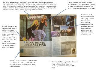
- 1. The kicker appears under “UPFRONT” which is in capital letters with bold font The main image links in with what the making it very in your face and eye catchy, making people more likely to notice the article which is about Nicki Minaj first ever kicker. The repetition used in it “what's happening” changes the way people would UK show. As there is a picture off Nicki read the kicker as the second time you read the words you find yourself saying it in Minaj at the gig it self preforming on stage. a different accent making it more appealing and memorable. Furthermore, all the pictures on the other page are laid out to look as if they are over lapping each other The title “Minaj Paints and have captions Hackney Pink” links in on the images with the boots she's giving you more wearing on the main information about image, plus her gloves what went on. and lip stick. Underneath the title is a strap line giving the reader more information on what the rest off the text is going to be about. Usually articles have a drop capital but this one doesn’t. But it does use bold font to • The layout off the page makes the main high light different artists to make them image off Nicki Minaj stand out stand out more. massively, as it takes up most off the room.
- 2. There are no drop caps in both pages. Instead the designer has made the font bigger to help make some of the text stand out more than others Both sides color’s and still keep the color scheme. contrast showing there both about different thing, as well as Both of the texts are making them stand in one Colum. They out individually. aren't cramped together which will make the target audience more likely to read all of the text as it doesn't’t look a huge amount. With the target audience being 7-15 year this is perfect because that age group don’t normally like reading a big amount of text. “Louis and Niall’s The target audience is 7- school secrets are over 15 year olds who are Furthermore, since Zayn is holding himself it immediately implies to the the page” Encourages interested and idolize audience that he is hurt making them feel sympathetic and want to read the text the audience to read young boy bands. Zayn to find out why he's upset. In comparison to how Harry is portrayed in the on as people reading and Harry are wearing photo. His body language makes him look at ease with his hands in his pockets about Zany and Harry trendy clothes which showing he's relaxed, as well as his facial expressions showing he's happy due to are likely to be make them appeal even him smiling. This then encourages the audience to read the text on the other so interested in the other more to the target they can find out why he's so happy and relaxed. members off One audience. Direction as well.
- 3. There is use of drop caps in the text such as the letters “J,H and T” to help separate The picture of Jay-z different sections of the text. Furthermore, the designer has placed a big red “J” drop show a very sad, The colour scheme on cap one the second page making it very eye catchy as well as linking with the red serious side of him this double page spread colours on the other page. Also the “J” links in with the artists name “Jay-Z” which was yet still creates a lot is red, blue, while, black a very clever thing to do. of mystery about and yellow. The main him. This is because colour is red which he is wearing glasses resembles danger, blood, as if he doesn’t want hurt, passion, and sex. to show his face This then gives the making the audience audience an incite of want to know the what the article might be reason for this. about. The fist page has a picture of Jay-Z wearing shades with different backgrounds each side of his face, one colour being red and the other a light blue. Since blue is a very bright positive colour it could be a metaphor of Jay-Z personality showing that he has two, one being nice, loving and caring and the other dangerous, scary. Moreover, because of The pull coat “Better red than dead” entices the contrast of colours it All of the first page is a picture of Jay-Z immediately the audience to read the article because it is gets the audience informing the audience both pages are going to be very catchy, plus red also links in with the thinking making them about him. The lay out makes you look at the picture colour scheme making the double page spread want to find out what of Jay-Z then come across to the page to see and see look more professional. The first page has the text is about. the text, since the audience will already be interested “Rap Radar” the use of alliteration hear also in the text because of how good the picture and colors interests the audience to read on as well due is on the other pages makes them more likely to be to it rhyming. willing to read the big amount of text.